[Riot Art Contest] Lucian and Thresh
Final Result
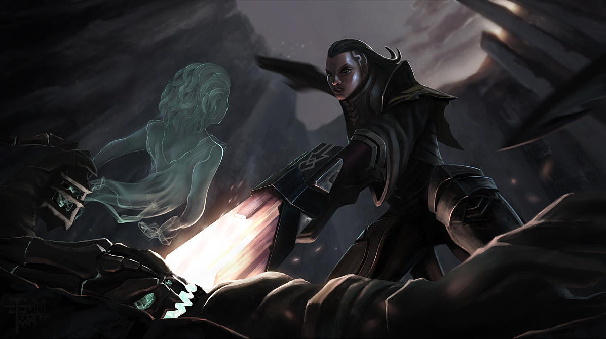
Some thoughts:
I'm really really happy that I participated in this contest. I chose to do something that was way out of my skill level due to the complexity. For me as a student, the point of this contest was never the prize, I saw it more like a challenge and an opportunity to push my limits. I'm glad I chose something that was out of my comfort zone. I learned a LOT through the process of making it. I have to admit that I did struggle a lot, and I didn't know if I could ever achieve what I had in mind. Something was always clear though, I always knew when what I had was NOT what I wanted. So I just kept trying and changing until I liked it. I feel like there is no better way to have fun and learn at the same time, than painting your favorite characters from your favorite game Now looking back at what I had when I started, I feel really happy about how much I've improved over one month. I'm no where close to where I want to be yet, but I will keep at it until I get there.
10/27/2014
Hello everyone,
My name is Tony. This is the second idea I have for the Riot Art contest -illustration category. I think I like this one better than my first Leona idea.
I wanted to illustrate a fight scene between Lucian and Thresh. Just like in the actual League of Legends game, Thresh probably would not stand a chance against Lucian one versus one. I imagined the fight scene to go like this: Lucian just beat Thresh in a duel. Thresh is on the ground with a gun pointed to his head. Lucian is ready to make the final blow when Thresh starts to laugh. He then raises the Lantern and let it open a bit. You see the soul of Senna coming out of the lantern and it gets all of Lucian's attention. Thresh tells Lucian that, is he kills him, he will never even get to see her soul any more. While Senna gets all of Lucian's attention, you see on the bottom of the screen that Thresh is slowing reaching for his scythe. I wanted to illustrate that whole scene with one image. And here are the sketches I have so far.
Let me know if you think the story is coming across clearly!
My next step to finalize the composition and start on the values!
Thank you for looking!
10/28/2014
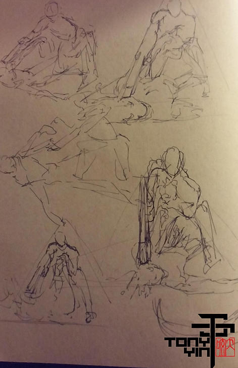
Rough paper Sketch. I want the camera to be low, looking up at Lucian :
Line sketch in PS:
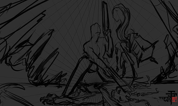
Line sketch 2 in PS:
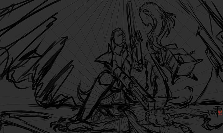
rough value sketch:
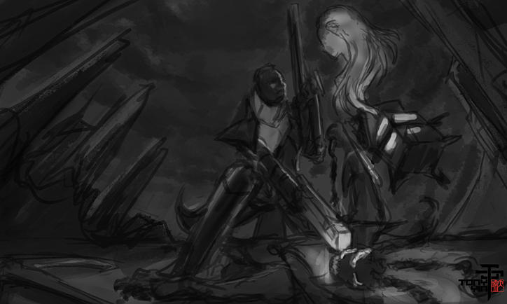
Update 10/29/2014
Tweaking composition:
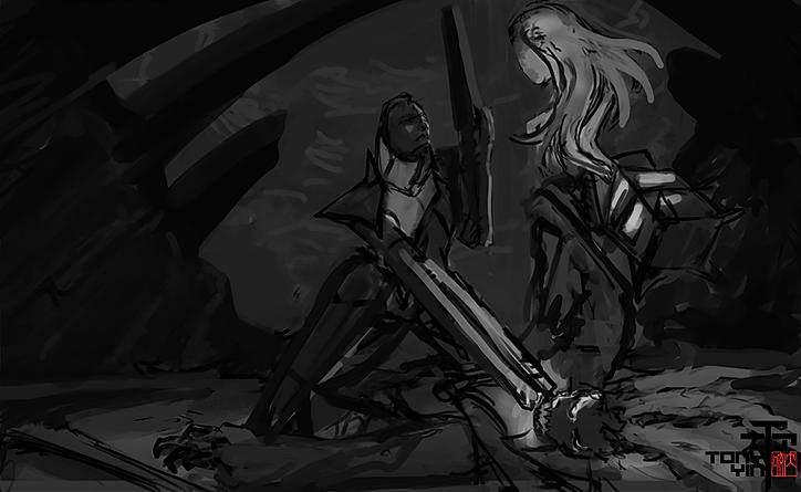
Testing new lighting:
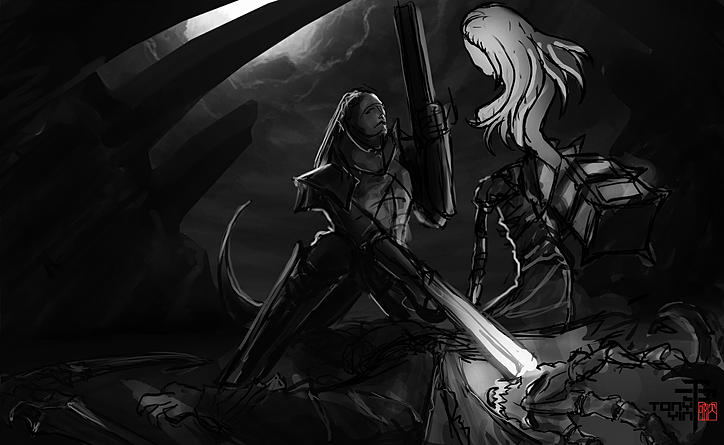
Playing with color and smoke brush. I wanted Senna's hair to blend with the smoke trails.
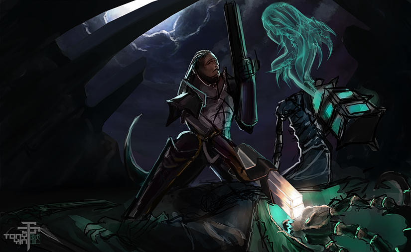
Update 10/31/2014
I did a bunch of lighting and color tests yesterday, and realized that what I had was not what I imagined. So today, I redid the composition and camera angle. I like it now, and I'm ready to add some details.
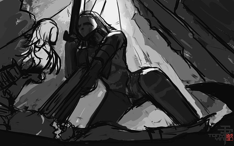
Update 11-2-2014
Finalized composition
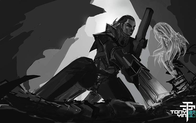
Resized the image to be tiny and tried out some different color
Update 12/1/2014
Took a break from it. Still don't like the composition. Changes are being made.
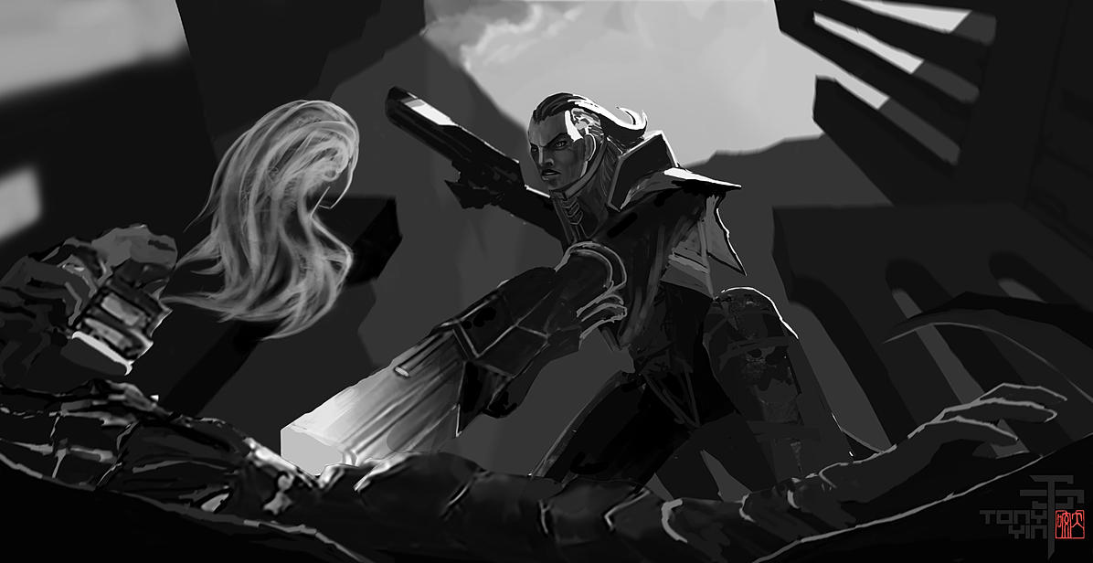
Update 12/7/2014
Trying out some lighting and color. And got rid of the structures in the background. I feel like they were too distracting. Also changed Thresh's right hand to feel more dynamic.
Update 12/13/2014
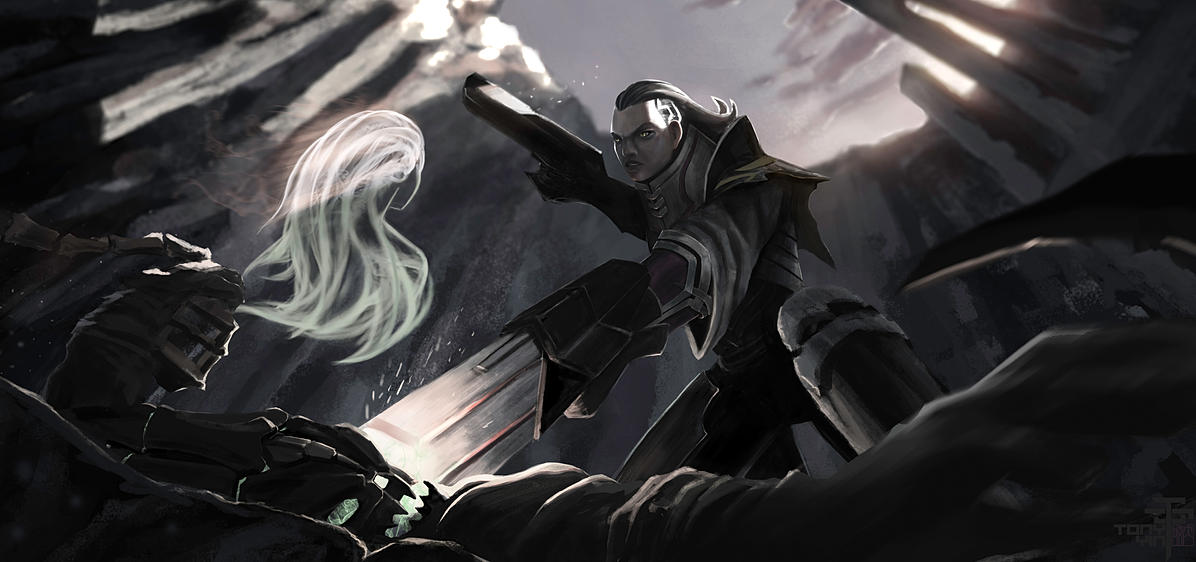
I have decided to change the overall lighting. What I had before didn't feel fitting for the scene. I want the light from the gun to play a bigger role. I've also changed Senna. I used to want her hair to blend with the soul, now I've changed it so her body blends with the soul instead. Also added more details to Lucian's gun.
Ypdate 12/15/2014
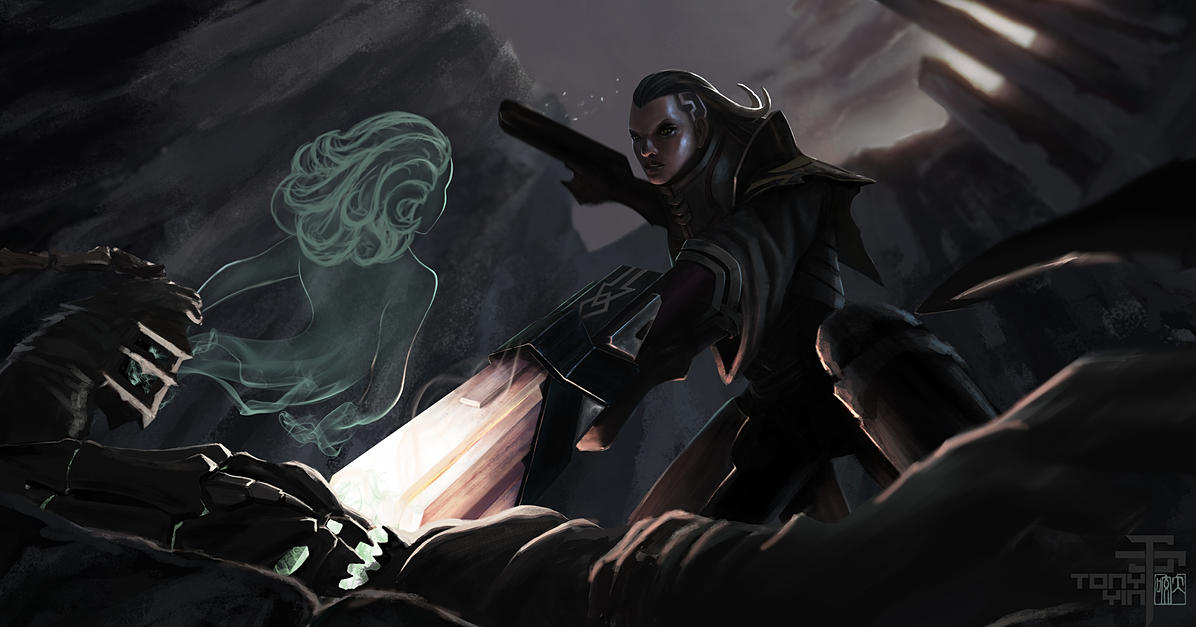
Decided to make Senna more accurate to the release video of Lucian. It came out perfectly because now I can have her clothes blend into the soul part. I like that a lot. Still more work need to be done. Almost there.
Update 12/17/2014
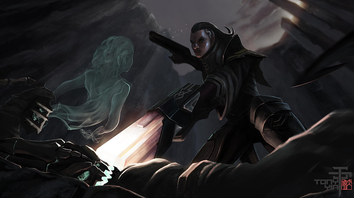
Here is the final!


Some thoughts:
I'm really really happy that I participated in this contest. I chose to do something that was way out of my skill level due to the complexity. For me as a student, the point of this contest was never the prize, I saw it more like a challenge and an opportunity to push my limits. I'm glad I chose something that was out of my comfort zone. I learned a LOT through the process of making it. I have to admit that I did struggle a lot, and I didn't know if I could ever achieve what I had in mind. Something was always clear though, I always knew when what I had was NOT what I wanted. So I just kept trying and changing until I liked it. I feel like there is no better way to have fun and learn at the same time, than painting your favorite characters from your favorite game Now looking back at what I had when I started, I feel really happy about how much I've improved over one month. I'm no where close to where I want to be yet, but I will keep at it until I get there.
10/27/2014
Hello everyone,
My name is Tony. This is the second idea I have for the Riot Art contest -illustration category. I think I like this one better than my first Leona idea.
I wanted to illustrate a fight scene between Lucian and Thresh. Just like in the actual League of Legends game, Thresh probably would not stand a chance against Lucian one versus one. I imagined the fight scene to go like this: Lucian just beat Thresh in a duel. Thresh is on the ground with a gun pointed to his head. Lucian is ready to make the final blow when Thresh starts to laugh. He then raises the Lantern and let it open a bit. You see the soul of Senna coming out of the lantern and it gets all of Lucian's attention. Thresh tells Lucian that, is he kills him, he will never even get to see her soul any more. While Senna gets all of Lucian's attention, you see on the bottom of the screen that Thresh is slowing reaching for his scythe. I wanted to illustrate that whole scene with one image. And here are the sketches I have so far.
Let me know if you think the story is coming across clearly!
My next step to finalize the composition and start on the values!
Thank you for looking!
10/28/2014
Rough paper Sketch. I want the camera to be low, looking up at Lucian :

Line sketch in PS:

Line sketch 2 in PS:

rough value sketch:

Update 10/29/2014
Tweaking composition:

Testing new lighting:

Playing with color and smoke brush. I wanted Senna's hair to blend with the smoke trails.

Update 10/31/2014
I did a bunch of lighting and color tests yesterday, and realized that what I had was not what I imagined. So today, I redid the composition and camera angle. I like it now, and I'm ready to add some details.

Update 11-2-2014
Finalized composition

Resized the image to be tiny and tried out some different color

Update 12/1/2014
Took a break from it. Still don't like the composition. Changes are being made.

Update 12/7/2014
Trying out some lighting and color. And got rid of the structures in the background. I feel like they were too distracting. Also changed Thresh's right hand to feel more dynamic.

Update 12/13/2014
I have decided to change the overall lighting. What I had before didn't feel fitting for the scene. I want the light from the gun to play a bigger role. I've also changed Senna. I used to want her hair to blend with the soul, now I've changed it so her body blends with the soul instead. Also added more details to Lucian's gun.

Ypdate 12/15/2014
Decided to make Senna more accurate to the release video of Lucian. It came out perfectly because now I can have her clothes blend into the soul part. I like that a lot. Still more work need to be done. Almost there.

Update 12/17/2014
Here is the final!

Replies
I'm sooo happy to hear that!!
haha thank you so much!