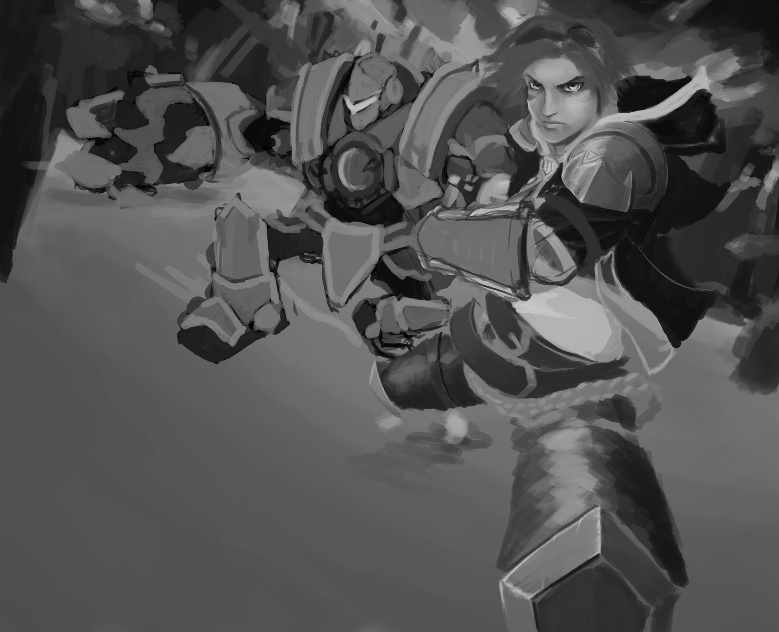
[Riot Art Contest] Ezreal
Hi PC,
This is actually my first thread let alone art comp lol.
I've only really started taking my art seriously as of the start of this year, so I thought id finally challenge myself n try something new. I'm new to painting so any crits and tips I can get along the way will be greatly appreciated.
I'm only hoping I can complete this in time as I am currently in the middle of my end of year game enviro project (and I'm SLOW!) for school so this unfortunately won't take priority
Any way with the intro out the way, my plan of attack is to renovate the existing frost Ezreal skin. Mostly because I find it rather bland for a skin. I mean its just the original with a blue pallet lol. So ill be attempting a splash art.
LATEST:

Replies
Looking good!
POSES
THUMB SKETCHES
In the final sketch I would make his left fingers variate more in length. Make the total of him a bit smaller and place him a bit lower. Add some space to the left of your comp to give Ez more space. Those are my suggestions ^^
also any suggestions on blonde or white hair?
might just be looking at it for too long lol
My comments about space still apply, please read back if you're interested.
but i may call the line art done n start painting its getting draining haha.
edit* think that horizon line needs to go up a tad lel.. ill fix it later
As far as background goes I'd analyze some existing splash art that you find particularly awesome and think of what they did that makes it awesome. Try to keep the perspective in your image in relation to the character, further selling the exaggerated action. You can also afford to exaggerate atmospheric perspective to push the depth even further.
This tutorial covers colortheory among other things: http://androidarts.com/art_tut.htm#color_relativity
Hope it helps! It's such a vast subject though so all you really can do is practice it and do studies over a period of time. good luck.
Im considering giving that fishbowl (bend) or whatever you call it look to the mountains snd horizon line. I think the picking how saturated my colours are gets me the most. So would adding explosions or something be a good for some sort of 2ndary lighting? Was thinking i have to make his glove glow
Thanks again
so i decided to take a couple of steps back n try to learn to walk before i run and figure out how these things we call "values" work. LOTS to fix clean up and work out but not overdoing the rendering REALLY helps, keeping it simple n moving around helps
decided i wasn't digging the glove so reconcepting that (again). need a little more perspective adjustments i think.