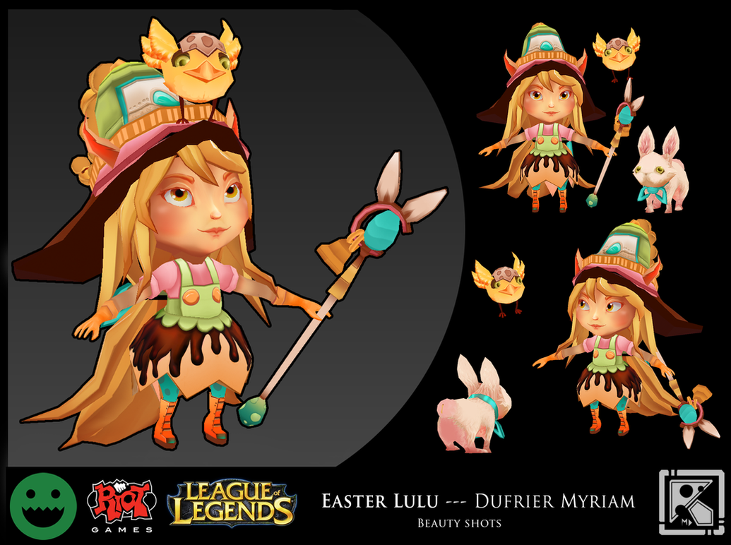
Easter Lulu
Last :

Hello there !
I thought I'd give it a try, as a contest is a good way to improve, so I'm gonna make Lulu in an easter theme
Here are some sketches I made, I will apply some slight changes to it (like the bell she wears as a hat; it will have a triangular base because it fits Lulu's character better . Also she is too tall so while modelling her I will probably change the proportions
She will make the other champs transform into gnar-inspired rabbits and wear a Chocolate dress
i hope you like this design
Please don't hesitate to make constructive comments, I really want to improve my skills in 3D modeling And good luck to everyone participating in the contest

Hello there !
I thought I'd give it a try, as a contest is a good way to improve, so I'm gonna make Lulu in an easter theme
Here are some sketches I made, I will apply some slight changes to it (like the bell she wears as a hat; it will have a triangular base because it fits Lulu's character better
She will make the other champs transform into gnar-inspired rabbits and wear a Chocolate dress
i hope you like this design
Please don't hesitate to make constructive comments, I really want to improve my skills in 3D modeling
Replies
Here comes Lulu with the hat! I also started modeling the rabbit
and yes, sculpt in a regular material like basic material or zbro_mud1
For now I just use the basic material in Zbrush to sculpt.
It's true that another type of material might look better
I think I will make the textures directly in Photoshop for the low poly model. Don't know which software i should use for the final render though. maybe UE4? or Marmoset but I don't know how to use it at all ^^'
For the head I tried to make it look more like the splash art than the in-game model, that's probably why it looks different
Thanks a lot for the constructive comments, I followed your advices and I think it looks better this way
I started to make some research on the colors for it to have an "easter" feel
(the dress is in chocolate, and the darker parts on the dress are chocolate drips)
Any advices?
I would also go for colorful and not chocolate, the idea is nice, but does not work in this gameview
does it work better?
Otherwise, nice character, keep the good work !
I like the rabbit (cat?)
I'm sorry, I've been overwhelmed with things to do and I didn't post a lot these recent days
Buuuuuut I've started texturing
Still changing the colors to make them match with the colors of the new map.
Feel free to tell me any constructive critique o/
I made some progress in the texturing and made the retopology of the rabbit. I started to make Pix too but it's not looking good enough to post it yet :B
I might increase the contrast a bit, I'm afraid some parts aren't highlighted enough and it might not be very readable from afar ^^'.
What do you think?
I'm having trouble with the fur. Do you guys have any advice ?
Overall something I noticed: If you take a close look at your thumbnails on the page before seeing the larger versions, you will see that the simplified models look pretty good in low resolution. The colors and shapes are really fun. I would use this to your advantage and cut down noise in your textures while refining the forms. You'd be surprised how much can be implied in the texture without over-rendering.
Lulu: I believe her face is getting there but can be a bit more refined. Seeing inside her eyelids is a leeetle creepy.
Rabbit: I feel your textures may be getting a bit busy, I would recommend simplifying the fur a bit. The eyes could also be less bulgy... They feel disconnected from the rest of the rabbit.
Pix: Cute! The geo could use some love. Because he will be so small, you could cut down his poly count by quite a bit. You have some edge loops which aren't contributing to the silhouette, which can be either removed or help round out the shape. You could also probably get away with cards for the feathers.
I made a retopology of pix
I finally submitted my entry
I'm glad I could improve this much thanks to the contest
Thanks to everyone that gave me advices on how to improve it o/
TeriyakiStyle > Thanks ! You helped me a lot with the color choices
great work Kazefield!
Thank you