Home 3D Art Showcase & Critiques

Engine Power Up!

polycounter lvl 10
Offline / Send Message
Joltya polycounter lvl 10
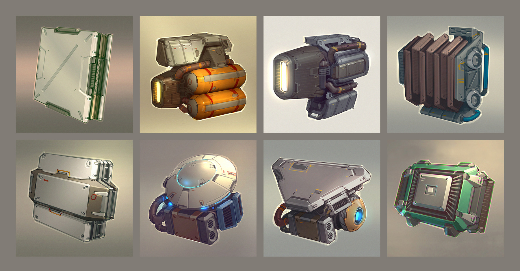
Hello Polycounters! I've been working on this little thing here. I'm not quite sure what it is, but I'm having a lot of fun with it so far! I'm currently done with the high-poly, and I'm now working on the lowpoly.

rtxcI6Q.jpg

Concept art by Daniel Graffenberger
Quantum_Rush_Concept_Art_Items.jpg

Replies

  • Bartalon
    Offline / Send Message
    Bartalon polycounter lvl 12
    Looks fantastic! Nice job filling in the back where there was no concept.
  • fab-camp
    Offline / Send Message
    fab-camp polycounter lvl 6
    looks great, want to see colors on this !

    maybe add some more details on the pipes, as these add to the roughness of the concept
  • Joltya
    Offline / Send Message
    Joltya polycounter lvl 10
    Thanks guys! I was trying out model out some details in the pipes in the high poly, but it just ended up looking weird. I'll probably do those in nDo when I finally get it (which should be soon!)

    Anyway, I got some bakes done so far. It's at about 2.4k tris. I've also tried adding my branding to my images in order to help sell myself a little more, but I feel like it might be a little too distracting. Thoughts?

    ZX2GVsD.jpg
    KJ3Hl9y.jpg
  • wccrawford
    Offline / Send Message
    wccrawford polycounter lvl 4
    The logo in the bottom corner looks perfect to me. It sets itself apart and isn't even close to touching the artwork, so it doesn't feel like it's in the way at all.

    I'm loving how few polys this has with such detail, too. Great job!
  • Joltya
    Offline / Send Message
    Joltya polycounter lvl 10
    Thanks! I was more concerned with the color though, but I've grown to feel like it's a lot more acceptable right now.

    I'm trying to figure out the materials right now, and I'm having a pretty hard time since 1) This is the first time I've tried to texture from a concept, so it's hard to tell what colors represent which material and 2) this contraption doesn't actually exist in real life, so I can't do actual research on it. I have done some research on some computers and engines and tried to come up with some general materials, but I'm still very unsure about them. If someone could provide some insight, that would be greatly appreciated!

    LxUGEm1.jpg
  • Joltya
    Offline / Send Message
    Joltya polycounter lvl 10
    Been messing around with materials today. I could really use some input/feedback as I'm not nearly as confident with texturing as I am with modeling. I've just been trying to define some materials so far, so there's not a lot of grunge or material break-up just yet.

    I'm also trying to nail down the color of the fans on the other side. I thought I would just use the same yellow that are on the cylinders, but I feel like this may make the piece "too yellow". When I tried other colors though, they seem to stray too far off the color palette. Any suggestions would be greatly appreciated.

    3SWZH2v.jpg
    6NfwD0P.jpg
    lPM0jLK.jpg

    MAPS:
    0AY8IO6.jpg
  • JamesMeader
    Offline / Send Message
    JamesMeader polycounter lvl 9
    Looking cool, keep up the good work. The concepts are really nice, may have to choose one myself and do a study.
  • AlexJWhite
    The blue looks better than the green, but what I'd recommend is perhaps reversing the colour scheme for the fans - take the dark orange going round the cylinders and make that their primary colour, then maybe highlight it with the yellow. Also, I know it's a stylised piece, but may I recommend some description of dirt map? It'll really bring it to life.
  • Joltya
    Offline / Send Message
    Joltya polycounter lvl 10
    Thanks for the feedback guys. Alex, were you suggesting something like this?

    UKpLrjh.jpg

    And I did have a dirt map on there, although I guess I could increase it quite a bit. Like I said, I'm trying to hold off on too much grunge until I get the materials figured out.
  • AlexJWhite
    Yeah, exactly that, it's a but more harmonious. Maybe the section looping round the silver next to the fan, and the bit between the two fans would also suit the yellow, it'd be worth a test I think. Definitely works better than the blue and green in my opinion.
  • Joltya
    Offline / Send Message
    Joltya polycounter lvl 10
    Thanks for the input, Alex. However, one of my peers actually suggested that I make the fan holders metal like the top piece, and I'm pretty confident that that is the best way to go. I added a bit more grunginess to the textures. I wouldn't call it done yet; there's a lot of dirt and grime and scratches to add, but I feel like it's getting pretty close. It's definitely uncomfortable since I'm not used to texturing entirely in Photoshop, plus I don't even know how this thing would be used. As always, feedback always appreciated! :D

    QuXZK46.jpg
    isym4ZO.jpg
Sign In or Register to comment.