Agatha Knight - The King's Guard
Hi guys, not sure of the format for these new submissions so I'll just continue as in the competition...
Here's where I got to previously before some real-world commitments meant I couldn't finish the competition:

Due to the fact this sword is clearly Agathan in design (courtesy of that lion pommel), I feel that I really do need to throw in a helmet to make a set rather than finishing this off as a standalone weapon. With this in mind, I've gathered a couple of potential designs for taking forward.
First up, there's the Game of Thrones Kingsguard helmet:

Naturally I can't just copy this but it would act as a majority reference in an original design.
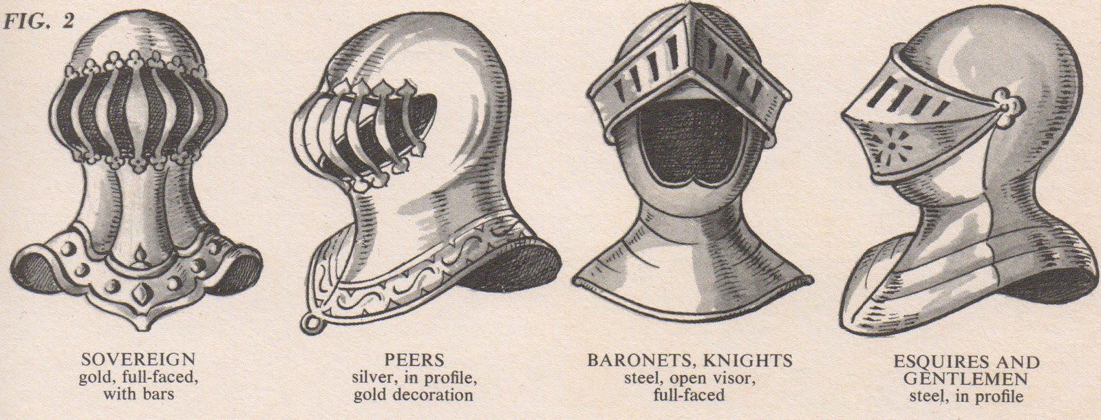
There's also this helmet design (first/second from left) I've seen around in coat-of-arms designs but can't seem to pin down any real photographs for, so would have to be an original design based on it again.

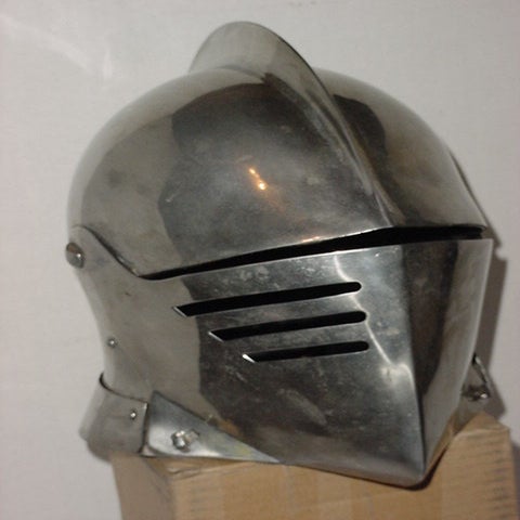
Finally I saw this helmet which is a fairly standard looking knights helm. Not to sold on the style of it though, not sure it really matches the curvier designs of the sword furniture...

Current favourite for me is an adaptation of the GoT helm in the first image, but I'd be interested to hear if anyone has any thoughts about the others.
Thanks!
Here's where I got to previously before some real-world commitments meant I couldn't finish the competition:

Due to the fact this sword is clearly Agathan in design (courtesy of that lion pommel), I feel that I really do need to throw in a helmet to make a set rather than finishing this off as a standalone weapon. With this in mind, I've gathered a couple of potential designs for taking forward.
First up, there's the Game of Thrones Kingsguard helmet:
Naturally I can't just copy this but it would act as a majority reference in an original design.
There's also this helmet design (first/second from left) I've seen around in coat-of-arms designs but can't seem to pin down any real photographs for, so would have to be an original design based on it again.

Finally I saw this helmet which is a fairly standard looking knights helm. Not to sold on the style of it though, not sure it really matches the curvier designs of the sword furniture...

Current favourite for me is an adaptation of the GoT helm in the first image, but I'd be interested to hear if anyone has any thoughts about the others.
Thanks!
Replies
On a side note, is there any way to preview a weapon in hand as the players will see it? I can't find a way to do this but it seems like a pretty crucial step in tweaking the textures...