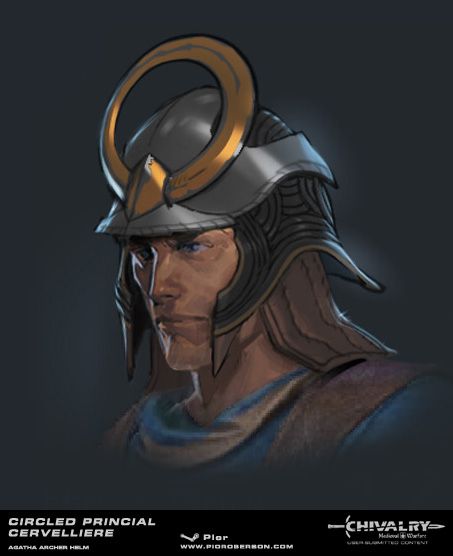
Circled Princial Cervelliere - Agatha archer helm
Hello all !
Spudnik and I just finished an archer helmet that we originally started for the contest. I am very glad that we have the opportunity to submit it now ! Alex took care of the highpoly sculpt and lowpoly model, and I took care of the concept and textures.
Steam Workshop page


The contest taught us a lot about making things fit into Chivalry as best as possible, both from a design and execution standpoint. It really was a very interesting experience.
I hope you will like it !
Spudnik and I just finished an archer helmet that we originally started for the contest. I am very glad that we have the opportunity to submit it now ! Alex took care of the highpoly sculpt and lowpoly model, and I took care of the concept and textures.
Steam Workshop page


The contest taught us a lot about making things fit into Chivalry as best as possible, both from a design and execution standpoint. It really was a very interesting experience.
I hope you will like it !

Replies
In the battle of Agincourt,the French showed up with 3000 mounted Knights mostly nobility,while Henry V brought 500 archers,mostly scum and ex prisoners and thieves trained as longbow men. The French laughed at the English because fighting with such peasantry was was unheard of until the next day England's 500 archers decimated the France's nobility using mostly archers.
The reason I am not to keen on the circular element,if you look at Medieval gear,aside from jousting armor,none of the armor has anything sticking out the sides like horns for example. Because if you are in a pitched battle,if someone grabs your helmet by the horns they can throw you to the ground and stab you while you lie helplessly. I mentioned Agincourt earlier because archers did fight melee in battles and having something on you gear that is a potential disadvantage is unheard of. That's why most armor from medieval times is meant to deflect blows and close off potential chinks in the armor that can get you killed. For example look at Gothic Plate armor,there is typically a round metal plate at the armpit,that is because that was a spot often exploited by enemies to kill knights,often using a small dagger.
Not to sound to harsh but your helmet looks better suited for the Elves of middle Earth as opposed to Archers in the Middle Ages. It's a beautiful design don't get me wrong,it sticks out way too much in CMW
JO, these are very good points. Chivalry really is an interesting creative sandbox - the historical believability of the designs is important (although time periods seem to mix quite a bit) but the gameplay itself also adds an extra layer of design requirements that I find interesting. I do agree about the circular hoop being impractical - you are correct, in real life it could be grabbed or hooked rather easily
The idea behind it was purely visual : I could imagine a team of 4 players (MAA, Knight, Archer and Vanguard) all sharing a common visual trait. For instance, these 4 characters could all come from the same royal family (even though that obviously doesn't really make sense in a historical battle setting !), sharing similar visual ornaments (bold, golden-plated graphic shapes) and each a sporting a different graphic symbol, similarly to a deck of cards. I obviously took inspiration from samurai and chinese medieval gear here, since if I understand correctly, their helmets had strong visual elements to help identifying the warriors during battle.
All your points remain valid though ! This is definitely something I need to keep in mind. I suppose that I am always driven by a desire to invent new forms and shapes, and I certainly need to be careful with that. I do not want to do straight-on replicas though, because even though these are very likely to be popular (something that the comments on existing workshop items seem to confirm) they tend to be a little less challenging from a creative standpoint. However they are still a great technical exercise, so I probably should do a couple for the sake of practice !
Thank you for sharing the anecdote about the english at Agincourt ! At least we got to kick their asses a few years later thanks to our very own make-believe hot crazy witch in armor
Also, I would like to note that I think there is room for pieces like that circular element. Battle attire isn't always 100% practical killing garb, there are other things at stake. Like rank/ego/social status, and probably more importantly, visual identifiers - like Pior mentioned.
If everything is completely confined to what has been created through history the store library will likely become homogeneous eventually. This is a advantage DOTA has, being full on Fantasy, and something I think Torn Banner recognizes considering the items chosen for the Arms and Armour comp. Rule of thumb, justify your shapes with plausible materials, and then define those surfaces accordingly. This should allow for things to look like they could be made real world, while still being creative.
keep em comin'!
I am not saying however all designs should be a 1 to 1 copy of a preexisting historical example,but perhaps that it should be the basis and built from there.
I do think it is tricky to make weapons for this game that are both unique and adhere to Medieval aesthetics. The part about fantasy that makes it easier IMO to design gear and weapons is that,off course its just made up. Most designs work because the only limitation is your imagination.
Medieval designs look the way they do based on lessons learned from battle and the designs often conform to function as opposed to pure looks. For example check out the cross gaurd on the iconic Claymore sword.
Pretty cool design isnt it? The upward tilting cross guard has its function,if you were to parry a blow with a claymore's cross guard,the upward titling angle means that the opponent,has to pull his sword away to disengage putting the enemy in the defensive,giving the guy with the claymore the initiative.
One more is the Bascinet helmet,created for the hound set. Also a cool looking design,and the design also has its function. If you notice,the helmet has almost no flat services,so if an arrow lands on it or a sword swing hits it,the curved shape of the helmet will deflect it away thus sparing either sword penetration and a certain degree of blunt for trauma.
Which is why I am very glad to have participated in this contest, and am now looking forward to doing more Chivalry items ... as well as more fantasy designs for other games too, benefiting from this newly gained knowledge. Thanks for the references !