Home 3D Art Showcase & Critiques

UE4 Adventurers Desk

polycounter lvl 8
Offline / Send Message
MaYdaY polycounter lvl 8
Hey there,
its been quiet a while since I posted artwork here. So its about time!
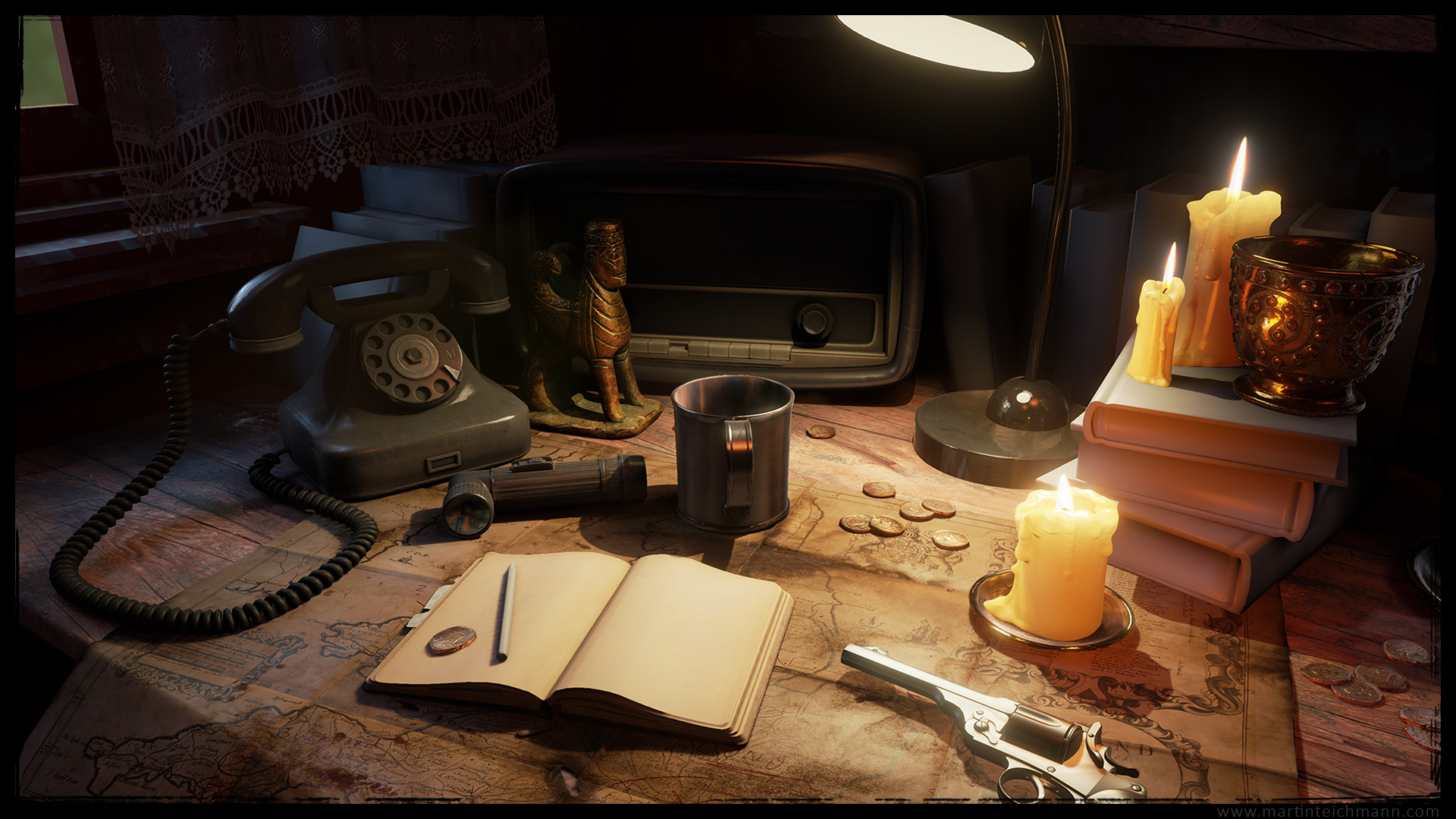
My goal is to create a small scene in Unreal 4 and play around with materials and lighting.

Still loads to do, looking forward for some critics :)

Latest:
adventurers_desk_013.jpg


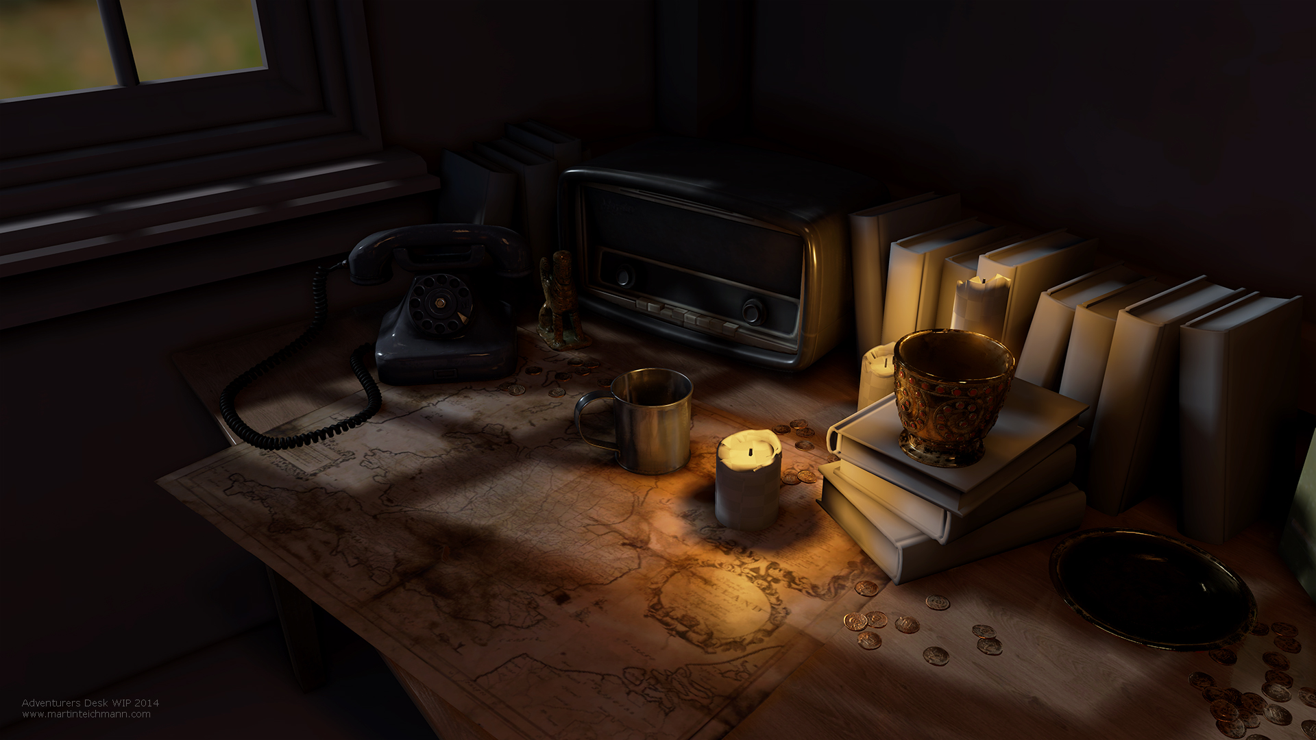
Original Post:
adventurers_desk_001.jpg
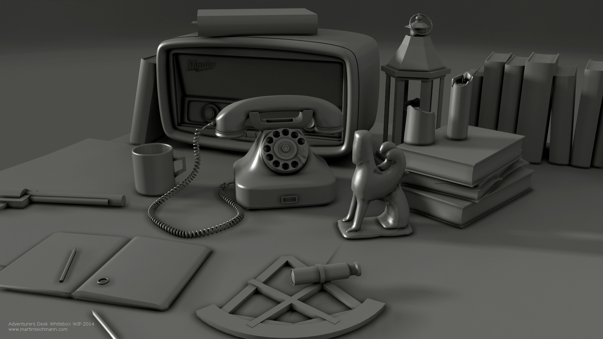
adventurers_desk_whitebox_001.jpg
adventurers_desk_002.jpg
adventurers_desk_003.jpg

Replies

  • Bedrock
    Offline / Send Message
    Bedrock polycounter lvl 10
    Assets look great so far! Got any idea what the focal point will be in your scene?
  • BJA
    Cool idea Martin, looks great so far!
    I would probably make the map the focal point of the scene. It's an adventurer desk, so make it look more like a treasure hunter map and more interesting, add an "X" that marks the location of the treasure, notes of the adventurer he wrote down there, add some coffee stains from the cup, wax spots from the candle etc. Also, I would maybe rearrange the cup and candle a bit more around the map to help the composition.

    Looking forward for more updates, so keep posting :)
  • Snefer
    Offline / Send Message
    Snefer polycounter lvl 16
    Oh man, those are some highpoly objects! ^^ Whats the tricount on those things? Looks really good :)
  • MaYdaY
    Offline / Send Message
    MaYdaY polycounter lvl 8
    Thanks guys, atm I haven't planed the final composition and camera so far. I am planing to do a series of shots. The idea is indeed to add a little story to the objects. but thats also not really decided yet. Some nice points Robert I will consider those :)
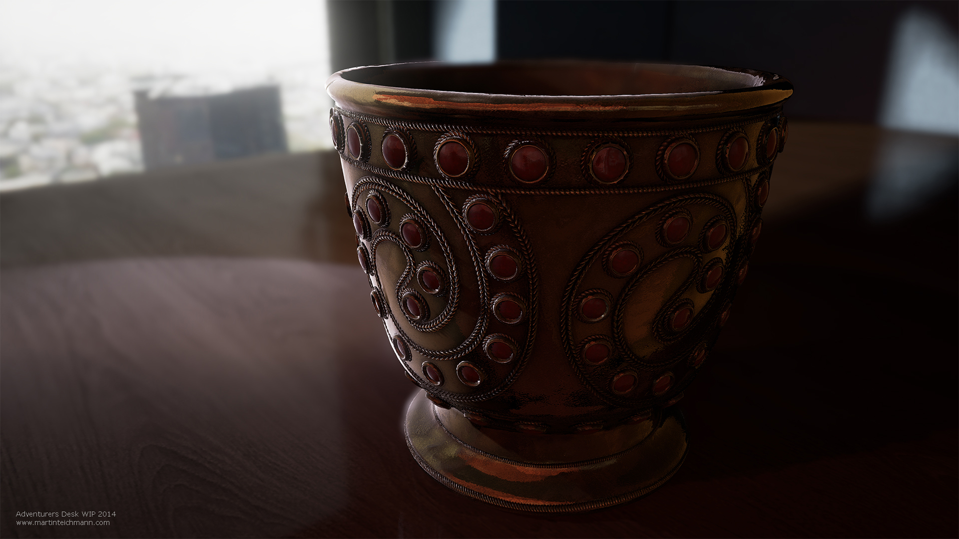
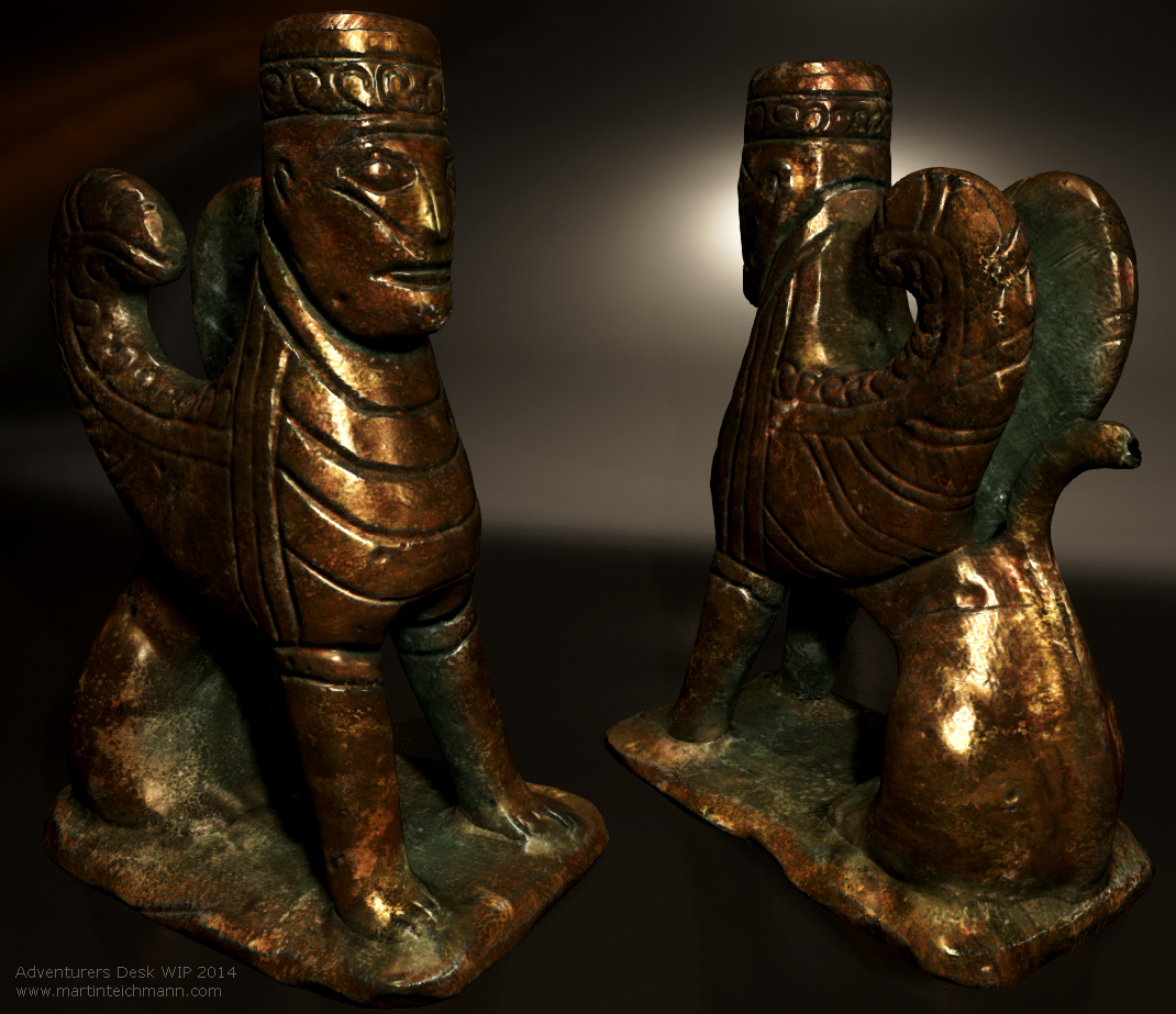
    Snerf: yeah relativl hight poly count. I call them cinematic props. The little figurine got around 1800 tris. The golden goblet is almost 14k. kind of expensive but I like to keep the round objects as detailed as possible. There will be some optimisation when I decided on the shots for the scene. :)
  • mats effect
    Assets look very nice indeed nice work! Can't wait to see those books textured you could do some really nice leather covers for those :)

    I think the scene itself is lacking a vocal point at the moment but thats fine because you have a lot of great stuff to work with. I think basing things around the map would be a good idea maybe have books and candles at some of the corners keeping it flat, wax dripping down onto paper.

    Really can't wait to see more :D
  • Snefer
    Offline / Send Message
    Snefer polycounter lvl 16
    Are you using parallax mapping or tesselation? Cause that goblet looks like alot more then 14k to me :D
  • MaYdaY
    Offline / Send Message
    MaYdaY polycounter lvl 8
    oh yeah sorry forgot to mention the tessellation :)
  • Pedro Amorim
  • DWalker
    The map really looks too straight. At the least, I'd expect the edge of the map hanging off the table to at least droop, if not deform like somewhat stiff cloth. Rolling up the corner nearest the camera might work as well. I can't tell if the creases in the center are in the normal map.

    The books are untextured, but they look to be of the type & age to have raised spines and engraved lettering on textured leather. The pages themselves will probably not be perfectly straight; a subtle, linear normal map texture would probably work there. You can further break up their linear nature by inserting a few scraps of paper between pages as bookmarks.

    The candles, while potentially nice thematically, don't really fit; they are rather anachronistic for the time period, and you REALLY wouldn't want to risk burning your treasure map. A simple desk-lamp would be a better fit.

    The desk itself is too clean. Add some coffee rings, scratches, and cigarette burns.

    A period desk calendar and blotter would help establish the time.

    You could add to the general 'cluttered' feel by adding odd features, such as using the gold plate as an ash tray.

    The scene is missing pens, pencils, and notes.
  • MaYdaY
    Offline / Send Message
    MaYdaY polycounter lvl 8
    Thanks for the comments, Ill keep your suggestions in mind DWalker.

    Here the first version of the candle using a placeholder flame atm.
    adventurers_desk_004.jpg
  • MaYdaY
    Offline / Send Message
    MaYdaY polycounter lvl 8
    Some progress: The main light should help the composition quite a bit. Still loads of white boxes her and more objects missed.

    adventurers_desk_005.jpg
    adventurers_desk_006.jpg
  • MaYdaY
    Offline / Send Message
    MaYdaY polycounter lvl 8
    another asset to play around with zBrush and Panel Loops.
    adventurers_desk_007.jpg
  • noscope
    Offline / Send Message
    noscope polycounter lvl 6
    Defo my fav ue4 project ive seen so far. Small enough a scene for it not to be overwhealming but enough little parts to make it super interesting. Only suggestion would be to have a nice blue light coming through that window to add some contrast to those lovely warm candles. Well done tho!
  • _Kratos_
    Offline / Send Message
    _Kratos_ polycounter lvl 11
    Lovin it man! Small but with so much care for details ;)
    I would really love to see more atmosferic and postprocess to get a nice mood on it!
    Nice job! Looking forward to see some more!
  • JasonLavoie
    Offline / Send Message
    JasonLavoie polycounter lvl 18
  • MaYdaY
    Offline / Send Message
    MaYdaY polycounter lvl 8
    Thanks for the nice comments guys. Really keeps me working on this scene and posting here.
    I will have a look at composition, camera and lighting next to nail down the scene bit more.
  • Zepic
    Offline / Send Message
    Zepic polycounter lvl 11
    Love the progression of this piece. Like noscope said, might be nice to play with some window lighting to get a nice contrasting rim light on the objects. Either way, it's looking stellar, keep it up.
  • jeroenbackx
    Offline / Send Message
    jeroenbackx polycounter lvl 13
    Such a great idea, I think this is a fantastic excuse to just create some fun varying modeling challenges and put them together in a scene. Fantastic execution on the overall composition and detail. I'm already loving the lighting too!
    Maybe weather some of the objects a bit more? The table surface could use some dents and scratches. Perhaps also a bit more atmosphere and tiny dust particles floating around?
    I might also suggest to have some small pieces of paper and bookmarks sticking out of the books. Make everything look a bit more used and chaotic, I don't think a true adventurer would keep things very neat and tidy.
    Anyway, I'm gonna keep an eye on this thread. It's very cool!
  • MaYdaY
    Offline / Send Message
    MaYdaY polycounter lvl 8
    Its been a while, but super busy at work atm. But finaly I got my Ma Hipoly of the adventurers revolver done. Looking forward to the ZBrush pass next.
    revolver_render_wip_01.jpg
  • MaYdaY
    Offline / Send Message
    MaYdaY polycounter lvl 8
    bit more progress slow but steady. :) All materials are still wip also my composition and the camera is something I play around with.
    adventurers_desk_009.jpg
    adventurers_desk_008.jpg
  • visoutre
    Offline / Send Message
    visoutre polycounter lvl 11
    The amount of detail you have in some of those props is awesome. I'm so curious what you're going to put on the little notebook.
  • MaYdaY
    Offline / Send Message
    MaYdaY polycounter lvl 8
    It's been a while since I posted updates here, but finally I got some time. So here is a update.
    Still loads todo. Materials and lighting need more love and I will have a particle, atmospheric pass.

    adventurers_desk_013.jpg
  • ZacD
    Offline / Send Message
    ZacD ngon master
    I'd expect the lighting from the spot light to be a bit softer, light gets bounced out from all directions from the hood.
Sign In or Register to comment.