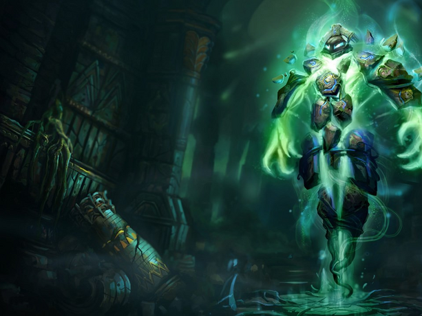
[Riot Art Contest] - Xerath
Update:
Got some free time recently and returned to this guy, So thought I'd update the WIP thread too... even though it looks like my shader work gifs have died

Forgive this slow loading gif:

Hey guys,
Better late than never.
I'm going with Xerath and the Runeborn skin,
I was deciding between environment or VFX, then settled on a champion who's a nice blend of both.

Got some free time recently and returned to this guy, So thought I'd update the WIP thread too... even though it looks like my shader work gifs have died

Forgive this slow loading gif:

Hey guys,
Better late than never.
I'm going with Xerath and the Runeborn skin,
I was deciding between environment or VFX, then settled on a champion who's a nice blend of both.


Replies
& so it begins...
Looking forward to the results.
I know it's gonna be insane!!!
Sharpened up my block out and started adding my vines,
Also quickly added the skin for his green glow,
though after a while of calling it a skin and the white glow inside it the skeleton,
I've decided to actually make a stylised 'light' skeleton to sit inside the green glow next.
It sounds pretty lax, but it was a well thought out decision really lol
Ditto
You're defo right Slosh, I did restack the stones around the skeleton, which gave it a less rigid feel (thank you), but I'm having a really hard time hitting the 'natural' mark, I'm probably being too delicate with it tbh so the change is probably too subtle.
I had a week of holiday then spent a few days as a forum spectator, but it's about time I got back to work on this.
Added a bit of rock and rune detail to the stones and added a bit more interest to the vines with twists and scores and stuff.
Really liking her orange yellow gradients with the blue, wanted to try that out with a bit more saturation.
So,
turned my dynamesh rocks into tools, reduced them to about 500-1k polys each, then divided a few times and reprojected to get my details back on a poly paintable mesh and started my first pass of the texture, cel-shaded left, flat col centre and sketch right, which prolly gives a better estimation of the AO.
It has been a busy few days but finally got my first pass of the texture done,
Flat colour left and right.
The main body ofc is place holder, I just needed colour in there ^^
Shouldn't need to texture the body and skeleton at all actually.
Next stage is to get a low poly, some AO and move fully over to Maya and photoshop...
But first some more disruption... another holiday.
Sorry Xerath, see you in a week.
So I did check on an approach to the skeleton and skin in the questions section with:
A couple weeks back on 'Last edited by Kel-Shaded; 10-31-2014 at 02:41 AM..'
And didn't get a no at least, So this is the way I'm going.
Essentially combining the rules for the Character and VFX categories.
And as I missed the flight, I had a few hours spare in the airport waiting for the next one to try some things out on my laptop,
And as I essentially missed most of my girls birthday in the wrong country, I had more alone time than I had planned for across the week to try shtuff out :poly136:
For the skeleton I wanted to go for an outline shader vibe, The sphere shows best what I had in mind.
The solid white in the centre felt too much like bone so used transparency at the facing angle,
Also went with green as I didn't wanna go for yellow and blue completely, But I used a teal mid tone to mellow out the green, and then used the green more like a rim light.
Also tried something else which is to have a darker green gradient towards the bottom/ off camera angle... but that's causing me problems with transparency...
*Shrugs* WIP
With the skin, I tried to get a hazy feel around the edges to try and break up the form a little. Also tried to make it feel a lil more alien by faking specular, by tuning up the opacity and incandescence at the facing angle.
The splash image makes it look like the magic is moving around inside the character.
I did try to do it with a helix, using vertex alpha to add noise, and then colour sets to undulate the alpha but turned out that doesn't work in viewport 2.0, and the ramp shaders used for the above don't work in standard viewport >.<
So ended up using a layered shader to combine ramps, which is something I only learned recently (TY Danny Williams), And that gives me the bonus of being able to animate the noise easily so I could have something like a gas at one point or something more like particles at another (shown in gif)
The cylinders inside the skin are representing my bones which kinda disappear behind fake spec... which i'm not sure if I like...
May wait til I have the rocks and vines in to see if I need to tone down the incandescence on the skin, and push up the opacity and vibrancy on the bones....
Got some free time recently and returned to this guy, So thought I'd update the WIP thread too... even though it looks like my shader work gifs have died
Forgive this slow loading gif: