The BRAWL² Tournament Challenge has been announced!
It starts May 12, and ends Oct 17. Let's see what you got!
https://polycount.com/discussion/237047/the-brawl²-tournament
It starts May 12, and ends Oct 17. Let's see what you got!
https://polycount.com/discussion/237047/the-brawl²-tournament
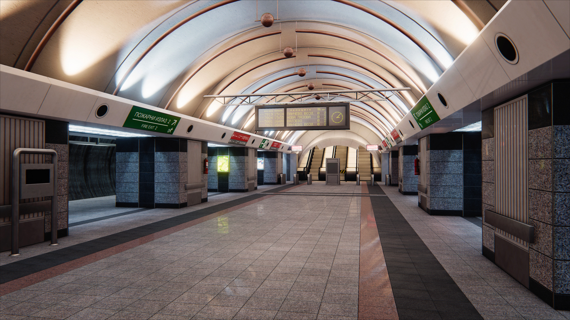
[UE4] Subway Station
I've been here for move than 3 years now, but never got to post anything. So here's one scene I did (and pretty much my first one). 
Started this in UDK first, but never got myself to finish it, so now I took UE4, dug my old files and ported everything along with some other changes.
Some pics.


Pics of the real thing
And a short video flythrough I captured. Had some problems with 30 fps video on YT and Vimeo, movement would come out all jittery, so here's 60 fps version from my Dropbox account.
Video
Started this in UDK first, but never got myself to finish it, so now I took UE4, dug my old files and ported everything along with some other changes.
Some pics.


Pics of the real thing
And a short video flythrough I captured. Had some problems with 30 fps video on YT and Vimeo, movement would come out all jittery, so here's 60 fps version from my Dropbox account.
Video
Replies
The lighting is something that could be improved imo, it's a bit flat.
I'd try to recreate the picture more, there's a nice contrast between very warm and very cold lighting in it.
Other that that, those coloured signs look very artificial for some reason.
I agree with Wesley, it's looking like no-one has set foot in that subway. I would suggest adding grime, scrapes, cracks, worn paintwork, even slight rubbish that's been left on the floor would help a lot to make it more realistic. Unless this is a Vis scene of course!
But again it's looking pretty nice keep it up!
-Jhax
frmdbl: I agree. Lighting, especially the ceiling was something that always kinda bothered me, but never got to nail the look I wanted. My pc also isn't really helping because I running well bellow min UE4 specs on CPU so bakes are painfully slow.
I wanted to experiment with IES profiles, however those tests ended badly because of some limit where only 4 lights in one area resulting in most of them not working. It was either shorting their distance or narrowing their cone, and both looked bad. Might try that again later.
As for the contrasting part between warm and cold lights it shouldn't be too hard to do to break up that sterile look a bit.
WesleyArthur, JHax: I went for a more clean look like a Vis scene, so less wear was intentional.
Still, always felt like floor could use more work (I wanted to make those bright tiles look kinda greasy). So far it uses tiles texture to break up roughness repetition on bright tiles part (might increase range between max and min value there to pronounce it more) and one dirt texture (I didn't like how it looked so).