[Riot Art Contest] - Rise of the Thorns [Zyra]
Hi everyone!!
Zyra helped me get to plat and I love her aesthetics, so I decided to make a splash based on her default skin.:)
Any critiques would be awesome!
I would love to make new friends so if you guys want to play with me, message me and I'll send you my summoner's
 Alex
Alex
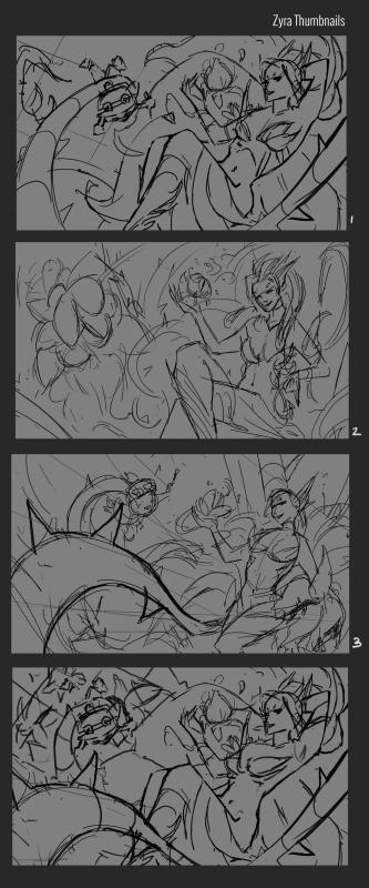
Here are some thumbnail sketches so far, let me know which one is your fave!
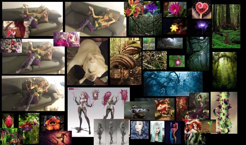
Reference:
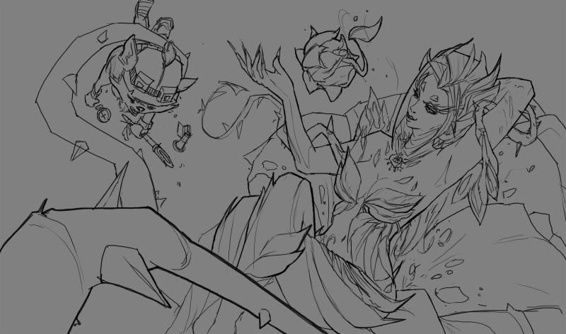
Lines:
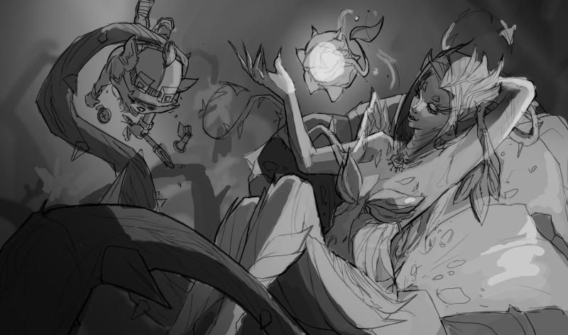
Light Study:
Flat Color:
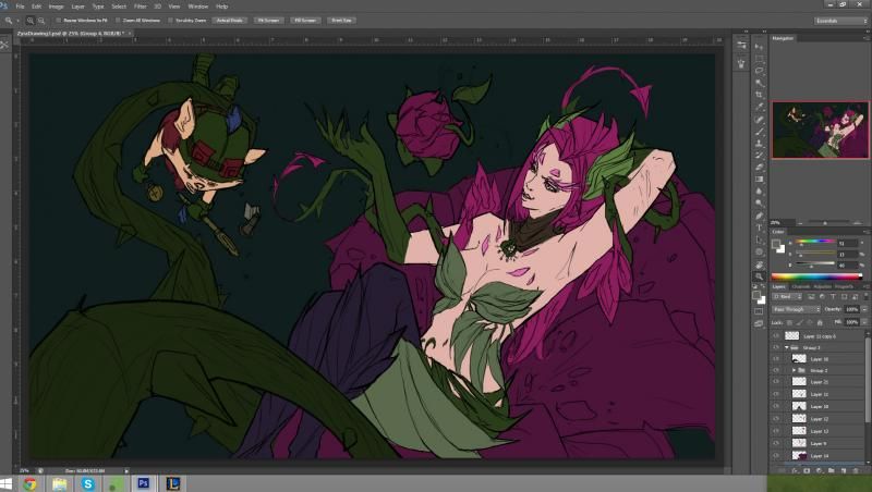
Rough Color:
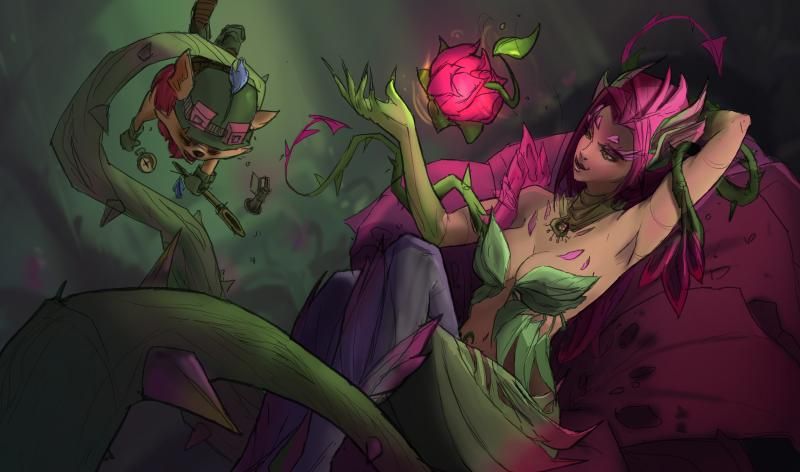
Most Recent Render Update:
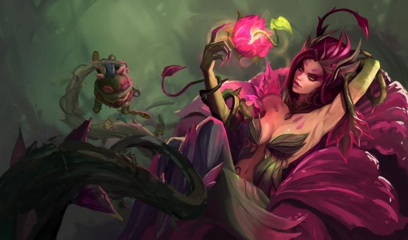
Effects:
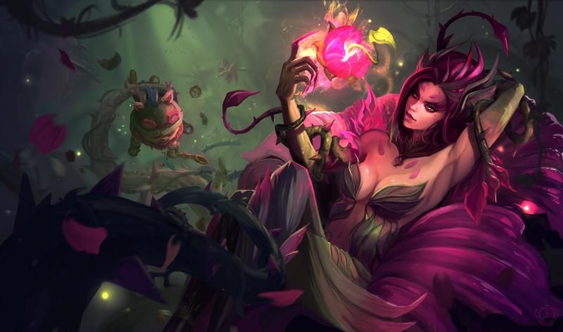
Final:
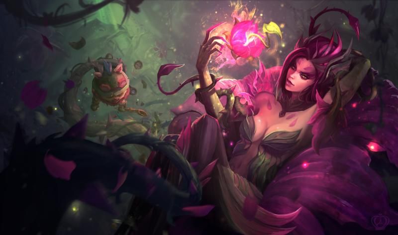
Zyra helped me get to plat and I love her aesthetics, so I decided to make a splash based on her default skin.:)
Any critiques would be awesome!
I would love to make new friends so if you guys want to play with me, message me and I'll send you my summoner's
Here are some thumbnail sketches so far, let me know which one is your fave!

Reference:

Lines:

Light Study:

Flat Color:

Rough Color:

Most Recent Render Update:

Effects:

Final:

Replies
Thanks Arlequinne! Hopefully I can push the depth more as Jessica suggested.
And thanks Dante!!
I dressed up in my Zyra cosplay and took some reference of myself posing, as well as gathered some from the internet.
Once again feedback would be awesome.
I would also recommend finding a way to show zyra's other hand, it might end up looking a little stumpy otherwise.
@awied18 and RedDawnWalker. Thanks so much or the feedback. I made another drawing with the head at the same angle as the old sketch, but I personally don't like it as much as the new angle. I feel the new angle gives her more personality. I also showed more of her arm to help with the stumpy issue. I also tried just cleaning up her face more to see if that fix the weird problem. Please let me know if that's better or what you guys think!
Here's an updated version with changes to Teemo as suggested by Flaxor!
On topic: Her chin could be a bit lower and her neck (upper part) a bit thinner.
@Jangmai, Thanks!
@Flaxor, hahaha, You'd make Phreak proud :P
Be mindful of your anatomical structures - think of the skeleton and muscles beneath, and how they all connect to one another. Her arms, especially, lack correct form - pectorals leading into deltoids, biceps, triceps, elbow, etc. Don't forget she has a ribcage. Her leg does not lead correctly into her hips if you were to connect the lines. Drawing her leg correctly then hides the pinch of her waistline (which, if you thought that was nice, you will now have to move her leg forward a bit) Her face was lacking lower jaw structure, causing it to pinch near the chin.
Be also mindful of the directions her forms move in space - toward the viewer, away? It might help to lightly draw some contour lines as you sketch, and then for the final illustration, add elements which can convince the viewer of where her forms are heading - wrapping vines, bracelet, shirt cuff, etc. Shadows will also help, but will not alone suffice. Here's a paintover, hope it helps a bit
@Hai, you should! Looking forward to seeing it.
I made the changes that Jessica mentioned as well as started painting the color. The next step would be rendering, so if there's any major feedback, please give it now! Thanks
Hope this is understandable.
http://schweizercomics.tumblr.com/post/11966164633/the-schweizer-guide-to-spotting-tangents
It´s either:
Number 1: The long line or
Number 5: Directional Tangent
@Flaxor, nice catch! I'll make the changes accordingly.
You can find my stream here:
http://www.twitch.tv/eneopa
There´s a little something I was going to mention before, but since I´d already bombarded you with a bit of critique I though I´d best wait.
The anatomy in her left arm looks a bit off. It appears that she has two shoulders currently. I´ve attatched a silly but informative jpeg to show you what I mean.
Sorry for taking the piss a little XD I mean no disrespect, just a funny idea that popped into my head while doodling it.
I hope it helps, I´m enjoying yours a lot so far, good luck
Also there are some subtle inaccuracies with my example, best look at real reference to help, this should just serve as a quick guide.
On another note, streaming again~
http://www.twitch.tv/eneopa
I would suggest changing her lips a bit, as they seem a little stiff. Maybe move them a teensy bit closer to her nose! ^^
@Crownedking and Jelligeth, I agree. Her face was giving me a hard time. I tried making her expression less stiff and back more to the original.
I hope the arm is better too. Please let me know what you guys think!
Maybe it's jjust the lighting or changing her "bra" accordingly might already do the trick.
Looking forward to more results.
Very, very beautiful.
X
PS Teemo must die