[Riot Art Contest] - Strong-man Circus Braum
EDIT:
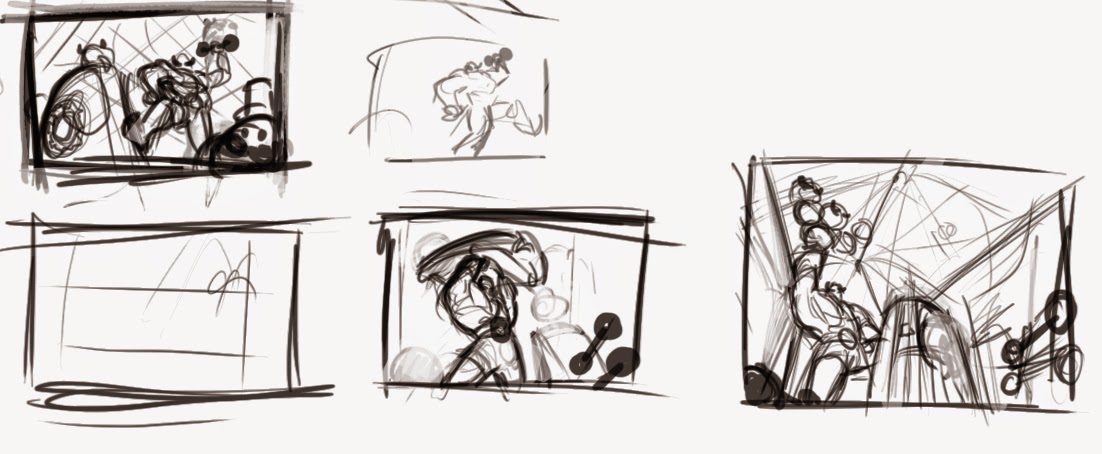
Here are some quite small thumbnails for possible composition ideas. I want to reflect his kindness and strength so I have been playing with a few ideas on how I could go about showing that. Next I plan to have a few variations of shield designs "a la" Steampunk drawn up.
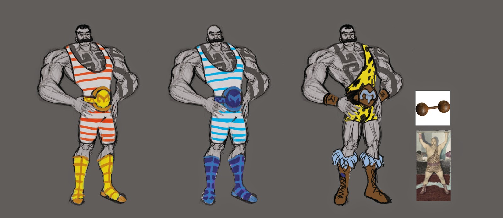
Here are some costume designs for my entry for the Riot League of Legends contest. I am looking into hair cuts, and steam punk ideas to help with the design for the shield and belts and such. Then I will start some quick tumbnails for the illustration and colours keys and the usual illustration process. If anyone knows of any sites or such where I can get some good reference for 1950s circusness please feel free to share their knowledge
EDIT UPDATE:
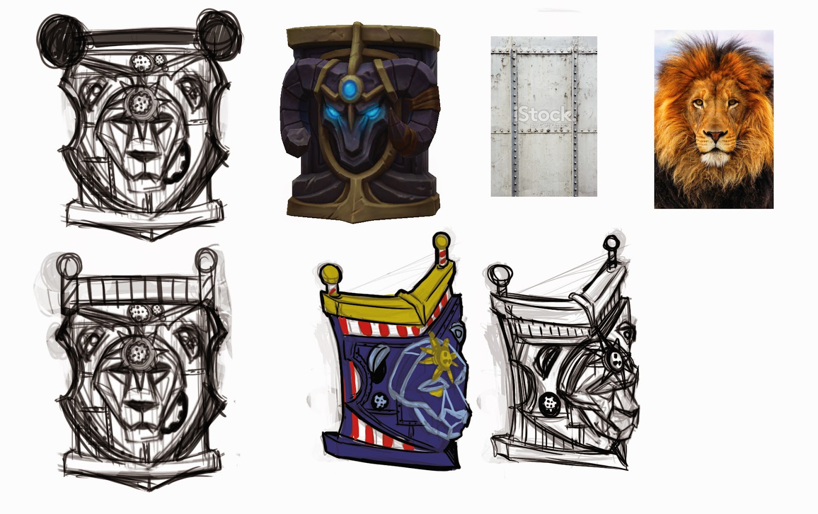
So I have been looking up steam punk things and circus themes for the shield and decided upon a lion head design to replace the ram head on the shield, it will be more wooden and metalic than the stone one to fit with the new circus 1950s steampunk look.
UPDATE:
Here is a potentcial thumbnail of Braum performing in the centre of the circus. Perhaps I could have oter league circus characters performing in the background for interest.

UPDATE:
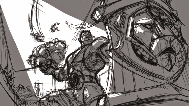
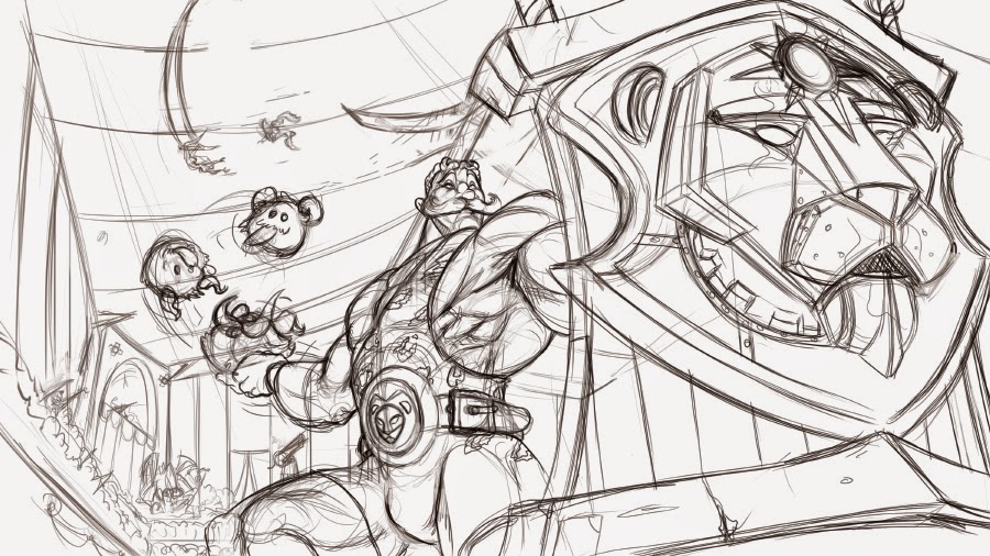
Not much to say, rough drawing before I go over to the clean drawing. Please feel free to give me any advice or opinions before I set this in stone
UPDATE: Lines
UPDATE:
Some tonal thumbnails:


UPDATE: Coloour keys
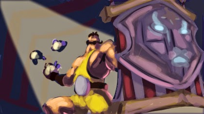
UPDATE: Flat colours
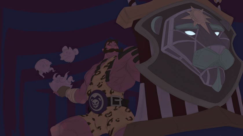
UPDATE:
Here are some quite small thumbnails for possible composition ideas. I want to reflect his kindness and strength so I have been playing with a few ideas on how I could go about showing that. Next I plan to have a few variations of shield designs "a la" Steampunk drawn up.

Here are some costume designs for my entry for the Riot League of Legends contest. I am looking into hair cuts, and steam punk ideas to help with the design for the shield and belts and such. Then I will start some quick tumbnails for the illustration and colours keys and the usual illustration process. If anyone knows of any sites or such where I can get some good reference for 1950s circusness please feel free to share their knowledge

EDIT UPDATE:
So I have been looking up steam punk things and circus themes for the shield and decided upon a lion head design to replace the ram head on the shield, it will be more wooden and metalic than the stone one to fit with the new circus 1950s steampunk look.

UPDATE:
Here is a potentcial thumbnail of Braum performing in the centre of the circus. Perhaps I could have oter league circus characters performing in the background for interest.

UPDATE:
Not much to say, rough drawing before I go over to the clean drawing. Please feel free to give me any advice or opinions before I set this in stone

UPDATE: Lines

UPDATE:
Some tonal thumbnails:


UPDATE: Coloour keys

UPDATE: Flat colours

UPDATE:

Replies
One idea is a load of Poros (hehe poro is a joint in spanish XD) to show his affiliation and love for the cute little critters, though they don´t look very heavy, ditracting from his strength. Another is having him lifting an old fashion dumbell to show off how strong he is, but then that doesn´t show off his massive heart. I need to find a way of combining a demonstration of his strength and heart.
Also thanks for the other lovely comment guys!
Juggle juggle
It goes very well keep the good work
Wow, thanks Manerarts! I´d be over the moon with joy if Riot ever used anything of mine as reference hehe, one can dream ^_^
Maybe try painting in black and white values. We have a ton of time to get the colors right. Maybe just work on the values first?
Oh yeah I´ll definitely keep the line layer set to multiply to keep all of the little details and such and only ddiscard it right at the end when I´ve finished painting.
So should I just go for a bit more detailed grey scale thumbnail before I go onto the colours? Say like this for example? http://4.bp.blogspot.com/-H215MMhQQrg/UjlOZWAC8GI/AAAAAAAABcg/uQndCfhfznM/s1600/grayscale_thumbs.jpg
Or go for a full on render of the painting but in greyscale and use colour blend or softlight to paint the colours later?
Like this http://media-cache-ak0.pinimg.com/736x/ff/bd/8b/ffbd8bdcdc1551c1e9caf3364cd55708.jpg
Take any painting, make it black and white in photoshop, and you can see everything looks great in black and white. So if it looks great in black and white, Color is just the next step.
Not everyone does this process, you can do it your own way, but its something I learned at my Digital Painting club.
Have you ever watch Kienan Lafferty? He did some league artwork and has Demos on youtube.
Cheers Ramaeia, I will get to work on a more detailed grayscale thumbnail painting than my previous one and then work on the colours. I will check out Knockwurst´s youtube videos too! I didn´t know his real name was Kienan Lafferty hehe, I´ll remember that.
I´ll have to put this illustration on hold for a short while since I have just received a bit more work from Lab zero, so I must get animating as that´s top priority.
HIYAAAAAH!!!
But stil epic, I want to see it finished
Thanks a lot Storeboughtsouls!
Blue_Skies Hehe yeah it does seem like an obvious choice for Braum, maybe it was too obvious for Riot? I, like yourself, still feel like it needed doing, hehe hence the illustration
I had some time this weekend to do some tonal thumbnails for different light sources with a bit more detail than before as was sugested by ramaeia so I´ve updated the first post with them
An idea maybe for a color study of light. Think about what color the lighting is going to be. Subdued, yellowed, bright, white? Maybe three different light colors (cyan, magenta, yellow)
I think it might be too colorful. i'm not sure. Maybe look up some spotlights a circus.
I have done 3 more quickly, but I feel that the second one wins out with most people. I did try and incorporate what some people have said with these thumbnails. Focusing more on Braum and less on the sheild and backlighting Braum, the multiple lights with Braum being lighter. I am liking the new one on the left. It focuses more on Braum himself and less on the shield and I can add the nice effect of light coming from the shield´s eyes and mouth.
These will be the last of the grayscale thumbnails before I get onto the colours or I may be over thinking this part.
Thanks again everyone for all of your hepful comments
I think once you have decided exactly where you want the focal point to be, you can build the lighting up around it
I like the first one, with the focus on Braum, since he's the champion here, and is the one who is supposed to be the focus! Then my eyes are drawn to the lion's glowing eyes, which is very nice!
Keep up the great work!
Also, Lab Zero represent!! I did some work for them as well ^p^/
Here´s an update that I worked on a bit today. Colour key. I will get some more done until the colours feel right, they seem pretty lack luster at the moment, but getting there.
Thanks Jeligeth, I have focussed the lighting around Braum and then secondly towards the shield. That one seemed like the most popular one and it made sense to use it for it´s light values.
Thank you everyone for all of your responces and helpful advice!
Yay Wuzidan, another Lab zero helper!!! Nice one!
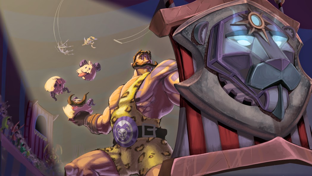
Here´s a little update. I´ve started to slop down some colours onto the final pece. Please let me know if there´s anything big that jumps out that needs changing before I continue to paint it.