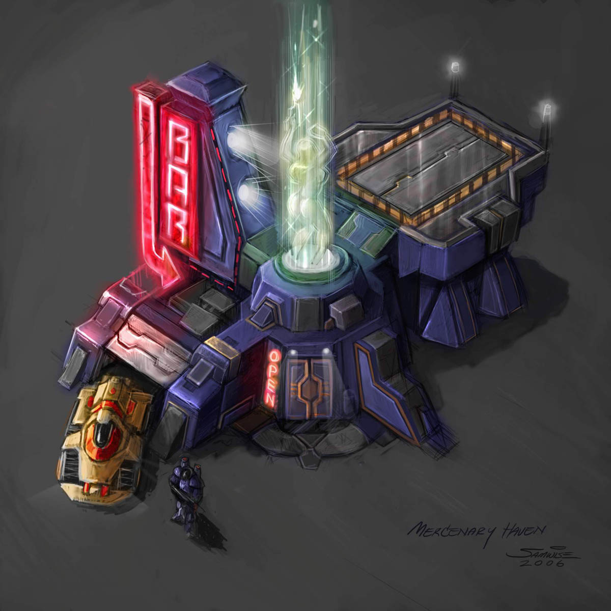
Starcraft MercHaven WIP (Status: Planing)
Project Status: Modeling
Hi,
after I did a few sketches but no real new project I decided to go a little bit bigger for my next project.
I went thru a few game concepts and finally decided to build the Starcraft 2 MecHaven:

My idea is to create this building for a fictional Starcraft 1st Person shooter using Unreal (UDK or UE4 (not decided yet)).
At I had some problems finishing big projects in the past I want to use a different approache here.
In the past I don't spent much time on pre-production, time-planing or defining the specs (max. vert count, map size/types etc.), this is something I want to change for this project.
I want to try to handle it like a real game asset project including deadline, max vert count, fix texture size etc.
As I did this never before I'm not sure how to start.
For the start I plan to do some simple paintovers to see where I can use tileable textures, reusable or unique one.
Same for the modelling part.
But as I don't have much experience with current game art numbers, I want to ask if anyone can tell me what would be the appropiate vert count, texture size (and approx. amount of textures) etc. for such a building?
And if you have any other tips and tricks for this project, I will be happy to hear it.
My old projects: http://fguentzler.daportfolio.com/gallery/890173
Hi,
after I did a few sketches but no real new project I decided to go a little bit bigger for my next project.
I went thru a few game concepts and finally decided to build the Starcraft 2 MecHaven:

My idea is to create this building for a fictional Starcraft 1st Person shooter using Unreal (UDK or UE4 (not decided yet)).
At I had some problems finishing big projects in the past I want to use a different approache here.
In the past I don't spent much time on pre-production, time-planing or defining the specs (max. vert count, map size/types etc.), this is something I want to change for this project.
I want to try to handle it like a real game asset project including deadline, max vert count, fix texture size etc.
As I did this never before I'm not sure how to start.
For the start I plan to do some simple paintovers to see where I can use tileable textures, reusable or unique one.
Same for the modelling part.
But as I don't have much experience with current game art numbers, I want to ask if anyone can tell me what would be the appropiate vert count, texture size (and approx. amount of textures) etc. for such a building?
And if you have any other tips and tricks for this project, I will be happy to hear it.
My old projects: http://fguentzler.daportfolio.com/gallery/890173

Replies
Texture planning:
So far I plan to create
- one tileable texture for the "blue wall" (
- one tileable texture for "dark walls"
- one texture for details and unique textures (like the door, sign, warning lines etc.)
Modelling Planning:
- Model for a 1st Person enviroment
> large and medium details will be modeled, small one via normal map
- no interior (except of the "garage")
I tried to seperate the building into several objects (colorcoded). The plan is to create a rough block out and then refine it object by object.
While I think that I get the base shape of it I'm not yet sure about a few parts:
1. The garade entrance seems much more "flat" on the concept
2. the "door-building" looks not correct but I can't nail it down
3. The "conection" between the tower and the upper part of the "door-building" looks more massive in the concept
The material is from UDK (I think is looks better then the Blue/White pattern^^)
Material: 3DMax Matte Plastic
Render: Mental Ray
Vert Count: 4356
Comments & Critics?
Even if the coloure sheme on the concept looks good, it looks really strange as soon as you go into real world style.
So I decided to go away from the concept colors and try to find my own.
Also this is the first project I use photo reference for texturing so let's see whow it will end.
As you see there is still a long way to go and I plan also to add some more props (rocks, boxes etc.) to make it a complete scene.
Comments & critics welcome
I experimented with an "all in one texture" here, which means using the upper part of the texture space for two tileable textures and the lower part for the unique parts.
The problem I found with this is that I would vaste a lot of texture space and have to use a big texture.
So I decided to go back to the planing phase and did a new breakdown of the model.
My plan now is to use two tileable textures and one unique one:
blue = wall texture and I will try to find something more close to the concept!
green = metal floor
orange = unique texture
I will also add more details into the orange parts and also use a normal map.
I'm not totally happy with the door light and the "floor" infront of the door. Also the "AC" needs some more love.
But I think I found the level of details I'm aiming for.
At the moment I'm still below 10k verts (~8500) for the complete building and I think with this level of details I should be able to keep it below 15k.
What do you think, is 15k for an Ingame Building of this size to much?
Any suggestions regarding the door light or other parts?
1. Simple Corner
2. Apply Champfer Modifier
3. Add aditional Line via the "swift loop" while holding Shift. This will add a new edge exactly in the middle between the two and also will estimate the displacement of it to create a round corner.
Now apply the smoothing groups according to the letters on the sketch above (A = Smoothing Group 1, B = Group 2, C = Group 3, which means the "corner polygons" will have two groups each (A+C and B+C)
4. Result
cant you just use one smoothing-group for these four polys? I dont know what difference it would make using these three groups in this example.
also consider that you wont get a flat surface-shading on the outer polys.
maybe just a supportloops as far the silhouette doesnt matter and its only smoother shading you are looking for
Normally if I use one smoothing group for all related polygons I got problems as soon as the object has oposite normals or some corners.
With this methode also complex corners look smooth without a lot of additional vertex.
The idea behind it is to create the illusion of a high poly corner without using a normal map.
First step was to create the two tiling textures (blue wall and the metal floor at the back) then I created a simple color map for the rest:
This is my result so far: