Home 3D Art Showcase & Critiques

Female Captain

So I recently finished up my first attempt at a full real time character. I gotta admit I got tripped up quite a bit on it. Working on a full character compared to the simple objects I've only been doing recently is just a whole nother beast. Still, I'm pretty ok with the way it turned out, compared to the original I feel I didn't do it much justice though :p, and mainly just want to try my hand at another character that is a bit more low res :\. I'd love to know what you guys think.

Original concept by Tahra
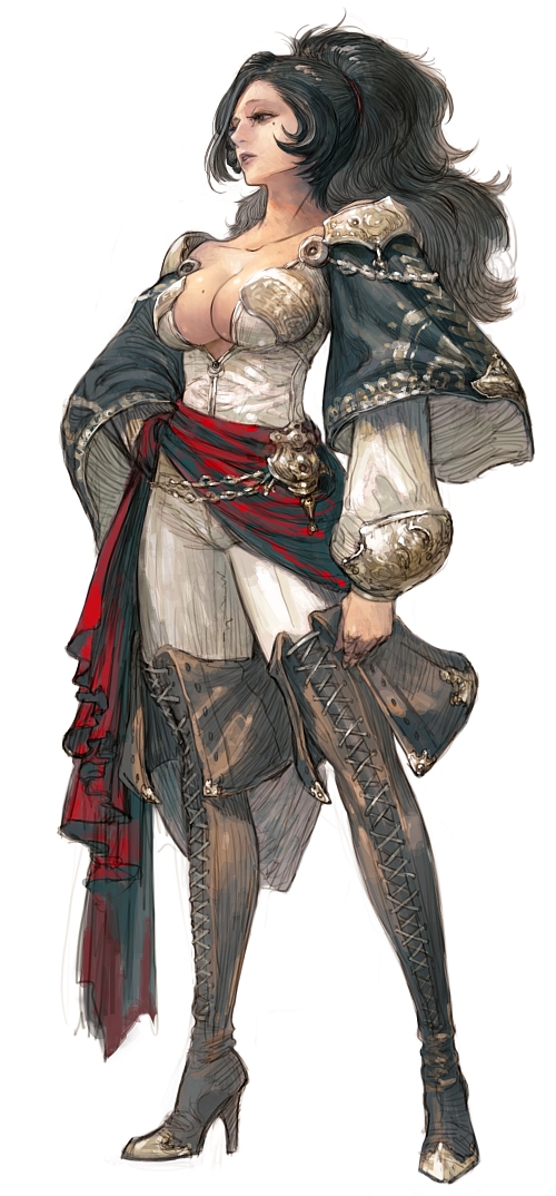
study_character_by_tahra-d4u7d7s.jpg

4098708_orig.png
2537321_orig.png
[vv]107774470[/vv]

Replies

  • slosh
    Offline / Send Message
    slosh hero character
    Not bad at all for a first attempt! Off the top of my head, folds need a lot of work, a lot seems to be off from the concept proportion-wise, texturing needs a lot of work as most of it is just flat colors from the looks of it. Some of the shader work looks decent though. Again, definitely a solid start for your first character...good luck on the next one!
  • TAN
    Offline / Send Message
    TAN polycounter lvl 12
    Not a bad start indeed mate. A few things:


    - Try to capture the feel of that face. Her expression surely has character to it. She really gives the feeling of " solitary, experienced and strong captain" . You can pose her face just the way you posed her body in ZBrush so go for it ! :D

    - She wear silk garments underneath and these needs get folded easily. You don't have to hold yourself back these times. Create heavy details on those areas.

    - Watch the way her breasts hang over her rib cage. Breasts are hard to do but in these type of concepts you really need to give them some consideration.

    - When making objects that are built with hard leather ( like boots) give a little glossiness and make sure that these little folds around the joints ( like ankles) reflect a bit of light.


    So good start mate. Now take it higher !!! :D

    Goodluck and Godspeed !
  • Dave Jr
    Offline / Send Message
    Dave Jr polycounter lvl 9
    TAN wrote: »
    Not a bad start indeed mate. A few things:


    - Try to capture the feel of that face. Her expression surely has character to it. She really gives the feeling of " solitary, experienced and strong captain" . You can pose her face just the way you posed her body in ZBrush so go for it ! :D

    - She wear silk garments underneath and these needs get folded easily. You don't have to hold yourself back these times. Create heavy details on those areas.

    - Watch the way her breasts hang over her rib cage. Breasts are hard to do but in these type of concepts you really need to give them some consideration.

    - When making objects that are built with hard leather ( like boots) give a little glossiness and make sure that these little folds around the joints ( like ankles) reflect a bit of light.


    So good start mate. Now take it higher !!! :D

    Goodluck and Godspeed !

    Definitely not bad for your first character at all! Really like the style of the boots ;) I think its the texturing the holds the piece back as others have already said.
  • Rohan
    Thanks so much guys. I really want to push my next project with the texturing this time cause it was at that stage where I hit most of my hang ups. Never was the best at 2D when I was in college :p, but that needs to change.The faithfulness to the concept is my own fault as I focused on making it look like how I wanted it and not trying to recreate what I saw. Like with the chest, thinking it was a good idea to maybe lessen up the exaggerated aspects like that XD. Now I'm determined to show what I've learned and hopefully make an even more awesome piece.
Sign In or Register to comment.