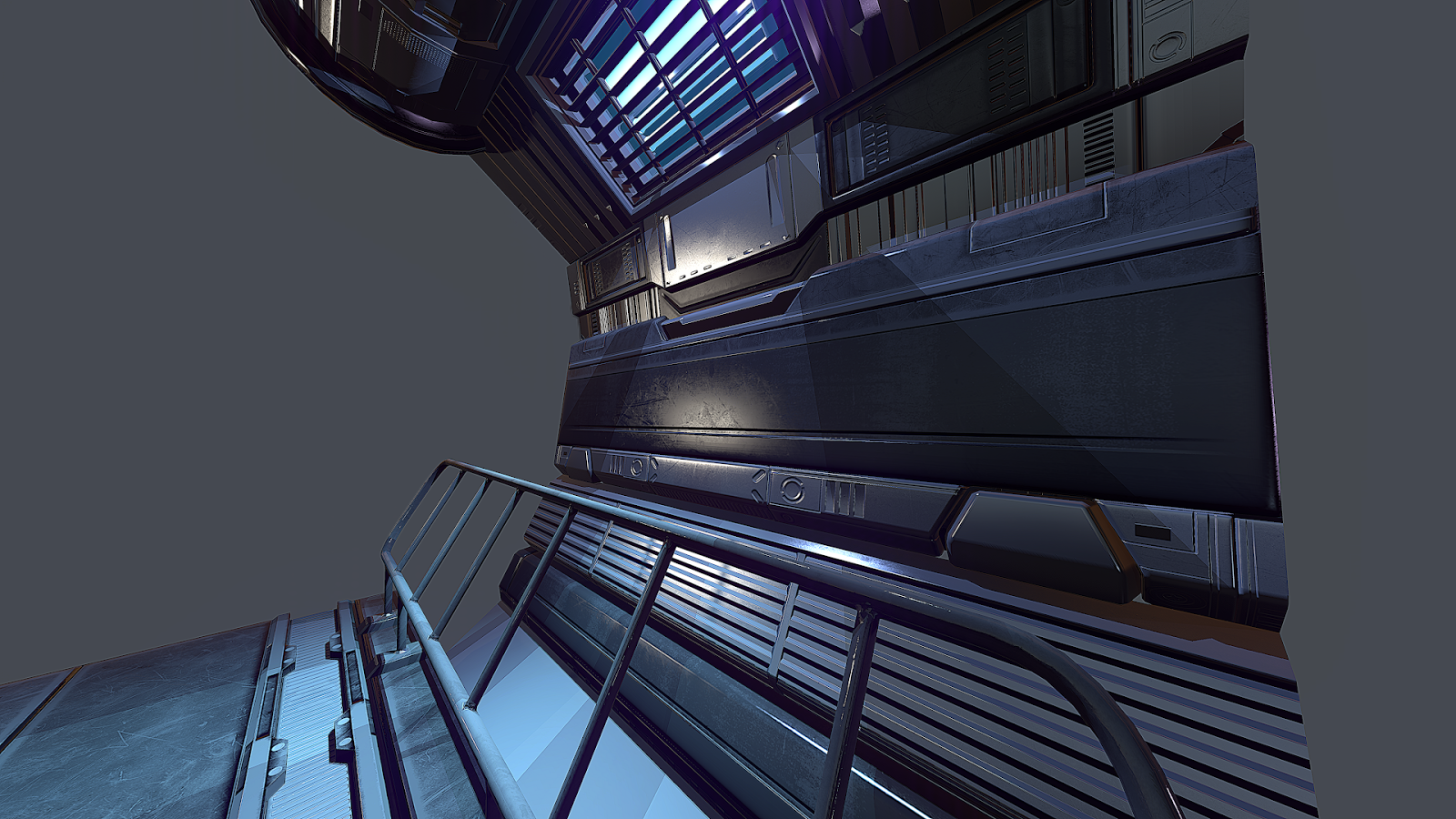
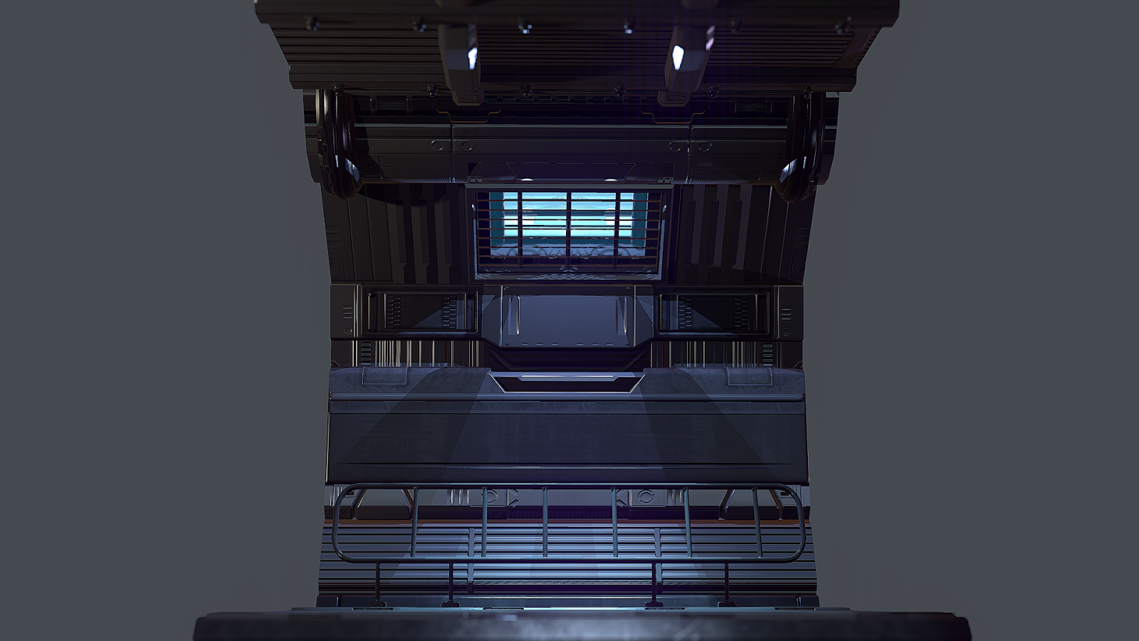
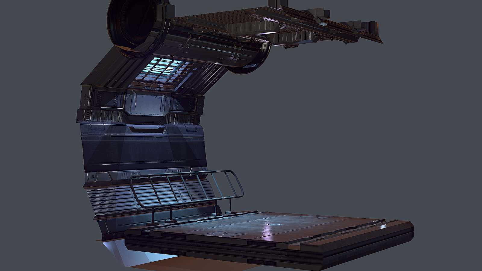
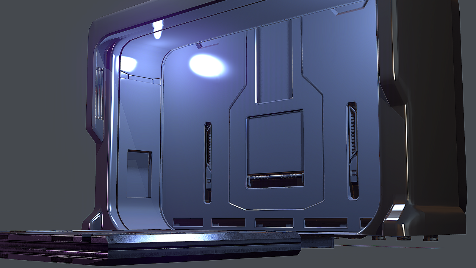
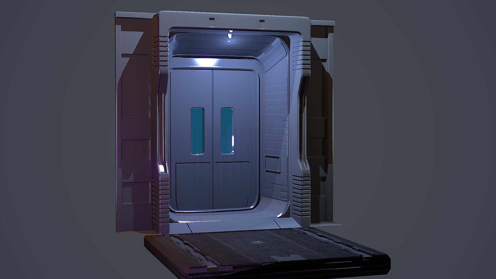
So I decided to use all I know and finally hammer out a decent Sci Fi environment for my portfolio.
Concept art is not greatest strength, so I tend to take concept from the internet like everyone else and start from there. Once I make a few things, I might add or subtract a little here and there. Either way here's my progress so far.
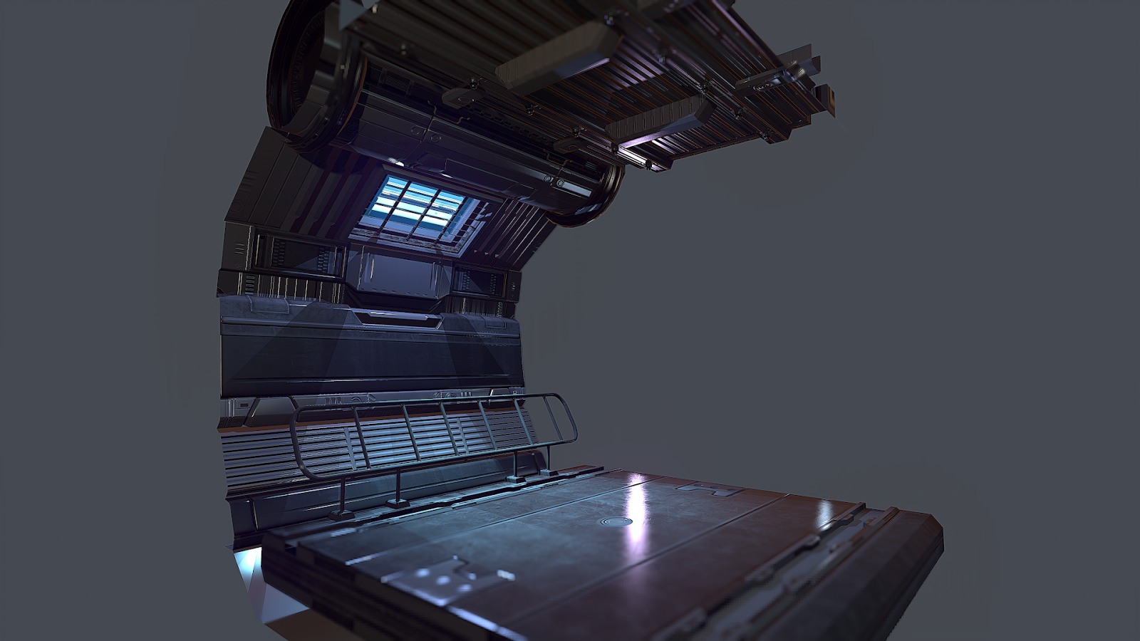
I have the modular pieces working pretty well. This isn't everything, but it's the screenshots I have atm.
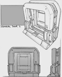
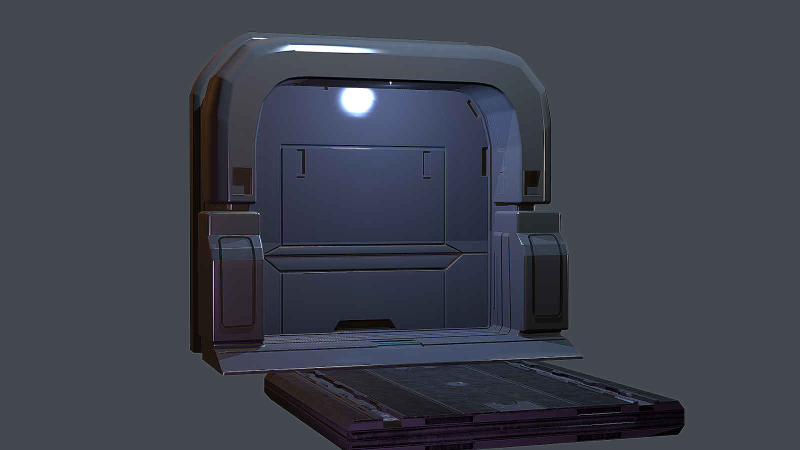
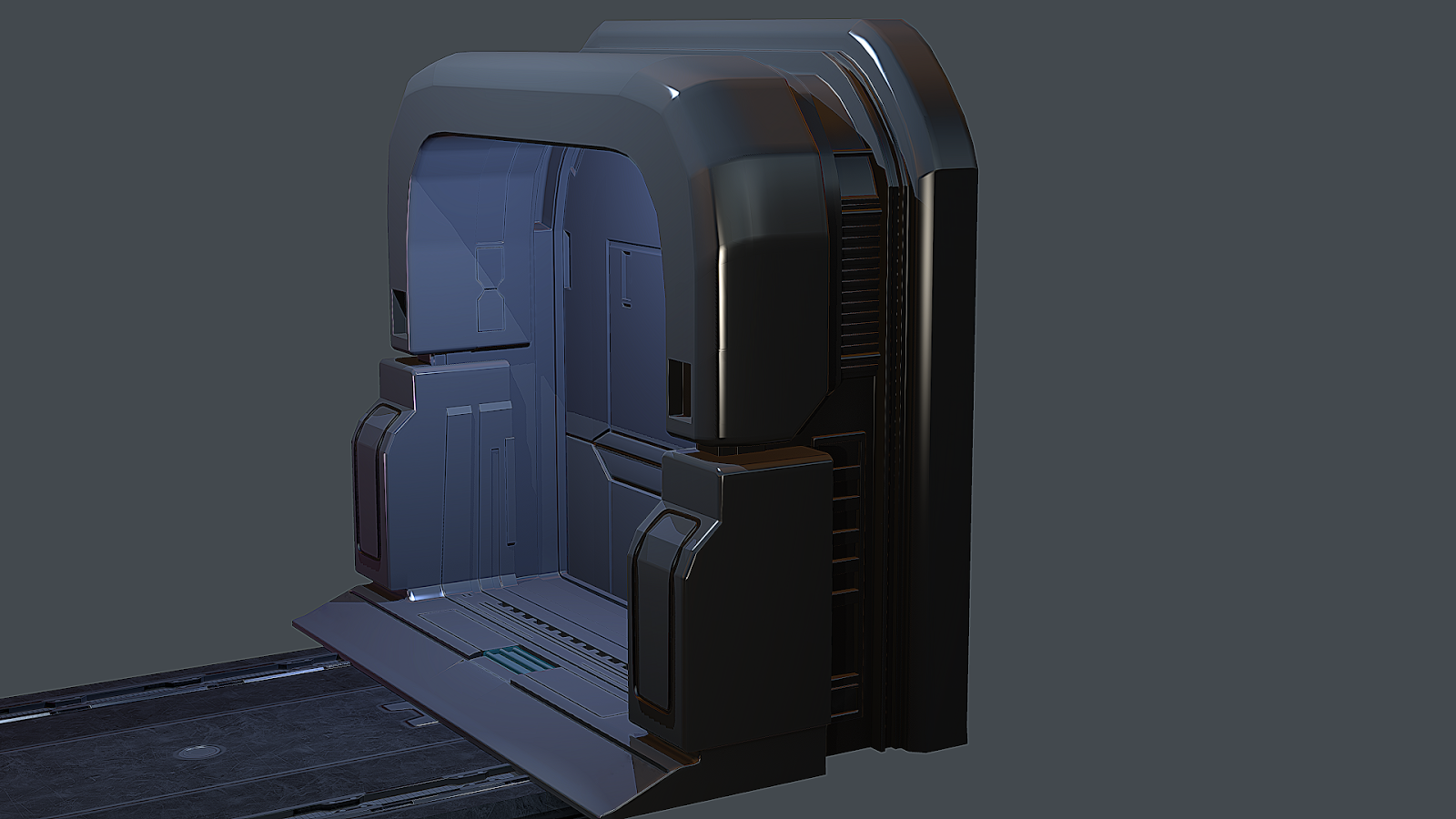
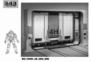
Here are the doors I borrowed from the interwebs as well as the hipoly. Some is Halo, the other I need to find out so I can credit that man.
I need to tweak some geometry on a few things, but at the rate this is moving, the environment should at least be in UE4 with normals, light mapped and lit by Sunday.
Also, the doors are looking really flat. None of the geometry makes the models pop. I noticed you are taking the basic shapes from the concepts, but you are leaving out a lot of the things that make it look functional. Instead, you have details that are lines extruded all over the place.
Also, I noticed a lot of your details are using 90 degree angles. This won't transfer to a bake very well.
Keep at it! Can't wait to see what you come up with!
Thanks guys, you're both right. And Josh, I'll definitely be adding more geo to these pieces, I got some feedback earlier on that from a group of friends. Hearing it again only strengthens that critique. I'll post more later.
I think the lighting looked better before as you could it was a lot easier to see your work. Right now it's pretty hard to see any of the detail work on the walls. Also IMO it doesn't feel realistic that someone would actually light a corridor that dimly, it does however look pretty atmospheric.
I like the modeling and texturing on the walls, but as Josh said the doors need some more work.
Also that door concept was made by Autodestruct for Quake 4.
Went ahead and made some changes according to critiques and personal insight, I appreciate all of your input as well. Please, keep it coming.
Played around with lightmass and AO settings in both world and post process properties. I think this is good for now, lighting wise, I really want to get back to modeling and baking. You are all right about the doors so I'll be starting there first.
oh and I'm really liking the dirt mask in the bloom settings. Really helps create the sense of this being recorded by a camera.
I appreciate the feedback Nos, I used it before I made the changes too. Also, thanks a bunch on the artist concept info. I'll be sure to credit and look for more of his concepts.
Things need to be fixed and I made things different colors to see what looks better, but you get the idea.
Please keep in mind, the bullet hole decals are just place holder, I still need to UV/Lightmap some meshes and make a few passes at Materials. And the main door needs to be textured. Those guard rails are going to be revamped. As for the bullet holes, I'll be spending some quality time making better ones with different patterns. But I feel like this is about 90% done now.
Also, I'll be making new props, like crates and such. I like the ones in the scene, but they'll just be place holders for all my sci fi projects now.
I think you could be a bit more subtle with the bullet holes, and have them be focused in one area, so it creates a focal point. Also around that focal point have some large scale damage done to sell the effect. Right now the bullet holes are just reading as noise because they are everywhere and lacking any direction. If you want to tell a story you need have more than just bullet holes because that doesn't really tell the viewer anything, it just makes them ask questions. The story comes from hinting at bits and pieces of who, what, where, when, and why.
Lighting looks much better, keep going and add those decals, bullet holes, scorch marks, destroyed geometry, but agree with others when they say tone it down, less is more, just a few dotted around will intrigue the viewer without it looking like a mess.
+1 for less bullet holes. I really don't think it's giving any personality or going to individualize your scene. Besides, standard "bullet" holes don't sell too much story in a high techs environment like yours, maybe scorch marks from laser beams or some organic bio weaponry - melting acid, yea, acid.
Hey thanks guys, I appreciate the feedback. I will definitely make appropriate changes to the scene. I'm going to be slowly working on this from now on. I will be starting a new project, but this will get attention throughout the month.
Gotta love the holidays, family time is crucial to me, but... back to work.
I decided to continue on this piece and finish it within the following 2 weeks.
Made some changes and modeled some more. Still have much to do, but I feel confident I'll get it done in time.
man I hate these crates.. sry to tell you but they look like you were super lazy and just kept them basic cubes with a little bevel... I feel like these are getting most of my attention though..
might just be my own perception though
the cylindrical ones for example work a lot better.. probably because they are kind of asymmetrical
I love the lighting and the corridor pieces work well too.. gives me a little of that alien isolation vibe
I can see why you'd think I got lazy, but it was actually concepts from Daniel Graffenberger, specifically from Quantum Rush. Here's a pic from his deviantART page.
Here's the geo with normals and AO I made.
My mistake on not posting it earlier, I did on my blog, for some reason I thought I did here too.
However, I do feel ya though. I've been wanting to make some of my own crates, I'll replace them once I get around to it.
I would go with a different Crate design, they just seem very simplistic and kind of out of place, because everything else in the scene seems a lot more detailed
Thanks sziada, I've seen that quake crate sheet for the past two years at school. Either way, still great reference. I might make one of those. Mean time I hammered out a quick ammo crate.
Replies
Also, I noticed a lot of your details are using 90 degree angles. This won't transfer to a bake very well.
Keep at it! Can't wait to see what you come up with!
I like the modeling and texturing on the walls, but as Josh said the doors need some more work.
Also that door concept was made by Autodestruct for Quake 4.
Played around with lightmass and AO settings in both world and post process properties. I think this is good for now, lighting wise, I really want to get back to modeling and baking. You are all right about the doors so I'll be starting there first.
oh and I'm really liking the dirt mask in the bloom settings. Really helps create the sense of this being recorded by a camera.
I appreciate the feedback Nos, I used it before I made the changes too. Also, thanks a bunch on the artist concept info. I'll be sure to credit and look for more of his concepts.
Here's an update on some of the modeling I've done.
Also, got a little side tracked, but decided to work on some camera angles for a demo reel, here's my 3rd test.
http://youtu.be/qGRf3L4EogQ
This is more of what I was looking for.
https://www.youtube.com/watch?v=pn5Au5nw37A&feature=youtu.be
Things need to be fixed and I made things different colors to see what looks better, but you get the idea.
Please keep in mind, the bullet hole decals are just place holder, I still need to UV/Lightmap some meshes and make a few passes at Materials. And the main door needs to be textured. Those guard rails are going to be revamped. As for the bullet holes, I'll be spending some quality time making better ones with different patterns. But I feel like this is about 90% done now.
Also, I'll be making new props, like crates and such. I like the ones in the scene, but they'll just be place holders for all my sci fi projects now.
Just giving it extra love, don't want it to be just another corridor environment. Giving it a little story.
And is anyone else getting a Perfect Dark Pelagic II vibe?
I decided to continue on this piece and finish it within the following 2 weeks.
Made some changes and modeled some more. Still have much to do, but I feel confident I'll get it done in time.
might just be my own perception though
the cylindrical ones for example work a lot better.. probably because they are kind of asymmetrical
I love the lighting and the corridor pieces work well too.. gives me a little of that alien isolation vibe
I can see why you'd think I got lazy, but it was actually concepts from Daniel Graffenberger, specifically from Quantum Rush. Here's a pic from his deviantART page.
Here's the geo with normals and AO I made.
My mistake on not posting it earlier, I did on my blog, for some reason I thought I did here too.
However, I do feel ya though. I've been wanting to make some of my own crates, I'll replace them once I get around to it.
Normals and AO only
I did finish this in 2014. it landed me a job.
https://www.artstation.com/artwork/RkGLW