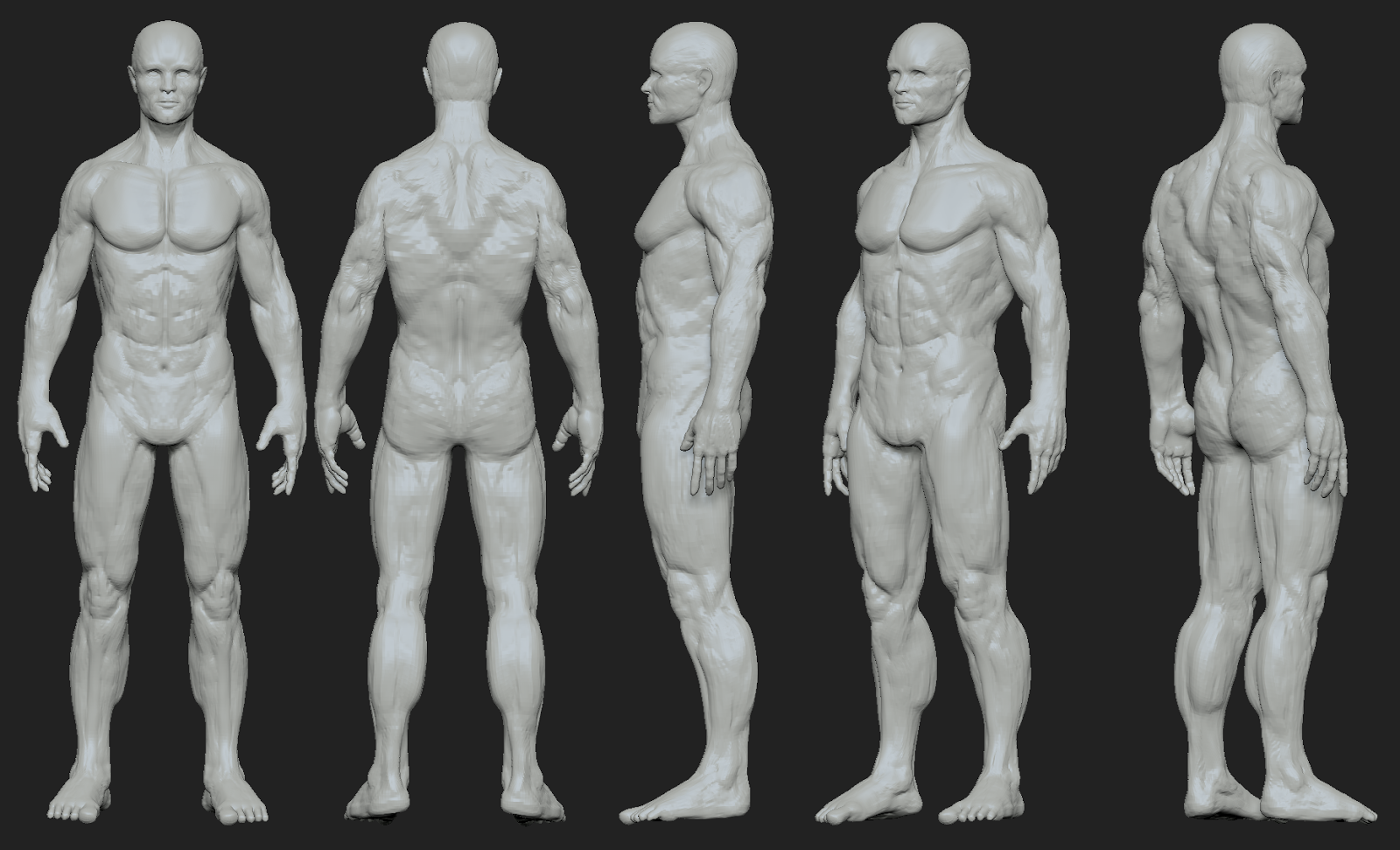
Anatomy Sculpt - crits wanted please
Yay! My account was re-activated!
I was hoping for some anatomy crits/paint-overs. This is my first real sculpt since recovering from nerve damage in my elbow. I wasn’t able to draw/sculpt for over a year. It’s just a simple male anatomy sculpt but I’d love to get some opinions before I moved forward. Thanks for any help in advance! Feels great to be back btw!
Here's the latest for him

First pass. I'm pleased with how this has improved. Thanks for all the help, everyone!

I was hoping for some anatomy crits/paint-overs. This is my first real sculpt since recovering from nerve damage in my elbow. I wasn’t able to draw/sculpt for over a year. It’s just a simple male anatomy sculpt but I’d love to get some opinions before I moved forward. Thanks for any help in advance! Feels great to be back btw!
Here's the latest for him

First pass. I'm pleased with how this has improved. Thanks for all the help, everyone!

Replies
Looking at the 2nd picture from the right, looks more like has boobs rather than some huge pecs. I think flattening would help a bit rather than being slanted as they are. (Show in 3rd picture)
Adding in some muscle definition in them would help.
Concerning your 3rd picture, I don't think the muscles in his upper-torso level are suppose to meet up together like that. Judging from google back muscle images, they should be separate from each-other.
I don't see any indication of his spine either.
His biceps seem rather larger/more focused compared to the rest of his arm.
Thanks!
Also in the Abds the line below the belly botton might be a bit too strong. It looks like a 6 pack, which is not what the abs look like. There are 4 asymmetrical packs below the arch and 1 big pack down to the pubic bones
Anything else?
Oh! Forgot to mention, he'll have briefs on in the final (client requested it), so no junk sculpting required on this guy.
Try using clay buildup. You can brush in the direction of the muscle and it tends to create a nice flow. If you want something to be bulky, brush in the alternative direction. For example if you needed rounded biceps you would stroke across at 90 degrees instead of tendon to tendon.
Damn standard will really help you "draw" the muscle boarders in. You can then use the previous bulking method to stroke up to the damn standard line. This will really separate the masses of muscle. If your guy becomes too cut you can go back with the clay brush to fill the harsh creases.
This is just what I did today, but it's now time to head home. Croftyness's excellent paint over will be what I tackle tomorrow. Cheers!
Overall, I want him to be in shape looking but not totally jacked, so I'm working on softening things a bit.
Also pelvic area. Once again, study books and try to understand how it should look like in all views. Study skeletal landmarks to place your bones properly.
There's plenty of problems with everything. Just keep studying the books, photos of bodybuilders and keep sculpting
Recommended reading: Richer.P.,Hale R.B.-Artistic Anatomy . Best illustrations around.
I think you understand what the muscles are, but you're not completely in full understanding of how they're all formed.
This is important, and this is what's holding you back.
So let me link you to a post I made about pectorals a while ago:
http://www.polycount.com/forum/showpost.php?p=1946653&postcount=54
It looks like you know what a pec is, and kinda sorta where it goes, but as of right now, its a big formless blob. that isn't really sure of where it starts or ends.
I took a high level anatomy Class by Scott Eaton, which I HIGHLY recommend you take (pretty much mandatory if you're serious about character art as a career).
http://www.scott-eaton.com/
Here's a few snippets of the homework we have to do:
http://www.jacquechoi.com/Misc.html
To give you a bit of an understanding of how anatomy construction is supposed to work.
Each muscle starts from a bone (origin point) and attaches to a completely other bone (Insertion).
The Orange Lines represent Boney Landmarks that are visible on the surface. Most muscles you see on the surface originate, and insert into these boney landmarks.
Feel free to google these ones from the torso:
- Acromion Process
- Sternum
- Thoracic Arch
- Spine of the Scapula
- Illiac Crest
But looking at reference, and trying to figure this out is still going to make it very difficult to understand. You really should take Scott Eaton's that class.
I was actually thinking that I really wanted to take a class again, any class. I'll have to look into that one since the topic is interesting. I'll check out that book too.
Ok, well, lets see how far I get today. On to zbrush!
and it IS an investment. it's a fairly hefty up-front cost, but it will return major dividends if you use it properly.
This is the greatest art tool investment I have made. I use it every time I do a new character...keeps me honest.
Things I tried to focus on:
-Croftyness's paint over
- Tilted the pelvis
- Pectorals
- Flow in the legs
-Boney landmarks (still probably missing a few)
-Torso/hips
-Missing leg muscles
-Forearms
Things for later:
-Hand, feet, face
Things that I'd like to hear people's opinions on:
-I've love help on the 3/4 view torso. It looks off.
-Thigh muscles, how are they looking? I'm wondering about the quad tendon.
-Forearms - little bastards got muscles coming at you from everywhere! Very confusing to look at.
-General leg shape
-Boney landmarks, am I missing any?
-Do you think the torso is too long?
-And really anything else that irks you.
Thanks!
crotch area seems too short, which i feel is being caused by the obliques sitting far too low and that doesn't leave enough room for your hips. also, the thighs feel the same width from top to bottom, they're a bit blocky
from the front view the outer calf feels too bulbous while the inside of the calf is sitting up too high. you should get a diagonal line from the inside of the calf to the outer calf. the widest part on the inside should be lower than the widest part on the outside.
his neck feels a little bit too long
i'd also maybe widen the shoulders slightly. from the back view it looks like he is widest at a lower point on the lats, where I think he should be a tad bit wider up at the shoulder area
it looks like you've got a handle on where the muscles attach and the overall anatomy, but it is just the proportions and some small things that need some attention
Those are awesome points to hit tomorrow. I'll get right on it.
I spent a lot of time on the torso would like to hear people's opinions on it. I'm trying to "soften" him up over all so he looks in shape (like 10-15% body fat) but not like he's a body builder.
Thanks!
Thanks!
Changes attempted
- smaller delts
- natural pec shape
- bicep moved over from chest
- butt higher than junk
- back of knee higher than front
- side view tilt - looked at Loomis
- side of neck
- hands/feet smaller
- smaller ribs
Questions
1) Is the head too big?
2) General leg flow, they look kind of stiff to me
3) Teres major - Im confused here. There are 2 muscles? Is it too big?
4) Anything else Im missing?
5) are the knees too low?
6) Push the ribs more?
*Damn, I need to fix those legs up!
Have a good day!
There's still a lot of things that I can see need fixing but I haven't posted in a bit, so this is where I'm at.
- made the legs less extreme in the side view. I was matching the Loomis drawing but it seems so over the top to me.
- played with proportions a bit
- tried the make his back less boxy
What do people think of the legs and back now?
Tomorrow, Ill be working on the abs, and any crits I get
I made these to help with proportions. (Not the photograph part, just the wider lines)
I think I got to everything mentioned except the back; it's still rough. Also, I'm trying to "soften" him up. Any tips on how to do that would be most appreciated. I want him to look a bit more average joe. Let me know what you think! Have a great weekend!
Anyways, what do people like of the abs and back? Ive bee struggling with the torso and would like other opinions. Thanks for any help in advance.
Thanks!
I still think the legs could be better, any suggestions? Thanks!
Also, I'm really hoping to get a few good crits since I think this might be close to decent, so if you give me a crit, shoot me a link, and I'll give you a crit (if you want).
Thanks!
Here's the latest for him
Looking forward to when you work on the face a bit more.
I'll get right on those edits! Thanks again!
a few things still stick out to me that need some work.
-the obliques feel a bit thick from the front to the back. it does depend on a persons build, but with what you've sculpted he feels very lean and defined, yet the obliques feel more indicative of someone who is a tad overweight.
-the overlapping of the lats on the rib cage feels too far back to me, i'd move that a little bit more forward towards the front
-from the back views the rear deltoids look a little bit small and the cut line feels a bit sharp where the triceps tuck under the rear deltoid
-the feet need some work overall, the toes feel somewhat floppy and straight and the big toe doesn't feel big enough or bulky enough. there is also some bone anatomy on the top of the foot you'll want to incorporate, i think the top of the foot is overall too smooth from the ankle to the toes
Btw, thank you so much guys for taking the time to give me actual muscle groups to check out. I got a crit on another forum that was just, "Your anatomy is inaccurate", which is so hard to move forward with. Now, I know what to work on.
Forearms are hard to work on. Remember each muscle must start and end somewhere. It's almost worth plotting colours both at the wrist and base of the forearm to keep a sane mind. Further from this learning the names can really help. Splitting the arm into flexor and extensor can help as well, almost like a twisted cut in half baguette (sorry for the analogy)