Meat Locker - Environment
Hi Everyone,
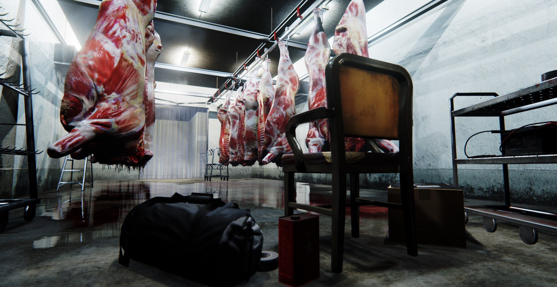
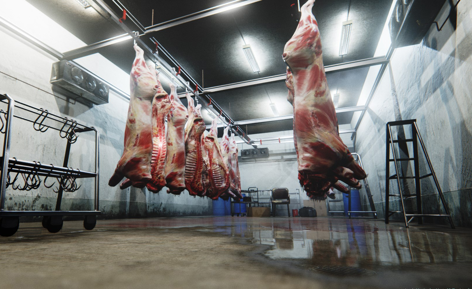
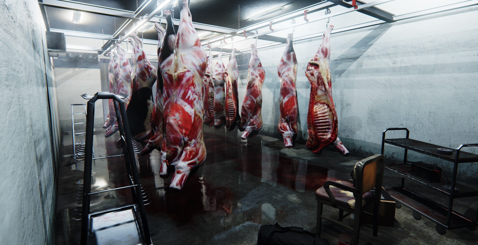
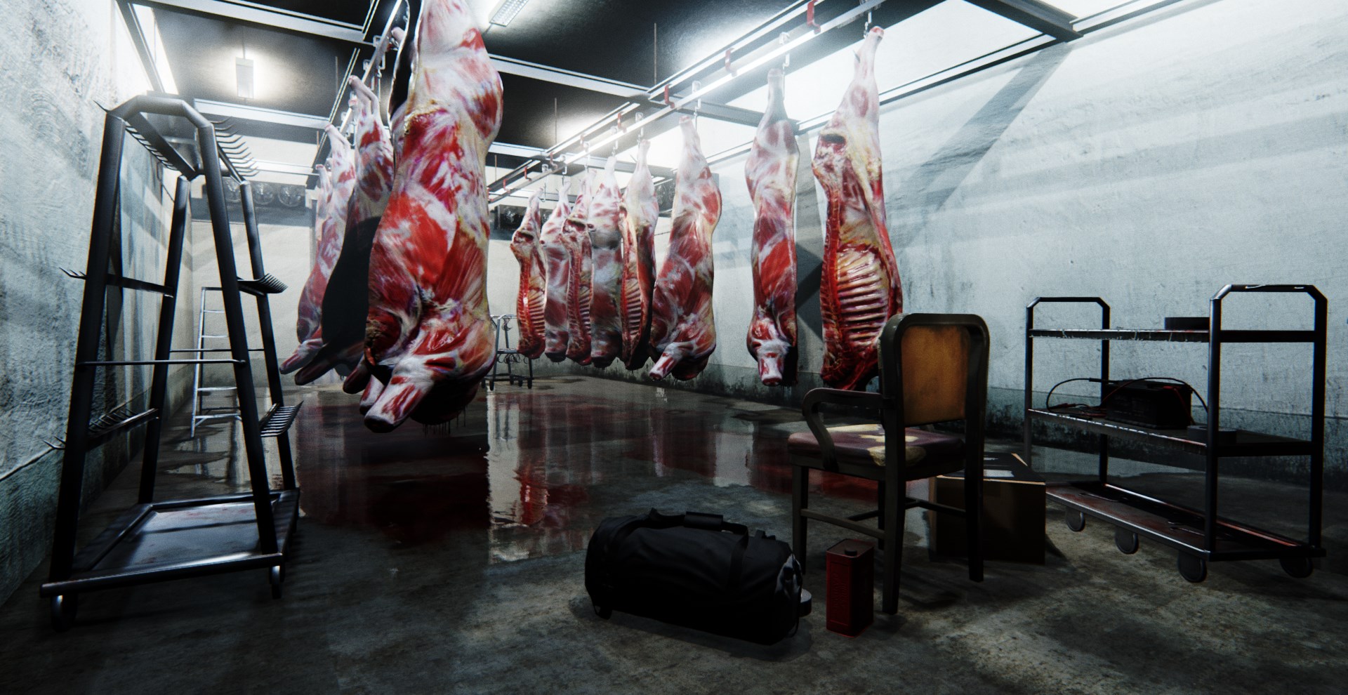
Here's my new environment - The Meat Locker
Feedback welcome!
Thanks
Cat")
https://www.youtube.com/watch?v=HCaUt3Fq43I&feature=youtu.be

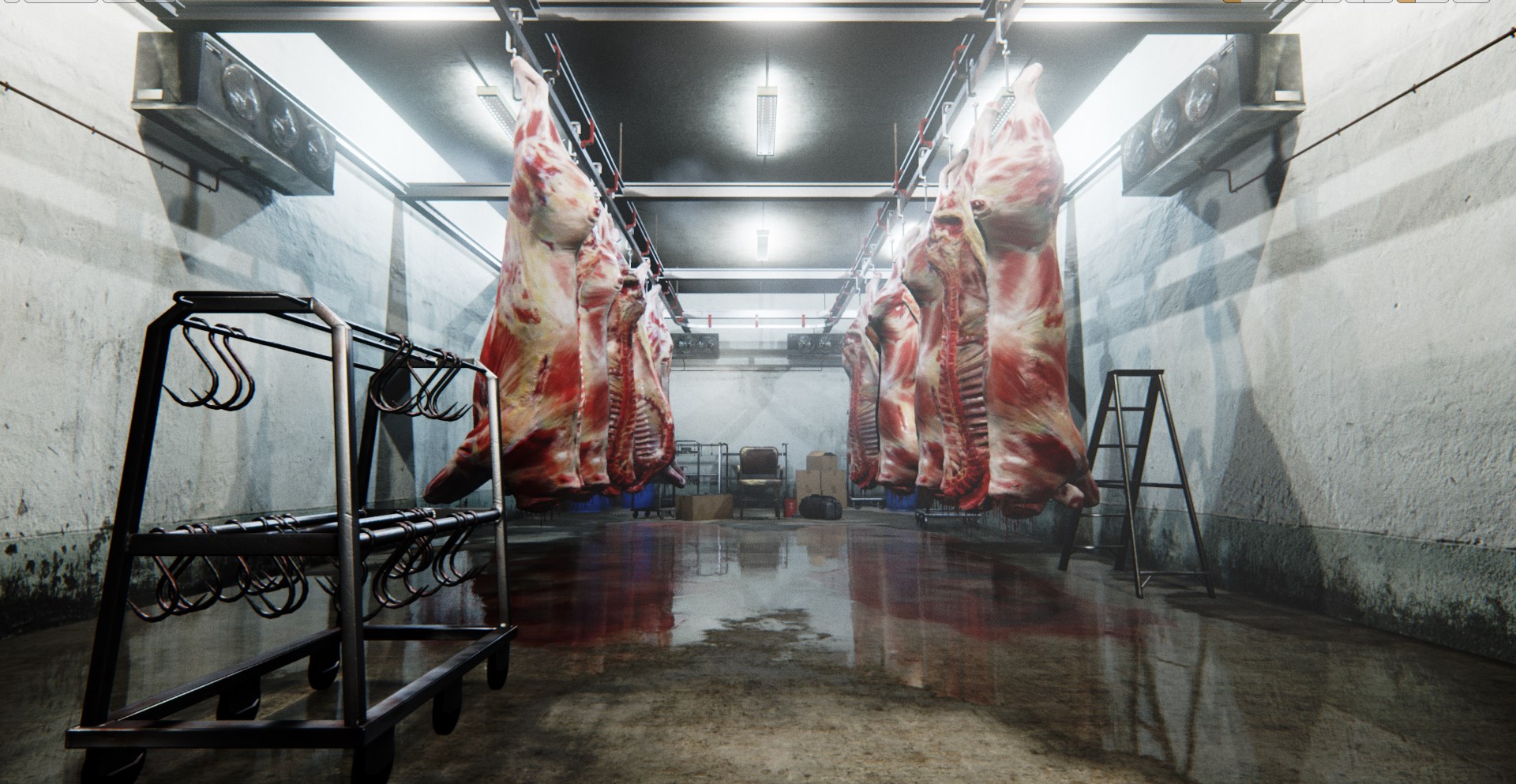
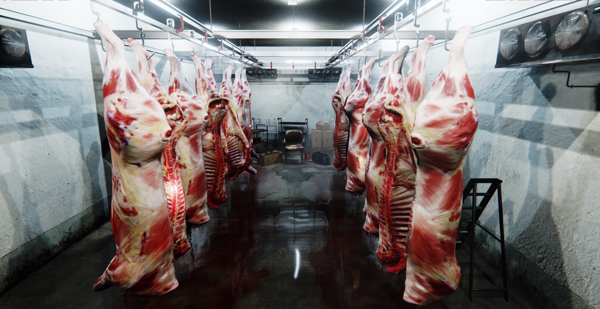
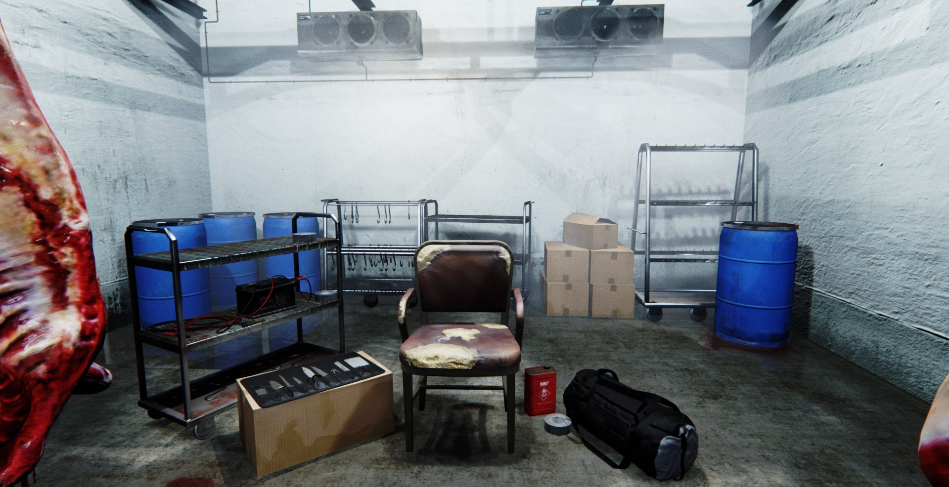
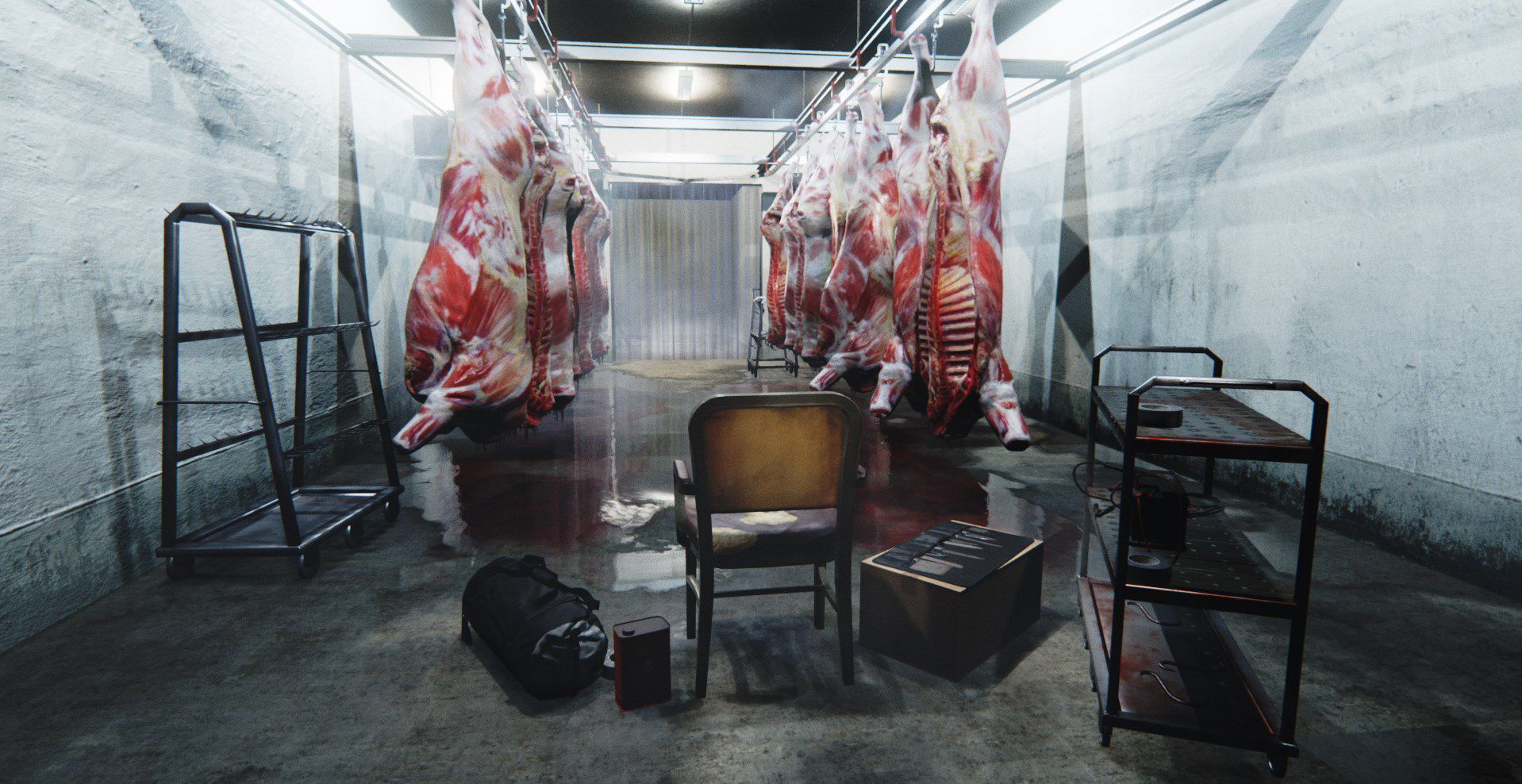
Here's my new environment - The Meat Locker
Feedback welcome!
Thanks
Cat
https://www.youtube.com/watch?v=HCaUt3Fq43I&feature=youtu.be
Replies
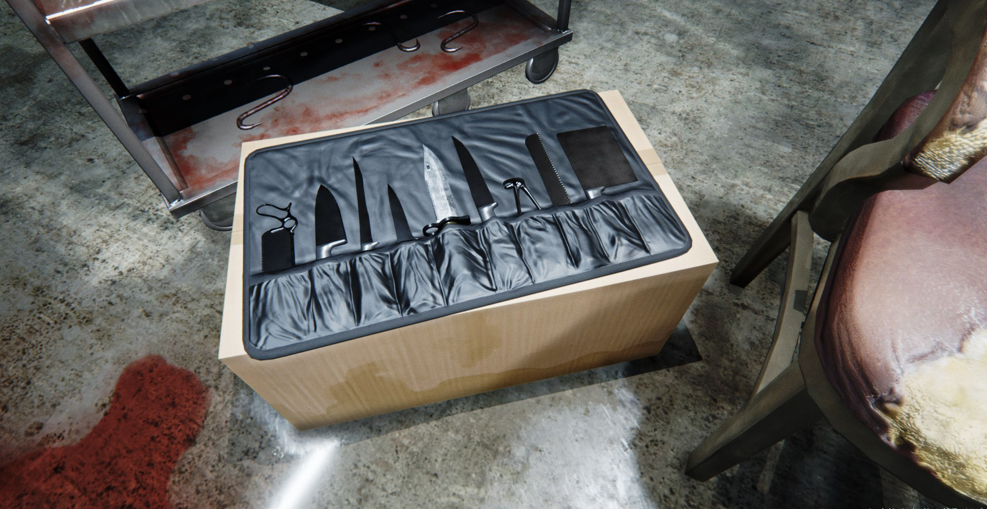
The metal textures are very lacking however. For most part they are very basic without any detail and no edge wear of any sort. The meathooks, the knife set, the H-pillars the rolling desks etc. The plastic bag and the envelope of the knifes break the illusion more however, the values look not right, and they are mere flat colors and normals, and the dark shadowing looks strange. Did you use global illumination ?
Else a little ambient light could fix that. The top of the water canisters looks very sharp and artificial as well. The first impression is very nice however, but dont let the meat and reflections carry you : P
Same here! Really great execution.
Hi Shrike thanks for the constructive comments
the meat first
1.Modeled and unwrapped in Max
2.Texture -In ZBrush I projected a series of images front and back on each side of the meat and then did a paint over correcting the ugly stretching, and filling in parts I either didn't have or where the resolution wasn't holding up
3.Next I sculpted the detail to match the muscle forms and added fatty uneven patches with RGB and a combination of the clay tools and dragging alphas
4.I then another full paint over etc for the second set of textures.
5.For the Material I took the blue channel and adapted this for a lerp on the roughness take some gloss off the fat, and finally set up the vertex paint with the second set of textures.
Ah the metal yes I think i've lost some of the detail in the lighting, I've got welds wear and some splatter on them but maybe I could go further. I didn't want to go rusty but maybe that would have brought the wear out somewhat.I'll look at the roughness some more too, and getting some larger more obvious wear in. I'll hunt down some more reference, currently what I have is all quite clinical.
I used global illunintaion, but then upped the contrast with a post process volume to get a more Guy Ritchie look, I'm sure a fill light would help to fix that. In UE4 I've found it really hard to stop blacks getting washed out, a fully glossy black comes out as your would expect jet black, but a fully matt black comes out distinctly grey. Ill have a look at the materials again as I think thats contributing to the plastic and knife envelope jarring as you mentioned.
The tops of the containers are rimmed with steel around the rim, but ill have a look at changing that
I've tried to be light handed with the AO but I really want to have everything feel grounded so I appreciate where you are coming from. The walls are probably cranked a bit because of the contrast, so I might take a little off, they are quite rough anyway though so I don't want to lose that.
Thanks Again
Cat
I'd like to see more such places in games - no crates, pipes, not cliche. Real topic, though chosen carefully (its essence distilled) so it would be a great, strong environment for a SWAT game, Hitman, murder investigation.
thats all i gotta say
The one thing that jumped out at me was the cardboard box -- the material definition isn't really there, and it was jarring simply because everything else is so well done.
impressive........most impressive.
Would love to see some texture flats for this...especially for those hunks of beef.
One critique I have, which was touched on lightly by someone else, is that aside from the pooling blood and the chunks of meat...I feel like the rest of the area is not quite there. You have some nice quality props, like the knife set, and the chair...but other things seem to be not at the same level. Especially some of those square metal bars on some of your props with smoothing errors. Also the way the walls meet in the corner...it looks like maybe the texture is stretched a bit and there is such a hard seam in that corner. Softer lighting in that area might help fix that.
Also, in the area with the chair, duffel bag, etc...it really feels like all of your props are floating...nothing feels seated on the floor. Again, first impression is that this is due to how its lit.
What could be cool is if you kinda made the space feel a little more eerie. It gives off a creepy vibe...but the room is so bright that its really not scary to me. Maybe have the meat lit up a little brighter, but have a pocket of darkness near the chair....just to make that space feel very ominous.
I feel like you are like...70 percent of the way there. Finish it up
what did u render that with? O_O
amazing
Looks like either everything is a dynamic sharpened shadow map, and the parts that throw me off are how all of the edges of every shadow are about the same straight sharpness/ there doesn't seem to be an apparent blur happening based on the distance from the light source.
If it's dynamic shadows then maybe you could try tweaking the sharpen filter and distance/bias settings.
If it's actually baked shadows then perhaps you can tone down the resolution of some of your lightmaps, I found that if I set some of my lightmaps too high in UE4 the shadows become too perfect/solid in nature. I realize that shadows in real life that overlap like that do occur, and maybe it's just my personal preference but I find too much shadow overlapping can be distracting, especially on a well lit white wall.
Other than those minor shadow quibbles, looks awesome, the first photo did fool me for a second in thinking it was ref!
that's it im breaking out the grill