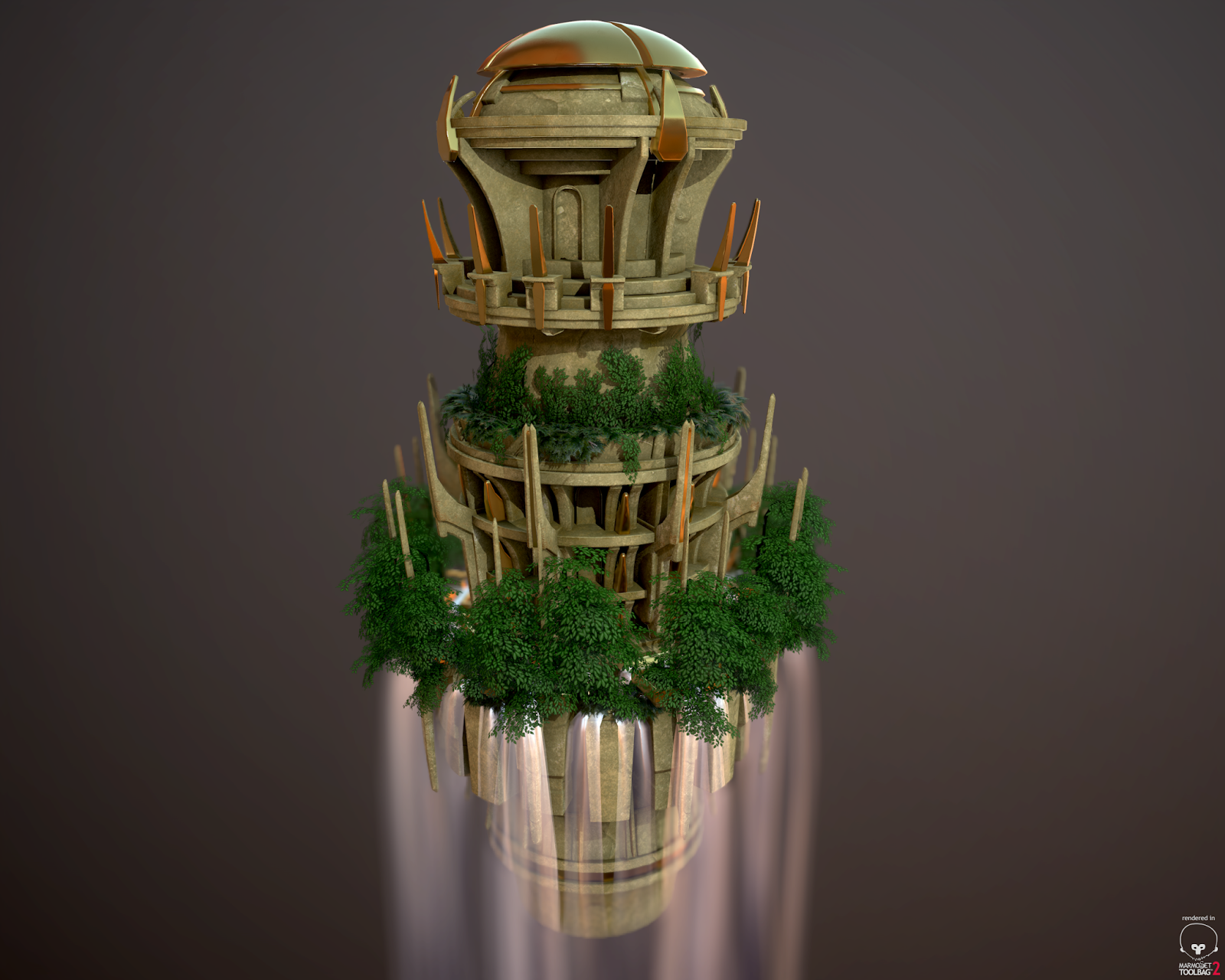
Hero Prop - floating temple
So i created this for my portfolio, what do you guys think? I am still working on it so any ideas/feedback will be helpful! It isn't something meant for players to be able to access, it's something that could be off in the distance or something like that.


Replies
Also, is the white edge around the foliage on the second tier a part of the texture or just edges of your opacity map? Either way, might want to make that look like the other leaves. Kind of distracting. Nice work!
- Make some variance in the hue and saturation of the leaves. They are all too perfectly healthy. Add some subtle browns/yellows into the greens and play with the saturation in some areas to make it feel more realistic.
- The stone is very clean. Take some time to dirty up the parts of it that would see more weathering, especially around the waterfall like jhoythottle said.
- The metal is extremely spotless and perfect. Of the three material types being exposed to the elements outside, the metal would show the most wear and tear. I would add some intentional wear and tear to it, especially play with the gloss/roughness maps where the metal would be worn or corroded. It will really help sell it, depending on which metal type you have in mind for it. Right now it either looks like gold, or really polished brass. Check out some reference.
Yeah i think it might look a bit better if i varied the color change from tree to tree also, they all have the same texture but i could easily just make like three different versions color wise and add them in. i'll make an autumn set and see how it looks too with the colors of all the stone and stuff!
Of corse it will be more professionally presented but this is the jist of it