Diablo 3 - Angel Tree - UE4
Hey!
I was doing a re-run of Diablo 3 maybe two weeks ago or so and wanted to build one of the trees that you can see in the heaven act.
I wanted to kind of do my own take on it in UE4, not necessarily follow the painterly style of the game(and I'm not a great painter)
I feel I'm closing in on the finish line for this little side project so I though I could reach out for some feedback There are some tweaks and fixes here and there I want to do and maybe add in some clouds around it but overall I think most of it is there..
I'm currently fighting with matinees to get my camera shots up and running for the final presentation, so any feedback in the meantime is much appreciated
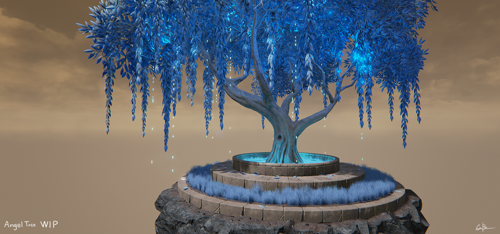
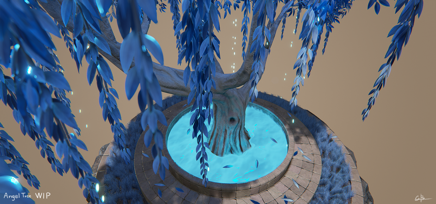
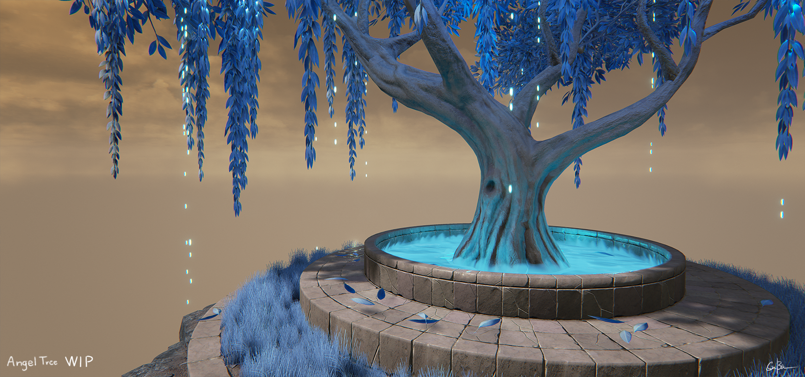
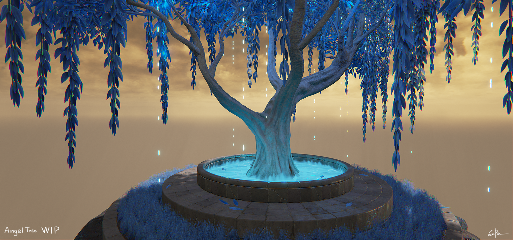
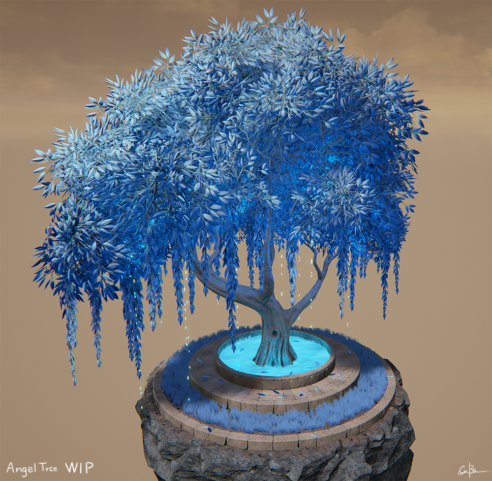
I was doing a re-run of Diablo 3 maybe two weeks ago or so and wanted to build one of the trees that you can see in the heaven act.
I wanted to kind of do my own take on it in UE4, not necessarily follow the painterly style of the game(and I'm not a great painter)
I feel I'm closing in on the finish line for this little side project so I though I could reach out for some feedback
I'm currently fighting with matinees to get my camera shots up and running for the final presentation, so any feedback in the meantime is much appreciated


Replies
I feel the particles could be a bit brighter, just my oppinion.
There is some subsurface going on in there, I might need to take a look into the shader setup and see if I can improve upon it
I think it you kill the skybox but light it with some orange light (and with that SSS? that could look hella sexy) it might work a bit better. That said, the orange light, even if extremely subtle, may not help. I'm just kind of spit balling here. Maybe if the rocks or stone have some subtle orange in them? I made a stone texture with some warm tones in the texture a bit ago and was happy with the result. I dunno, just something warm the compliment all the cool.
I have an orange main light in the scene but I might need to boost it up a litte I'm just worried about my bricks as they are picking up a lot of the lights color( they are actually greyish blue) but I'll tug a little with the sliders!
Yep its the default sky(shame) I'm just not that great at making skies and just having a flat color/gradient made it pretty booring in my opinion. I've been thinking of adding some nice clouds around the scene to help get rid of the default sky feeling and also sell the idea of it being high up in the sky more
Yeah I need to work some more with the rocks textures color variations
hehe yeah its very blue^^ I can link the ref I'm using later tonight, the actual tree is more pale and blueish white but I felt it made everything a bit dull since I dont have a proper environment around it to support it.
I need to work with the particles a little, its supposed to drop/ pollinate something! not exactly sure what since its only a few pixels in the game.
I'll play around with the grass settings a bit, right now its only one mesh as well. all of the stuff around the tree is more for presentation but I guess I need to push it further
I started adressing some of the feedback I have received during the day, including whats been said here.
I started working on my own sky, will probably have to complement with some cloud meshes/particles to make it work.
I added some height variation to the grass for now, I also reduced the "pointy" parts on the top of the tree so now it has a little more weight to it. I decided to keep the water about the size I have, I tried different ones but I still felt this one was the better one
I tog another pass at the lighting and some color tweaks, added some variation to the branch texture but it might be to subtle.. And I punched up the SSS effect more.
I will try to do the whirling glowing effect tomorrow and maybe start experimenting with some clouds
here is the current progress and the ref I am using as inspiration:
Might be nice to have intense lighting coming from the base of the tree like in D3 as well, creating intense shadowing on the canopy?
Changes:
Added misty stuff
Added faint light from misty stuff on the lower branches
Added a tiny bit more light in the shadowed areas on the stone steps under the tree to make it look like the light is bouncing around a bit more
Added more roots
Added more grass
Added glow (looks poo but could be done better in UE)
Added a bit of irregularity to the stones
Yeah the swirling glow effect is next on my list!
I'll see if its possible to flare out the roots more without having to rework the tree too much.
Going to bring back some more of the bloom in the scene so stuff glows a little more as well.
Thanks, Yeah I'm going to finish this! pretty close to the finishline so it would be a shame to stop now ^^
The glow and particles could really sell it. Great work so far.
But it's definitely something I would like to do later on
Here is a first mockup of the turntable video, nothing fancy just a simple camera and some tunes.
I'm going to take a final pass on this during this week and render out the final movie and images, also some breakdowns : ]
[ame="
Every bit of foliage looks to be an identical color. On trees, there is some variance - new leaves are brighter & less saturated, dead leaves (& leaves that have fallen) have lost their chlorophyll and resumed their base color - white, brown, red, etc. This is also true for grass - some stems will be dead or less saturated. You don't need to go crazy - just try adding a little bit of variance to a few leaves or stems. Take a look at the leaves from a weeping willow - a very similar tree to yours - and notice the yellow mixed in with the green, and note that the stems are yellow rather than green.
The trunk might look better in a subtle complimentary color, such as orange.
The stones of the planter look very regular. Offsetting alternate courses of stone by a half brick might improve the appearance. Adding some variance to the color of the stones might help as well.
The dripping particles feel to dense, more like a stream than anything else. Adding more emitters, but having them emit particles more randomly and less frequently might look better. Adding a very infrequent falling leaf particle might be nice. If you are going to keep the current stream, then you might consider adding small puddles of glowy blue stuff on the stone beneath a stream.
If the planter is old, then you might want to deform the shape a bit to indicate roots growing under the stones and shifting them as the roots grow.
I'll take a pass att the grass again.
I kind of want to stick to the D3 reference for the colors but I see what you mean about the variation, there is some in there now but it gets a bit overpowered by the SSS and the Emissive - I could try to add some more of it to break it up a little.
I am terrible att making particle effects and controlling them ^^ I agree that they need to be offseted in the timing, now they are too regular I'll see what I can dig out from the interwebs!
I'll see if I can get som displacement in there to break up the stones and maybe even break it up a little like in your reference picture as well as adding some more color variations
I will probably expand upon this piece later, making a full environment out of it
I will be posting some breakdowns tomorrow ^^ Hope you like it!
[ame="
Nothing fancy really
How do you model it to be tilable and how do you do the diffuse?
The diffuse I just threw in some colors and photos based on some masks I was able to get from the normalmap I produced from ZBrush
[ame="
[ame="
I just modelled the leaves and branches in Maya and rendered out a normal, diffuse and AO from Xnormal.
I mapped a leaf image onto my mesh leaves(started with a simple plane) and followed the shape of the leaves with the mesh then gave it volume and made the creases in along the middle.
I used Maya pant effects do draw out the branches with some pressure sensitivity with my wacom and then converted them to polygons. Then I went in and placed my leaves along them and rotated them around.
I made one "flat" branch and one branch that is from the front that will kind of serve as a "shield" mesh that is facing outwards to hide some of the simpler planes, so its basically 2-3 planes that are intersecting and then the "shield" is placed almost like a lid, hiding the sharp flat angles of the planes
Hopefully that made some kind of sense