The BRAWL² Tournament Challenge has been announced!
It starts May 12, and ends Oct 17. Let's see what you got!
https://polycount.com/discussion/237047/the-brawl²-tournament
It starts May 12, and ends Oct 17. Let's see what you got!
https://polycount.com/discussion/237047/the-brawl²-tournament
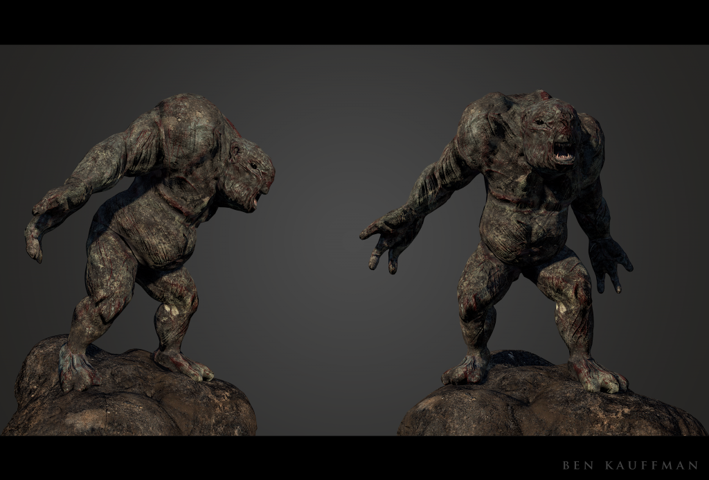
[Character ] Rock Troll
Hey guys!!! Rock Troll i have been working on. What you guys think?


Replies
Sculpt wise, it looks organic, like leathery skin.
Your material though speaks of rock.
If this is going to a be a rock troll character, design would dictate that the surface needs to read as rock and not leathery.
As well, the texturing seems too uniform. My eyes aren't being led to focus on any particular area. The face is hard to read because of this uniformity issue as well.
Right now, the quickest fix would be to retexture the character as an organic surface given the normals already, but if you're willing, the character could use a different sculpt.