Home 3D Art Showcase & Critiques

Sci-Fi Modular Environment

wdcstudios
polycounter lvl 8
Offline / Send Message
wdcstudios polycounter lvl 8
This is my first project using UE4 and I haven't used UDK either. I'm a 3d artist looking to get into environment art so at the moment I'm focusing on the visuals and learning everything as I go. So far I have to say I'm blown away by what can be produced in UE4.

Goals
Understand the modular environment modeling workflow.
Start to learn UE4.
Find a flexible tile-able texture workflow.
Create a flexible shader.
Create a flexible hard surface texture set.

Plans
For now my plan is to look into adding FPS controls and recording a walk through to show what I have in motion.
Next will be to add some functional details like pressure gauges and control panels.
Learn how to use vertex painting to make material variations.
Learn about decals to produce more variation.
Once I'm happy with the corridor modular kit I'll move onto some kits to create connecting computer rooms, larger engine areas and a bridge.

Any and all feedback is welcome.

Modeling // 3ds Max

Texturing // Ddo, Ndo, Photoshop

Rendering // Unreal Engine 4 (game engine)
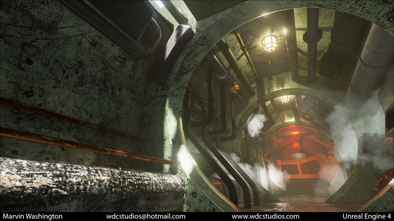
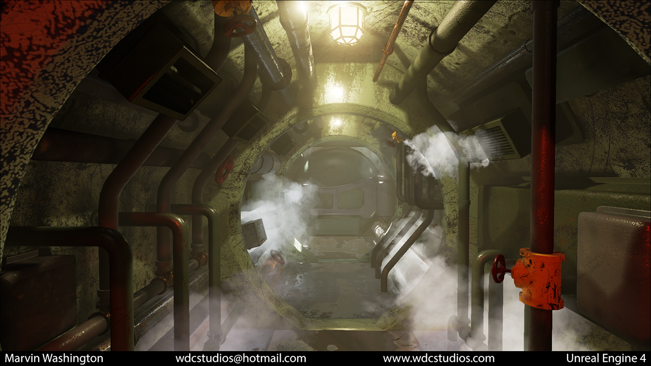
ue4_1a.png
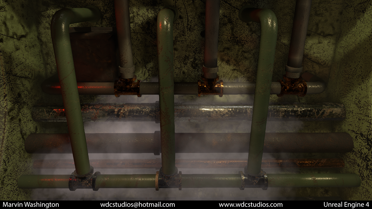
ue4_1b.png
ue4_1c.png
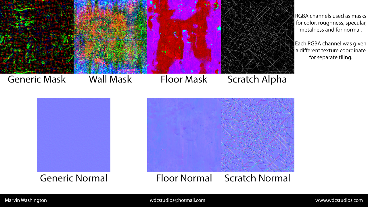
ue4_texture_sheets.png

Replies

  • BasicallyNormal
    Offline / Send Message
    BasicallyNormal polycounter lvl 7
    Off to a good start. I think right now the textures are very noisy, and some large scale detail would do your walls some good. Using masks and trying to be technically efficient is fine, just don't let that be a limiting factor in making something look good.
  • JoshWilkinson
    Offline / Send Message
    JoshWilkinson polycounter lvl 9
    The textures are way too noisy. I'm able to recognize some ddo masks, which is bad, and seeing general details applied evenly everywhere does not demonstrate and understanding of texturing. Generally speaking, scratches should be on edges, dirt and grime should be in corners and general surface wear/ sun-bleaching should be on large, open surfaces. In regards to the walls (the black and white polka-dotted objects), I have no idea what material that is. Is it metal? Concrete? No material wears like that over time.

    Your lighting and composition is pretty strong though.
  • wdcstudios
    Offline / Send Message
    wdcstudios polycounter lvl 8
    Thanks so much for the feedback. I'll definitely take it into account. I'll probably work on the masks and see if I can lean on vertex painting distributing scratches and grime.
  • ScottHoneycutt
    Offline / Send Message
    ScottHoneycutt polycounter lvl 14
    I agree with what was said above. This pretty cool, and much better than what you have in your blogspot. Good texture definition won't come from having the details so uniformly spread all around it. There needs to be more contrast like mentioned above, with spots with less wear and spots with more placed well. This is an area I've had to learn a lot about myself recently.
  • wdcstudios
    Offline / Send Message
    wdcstudios polycounter lvl 8
    I've add some added vertex paint control for distributing scratches rust and grime. I was hoping to get some more input on how everything looks. I'm still in the process of fine tuning the maps.
  • lamar McHaney
    Offline / Send Message
    lamar McHaney polycounter lvl 9
    The vertex painting was a nice touch and it has decreased the the noise in your textures. But I thing you have to many scratches and grunge noise in your alpha. It's just making your scene look weird. Also, there seems to be no AO in the scene, the pipes have no shadow when connecting with the wall.
  • Cibo
    Offline / Send Message
    Cibo polycounter lvl 10
    Better but not good enough. You have now places with random noise and places without random noise. I cant see that it is water damage, chipped paint and so on.
    You have no gravity, the generic scratches are always generic, vertex color doesnt help.
  • wdcstudios
    Offline / Send Message
    wdcstudios polycounter lvl 8
    Thanks so much for the feedback it's been invaluable. I've taken another swing and I'd love any feedback anyone can offer.
    ue4_3a.png
    ue4_3b.png
    ue4_3c.png
  • Luxap
    Offline / Send Message
    Luxap polycounter lvl 6
    The improvement is stunning from the first overwhelmly noisy stuff, maybe adding some more color difference on the scene could sell the picture more ( but thats up for debate )

    What I would personnaly do is adding some decals on places like the pipes or junction boxes to create an extra human factor, altough they have to be very worn

    But anyway, keep this up, it's looking great!
  • Swarm22
    Offline / Send Message
    Swarm22 polycounter lvl 15
    Shocked out how much better it looks now after you incorporated the feedback. Great job.
  • jacob07777
    Offline / Send Message
    jacob07777 polycounter lvl 15
    Daaaamn I'm going to keep an eye on this. Really awesome work with the most recent shots. Well done!
Sign In or Register to comment.