Tie Interceptor
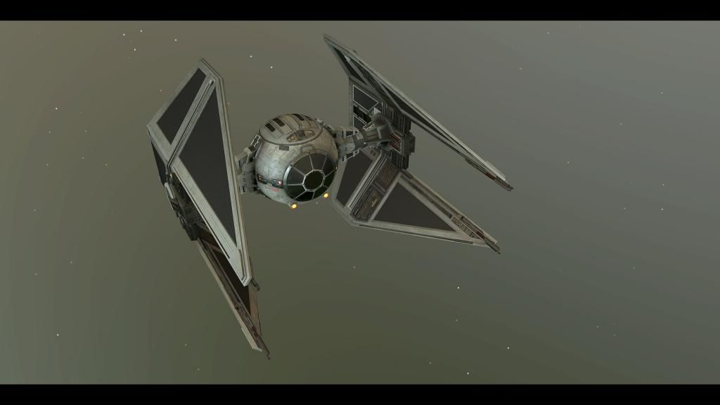
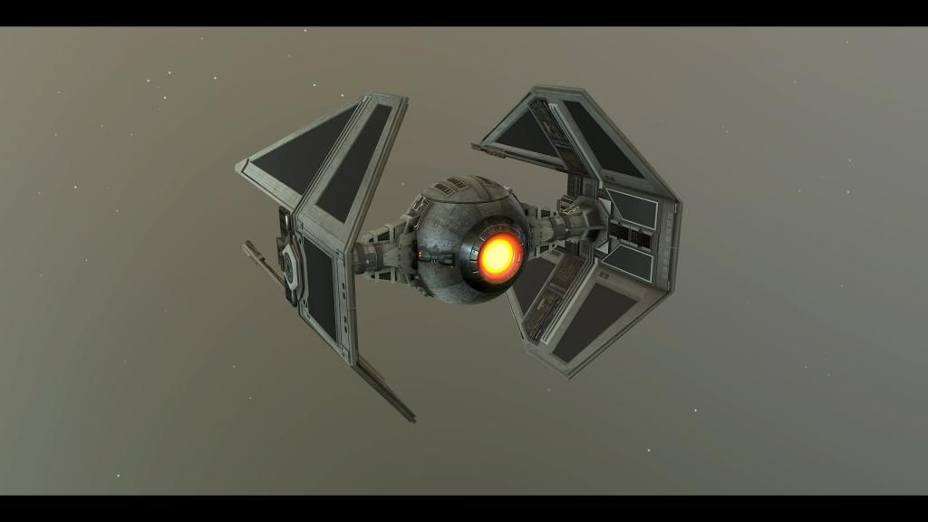
Hey hey everyone! been a long time since I posted anything here, but here goes. I've been having a play with a Star Wars Tie Interceptor and feel I am maybe 75 - 80% done, but kinda feel I could use some critique and suggestions to get it done..
I'd be very happy to hear any thoughts anyone might have on how I could move this to final, suggestions on changes etc.
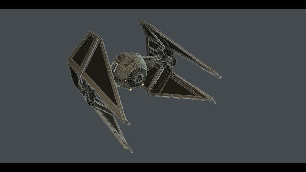
it currently sits at about 20k tri's and I've thrown it into marmot 2


thanks in advance!
I'd be very happy to hear any thoughts anyone might have on how I could move this to final, suggestions on changes etc.
it currently sits at about 20k tri's and I've thrown it into marmot 2
thanks in advance!
Replies
Nice one man, Looks very cool. Sort of feels a bit stylised in terms of texturing, was that what you were going for?
As far as feedback, i'd say have a look at your metal/more reflective parts and think about brightening them. They look mighty dark compared to the rest of the model for their reflectivity to make sense. Also the wings look quite clean compared to the fairly dirty center area, so could be worth getting those closer together in terms of grime and wear?
My only crit is that the detailing on the black panels could be scaled up, and this area seems to be missing something to me...I'm not sure what though. maybe add some more staining around the join and leaking down the wing.
Maybe also give him the blue hue the TIE's usually have and you're good!
Chris89 - Hey dude, damn you found this fast, I was hoping to get it sneakily finished before you spotted it. So were is the A-wing huh? :P
I wasn't aiming for stylized, can you say what you think is giving that effect? material definition?
I'll have a play with the metal areas and make them lighter as you suggest and I have a grime layer for the wings I have spent ages upping and downing :P I'll put some time aside to continue playing with that and see if I can get a good balance.
Oniram - You sure can, In fact the high poly was done about 2 years ago when challenged by Chris89. After doing the high I never got round to doing the low and baking, texturing etc. until now!
SecondShadow - The textures are still wip, but I am doing standard albedo, metal-ness, roughness and normal maps. I am texturing the body and wings as separate as I am thinking I could do other Tie variants and be able to share the body assets
desktoppirate - hey dude
Rumkugel - erm.... well... bugger lol. good spot!
Rurouni Strife - Thanks for the crits! I'll certainly take a look at the grime layer on the wings, I think I might also look at adding in some of the smaller panel detail as I now think that might be partly why the body and wings also feel different.
thanks again everyone, please keep posting any suggestions. I think I might be jumping onto the arms and armour competition so maybe not have time for this for a lil while. but I want to get it done for sure!
slight cooling filter applied:
I never did make that A-wing
TIE stands for Twin Ion Engine. It'd better have 2 engines.