Security Bot High Res Piece
Hey guys first time posting here although I've been on the forums a while.
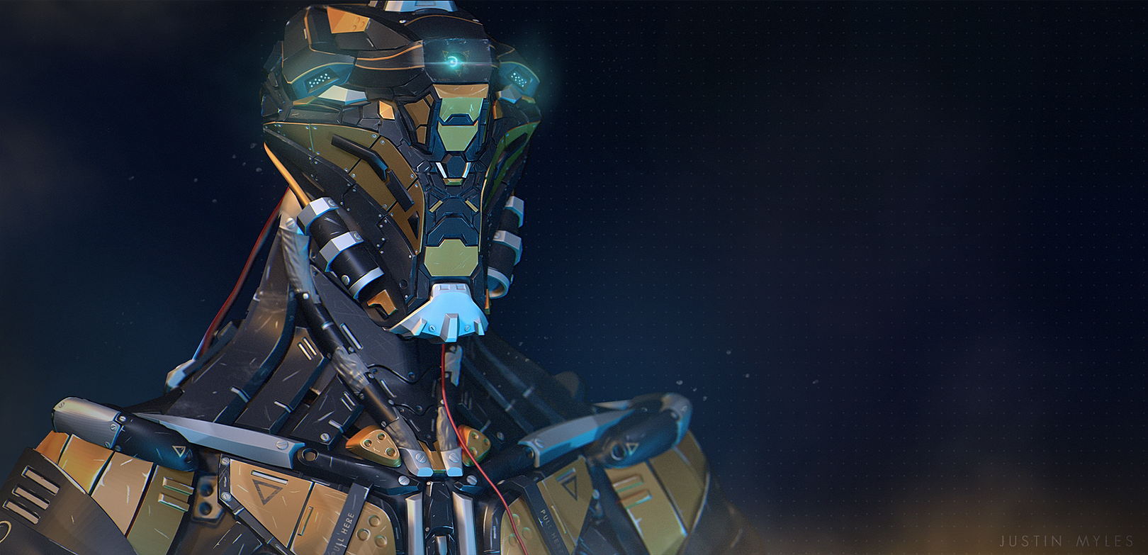
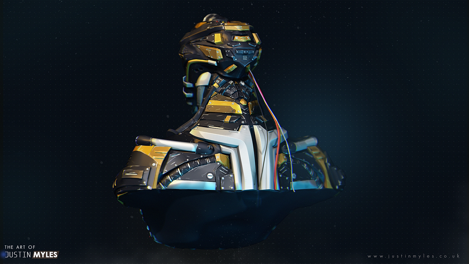
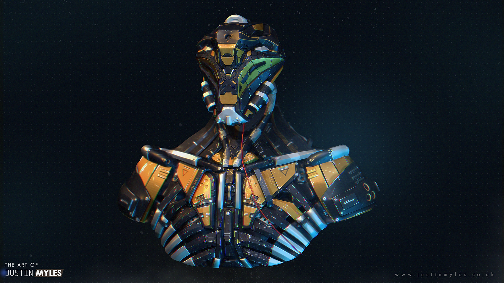
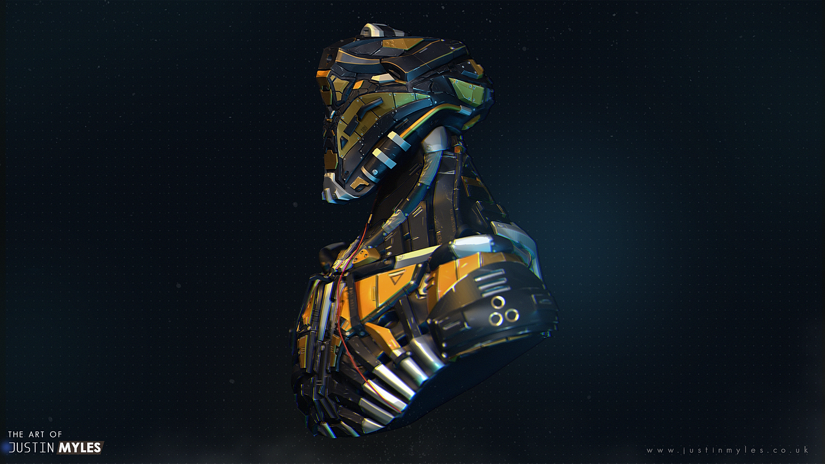
This is currently the high res version although I may intend to turn it into a video game piece at a later date.
Programs Used
The piece was entirely done with Zbrush and Photoshop.
It's been one year since I started sculpting and I've loved every minute so far, I want to thank Chris Goodwen and Ben Douglas for some really great tutorials and breakdowns.
You can keep up to date with my work over on my artstation account
http://www.artstation.com/artist/JustinTheEnd
http://static.wixstatic.com/media/4f77b8_6506f3b39afb4d639a39bd0213ff7ddf.png_srz_p_1620_911_75_22_0.50_1.20_0.00_png_srz
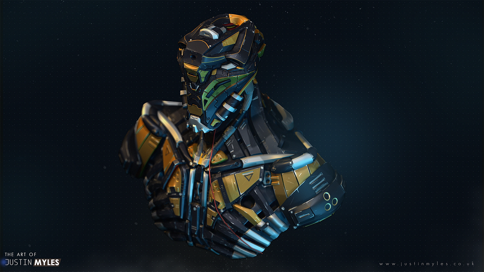
This is currently the high res version although I may intend to turn it into a video game piece at a later date.
Programs Used
The piece was entirely done with Zbrush and Photoshop.
It's been one year since I started sculpting and I've loved every minute so far, I want to thank Chris Goodwen and Ben Douglas for some really great tutorials and breakdowns.
You can keep up to date with my work over on my artstation account
http://www.artstation.com/artist/JustinTheEnd


http://static.wixstatic.com/media/4f77b8_6506f3b39afb4d639a39bd0213ff7ddf.png_srz_p_1620_911_75_22_0.50_1.20_0.00_png_srz

Replies
but on the other hand, you textures are really lacking, the scratches look cartoony abstracted and there is no real wear going on aside of that, its mostly base colors,
the same for the Tau battlesuit
Also the shader you use seems kind of strange and abstracted, I guess its a zbrush shader, I would not use them to present game art
Your highpoly needs to have a lot softer edges, all you have is really sharp and that
wont bake well and give aliasing issues
Also the tau render is so dark you can barely see a thing
If you want to get into lowpoly and baking, try starting with not too complex highpoly models at best, else you will get frustrated a lot ; )
Yeah the cartoon scratches are a render in zbrush for some reason I can't explain.
Also thanks for just taking the time to critique my tau mech as well, what sort of stuff would you recommend me putting on the bust and Tau mech texture wise? For as you can see I feel like I'm fine modelling wise but texturing not so much yet.
I was considering dirt blotches/particles, dust perhaps from a building, burn marks etc
I know all the cool kids are doing it but sometimes less is more. Check out Quack's District 9 WIP thread here http://www.polycount.com/forum/showthread.php?t=121260&page=6
. Even though the design is not his the mech different parts are easy to understand be them painted or not (first pages show his progress on the modeling side).
Just in case, you're onto something here, so don't go thinking I am slinging mud at your work as it's pretty good.
Hope that helped.
Hey that's absolutely fine dude and thank you for the critique! I was super nervous about posting on the site as it was a little intimidating to me but now I'm happy I did.
I actually thought the same about the piece being busy, this was my first hard surface piece so I just let myself off and just learnt the theory involved with the program.