[WIP] Brass Knuckle Shotgun!!
LATEST IMAGES ON 2ND PAGE

Okay check this out, its an automatic shotgun with brass knuckles, and a trench spike. For fighting close quarters, in trenches, against vampires or zombies! I guess..
Here's the progress on the low poly so far (8832 tris):
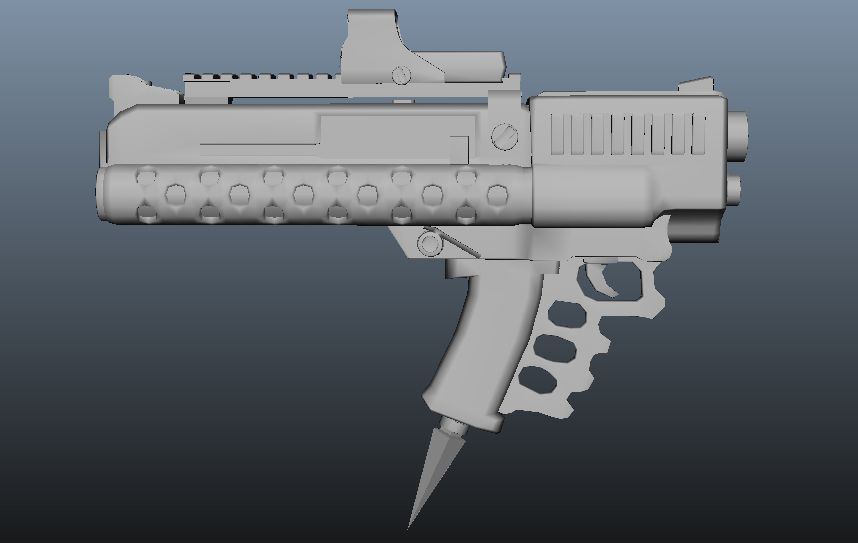
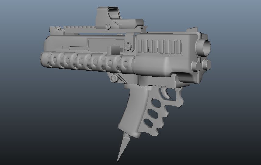
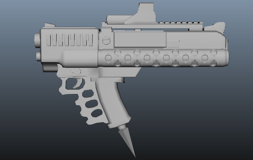
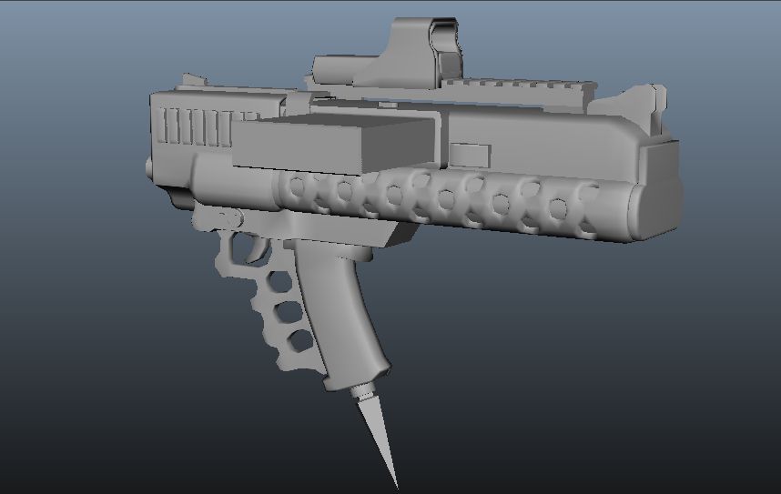
I'm not going to be able to work on this for at least a week for now, but I thought I could get some feedback on the low poly before I started the high poly sculpt.
Thanks!
Okay check this out, its an automatic shotgun with brass knuckles, and a trench spike. For fighting close quarters, in trenches, against vampires or zombies! I guess..
Here's the progress on the low poly so far (8832 tris):


I'm not going to be able to work on this for at least a week for now, but I thought I could get some feedback on the low poly before I started the high poly sculpt.
Thanks!
Replies
hahaha yeah yeah you guys, there's a reason why this gun doesn't exist in real life.
Looks cool though! I'd play with it in a video game. I think Duke Nukem could wield it effectively.
Ha sure I can! you've played a video game before right?
Now that's what I'm looking for! What exactly do you mean? Where? How would I fix it?
Says who?
No one here, it seems.
How would you aim?
Put your eye next to the sharp and hot metal pieces at the back? Or hold it at arms length and hope you don't angle it sideways? (And does a sight like that make sense, then?)
Haha no but seriously it is kind of a joke weapon. Im just having fun and playing with my art. Im glad the design is so interesting to look at and pull apart. But with that being said, I would only make it more outlandish and absurd at this point not less. I really want to do more and keep the discussion up but im stuck traveling this week.
Think less Battlefield, more Sunset Overdrive or Duke Nukem.
No, because those weapons have basis in reality, they function and make sense mechanically.
EG
I can see how I would hold it. I can see how it might have been constructed. It makes sense mechanically. It feels like it's based off of a chainsaw or other power tool.
Yours does none of these things. You'd stab yourself in the leg. You'd burn yourself on the heat shield which don't make sense (what are they shielding?) How do the rounds get into the barrel from the magazine as it is placed? And the back end just ENDS, no butt, nothing mechanically interesting, just a face. It's not interesting or fun to pull apart. Absurd does not mean badly thought out. As far as I'm concerned this might as well be your concept:
(At least this has a decent form and structure)
But sure, shrug off advice. You won't get very far if your response to everything is PFF I LIKE IT. And I don't know why you are trying to make your own designs when you clearly don't know much about modelling (or concepting for that matter).
ok, I know its to be an absurd weapon but perhaps you could shift the pistol grip to where it should be (at the back of the gun..) and have vert grip at the front with a big ol spikey knuckle duster, you start getting a bit more believability? i'd just lose the pointy down spike and nuke the eotech
I've never done any real concepting before, but if I were in your shoes my start would be to download images of like, every gun ever. There are great website with galleries. Learn how guns work. Keep this in mind when bashing out ideas. Incorporate ideas from designs you like. I see a lot of artists make a variety of black silhouettes to choose from. EG:
Note how you can really get a feel of what the weapon might be like just from it's silhouette. A strong silhouette is important in a design. And always keep in mind functionality. This doesn't mean you have to drop you basic idea, such as "brass knuckle shotgun". It just means you need to work it in in a more believable way. For example, "punchy shotgun" brings one thing to mind for me: the fallout ballistic fist.
I don't think I need to explain how this works. You can tell by looking. Because you can see how it functions.
So, serious mode now, here is what I'm making (warning this image is pretty big)
In short, its a compact single handed shotgun that turns into a massive brass knuckle. It cannot be fired in melee mode. Its designed as a hyper aggressive gag type weapon for a third person shooter.
Here is the list of changes I've made:
- changed the heat shield looking piece into a mount for a forearm brace. It was not a heat shield, it contained the springs that expands the shotgun into a brass knuckle.
- added an adjustable forearm brace
- added studs to the fore grip mounting screws (front of the weapon)
- added combat ridges to the barrel
- shortened lower receiver
- Oriented trench spike forward
- made outward rails for lower receiver to better illustrate sliding action
- moved bolt release switch further back
- flipped around lower receiver slide lock (right side of weapon)
- extended brass knuckles forward
- made the lower receiver slide farther forward and added bumper.
- redid spring release switch and mounted it on the left side of the lower receiver so one can press it with their thumb.
This is still the low poly and the weapon is now 9806 Tris.
I look forward to your feedback and suggestions. I'll do my best to answer your questions too!
Well I wanted to leave the option open for the wielder to only strike with the brass knuckle or to bury the 4 sided pick (trench spike) into the target. This is because this weapon was designed to be a "riot shotgun", but given the recent events going on here in the US with rioting and the police, I thought it would be in bad taste to label it as such.
No it'll be fine. The barrel is designed for you to hit people with, punch away.
Once the weapon is in shotgun mode you can maneuver it around like a normal firearm. The sight is an EO holographic sight, not a scope. The only reason I'm pointing this out is because its not suppose to go right up to your eye, it needs to stand off a good bit. But in all honesty the sight is more for silhouette purposes, because its meant for a third person shooter. The player would never actually look down the sights themselves. Anyway here's a picture to illustrate what I'm babbling about:
It looks like your right. I REALLY wanted to make a trench spike, but it looks like its just not going to work. I think the diamond stud is more in the spirit of the blunt nature of the weapon but I was really hoping to get some visual contrast with that spike. oh well.
I realize now I never said this but its designed to fire 20 gauge slugs or shot at near point blank range. 20 gauge shells really aren't as bad as you might think, but I do hear what your saying. Which circular piece are you speaking of, do you mean the forearm brace? What do you think could be done?
A folding stock would be pretty cool but I'm really trying to suggest that single handed feel. In game I would want it to fall in the pistol class of weapons. But ill definitely experiment with a folding stock.
So I angled back the forearm brace and lengthened it, as well as adding breaching teeth to the barrel and shortening the trench spike into a diamond stud.
Thanks again everyone I really appreciate the feedback and suggestions and am looking forward to moving on to the high poly.
-put a few extra shells on the right side of the weapon to visually balance it with the left side's magazine. Not 100% on this yet...
I'm bringing this thread back from the dead. Well actually I'm more of taking it out of stasis. I received an offer for a AAA game industry job, and of course I dropped everything personal to put all my time and attention into that test! So pumped!
But now its done, and I immediately came back to finish the "punchy shotgun" while I wait for the results to come back.
so here is my latest progress I'm posting before I break for the night. Its a quick and dirty first bake for the high res taken right out of the Maya view port.
Any feedback is greatly appreciated as always! Thanks
Probably too late now for this feedback, but i really recommend making the gun thinner, there's no need for the whole thing to be as wide as the two magazine tubes. It looks like you're pulling reference from a keltec so check out how the outer frame is usually only as wide as the underlying part, and those tubes are the widest part of the gun
Hey thanks, Im glad you like it.
I'll go ahead and take a closer look at the scale. Your right though, I did take inspiration from the keltec shotgun! The magazine tubes are not magazine tubes at all though, they contain high tension springs which pop the weapon into melee mode when placed on safe and the release switch by the selector switch is pressed. I have a post on the first page briefly describing how it works.
Anyway I've started texture painting and I thought I would post some progress pics. The images are right out of the Maya viewport as always, and consist of normal, diffuse, and spec maps. Ill add in more maps like gloss later when I bring it into marmoset. The brass on the shot gun shells looks particularly ugly, but I'm kind of hoping I can fix it up with a high gloss setting later... I hope.
PICS
Sunkist has it right, stop the detail and map out your contrast/values first and then go into material definition.
AH shoot! :poly117: I really wish I would have saw this earlier! your absolutely right and this would have saved some headaches!
I'm sorry everyone, I forgot I was posting here on polycount. I've already finished and submitted the piece, but I can definitely keep this in mind with my next project!
So it should go normal, gloss, spec, diffuse yeah? I had a bit of a hangup:
I had everything handled by one material, as this is how I was trained. This mad it really annoying to get the reflective values I wanted for the rubberized fiberglass and the subdued metal at the same time. Am I actually suppose to have multiple materials on my mesh?
I dunno,.. anyway this is what I ended up with!
WARNING! IMAGES ARE HUGE!
Thanks again everyone for your help, I learned a lot. If there is anything else I should look at going forward from here, I'd love to hear it!