UDK - Ramelle
Hey guys, it has been ages since i've posted something here. Here is my latest project made in UDK, before switching to UE4.
It is 95% percent done, considering your feedback, i will tweak stuff here and there before making a flythrough for my final shot.
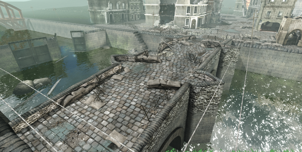
This project is basically the last sceene in the film Saving private Ryan where soldiers have to defend the bridge that crosses Neuville and Ramelle.
I didn't have any references except the film itself to recreate what I could with the footage. I also put some extras here and there to make it more appealing.
I'm open to add some static meshes to fill it even more and I will add some post process to it as well.
Thank you in advance for any critics
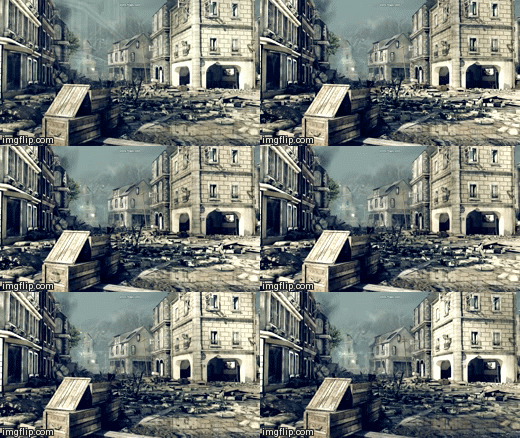 via Imgflip GIF Maker
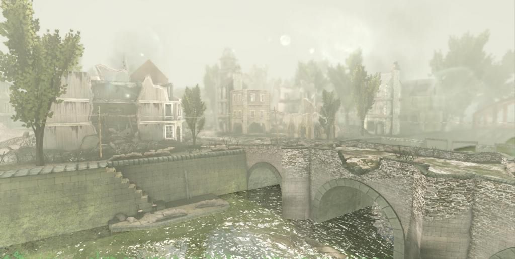
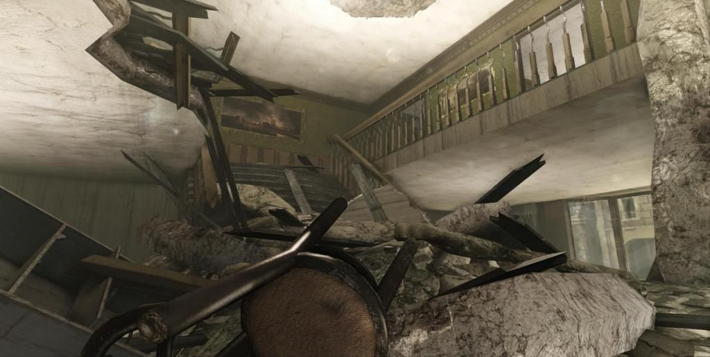
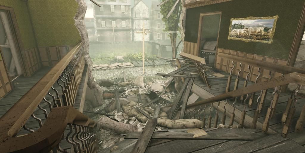
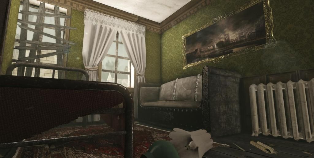
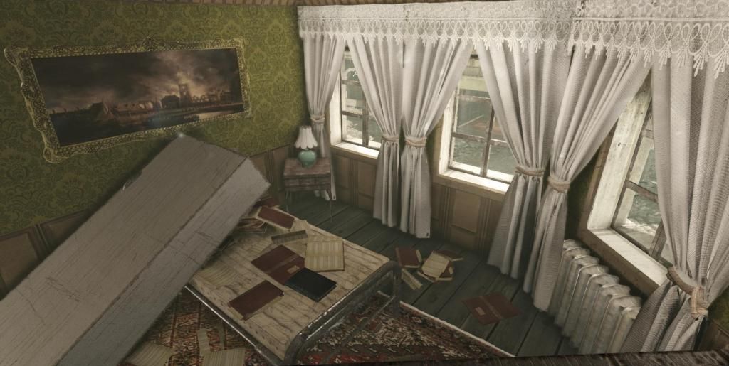
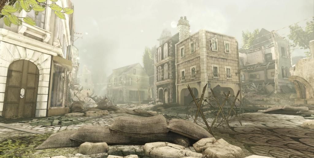
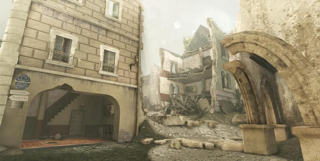
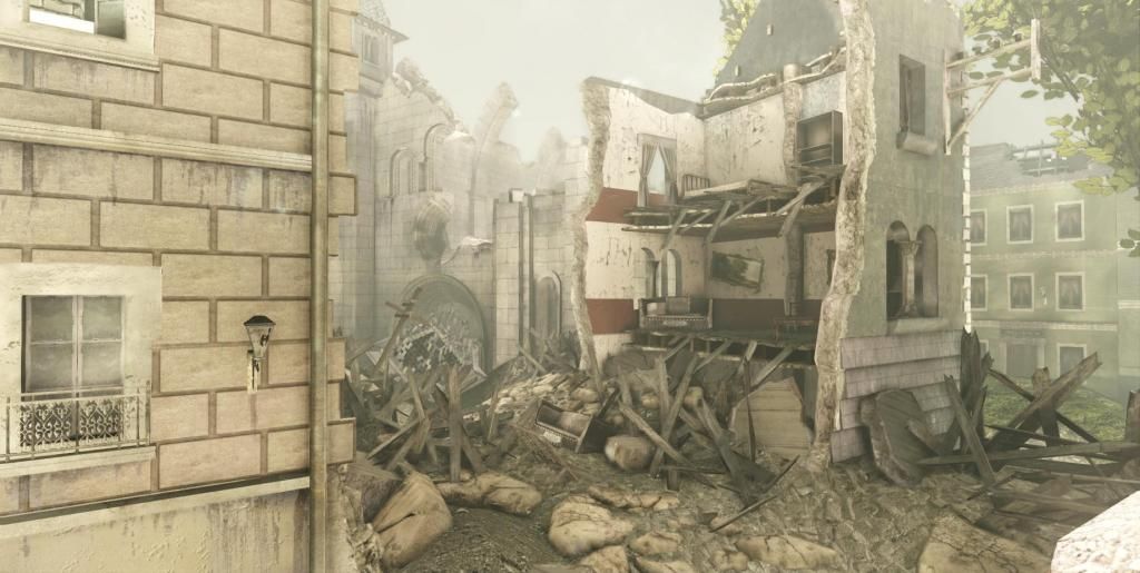
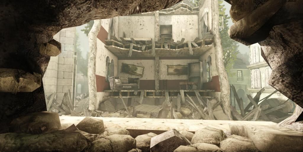
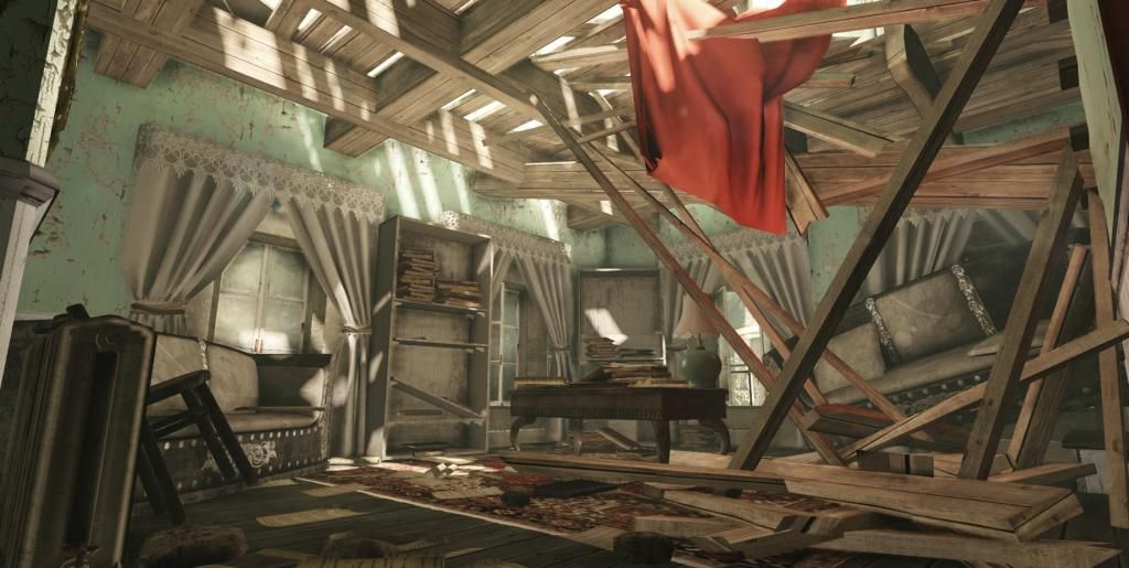
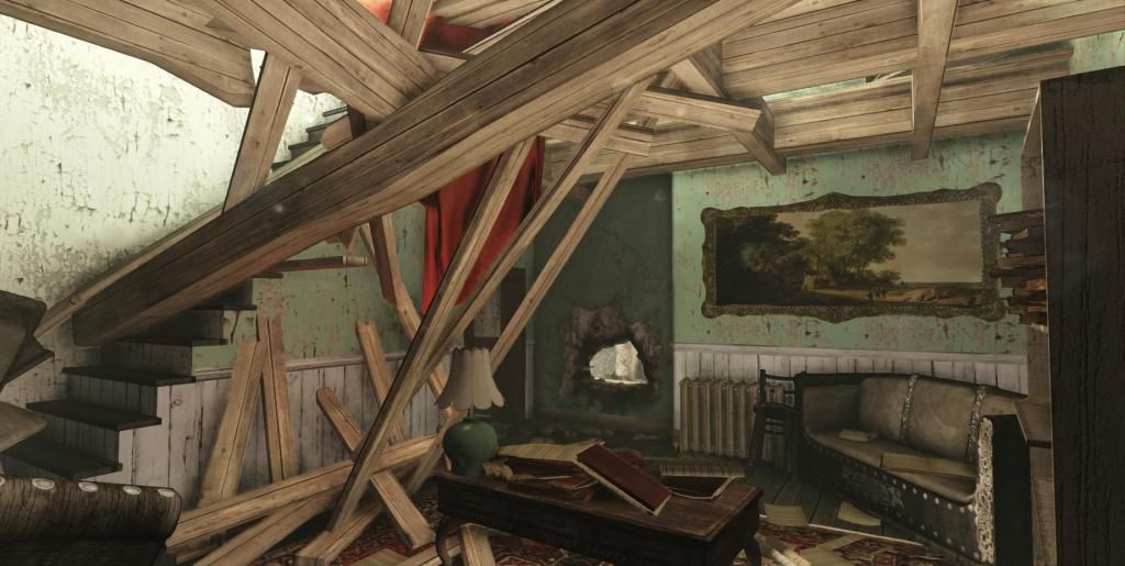
It is 95% percent done, considering your feedback, i will tweak stuff here and there before making a flythrough for my final shot.
This project is basically the last sceene in the film Saving private Ryan where soldiers have to defend the bridge that crosses Neuville and Ramelle.
I didn't have any references except the film itself to recreate what I could with the footage. I also put some extras here and there to make it more appealing.
I'm open to add some static meshes to fill it even more and I will add some post process to it as well.
Thank you in advance for any critics
Latest Update
 via Imgflip GIF Maker


Replies
I'm also down for the bicycle as well
Examine the following:
VS.
Above image from film:
There is a full range of values all the way from black to white, There is clear depth with concerns to distance. Your value range is very flat and lacks contrast. I understand the look your going for, but you could push it further and don't be scared to have areas that are not detailed/in shadow. You need those values to add interest and ground your objects.
Would greatly appreciate if you repost it sir. Thank you for the input though
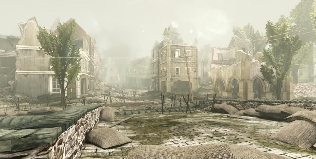
-less washed out
-bit more saturated
-shadows overhaul
I've also paved the whole ground with cobbleStone. A bit too much...maybe !?
I'm wondering if I sould stay with my last post before this one, instead of going with the third picture i'm posting now.
Let me know what you think. Thanks
I also agree about the cobblestone pattern.
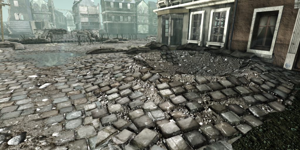
Firstly, the cobble stones look too new and are sticking out too much. They need to look worn like they have been there for hundreds of years and have some variation, I suggest using vertex painting. For UDK 3, Tor Frick made a free video tutorial showing now to do this at http://eat3d.com/free/vertex_painting , although I'm sure Unreal Engine 4 has more advanced features.
Secondly, I've noticed the decals for grunge have a sort of grey coating around them, making them stand out. I've had this issue before myself, however in the new Unreal Engine this may not be an issue.
Get rid of couple of meshes to redo the main road and its texture.
So what i've done so far on this update
-Making texture for the road
-Make use of verxtex painting for dirt, wet cobble as well as water puddle on the road.
-Road cratters
-change ligthing setup to match more with the film ( not defined yet )
-I did get rid of all my trees, so i'll make new ones in my next update.
Still Tons of stuff to do, so i'll keep you updated asap. Thanks for support