Shrike's portfolio and gamdesign blog (+Free stuff!)

interpolator
Hey guys
Now its finally my turn to get judged and flamed, so please enjoy doing so
I try giving honest feedback here on a regular basis, nobody is helped by saying "yea its great"
and while I genuinely enjoy doing so, I would still be very happy if you could do me the favor
and critique the living hell out of my page ; )
I am more of a game designer and the focus is on that part clearly,
but there is plenty of art stuff to see, and there are some (hopefully!)
interesting things to read for everyone that cares about making games.
There is free stuff for you guys to grab to make this more fun for everyone (maybe i take that down later, tell me)
A) Tiling camouflage texture pack for weapons or vehicles
Be so kind and fill out the form at the bottom of the homepage!
Please be really nitpicky guys, I want to hear every detail. And tell
me what to throw out, especially on the art page, im very biased towards that stuff. Im currently working full time++ on it and want it ready by tuesday, so I would really appreciate your input at the very moment ! ; )
To do:
Upload GDD document (having trouble with Word PDF export quality..)
Release most important article "Playertypes.."
Throw out all that is not up to level (Tell me!)
Rework formatting of articles
Upload CV + facebook Linkedin
Replies
Also, get to adding your email as quick as possible. I've seen people get more work from showing off portfolios here then in the 'looking for contract work' subforum.
and mainly rework the art page. But please tell me some things to cut
I edited the main post a bit to make things more clear
Took a second look at the design page and even tho I mostly figured it out, Its still pretty confusing. I'd sort out and name everything there. My main advice is still to switch it with the art page.
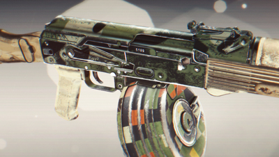
Oh and maybe possibly remove that ingame pic with the AK. Really doesn't look up to par compared to the other stuff.
Rest is good really, just needs some organizing and possibly more shots of the guns and similar assets.
e: just read this
I would make up my mind on the subject. Go for either one or the other. Ideally I'd have the blog/articles and portfolio on 2 different websites for fairly obvious reasons. Read the portfolio guidelines that are somewhere around here if you want a more in-depth explanation of it.
Im not happy about the blue text, but ill find a way
Please tell me what to cut and what you do not like guys!
To do: Formatting of articles + polish
To do: More and better descriptions and add missing stuff
To do: Check consistency and polish across the board