<Student> UE4 Castle Enviroment
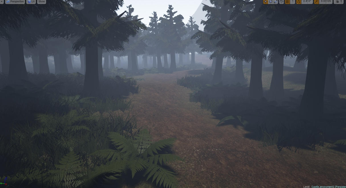
Working on a This environment for a Semester long project at school In UE4, Pretty much my first time making something like this and Its been heaps of fun so far. Its pretty much A long forest/ mountain path that leads towards a castle area,, ive really only touched the outdoor area so far but hopefully ill be able to start work on the castle sometime next week. Im very new to this so critique is welcome 
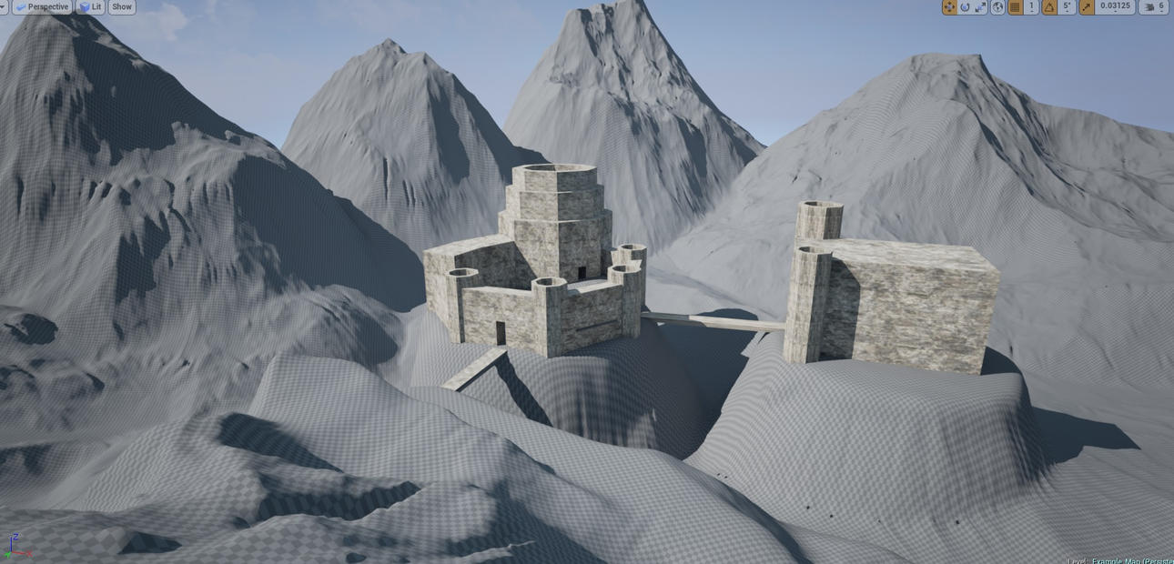
Basic blocking out of the castle
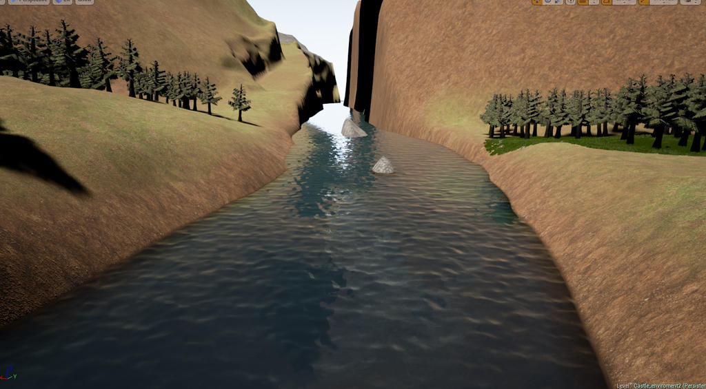
Managed to figure out to make some basic water here thanks to some tutorials I found online, id like to try some more advanced stuff with water hopefully if I have time
[vv]103493162[/vv]
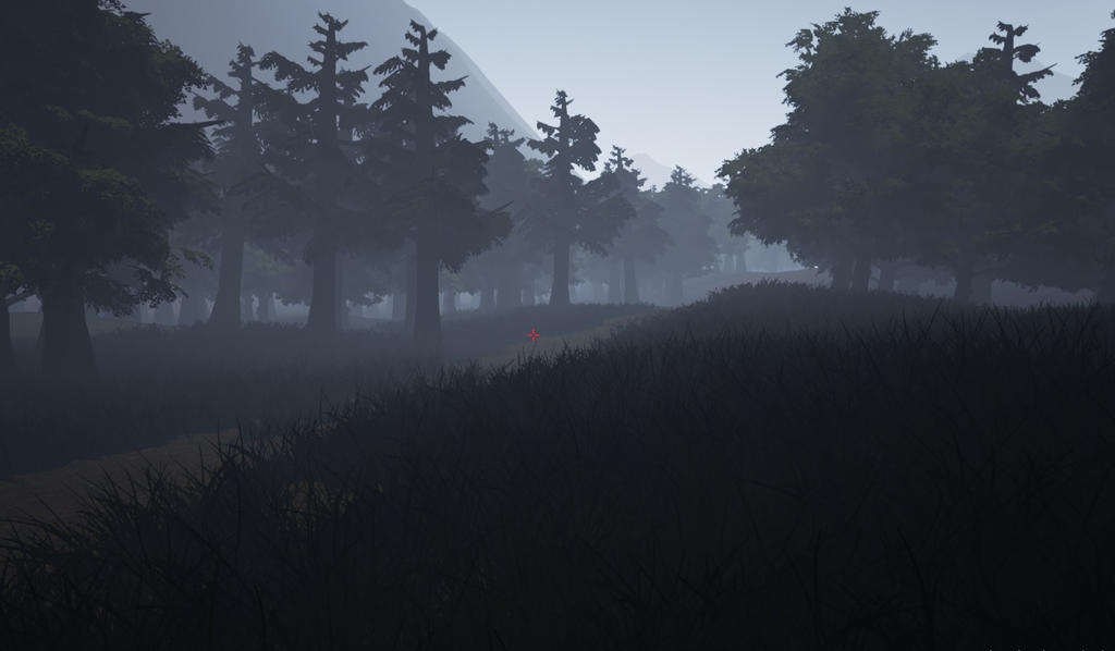
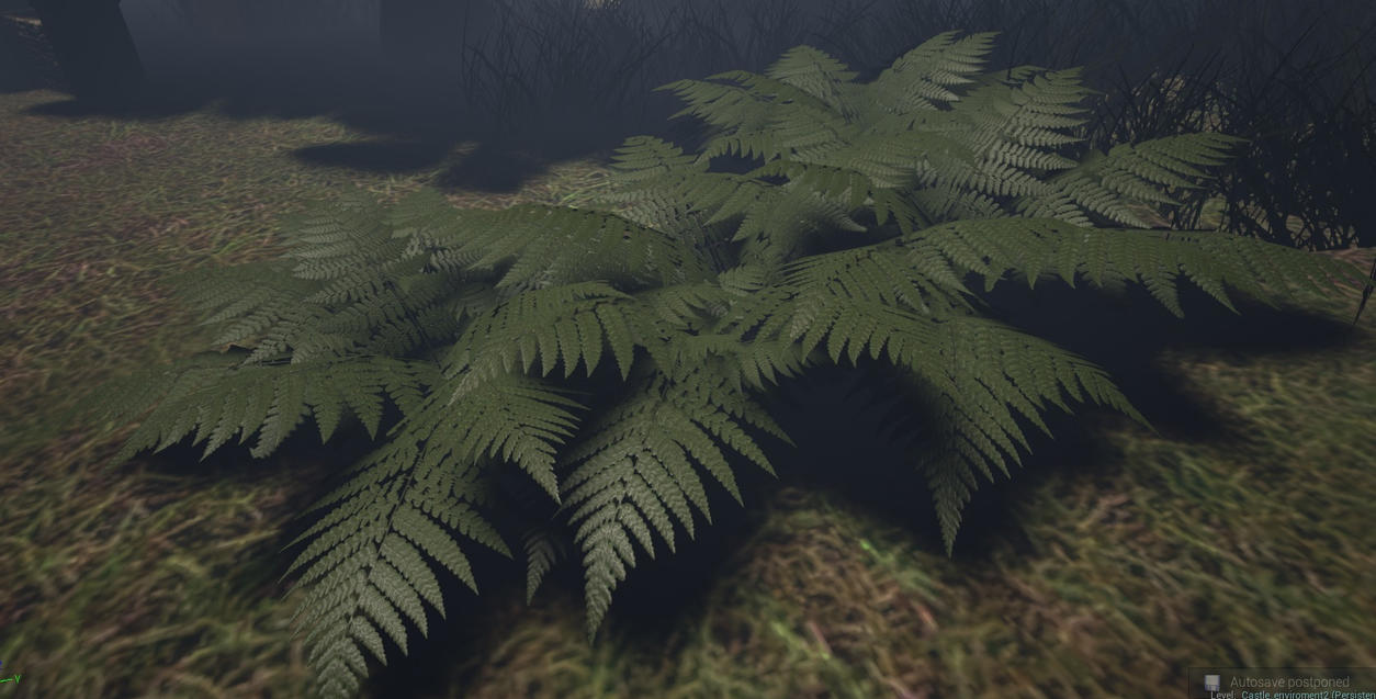
Working on getting some different kinds of foliage into the forest Not really happy with the grass or the trees so I will probably redo them a bit later on.
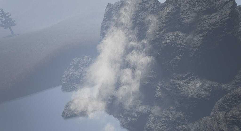
Decided to have a go at a waterfall today I dont know a lot about particle effects so its a bit of challenge still very much a work in progress https://www.youtube.com/watch?v=Ao0NcSZeY5A&list=UUJOQvS7i06-vQ5yxLGpIHPQ
Basic blocking out of the castle

Managed to figure out to make some basic water here thanks to some tutorials I found online, id like to try some more advanced stuff with water hopefully if I have time
[vv]103493162[/vv]


Working on getting some different kinds of foliage into the forest Not really happy with the grass or the trees so I will probably redo them a bit later on.

Decided to have a go at a waterfall today I dont know a lot about particle effects so its a bit of challenge still very much a work in progress https://www.youtube.com/watch?v=Ao0NcSZeY5A&list=UUJOQvS7i06-vQ5yxLGpIHPQ

Replies
Looking good, one critique would be on the trees. Don´t know what style you aiming for but would say that tree trunks are lot tinner then yours right now, especially the treetops. I always make a collage with reference when i making something, always helping me a lot.
Keep up the good work.
Good points on the trees I definitely going to have another go at them today, getting the proportions right has never been my strong suit ha
http://oldwiki.polycount.com/VertexNormal?highlight=%28\bCategoryEnvironmentFoliage\b%29
On the trees, I would spend some more time on the shape and variation. I noticed the trunk stays extremely thick all throughout its length, and the branches also stay very thick right to the end. They also feel very mobile-esque, being very uniform and game-ey.
Though it was for Cry, this thread http://www.polycount.com/forum/showthread.php?t=72008 was a good example of very well made, relatively low res trees. He also shows them in Maya to give you an idea how they were made.
This thread http://www.polycount.com/forum/showthread.php?t=92263 is a great thread showing someone's progress and workflow on making their pine trees, from meh looking to great looking. Would be worth a look.
The shape of the mesh for your ferns is good, but you need much more variance and work put into the fern leaf textures themselves. Add some dead spots on the leaf, colour variation, and shape variation. Because of the shape of ferns, you can usually fit 2 of them on one 512x512 texture and still get away with some decent quality.
To break up the ground, I would also suggest adding multiple types of grass/plant/flower cards to give it a much more realistic feel.
Very curious to see how this ends up, though. The scope is large, so make sure you spend your time wisely on things that are going to be close to the camera when you do your shots!
I haven't tried his technique yet but this thread seems to have some good solutions for nice grass in UE4.
[vv]105629889[/vv]
p.s : The blacksmith floor tiles are too obvious imo.
You should definitly do something to hide or break up the harsh material change from grass to stone at the forge and stables. It looks quite unnatural and stands out a lot.
p.s : yea im doing this all by myself
Decided to turn this area into more of a courtyard area building an archery range type thing in the middle
The very bright skylooks very strage compared to the dark lit castle. The castleis lit like nighttimte but the sky indicates daytime. A cool blue moonlight could work well together with the light from the fires.
Also the texture on the wall in the middle an the stairs indicate that they are made from one giant solid rock instead of bricks which seams a bit unrealistic.