Zbrush - Feedback for body and clothing
Hello everyone,
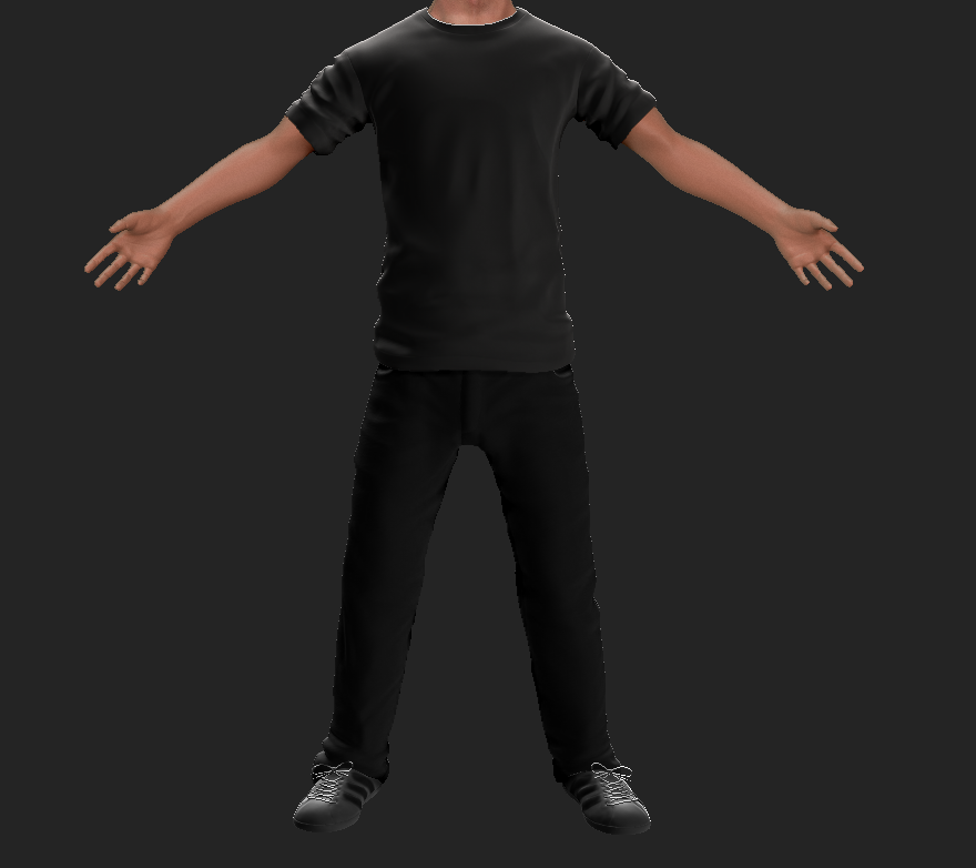
I am currently sculpting a character for a video-game. It's my first time sculpting a person, so I need some help. I am fairly happy with the head but now i'm onto the body and clothing.
Here's a screenshot:

There is obviously something off-putting about the sculpt. I don't know whether it's the form or the lack of detail? I hope someone can give me some good feedback on what I can improve on.
Thanks!
I am currently sculpting a character for a video-game. It's my first time sculpting a person, so I need some help. I am fairly happy with the head but now i'm onto the body and clothing.
Here's a screenshot:

There is obviously something off-putting about the sculpt. I don't know whether it's the form or the lack of detail? I hope someone can give me some good feedback on what I can improve on.
Thanks!
Replies
By the way: I know some things looks god damn awful but I just want to get a "picture" of how the end result might look like. For example the polypaint on the shoes haha! Going to fix things like that after I've gotten the proportions right.
And since the 2.5 perspective is warping the picture quite a lot it's even harder to get the form right
Anyway, thanks everyone for helping out!
Keep pushing it!
Thanks for the feedback! I'm just gonna fail enough times so that I'm bound to get it right
Your head is reading like the mask from Drive.
Mainly its the size of the cranium and it seems like the features of the face are scaled in, Like I said play about with it, Look at lots of reference.
Keep going!
Edit: There's an equal chance that the perspective is correct now, but wasn't before. Kinda hard to tell.
I will definitely look into the proportions and the folds more.
Here is an screenshot of the decimated and lowest subdivision sculpt in 3DS MAX:
(I had to sacrifice his right arm, but that's OK for now)
Once again, thanks for all the help! Quite surprised how everyone's awesome here at Polycount