Steampunk Time Device - First PBR attempt (WIP)
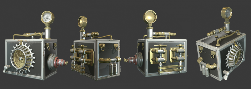
heys guys im a student and im starting school again and decided to get back into 3d with a prop. I usually texture in UDK but i decided to try a trial of marmoset 2 and try to texture for PBR. Wanted to do something small and focus more on texturing. Its really frustrating at this point, and im lacking the realism that i am aiming for.
Any feedback or critique would be greatly appreciated, i want this to be my first portolio peice for me so im looking to do my best on this. I need help on how to make the textures more realistic in pbr. Thanks for reading.
Work in progress, this is what i have so far
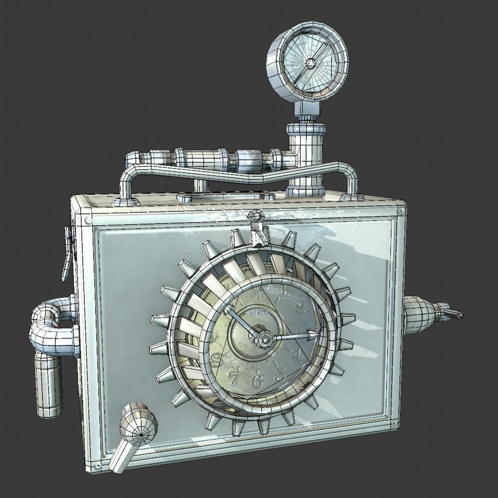
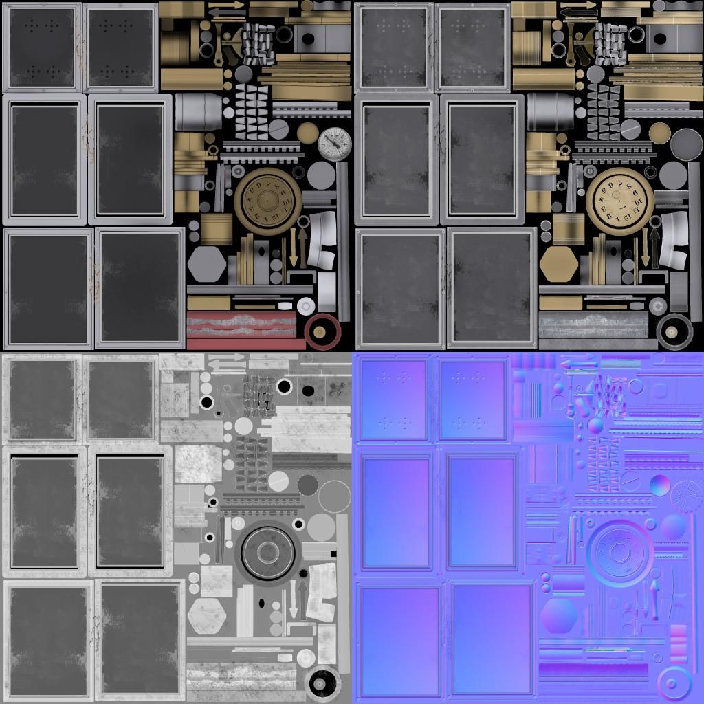
Reference image im working from
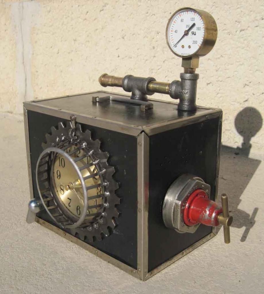
Any feedback or critique would be greatly appreciated, i want this to be my first portolio peice for me so im looking to do my best on this. I need help on how to make the textures more realistic in pbr. Thanks for reading.
Work in progress, this is what i have so far


Reference image im working from

Replies
The main thing I would change in your current texture is darkening the metals in Albedo, and let the specular take care of those parts.
You can also remove occlusion from your textures and apply it on the occlusion slot in toolbag.
Also, if you're relatively new to texturing (and even if you're not anyways) you might want to check the metalness workflow, it might feel easier depending on you're personal preference (see the reflectivity section of the pbr-practice tutorial linked above).
Metal in the full color spec workflow should be black on your albedo, with all of the color coming from the specular input (it looks like colored plastic currently). You should, however, keep the color on your albedo if you use Metalness instead.
Additionally, I think the numbers on your spec map should have a dark-grey spec value, not black, maybe a higher glossiness/lower roughness.
There shouldn't ever be AO on your spec; think about it. Something isn't less reflective just because it's close to something else! PBR is all about being physically accurate, so don't go out of your way to not be.
Do some reading up on PBR.
http://www.polycount.com/forum/showthread.php?t=136390
Also and additionally; tick local reflections on in the Render tab, it looks funky without. Honestly, I'd make it a little less glossy on the box, too. Looking better, though!
Wanted to do a better render, added some travel stickers and some damage marks on the box. Also tried to add slight noise on normal map for some metal parts to make material more defined. Also tweaked gloss map.
But This is a telltale sign that your textures are at fault, not the preset HDRi's. They're not all going to make the thing look great, sure, but it should look "right" under most circumstances if it's physically accurate.
What are your maps looking like now?