Home 3D Art Showcase & Critiques

The Annex - Boxing Club - Unreal Engine 4

Hi Everyone!

I'm new here so this is my first proper post!

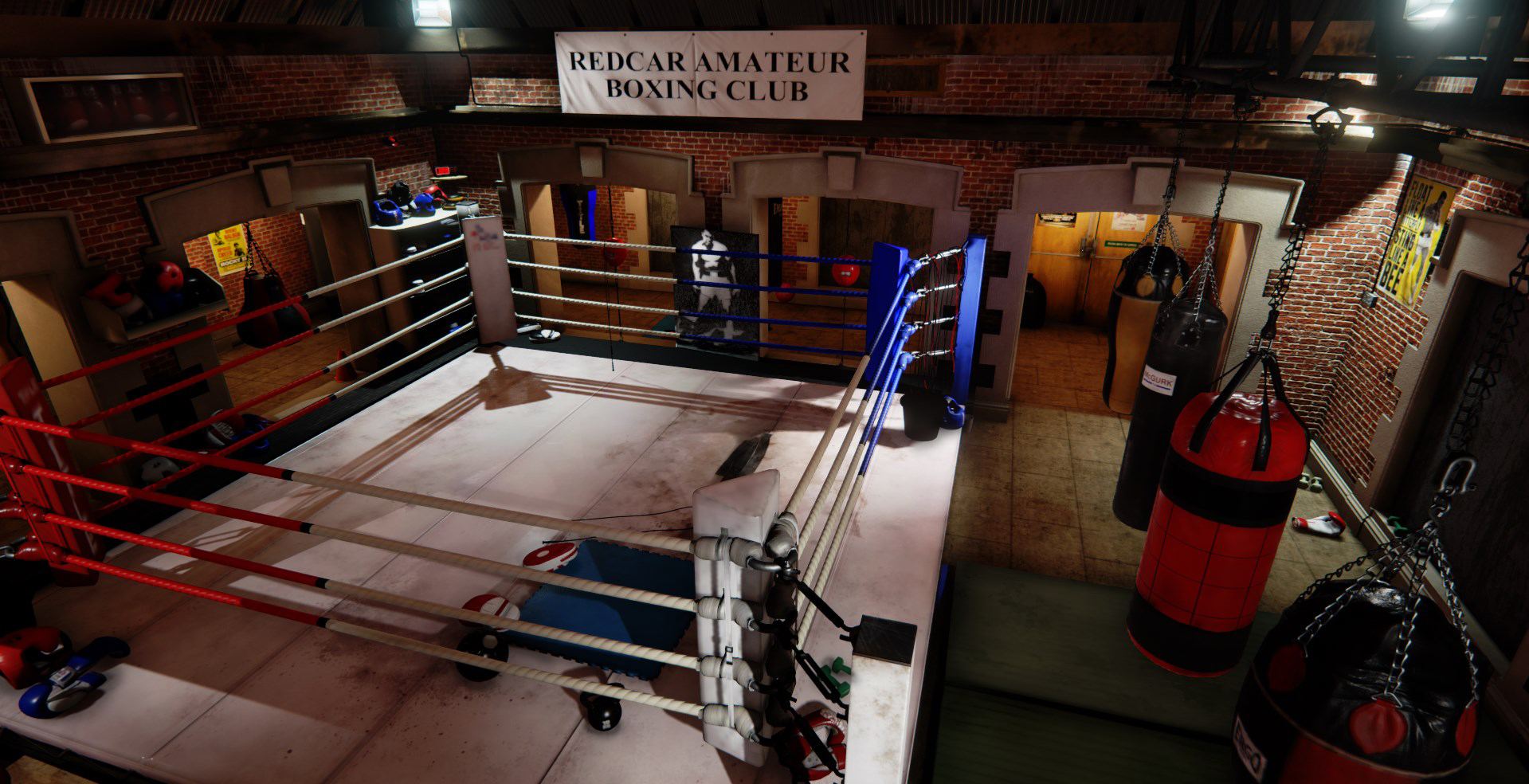
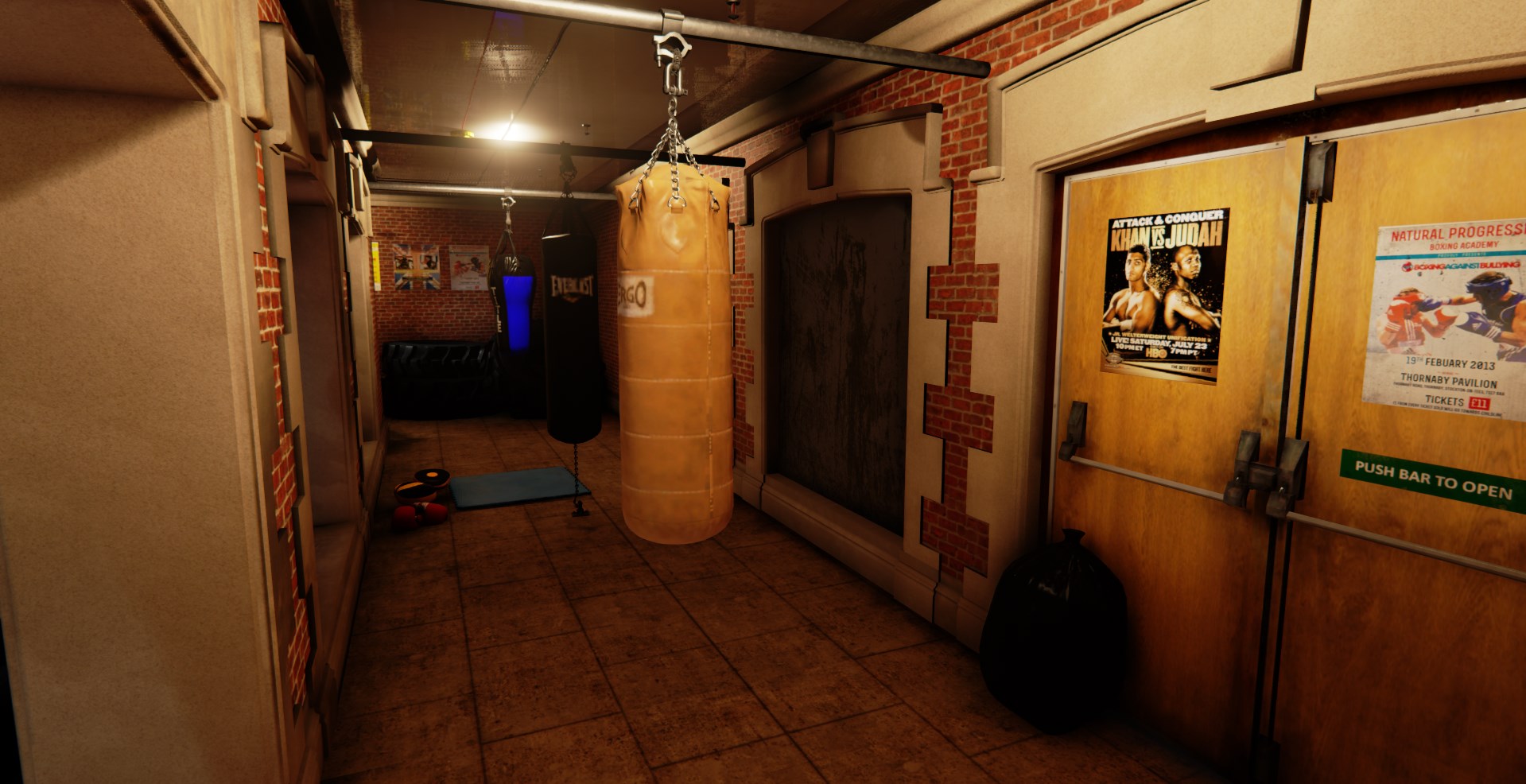
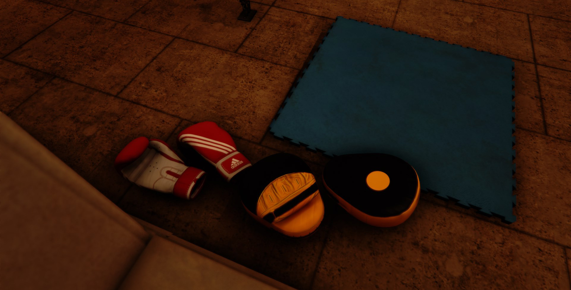
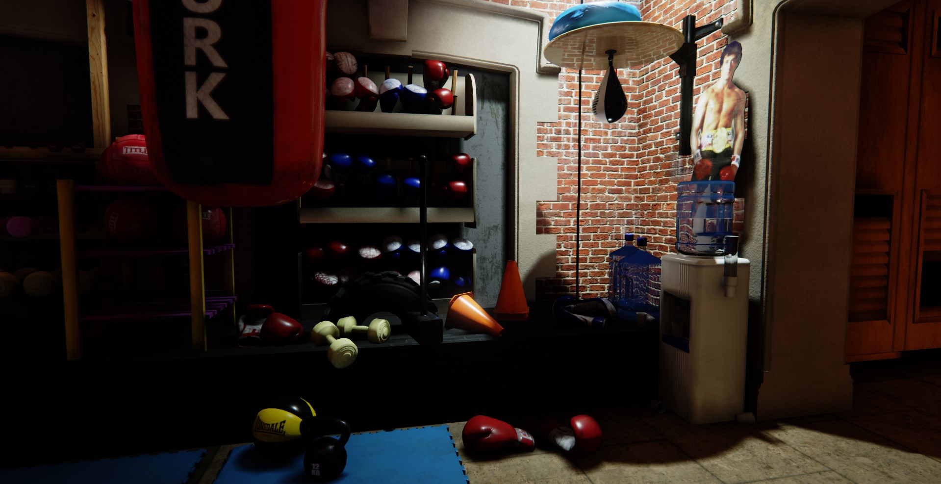
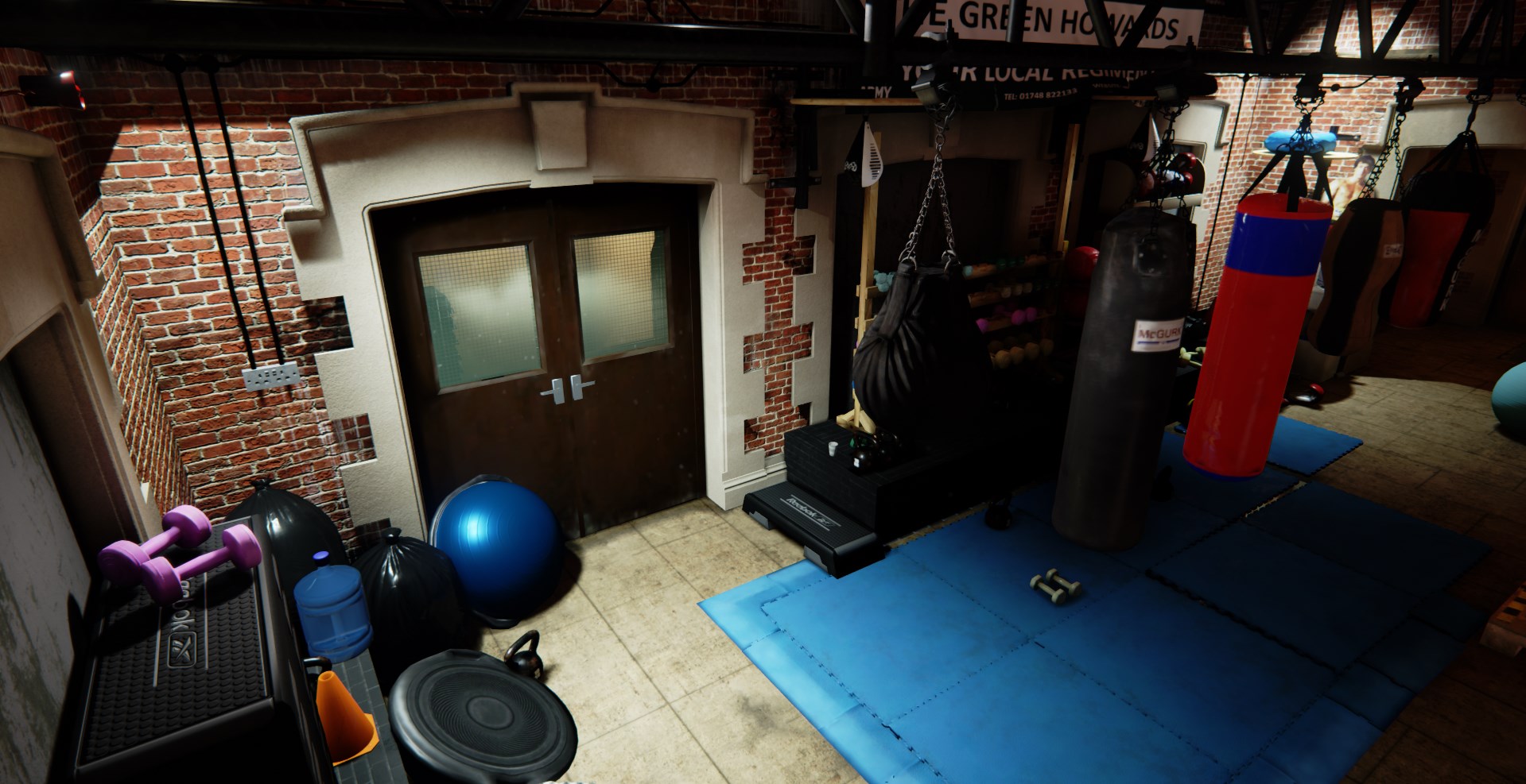
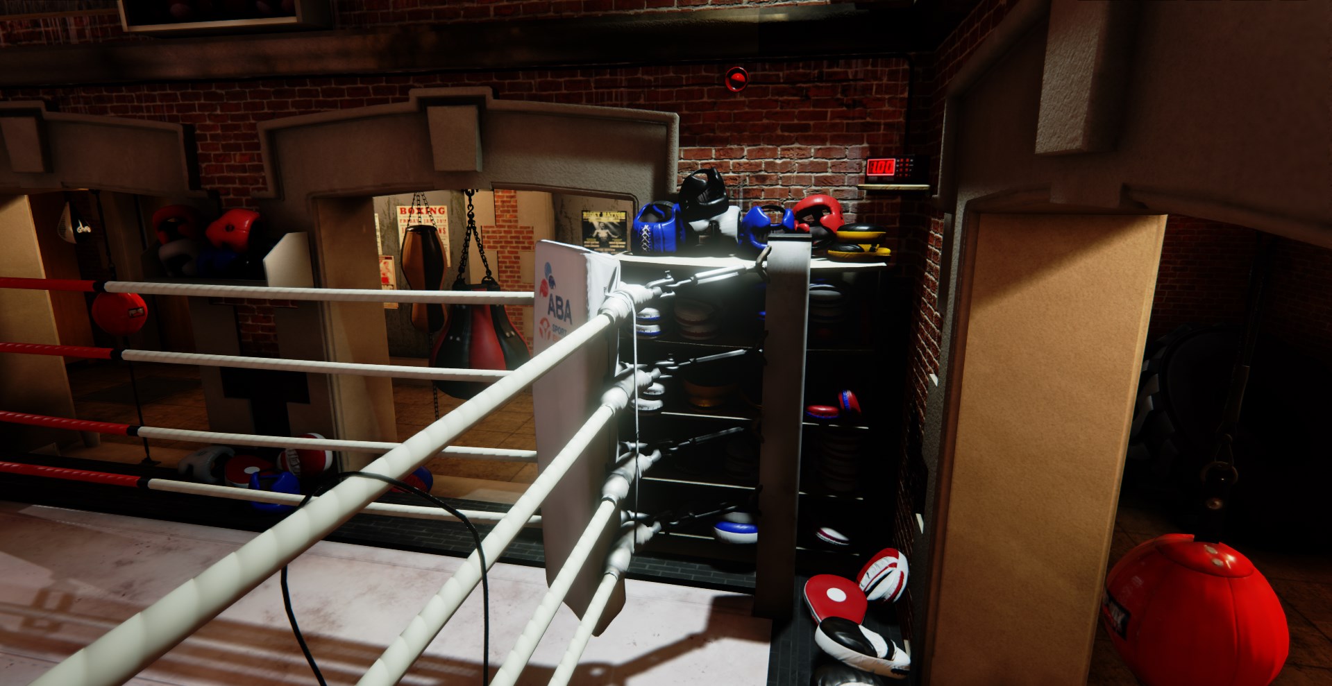
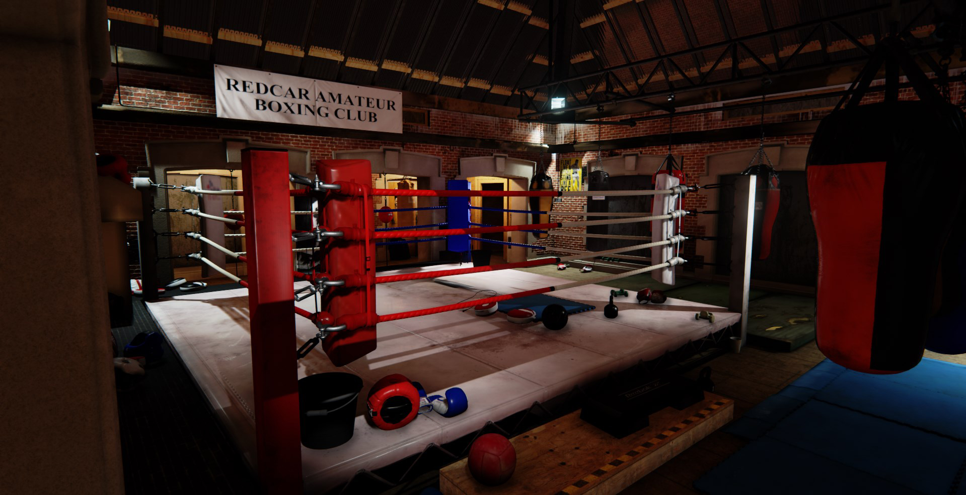
If you could take a look at the boxing club I'm making in UE4 and feedback, I'd be really grateful! It's for my portfolio while I'm looking for work.

There is a fly though on YouTube here http://youtu.be/AL1JCegnVIw

Thanks!!
Screenshot_7.jpg

Screenshot_41.jpg

Screenshot_14.jpg

Screenshot_13.jpg

Screenshot_10.jpg

Screenshot_21.jpg

Screenshot_161.jpg

Screenshot_6.jpg

Replies

  • JamesArk
    Offline / Send Message
    JamesArk polycounter lvl 10
    Tremendous material definition. Great work :thumbup:
  • Atokal
    Offline / Send Message
    Atokal polygon
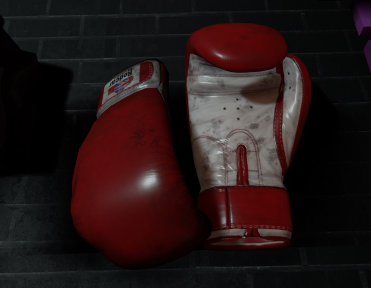
    Nice looking gloves, gonna save some of these shots.
  • oxblood
    Offline / Send Message
    oxblood polycounter lvl 9
    aahhh this feels like home. I cant wait to get back in the gym . Great work!
  • Soldier63
    Wow, this is mindblowing, like OMG there is really good work in here!!! :)
    How long had you worked on this project?
  • CatDixon
    Soldier63 wrote: »
    Wow, this is mindblowing, like OMG there is really good work in here!!! :)
    How long had you worked on this project?

    Hi :) Thanks so much! About 2 months on and off, I've got a few projects on the go so hopefully I can get some more things on here soon!
  • Shrike
    Offline / Send Message
    Shrike interpolator
    Looking good, like a scene out of a movie, or how you would imagine such
    a gym, but its missing focus a bit. I dont know where to look
    aside on the first pic, (text is 3x stronger than any other visual medium)
    Try leading the eye with
    the usage of color, you have so many opportunities with all this colored stuff and it will surely look very nice.

    Some things look like they are too saturated to be real, like that one boxing sack with red and blue colors

    Ambient occlusion is way over the top, making many spots look very dated. You probably have too strong baked AO and too strong SSAO / HBAO on top of it, making it look very unreal (badum tzz)

    That shot with the gloves on the ground shows this a lot. (also its not well lit, its super diffuse, no spec but i guess you just show us the mesh thats fine)
    Just look at real life AO in your room or so.

    aoo.png

    That guy doing that on the left with his arch-viz offline render is using too much AO, you can clearly tell on the
    ceiling, but it can be an artistic choice using more to make it a bit stilized.

    Unless the story behind the gym is that a world of darkness is trying to emerge from the very boundaries of reality,
    then i would say its soo much ; )
  • CatDixon
    Shrike wrote: »
    Looking good, like a scene out of a movie, or how you would imagine such
    a gym, but its missing focus a bit. I dont know where to look
    aside on the first pic, (text is 3x stronger than any other visual medium)
    Try leading the eye with
    the usage of color, you have so many opportunities with all this colored stuff and it will surely look very nice.

    Some things look like they are too saturated to be real, like that one boxing sack with red and blue colors

    Ambient occlusion is way over the top, making many spots look very dated. You probably have too strong baked AO and too strong SSAO / HBAO on top of it, making it look very unreal (badum tzz)

    That shot with the gloves on the ground shows this a lot. (also its not well lit, its super diffuse, no spec but i guess you just show us the mesh thats fine)
    Just look at real life AO in your room or so.

    aoo.png

    That guy doing that on the left with his arch-viz offline render is using too much AO, you can clearly tell on the
    ceiling, but it can be an artistic choice using more to make it a bit stilized.

    Unless the story behind the gym is that a world of darkness is trying to emerge from the very boundaries of reality,
    then i would say its soo much ; )

    Hi Shrike,

    Thanks so much for taking the time to look at my work and for such a detailed response.

    The brighter bags were intended to be new clean additions to the gym, however now that you mention the saturation, all I can see is the Red/Blue bag in particular, and the Blue/Black in the background of the corridor. So I'll make sure to improve these.

    Although I was going for a dirty feel in the corridor, I definitely wasn't intending a supernatural feel! While I wanted the scene to feel grounded, I'd agree (especially looking at your comparison) I've been somewhat heavy handed with the AO and contrast. The lack of secularity isn't really doing me any favours, Ill look at re-lighting and additional post process volumes in the corridors too.

    Thanks again, your comments have been really constructive. I'll look forward to posting the improvements :)
  • Gazu
    Offline / Send Message
    Gazu polycounter lvl 12
    Man i would love to train in this Gym ;)
  • almighty_gir
    Offline / Send Message
    almighty_gir ngon master
    [ame="http://www.youtube.com/watch?v=syhb3z4pTFQ"]Best Boxing Trainer Ever : Eric Kelly's Training 101 - YouTube[/ame]

    this came to mind quite quickly :D (i know they're not the same place).
  • oxblood
    Offline / Send Message
    oxblood polycounter lvl 9
    also you could add dirt to the walls, they look to clean so you could grunge them up a bit to make things a little more interesting.
  • pixelpatron
    Offline / Send Message
    pixelpatron polycounter
    compositions seem so cramped, a boxer would have no room to use those punching bags in that hallway....at full arms length wouldn't he/she backed up against the wall? I'd space things out a bit more, and work on your composition/negative space.
  • CatDixon
    compositions seem so cramped, a boxer would have no room to use those punching bags in that hallway....at full arms length wouldn't he/she backed up against the wall? I'd space things out a bit more, and work on your composition/negative space.


    Hi pixelpatron, thanks for taking the time to feedback.

    I know what you are saying about it being cramped, but its was a deliberate choice. Its a space that wasn't ever intended to be used as a gym, so aspects of it are not ideal. Its kind of a "it'll have to do, we'll make it work" space. It's inspired by a real club and you're quite right you do get backed up against the wall circling at full length, but its fine for inside work :)

    I'm definitely tweaking things on the composition and lighting, and as you also suggested, I'll look more at the negative space to try to push the scene further.

    It would be great to get your feedback when I have them up.
  • CatDixon
    Hi There,

    Thanks again for everyone's feedback. I've updated the lighting and tweaked the compositions and colours.

    In the end I've had to move over to fully dynamic lighting, as the lightmaps were significantly contributing to the heavy handed AO I had initially. It also instantly fixed the issue I had with the loss of glossy highlights in the low light areas.

    I've got some different work I'll be posting next, but there's always room for improvement, so if you see anything that needs fixing and updating further feedback is very welcome.

    Thanks

    Cat


    Boxing_Annex13.jpg

    Boxing_Annex07.jpg

    Boxing_Annex14.jpg

    Boxing_Annex03.jpg

    Boxing_Annex08.jpg

    Boxing_Annex09.jpg

    Boxing_Annex05.jpg

    Boxing_Annex11.jpg
  • Shrike
    Offline / Send Message
    Shrike interpolator
    Hm it should be working with baked light tho, arent there any Settings ? If you go with fully dynamic make sure to increase ambient light, so your shadows are not just black and you get a bit of that Global Illumination look back.
  • CatDixon
    Yeah I thought so too, I spent a while trying to adjust the AO before I realized that it was still there when I turned it off completely. I upped the lightmap resolution on the floor tiles and walls, which did improve things a little as the dirty seam got progressively narrower. However in the end I upped it to the point where the maps were crazy big and it still made a really dirty seam that I couldn't live with.

    Cool Thanks, Ill have a look at the global illumination. I've been back and forth a lot! It was more to save my sanity in the end that I turned to dynamic! :(

    Some of the lighting work coming out of UE4 is astonishing, so I'm sure there must be a way to fix it.

    Thanks Again
  • Swarm22
    Offline / Send Message
    Swarm22 polycounter lvl 15
    It feels a little over crowded with stuff. My eyes are jotting all over the place trying to make sense of everything. I'm sure this is what these gyms probably look like but as a portfolio piece it's just kind of straining to look at. The individual pieces are top quality stuff though.
  • GrungyStudios
    Offline / Send Message
    GrungyStudios polycounter lvl 8
    Only critique i have is those blue puzzle-peice mats. Cut back the specular and gloss. Those mats in real life have little to no specular, like cardboard. Other then that this is a good piece.
    Swarm22 wrote: »
    It feels a little over crowded with stuff. My eyes are jotting all over the place trying to make sense of everything. I'm sure this is what these gyms probably look like but as a portfolio piece it's just kind of straining to look at. The individual pieces are top quality stuff though.

    I dont agree. It's just very detailed, as a gym would be in real life. Eyes jotting all over the place is a good thing in my opinion, gives more to look at and fascinate about. I do beleive there is a point were you can go 'too far' with detail, but i don't think this peice is one of them.

    Good job on this!
Sign In or Register to comment.