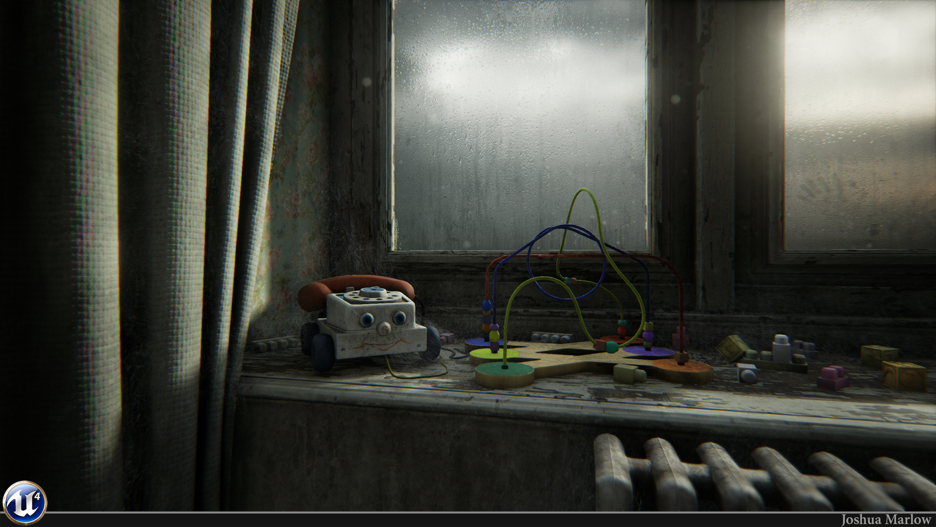
[UE4] - Lonely Toys
Hey guys. So instead of starting out ambitious like I usually do and not finishing something, I wanted to start out small and contained. I was inspired by a pic that one of my coworkers found online, so I decided to put my own spin on it and add some toys that my daughter doesn't play with anymore in there. Right now it's just this small corner, but I might expand this out into a bigger room 
UPDATE:

UPDATE:

Replies
I like it!
I'm curious about the glass too.
can you spill the sauce pls. :P
Jon W: The spiderwebs are just a spiderweb texture with opacity and a custom made mesh for it. Nothing special
Here is a breakdown for the window material.
Its just a simple Translucent material with my diffuse/opacity map controlling refraction as well. Refraction is very touchy, so be sure not to go crazy with it
Here is a pic of my textures. It a hacked job really. Ifound a good photo of some raindrops on a glass window, and masked out everything but the drops and a little bit around them. When overlaying on my diffuse, it made it look like drops with some condensation, so it was definitely a happy accident. I was going to make drops in max and render them out and all that, but this just saved a bunch of time. I made a normal map out of those in Knald and used the smudge tool in photohop on some of the drips to make them more like they were sliding down the window. Anyways, I hope this helps a little
http://i.ytimg.com/vi/dVjRg9owE38/maxresdefault.jpg
I'm a real fan of all your work.
locater16, Nintendo46, WarrenM - thanks guys!
urgaffel - thanks dude! Someone else pointed this out as well. I wonder if it's a bug with our high resolution screenshot function. I'll check when I get back to work. That's what I get for taking the shot at 12am hehe.
jamiemurphey - thanks for the kind words
felipealves, Bladers - np! I'm glad you guys like them and hopefully found something semi valuable
You sir, should definitly make videos, recording your breakdowns, cause i think this would help a lot of newbies out there, as me for instance!
So I went back and changed a bit of pp and added a few more cobwebs around. Here's a few more still of the scene too. I'll be working on fleshing this out into a full room now.
The curtain texture feels rather unfocused, and out-of-scale; unless they are rattan, the texture seems quite large and prominent. Their position seems rather odd - why are curtains at a 90-degree angle to the window? The white might be a bit much; almost all of the background is white. I know that white curtains are most common, but a light tan wouldn't be that unusual, and, going by the era of the toys, avocado or harvest gold wouldn't be unexpected. This would also let you play with selected sun fading, leaving the areas in the deep folds more brilliant.
The patterned wall-paper is nice, but I'm not certain it matches either a kid's play area or the era (I'm guessing 60s/70s from the toys).
The wear on the white wood, especially on the vertical portion, seems excessive and too uniform. The vertical portion - from a distance, at least, feels more like a poor white-washing rather than worn/faded paint. Remember that this is an indoor scene; the rain won't have been able to wash away the paint in job lots. I'd expect more bubbles & flakes than large, bare patches.
Some crayons and kid graffiti might work (another reason not to have expensive wallpaper).