Home 3D Art Showcase & Critiques

Sci-Fi Transport Station Environment

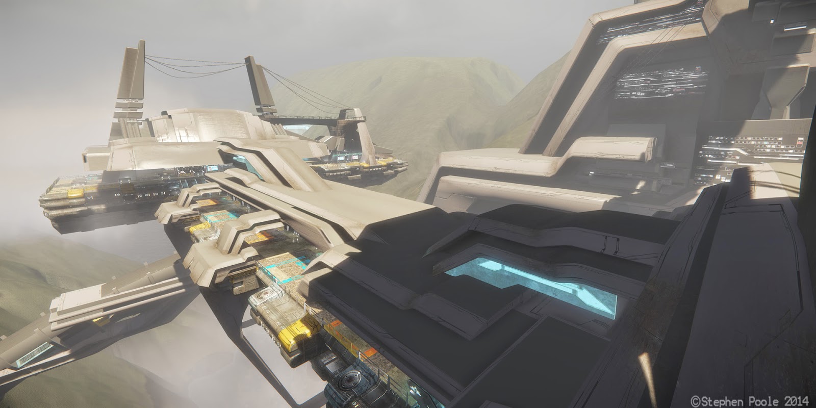
Hey guys, I wanted to post some shots of my environment in Cry-engine 3. I've been working in 3D for several years, but this is my first game environment. Let me know what you think. You can see some more shots at http://spoole3d.blogspot.com/
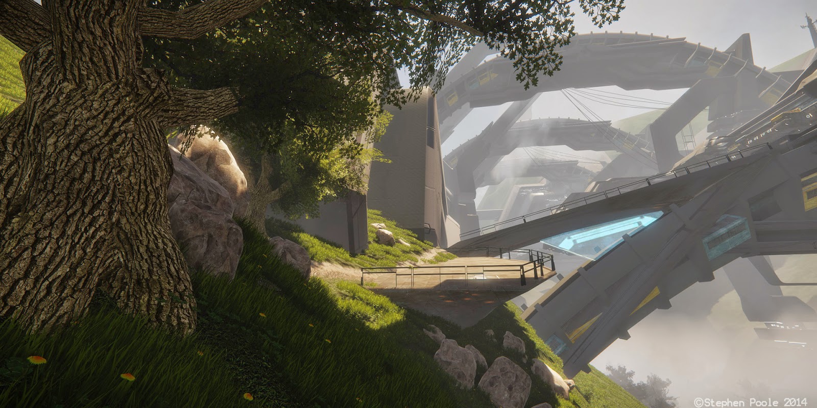
tree01_rev03.jpg
side_rev02+(2).jpg
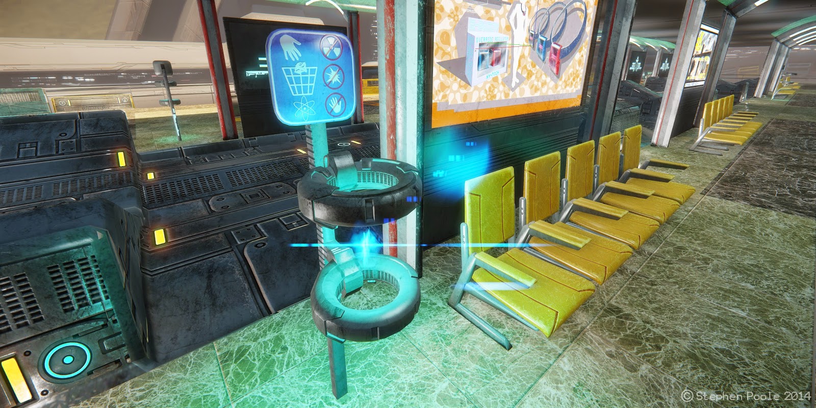
trash01.jpg
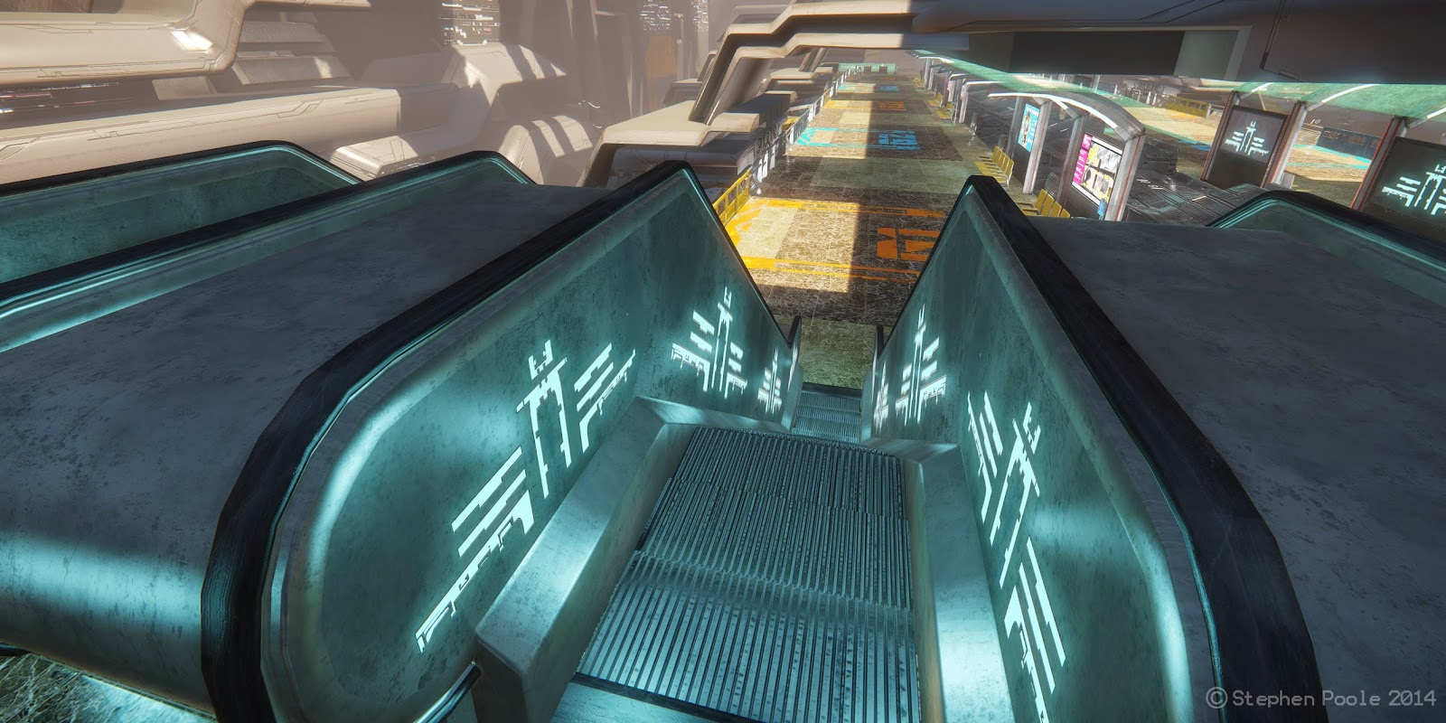
escalator02.jpgunit02a.jpg
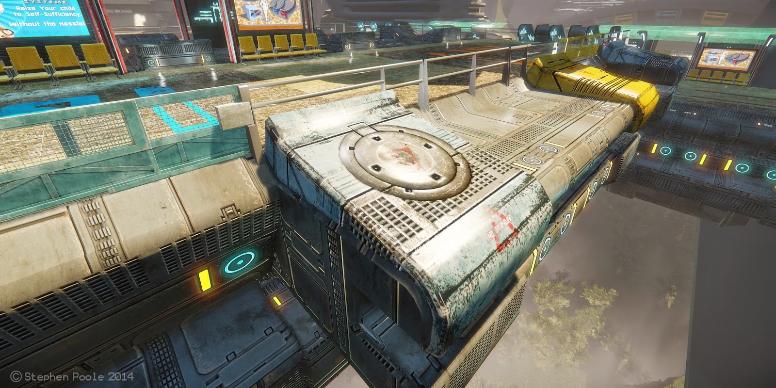
lowside_rev02.jpg
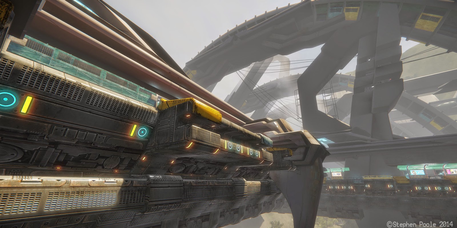
wide_rev02.jpg

Replies

  • beefaroni
    Offline / Send Message
    beefaroni sublime tool
    Oh nice dude I saw this on the FP forums.

    It looks real nice. I think the last touch would be to add some post to your screens. I think a little bit of editing (in or out of CryEngine) would bring everything together.
  • SPoole
    Thanks! It would be easy to sweeten them in PS. I'm fairly new to polycount. Is it not considered bad form, to do a round of post editing on environment shots, rather than having the true representation of what you did "in-engine"? I'd be happy to clone stamp all the crappy parts into oblivion, if it's within the bounds of gentlemanly behavior. I'll definitely go back and do some color correction, to get it looking closer to the way it looks in the engine.
    beefaroni wrote: »
    Oh nice dude I saw this on the FP forums.

    It looks real nice. I think the last touch would be to add some post to your screens. I think a little bit of editing (in or out of CryEngine) would bring everything together.
  • beefaroni
    Offline / Send Message
    beefaroni sublime tool
    SPoole wrote: »
    Thanks! It would be easy to sweeten them in PS. I'm fairly new to polycount. Is it not considered bad form, to do a round of post editing on environment shots, rather than having the true representation of what you did "in-engine"? I'd be happy to clone stamp all the crappy parts into oblivion, if it's within the bounds of gentlemanly behavior. I'll definitely go back and do some color correction, to get it looking closer to the way it looks in the engine.

    Oh, when I mentioned post, I should have specified. I'd love to see some post work in-engine. I duno why I wrote out either or..

    I know UE4 has a ton of options for lens flare amount, bloom, vingneting, noise, camera dust, etc all in engine. Did a quick search and here is what I found in CE.

    http://docs.cryengine.com/display/SDKDOC2/Advanced+Effects

    Anyways, hopefully some more people offer some critique. I read through your thread a bit on FP and you put in a lot of work in on this piece. Would be a shame not to receive more advice heading into your next project!
  • GOBEE
    Offline / Send Message
    GOBEE polycounter lvl 10
    heeeeey. Nice dude! I dig it.

    Two things I think will help.

    The tree? Contrast is pretty high. Try to tone it down a bit. It jumps off the screen as a distraction rather than complimenting your composition.

    And the marble floor? Way too noisy. I would kill it. Try something a little more simple. Smooth. Look at the floors 343/Bungie used in their Halo games.

    Keep at it.
  • SPoole
    beefaroni wrote: »
    Oh, when I mentioned post, I should have specified. I'd love to see some post work in-engine. I duno why I wrote out either or..

    I know UE4 has a ton of options for lens flare amount, bloom, vingneting, noise, camera dust, etc all in engine. Did a quick search and here is what I found in CE.

    http://docs.cryengine.com/display/SDKDOC2/Advanced+Effects

    Anyways, hopefully some more people offer some critique. I read through your thread a bit on FP and you put in a lot of work in on this piece. Would be a shame not to receive more advice heading into your next project!

    Got it. Thanks for the link. I need to get deeper into those aspects of the editor anyway. I've worked with the lens flare settings, but haven't touched some of the other stuff yet.
  • xChris
    Offline / Send Message
    xChris polycounter lvl 10
    Everything looks great dude! My only gripe is the seams on the tree. I really like that composition, but the tree's seams took my eyes away from appreciating it.
  • SPoole
    GOBEE wrote: »
    heeeeey. Nice dude! I dig it.

    Two things I think will help.

    The tree? Contrast is pretty high. Try to tone it down a bit. It jumps off the screen as a distraction rather than complimenting your composition.

    And the marble floor? Way too noisy. I would kill it. Try something a little more simple. Smooth. Look at the floors 343/Bungie used in their Halo games.

    Keep at it.

    Thanks! I see what you mean about the tree. The floor is a story element to me (along with the billboards and low-tech seating), relating it to train stations and airports of the past, due to it being a public installation, rather than a military installation, or vessel, like you might see in Halo. Those floors are pragmatic rather than decorative, or alien decorative, rather than human decorative. That said, you might be right. I like the way it looks in some shots better than others. I like it here for instance:
    seat01.jpg
    escalator04.jpg
  • SPoole
    xChris wrote: »
    Everything looks great dude! My only gripe is the seams on the tree. I really like that composition, but the tree's seams took my eyes away from appreciating it.

    Dammit! I was hoping you wouldn't notice.:) Thanks for kind words.
  • Johan26
    Offline / Send Message
    Johan26 polycounter lvl 8
    this is going to be huge
  • ScottHoneycutt
    Offline / Send Message
    ScottHoneycutt polycounter lvl 14
    Yeah looking very good. I'm not sure if the color scheme and overall visual look on the walkway areas are as unified as they could be, but maybe thats just my preference. My only other crit would be that it does have sort of a previous console quality to it rather than current console. I've never used Cry before so I would second the idea to further look into the editor features to improve the overall quality.
Sign In or Register to comment.