UE4 Sanada Shrine Diorama
So I've finally got my entry for the Slife of Life challenge wrapped up and tought I'd post it here too. No shame in the crosspost!
As usual there's a bunch of things I'm not really happy with or that I wish I had done in a different way but I was already starting to hate it, so...
Picture train incoming:
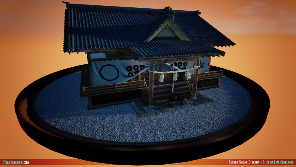
High-res screenshot: HERE
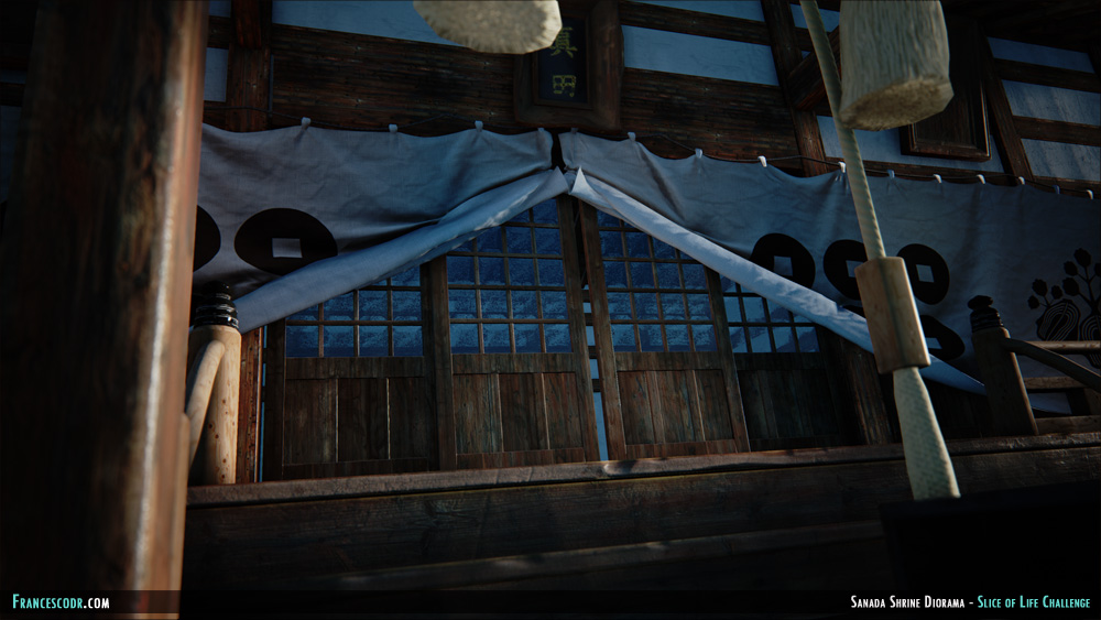
High-res screenshot: HERE
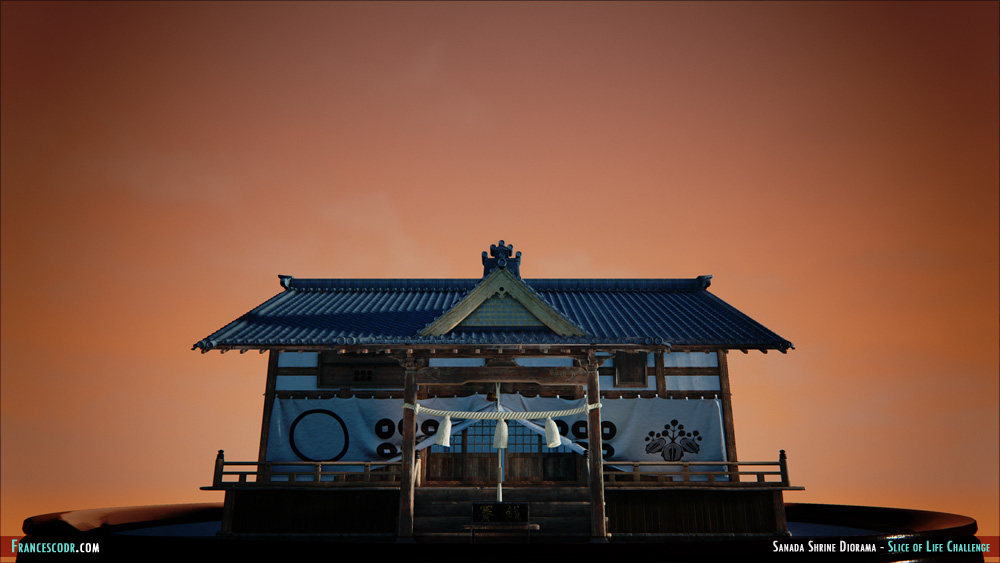
High-res screenshot: HERE
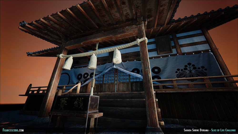
High-res screenshot: HERE
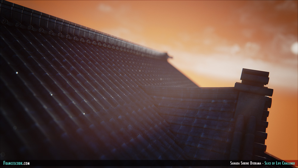
High-res screenshot: HERE
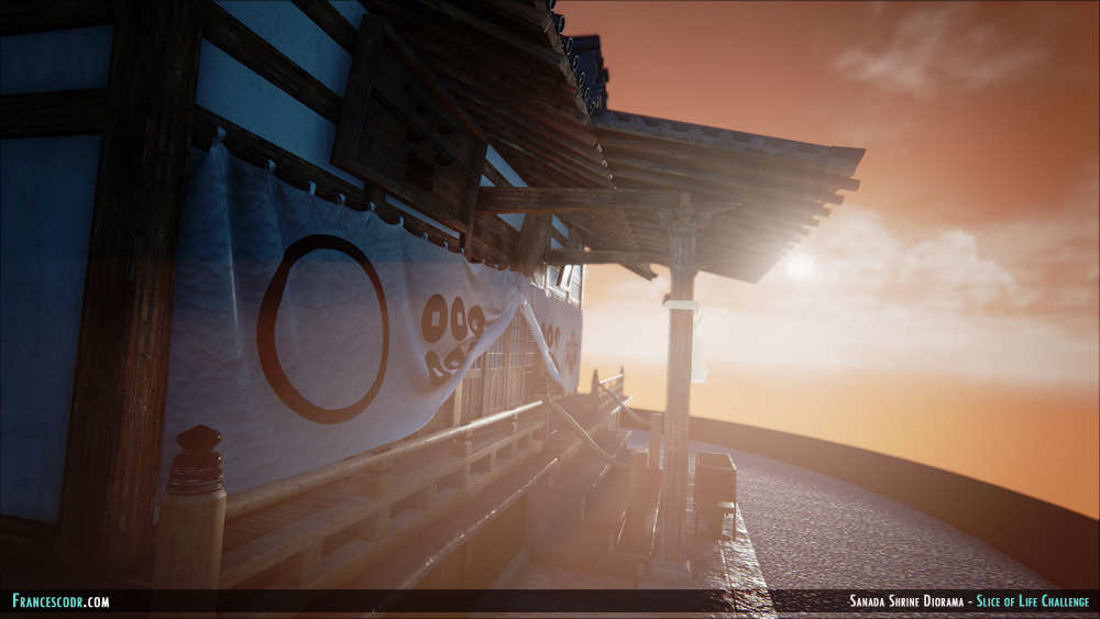
High-res screenshot: HERE
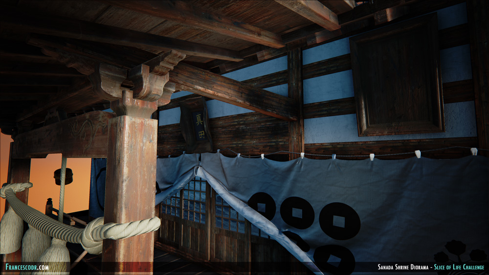
High-res screenshot: HERE
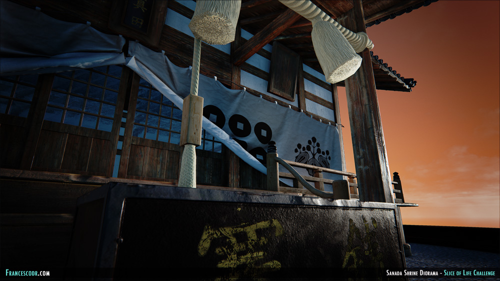
High-res screenshot: HERE
As usual there's a bunch of things I'm not really happy with or that I wish I had done in a different way but I was already starting to hate it, so...
Picture train incoming:

High-res screenshot: HERE

High-res screenshot: HERE

High-res screenshot: HERE

High-res screenshot: HERE

High-res screenshot: HERE

High-res screenshot: HERE

High-res screenshot: HERE

High-res screenshot: HERE
Replies
I don't think the tiled pebble diorama thing helps, more subtracts from the main asset itself.
The rope thing with some fabric bells thing hanging from it doesn't look up to par as the rest of the building. The bell shape things don't connect to the main rope and they lack fidelity (maybe could add some alpha planes with strands). The rope looks really thick too, very normal mappy, and its material definition is off, I'd play with your textures there.
I can't quite make out the window glass either, or is it some sort of paper, have you got reference?
Overall a lot of parts of this image are dark and its hard to make out what it is and its material definition. I think the orange sky is a bit too much.