UTMC Mining Facility
Ahgr…still can’t think of a good name for this thing xD.
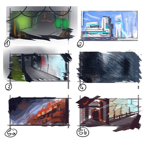
The first thumbnails I made where just for finding an idea.
1) A dark underground lab (with lots of liquids) or some kind of alien research basis.
2) A Sci-Fi rooftop scenery. Dropped this one because it came to close to the Unreal 4 Multiplayer Demo…
3) Some kind of destroyed shopping center. With lots of glowing signs and advertising to confuse the player… and probably get him killed. Jep…not such a good idea xD
4) The Rainy Slum City. I had some sketches lying around of a slum-city-island construction at the ocean. With rain and drama and so on. But I came to the conclusion that it wouldn’t fit the Unreal universe.
The 5th idea finally came close to what I wanted.
The Idea is a mining facility on a faraway planet. The facility is constructed from many parts. So that, wherever it’s needed you just transport the “facility building kit” and plug the different corridors and room parts together. Kind of like the containers on a construction side .
.
The design of the corridors and rooms should all be very simple to make it easy to navigate through them (at least the walls and the floor shouldn’t have to much detail). All the electronics and pipes should be on the ceiling, on the floor bars or on the outside of the building.
The facility can be build anywhere. Even under water. Still I wanted to set it up in a more “classic” setting (…yay mountains so classic… u.u).

The first thumbnails I made where just for finding an idea.
1) A dark underground lab (with lots of liquids) or some kind of alien research basis.
2) A Sci-Fi rooftop scenery. Dropped this one because it came to close to the Unreal 4 Multiplayer Demo…
3) Some kind of destroyed shopping center. With lots of glowing signs and advertising to confuse the player… and probably get him killed. Jep…not such a good idea xD
4) The Rainy Slum City. I had some sketches lying around of a slum-city-island construction at the ocean. With rain and drama and so on. But I came to the conclusion that it wouldn’t fit the Unreal universe.
The 5th idea finally came close to what I wanted.
The Idea is a mining facility on a faraway planet. The facility is constructed from many parts. So that, wherever it’s needed you just transport the “facility building kit” and plug the different corridors and room parts together. Kind of like the containers on a construction side
The design of the corridors and rooms should all be very simple to make it easy to navigate through them (at least the walls and the floor shouldn’t have to much detail). All the electronics and pipes should be on the ceiling, on the floor bars or on the outside of the building.
The facility can be build anywhere. Even under water. Still I wanted to set it up in a more “classic” setting (…yay mountains so classic… u.u).


Replies
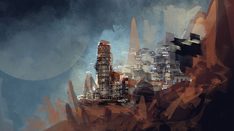
I changed the outside design of the facility quite a bit. Still not happy with it xD.
While working on the details I also threw a guy and an explosion (from wich he ran away) in there... but it looked just too stupid xD
Maybe I'll add a person in there again. It looks so empty ._.
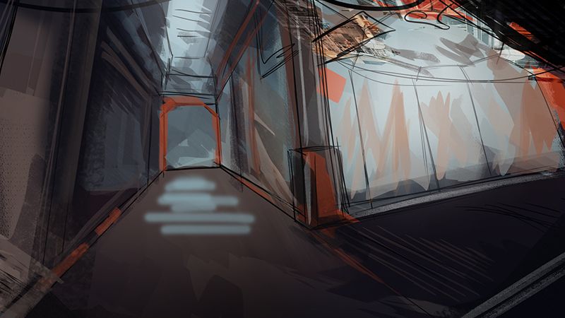
My only feedback I can give is that your ramp might look a little off on the way youve shaded and colored it, I first thought it was a wall with a reflection but looking back I can see it's a ramp. It could be as simple as making the ceiling darker again but right now it's playin with my brain.
Thanks
At least you saw, that it is a ramp xD a friend of mine did not.
I started to correct the perspective and make the left side of the image more readable.
I also darked a lot of the image o.o
And took a look at my first sketches:
Thats also why I tried to paint out all the round forms.
Worked a little bit more on this one and then dropped it.
Instead I started a new one with a more epic scenery.
But it's far from finished
just a fair warning here the perspective you set up in this shot is impossible. Your horizon line with all of the skybox stuff would either be MUCH higher or youd have to change the top surfaces of the boxes.
Here's your horizon line according to your architecture.
Here's your horizon line according to your landscape in the background.
Unless you're trying to say that the architecture mine is totally diagonaly slanted one of these has to change. You can't have radically different perspective horizons with architecture and landscape or it'll throw everything off. It's crunch time but don't trip over glaring mistakes.
If you can't change this in time for the contest, it's just something to think about in foresight
Since it was 2 am in my time zone I wanted to get some sleep and didn't flash out the 3rd image
But thanks for all your feedback so far
"Sorry about that! It has been reopened until August 5th @ 23:59 EST (GMT -4) (Roughly 16 hours from now.)"
So you can take this time to make final changes if you want to go for it