Sci Fi Hangar Bar - WIP
Hello all,
I am working on a sci-fi enviro for an upcoming game I am working on. Ive hit some walls with the design and was hoping for some feedback, suggestions and ideas. I'm posing a series of images that shows the progress over the last week or so. I'm kind of happy with the overall shape and look of the room, but now that I am roughing in colors I think its starting to look like a 1980's design rather than 2014 design. Any feedback, comments and suggestions are very much welcome.
On a technical note, I am using MayaLT for modeling, UV, baking etc while previewing with Marmoset as I am using PBR textures. The earlier non textured images were rendered in 3DS Max using shades of grey to preview the design.
My Color Pallet is as follows...
ff8a00, b3b3b3, 757575, ffc600, 008bae, 61bbd1, 333333
Thanks in advance.
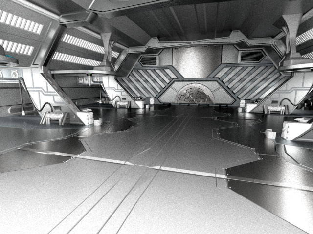
Image 1 - Overall Scene Design (Untextured)
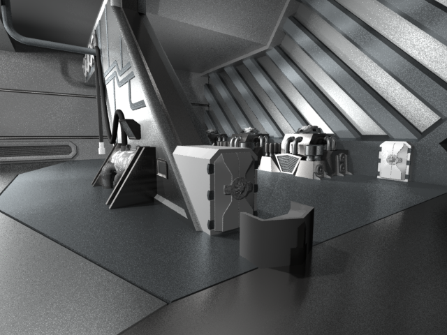
Closer View of Columns (Also Untextured)
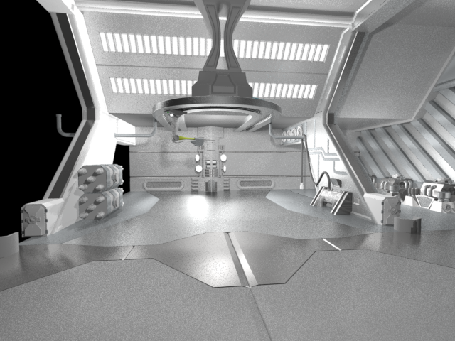
View of the "Launch Bay" (Untextured)
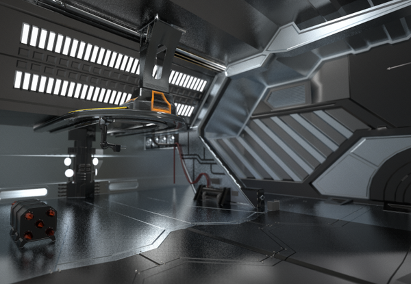
Some basic coloration of LowPoly in Marmoset using PBR
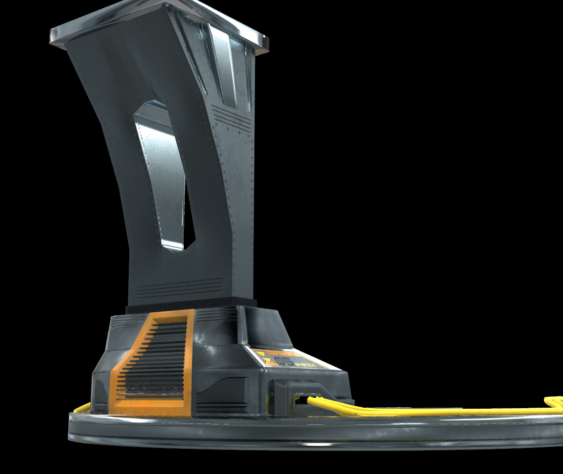
CloseUp of Overhead Element Normaled and Textured.
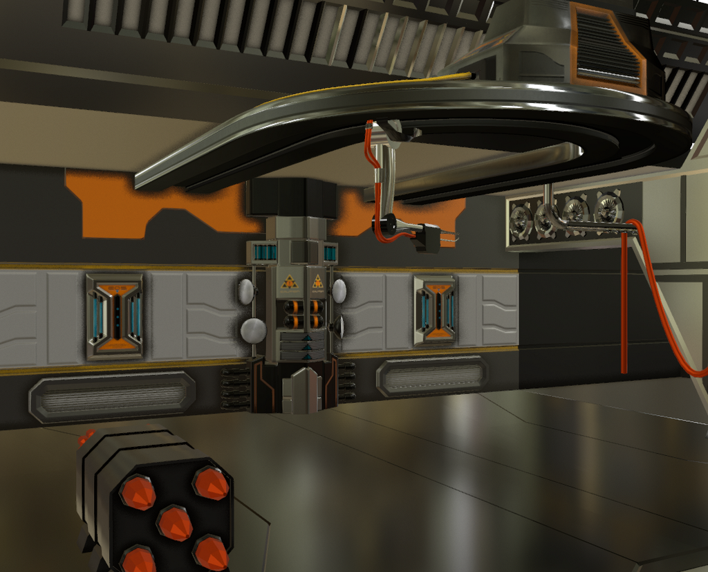
Working on the Back Wall (normal + Texture)
I am working on a sci-fi enviro for an upcoming game I am working on. Ive hit some walls with the design and was hoping for some feedback, suggestions and ideas. I'm posing a series of images that shows the progress over the last week or so. I'm kind of happy with the overall shape and look of the room, but now that I am roughing in colors I think its starting to look like a 1980's design rather than 2014 design. Any feedback, comments and suggestions are very much welcome.
On a technical note, I am using MayaLT for modeling, UV, baking etc while previewing with Marmoset as I am using PBR textures. The earlier non textured images were rendered in 3DS Max using shades of grey to preview the design.
My Color Pallet is as follows...
ff8a00, b3b3b3, 757575, ffc600, 008bae, 61bbd1, 333333
Thanks in advance.

Image 1 - Overall Scene Design (Untextured)

Closer View of Columns (Also Untextured)

View of the "Launch Bay" (Untextured)

Some basic coloration of LowPoly in Marmoset using PBR

CloseUp of Overhead Element Normaled and Textured.

Working on the Back Wall (normal + Texture)
Replies
But other say they see images, strange
These are the greyscale initial model images.
imgur.com
http://cubeupload.com/
Are great upload sites
Trying to be creative can be so tough! :poly105:
In my mind, I see lots of creams, browns and oranges.
I'd check out some sets from movies from late 70s and early 80s too, like Battlestar Galactica and Buck Rogers.
Google for sets from Blakes 7, late 70s to early 80s.
For an alternative point of view, check out the work of Chris Foss.
Also, I love this site: http://uzicopter.tumblr.com/
You'll probably increase your chances of people commenting and critiquing if you post higher res images that are not using the polycount attached thumbnails as we have to click through each one.
IE upload to imgur.com (it's fast and free), copy the direct link of the image, and paste in your post using "
That said, best of luck!
Ive been hammering away at this, so, ill post some pics tomorrow using your described method.
Thanks