[UE4] Feedback please :D
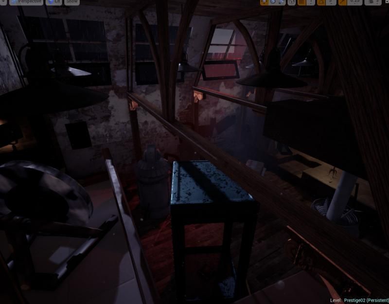
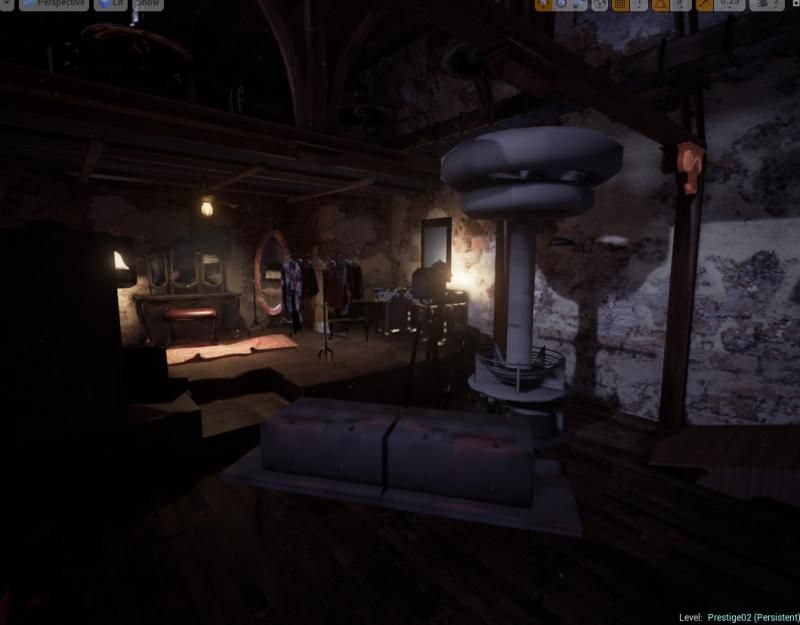
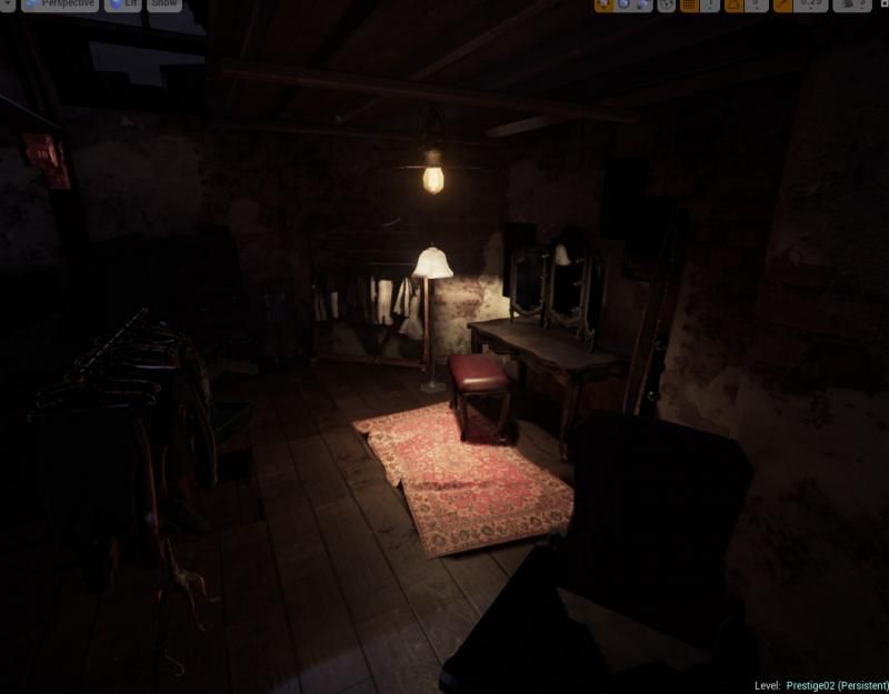
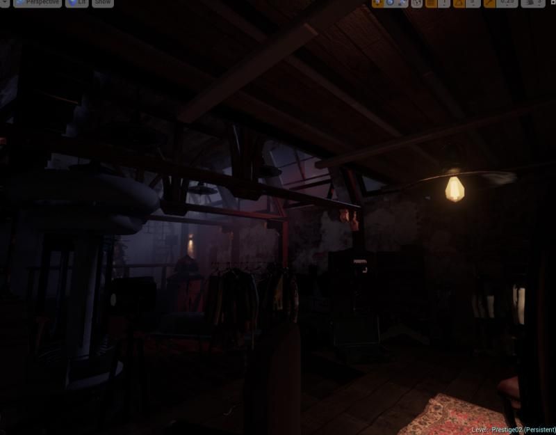
Hiya Polycount! Our class' UE4 mod project is nearing its end. Any suggestions and critiques would be great c:
[Edit]
It just occurred to me that we never actually shared the final product with you guys! Here's the video our class made, thanks for all the help!
http://vimeo.com/102967202
[/Edit]
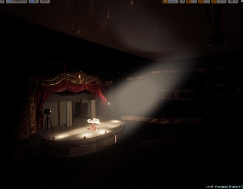
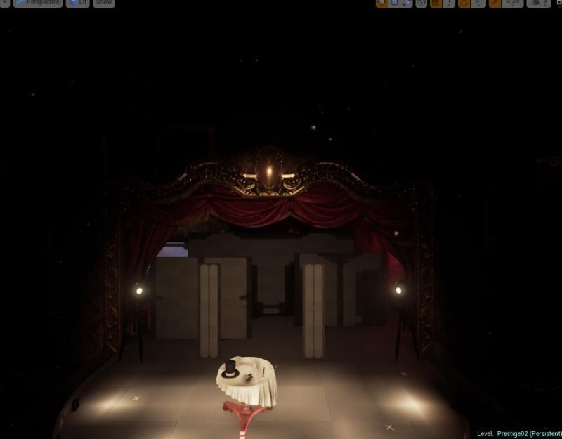
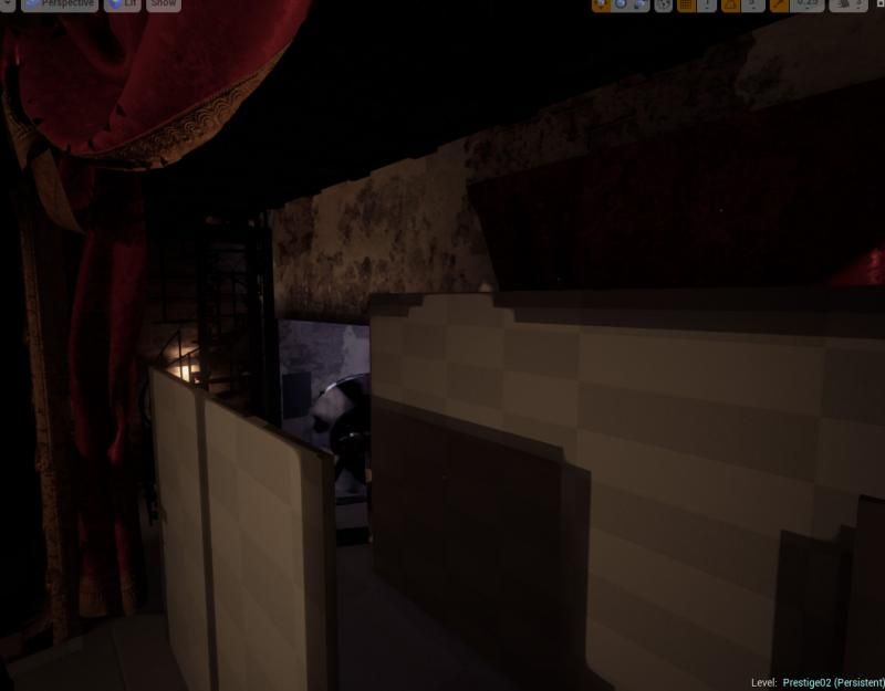
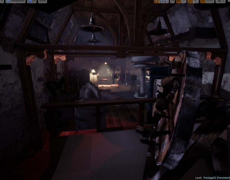
[Edit]
It just occurred to me that we never actually shared the final product with you guys! Here's the video our class made, thanks for all the help!
http://vimeo.com/102967202
[/Edit]


Replies
It's an old theather where a magician used to perform. It's the stage and the backstage area where he keeps his stuff and tricks.
Looking forward for some feedback too
Thanks for the feedback on the light
Oh, that's a good point. We'll definitely need to figure out the final lighting cause we have too many hyper black areas haha.
Thanks!
Are you using a regular print screen for your shots in the editor? I ask because it seems alot of the objects are blurry/looks like they're streaming in and out which happens automatically in the editor to save memory while you're working.
I'd recommend launching the scene in the actual game and using "HighResShot 2" in your console to take better pictures if you haven't already (the 2 can be whatever number you want, it's just doubling the image size so you can downsize it for AA/supersampling). That should let your textures and details read more clearly.
Also maybe messing around with the mipmap settings on your textures if you haven't already.
I was actually screenshoting the screen yes, thanks for this tip. Here are the pictures taken using HighResShot2. There's also some change on the light.
About the mipmaping our World Builder is aware but since we are going to pre-render the scene, it seems it's not an issue, but i'm letting him know!
http://imgur.com/a/yzZhU
You gotta remove all UE4 UI elements out of your screens though!! That silly XYZ axis on the bottom left shouldn't be there. Or the object pivot in the first photo. Gets in the way of the nice screens.