The BRAWL² Tournament Challenge has been announced!
It starts May 12, and ends Oct 17. Let's see what you got!
https://polycount.com/discussion/237047/the-brawl²-tournament
It starts May 12, and ends Oct 17. Let's see what you got!
https://polycount.com/discussion/237047/the-brawl²-tournament
Roxanne (original weapon WIP)
This is a follow up to my Borderlands style gun blade
(http://www.polycount.com/forum/showthread.php?t=137597)
I figured I would take the same concept but make it in a different style. I thought it would be cool to imagine an alternate history where the war in Vietnam extended well into the 80's. The result is you get a 30.06 assault rifle with a machete bayonet!
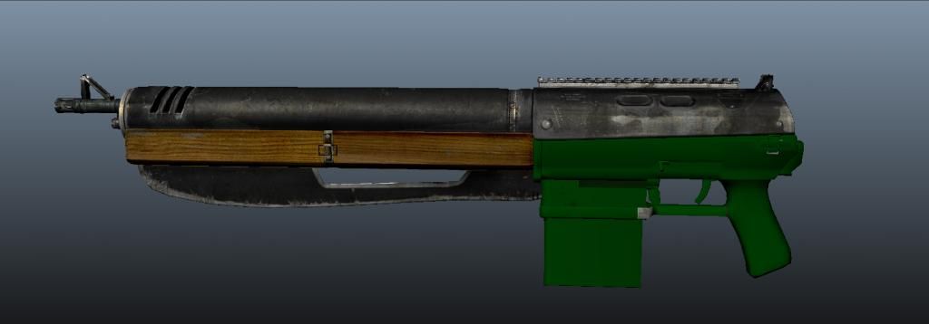
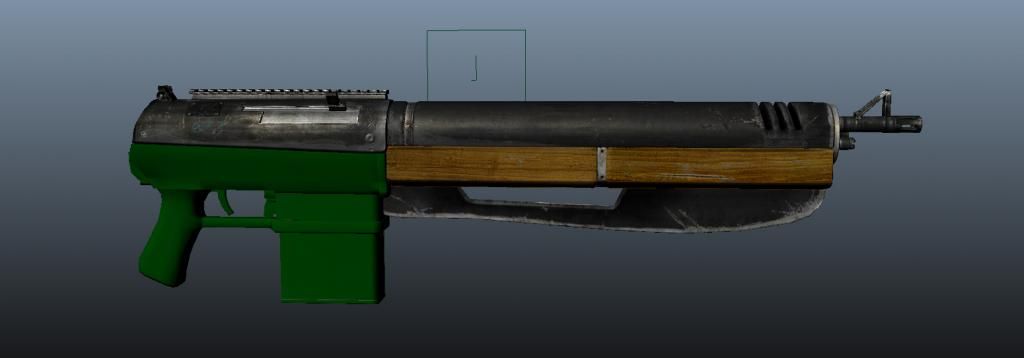
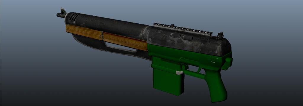
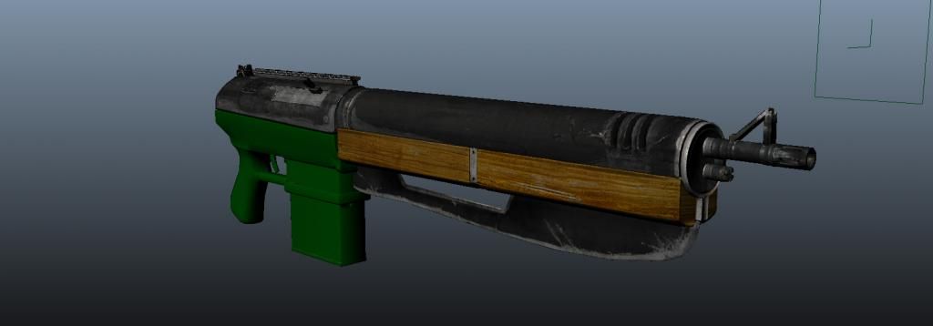
I'm practicing with 1024x1024 spec, diffuse, and normal maps on a 12123 tri model I made based on my own concept. I already did the high poly and bakes and I'm in the process of texturing. Here is some Maya screen grabs of what I have so far. The textures are mostly hand painted with some details and grains grabbed from photos.
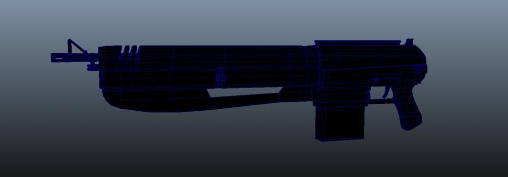
She don't have to walk the streets for money, but she don't care if its wrong or if its right.
I'm having fun trying to squeeze every bit of detail I can out of a 1024 map, trying to make the rifle look jungle weathered without looking totally broke. I'm using a lighter wood stain that is typical of most firearms because I like the way it contrasts with the black gun metal.
I'm thinking about maybe having a little red light come on somewhere when the weapon is taken off safe, just for kicks.
Any feedback will be closely considered as I move forward because I want to make this into a portfolio piece.
(http://www.polycount.com/forum/showthread.php?t=137597)
I figured I would take the same concept but make it in a different style. I thought it would be cool to imagine an alternate history where the war in Vietnam extended well into the 80's. The result is you get a 30.06 assault rifle with a machete bayonet!
I'm practicing with 1024x1024 spec, diffuse, and normal maps on a 12123 tri model I made based on my own concept. I already did the high poly and bakes and I'm in the process of texturing. Here is some Maya screen grabs of what I have so far. The textures are mostly hand painted with some details and grains grabbed from photos.


She don't have to walk the streets for money, but she don't care if its wrong or if its right.
I'm having fun trying to squeeze every bit of detail I can out of a 1024 map, trying to make the rifle look jungle weathered without looking totally broke. I'm using a lighter wood stain that is typical of most firearms because I like the way it contrasts with the black gun metal.
I'm thinking about maybe having a little red light come on somewhere when the weapon is taken off safe, just for kicks.
Any feedback will be closely considered as I move forward because I want to make this into a portfolio piece.
Replies
Seriously, you would cut yourself all to shreds in combat. The blade is actually meant as a utility item for chopping through annoying jungle underbrush, and only in a pinch, any baddies you might find hiding in said underbrush.
I'm wanting to make an accessory pack for it which includes things like sights, stocks, carrying handle, a machete sheathe, and what not.
As it is now, your gun is very blocky with a barrel coming out of a bigger cylinder. All of the parts just flush right up next to each other with nothing to break up the silhouette. I would actually detach the blade itself and let it be more distinct from the actual gun.
Here's a pic I found from Googling 'gun silhouette'. I would aim for a silhouette as strong as these.
You know I'm really starting to notice this more and more as I texture.
What I was going for was more simple, rugged, and retro. A gunblade that you could hit something with, and 1000 little pieces wouldn't break and fly off. More like an original M1 Garand, rather than M4a3 with every bell and whistle under the sun. Good ol' fashioned, if you will. Solid, and heavy.
But yeah, your right, I might have over done it. No worries! All that can be fixed with the accessory/upgrade pack.
So hows the texture looking so far?
Well machetes are more of chopping instruments rather than stabbing.
Here's a quick update with the maps so far. Id really appreciate any feedback about the textures as I'm really looking to sharpen my skills
Again all screen grabs in Maya viewport.
The compact design is kind of nice. Perhaps the blade slides or folds out when its needed.
I'm pretty sure the basics went like this:
If that don't work, you could try shooting?
haha I'm glad the design its something worth discussing, and I enjoy discussing it. But how about the textures? I could really use the help!
Re: swinging the gun like that - you'll have trouble stopping it without some place for the off-hand - a gun this big is gonna be heavier than a sword and balanced for shooting (stable when supported with two hands), not swinging around with one hand
I appreciate the wackiness but I think wackiness works best when it's believable; with this you're often sticking your potentially gloved hand through a small metal gap to hold onto a seemingly wide piece of wood - you're not gonna get it out of there quickly and it's not going to be able to be used for support or power during a swing.
Possible silhouette changes (will require a rework of the blade and a stock to remain stable - it's a very long, front heavy gun at this point)
Could be swung somewhat like an axe if the binding/attachment was sturdy enough I guess; I went for an improvised binding using the rope attachment hole common on any knives for outdoor use; food for thought perhaps.
You could upgrade your weapon to be more ranged based, or melee based. The melee package would include these:
And I suppose the ranged upgrade package would have a stock and scope instead, or something like that!
yeah?
The texture maps are packed for a third person shooter, it would never be in first person. I put some grain here and there to make it shimmer a little bit more from a distance on a third person model. Is it overdone?
I don't exactly know what you mean by cavity application?
Ill work on getting some new camera angles. Sorry if the updates are slow, I'm kind of in a rough spot traveling cross country looking for work, stopping where ever I can for a few days to make art. I'm having to do everything with a mouse and keyboard and its killer! haha
Any way thanks for all the feedback, I really appreciate it. I'm having a blast making this.
lol.
Re: your cavity being a bit harsh: there's some corners on the model that are a bit bright or dark, particularly the "extra worn" metal around the front end of the weapon and the join between the main body and the barrel enclosure, but your latest edit has helped clean that up quite a lot, and is looking much better overall. I'd match up the separation widths of the two sections of the rear half of the gun a little more - looks like a weird seam in that back shot at the moment.
Consider what you're showing with that hole through the machete - it looks like a sharp, worn edge now; would you want a sharp edge there as the shooter? (hint: your fingers are gonna need to be inside there when firing
The new angles help a lot with seeing the thickness of the weapon.
Overall the materials and weapon in general is looking better now but I don't think it's ever going to overcome its weird design flaws
Glad to hear you're enjoying making it.
+1. With a bit more polish it could look very nice but it's just so impractical right now
I wouldn't spend any time redesigning it though, just keep it in mind for future projects.
decided to clean it up today.