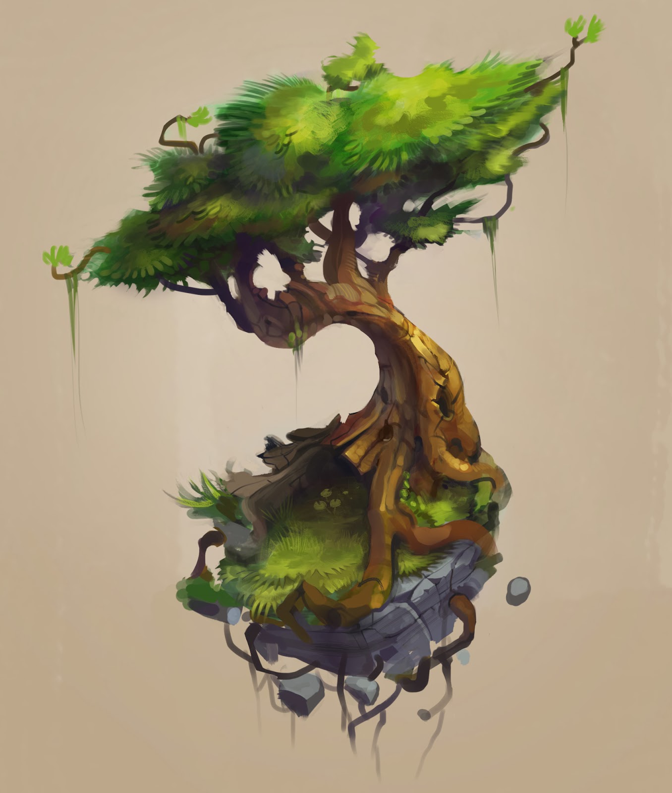
Tree Kraken - WIP
Making a stylized mini environment and thought I'd open a thread for feedback  . I Really want to push my texturing and composition skills for this.
First, here is the most recent wip:

Trello to-do list (because I'm a nerd)
The following is the original post:
First off, here is the concept I'm loosely basing it on [not done by me, click img for source]:

Here's my original blockout:

And here's what I have so far.


Texture is polypaint, and it's a little messed up and noisy in parts because I somehow lost my polypaint and had to transfer it from an old version. So I will definitely fix that, and I have some other finalizing to do on the tree texture but for now I want to get the roots, rock, and leaves done. The idea is supposed to be that the tree is destroying the rock... I'm still working on the rock sculpt and I'm not sure about some of those floaty bits, but if possible I'd like to make it so you almost feel bad for the rock, hah.
Speaking of leaves, I haven't really done them before but I think I want to take the Airborn rout
Looking forward to reading your feedback, I'll post updates when I can!
First, here is the most recent wip:

Trello to-do list (because I'm a nerd)
The following is the original post:
First off, here is the concept I'm loosely basing it on [not done by me, click img for source]:

Here's my original blockout:

And here's what I have so far.


Texture is polypaint, and it's a little messed up and noisy in parts because I somehow lost my polypaint and had to transfer it from an old version. So I will definitely fix that, and I have some other finalizing to do on the tree texture but for now I want to get the roots, rock, and leaves done. The idea is supposed to be that the tree is destroying the rock... I'm still working on the rock sculpt and I'm not sure about some of those floaty bits, but if possible I'd like to make it so you almost feel bad for the rock, hah.
Speaking of leaves, I haven't really done them before but I think I want to take the Airborn rout
Looking forward to reading your feedback, I'll post updates when I can!
Replies
Yay SCAD people! Hope you're enjoying it, I had fun. Sounds like they've improved the program even more since I've been gone. Anyway... I will do more painting on the tree after I block in the leaf colors and see how some extra violet near the top branches works with it. Sounds good
I've had a busy past couple of weeks so haven't had as much time for this as I had thought, but here's a quick update, just to show I'm still working, along with an even quicker paintover to show the general idea of where I'm thinking of going with the roots (positions aren't final). Let me know if it's too much, too busy, etc. I tend to get caught up in the details a lot and worry about things getting too busy because of it.
Keep going man.
I love the sculpting and the texturing, looking forward to see more!
don't focus too much on the bottom that it loses spacial contrast with the rest of the composition. In other words the concept has the tree taking up around 2/3ish space and the around 1/3ish is the ground/roots. If you make the bottom section bigger like you are planning, I feel you might hurt the balance of the composition and the roots and the tree will compete for the viewers eye. Also consider the shape and size of the branches and roots themselves. Don't leave them too even. the concept gives them "character" by making them "lumpier" going from thick to thin. You do this yourself somewhat, but maybe you could push it a little further?
Really good point, I didn't even think of that, thanks
This weekend I'm going to focus on painting the rock. Might make a tiling texture for the roots too. Anyway I'll shut up and get back to work so I can go home and work on this tonight :poly142:
Really digging it so far.
Maybe you could add in a bit more contrast in some of the deeper grains? Like the really deep ones and around the hole in the trunk just to get it to pop a bit more.
Maybe the leaves in the canopy are a tad to big? I would also try to add some more shading inside of it, a more layered occlusion maybe in a darker more saturated green just to get some of that extra depth in there.
Keep at it:)
Also trying to liven up the silhouette... I know the leaf density consistency is off right now...
Other than that really awesome piece of work! Love the bird
and for your leaves i would add in a few minor hue variations to chop up that solid mass of green only has to be slight but its just a wall of the same greeen
edit : just looked at the concept again and you can see the artist has painted in yellow to green to avoid what you are getting
Love the texture.
Haha you're right, it didn't turn out to be as kraken-esque as I was thinking when I was first starting it. Sorry to be misleading... I was going to add more tentacle-y roots but then someone pointed out it would throw off the composition by making it too busy so I decided to stick to the concept a little more. Maybe I should see if I can change the thread name >.>
Now to actually do it...
(edit) Didn't get much done over the weekend because of reasons. but
Still have a few more adjustments to make
Your discolored leaves are a little obviously repeated, my eye catches the clusters of three from first glance. Perhaps a little more variation would help, because they're a good addition.
And I like the positioning of the bird in the latest shot