UTMC - Frozen Derelict Facility
I messed around with one of the block outs, trying to come up with a fun theme.
I blew up the Ice theme larger and started working in photo elements and trying to balance colors.
Then I further integrated those images, and tried to more clearly add depth by letting darker areas fall to the back with less detail, and increase the brightness in the areas of direct sunlight. I figure much of the architecture would be covered with ice, but certain areas where light passes through thinner parts of ice you can get very nice saturated colors.
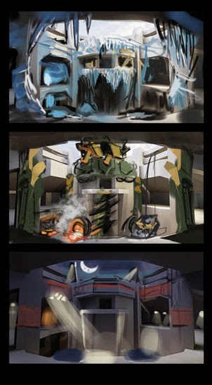
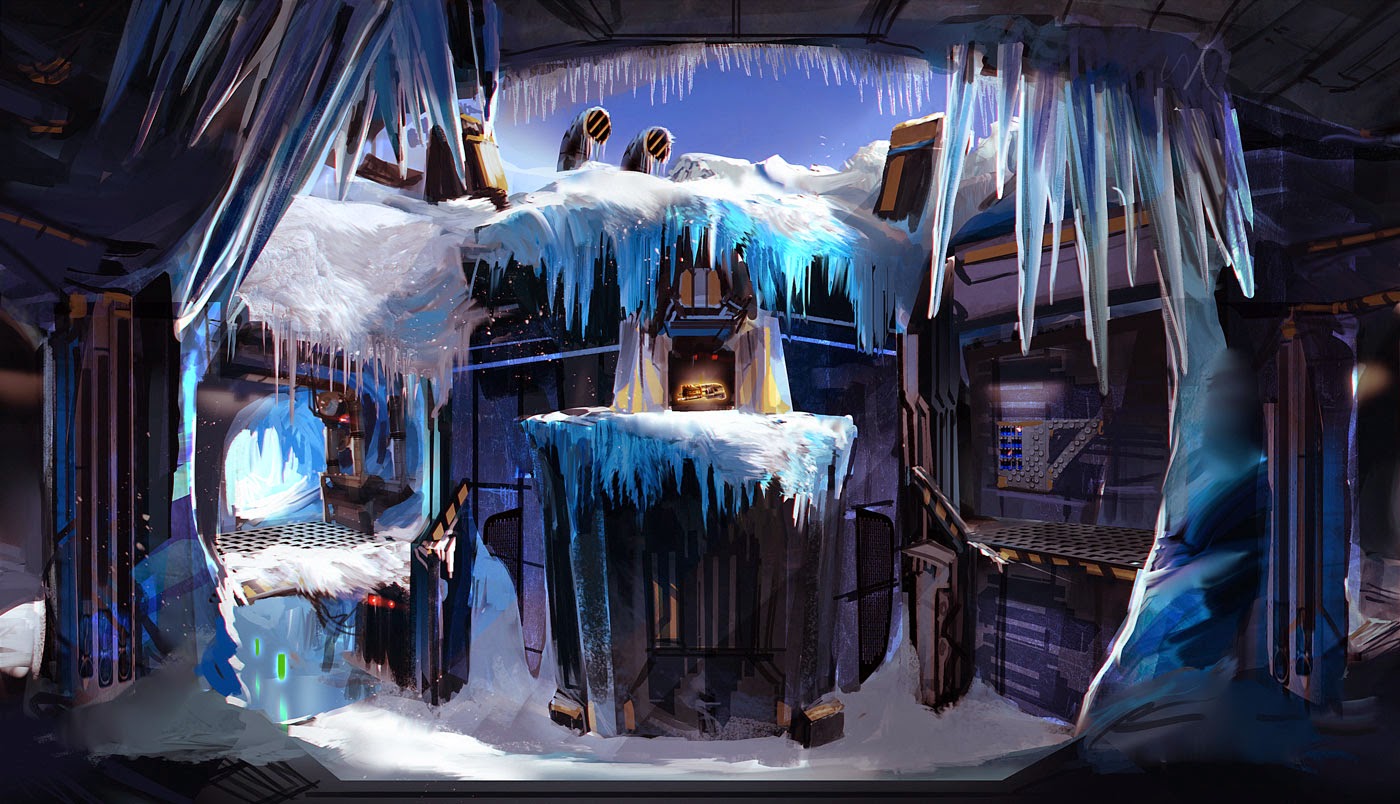
Replies
I just went over to Kotaku a minute ago and saw a video of the Epic team explaining VisDev and it does seem like visual clarity is a key. It is more common to hide a lot in shadows etc... so I am thinking of defining more of the underlying architecture in this screen, or doing a second shot to show the larger area.
And you are right, I through some spotlights and was thinking night time at a prison colony for the 3rd thumbnail. I think I would have to go to a new thread to flesh that out, unless I make the second image a FROZEN prison Colony! Thanks, might just do that!
I think everyone whos taking this contest seriously enough to try to get their stuff into the game should look at the videos and threads about clarity it's definitely the biggest struggle I've had to deal with balancing details and clean areas.
I found the thread they made before the recent video. I wish they had this stuff like the video and theads stickied on this forum for the contest.
https://forums.unrealtournament.com/showthread.php?8029-Visual-clarity-in-Unreal-Tournament
It's actually really surprising how much clarity UT3 HAD... until they put textures on it and post process bloom and blur. Completely ruined it with black grime everywhere.
Thanks for the comments, it helps me to know what is working, and also that I think focusing more on the clarity, and simplicity will be important moving forward. I totally agree that a lot of the eye candy effects have been overdone in the past, but I can't really fault them too much, because when its a new tool its tempting to throw it in. It only becomes overdone when you notice it everywhere and realize its become a trend.
LandSknecht, Thank you very much for the link to Alleria, it seems a frozen prison is exactly what that was, and having the understanding of the types of metals harvested there can inform material rendering going forward.
I have made a second image moving along with the frozen prison idea, in this case its underground tunnels had trains used for transporting prisoners and raw materials. Overtime the fissures in the ice ripped the region apart allowing for a humongous "slip and you die" battle ground.