Gun sword thing
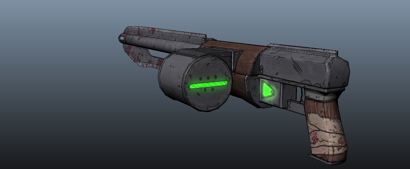
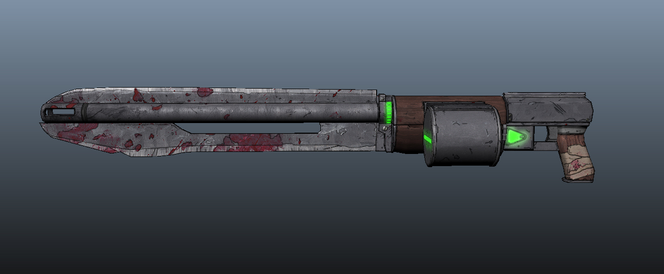
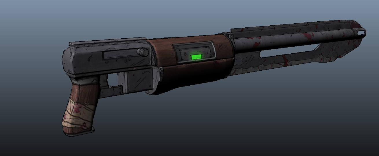
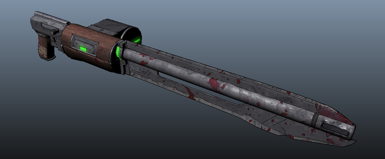
Hey! This is my first post here, and this is something I've been working on. Its a carbine, sword, scifi,.. something?
Before I graduated we had an artist from Gearbox come and give a lecture on the weapon pipeline for Borderlands 2. I thought it looked pretty neat and now that I have some time I decided to give it a try, though modified a little bit.
Since I was just goofing around with textures I didn't bother to make a really detailed high poly, or make a bunch of modular parts.
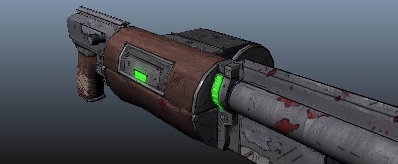
Now honestly I cant remember if the line work was physical and the painting was digital, or vise-versa. So what I did was print out the UV shells and paint them with gouache paints. I chose gouache because I like the heavy look of it, and felt it would match up with the wood and steel. The line work is all digital, overlaying the physical paint. I really like the way Telltale handled their lines so I followed their style a little more.
Anyway its 3302 tris and the UVs are packed for third person. It has a 1024x1024 diffuse, glow, spec, and normal map. The renders are just screen grabs from the Maya view port. It was a fun experiment and any feedback is of course greatly appreciated.


Replies
Anyway, looks way cool, really hope to see more stuff like this.
Room for improvement in certain areas, as you previously said, a lot of wasted geometry could defiantly be lower poly and have the same look. Also it's all one object, in a game engine it doesn't matter if geometry is intersecting so you can just mash it into each other (I know in school they may not teach you that way at first because they want you to learn 'the hard way' first) Also as far as the textures go, next time, invert select the layer with your UVs and create a black mask layer that way you don't paint outside the UV texture space, all that space is waste and it'll look much more presentable if you have the outside space emptied.
EDIT: I forgot to mention, a really good program to use for getting clean normals is Xnormal, which I believe is free. So that might not be a bad idea to use next time for nice clean crisp normal maps
Keep up the good work!
Thanks! I want to do an entire scene like this but I'm still experimenting with a way to make this more feasible. Printing out UV shells and painting them with gouache is very time consuming, and expensive...
That's why I'm pretty sure now the Gearbox artist said the line work is physical and the paint is digital. I think I will paint a series grey scale materials, scan those in, and use them as foundations for further textures. That is, if I can find another friend with a scanner. #broke
Thanks again. I was in fact trained to connect every piece of geometry unless the part articulated (magazine, bolt, etc..) so edgeloop all the things! I'm told floating and intersecting can result in some weird lighting issues in engine? But I agree, if I did it over again I would let more elements intersect.
For the UV's I do usually pack them tighter, and use a UV snapshot as a mask layer. However there are no layer functions in physical painting,.. also no "ctrl z/alt ctrl z" :poly122: I actually painted right on top of the printed UV shells, meaning after I started painting a shell I couldn't see my UV layout! So if I changed my mind about something it was pain to change anything.
Your definitely right though, UV's really do need to be packed tighter and I'll keep that in mind with future projects.
What you do it make all the parts separate, sword, revolver, handle, etc... intersect them, delete faces that are inside other objects, UV them, then combine all the objects and soften the normals. That's how the in-game objects are made for the indie company I work at, and we use a modified version of the Unreal Engine, we have no lighting issues!