The BRAWL² Tournament Challenge has been announced!
It starts May 12, and ends Oct 17. Let's see what you got!
https://polycount.com/discussion/237047/the-brawl²-tournament
It starts May 12, and ends Oct 17. Let's see what you got!
https://polycount.com/discussion/237047/the-brawl²-tournament
MoMaZa 3D Artist Portfolio
hi Guys
here is some of what i was working on last year, it has been very long time since i posted something so i thought it's time to share with you some
hope you like them
Software used
3DS MAX,VRAY,After Effects
for more you can visit my website
http://MoMaZa.com
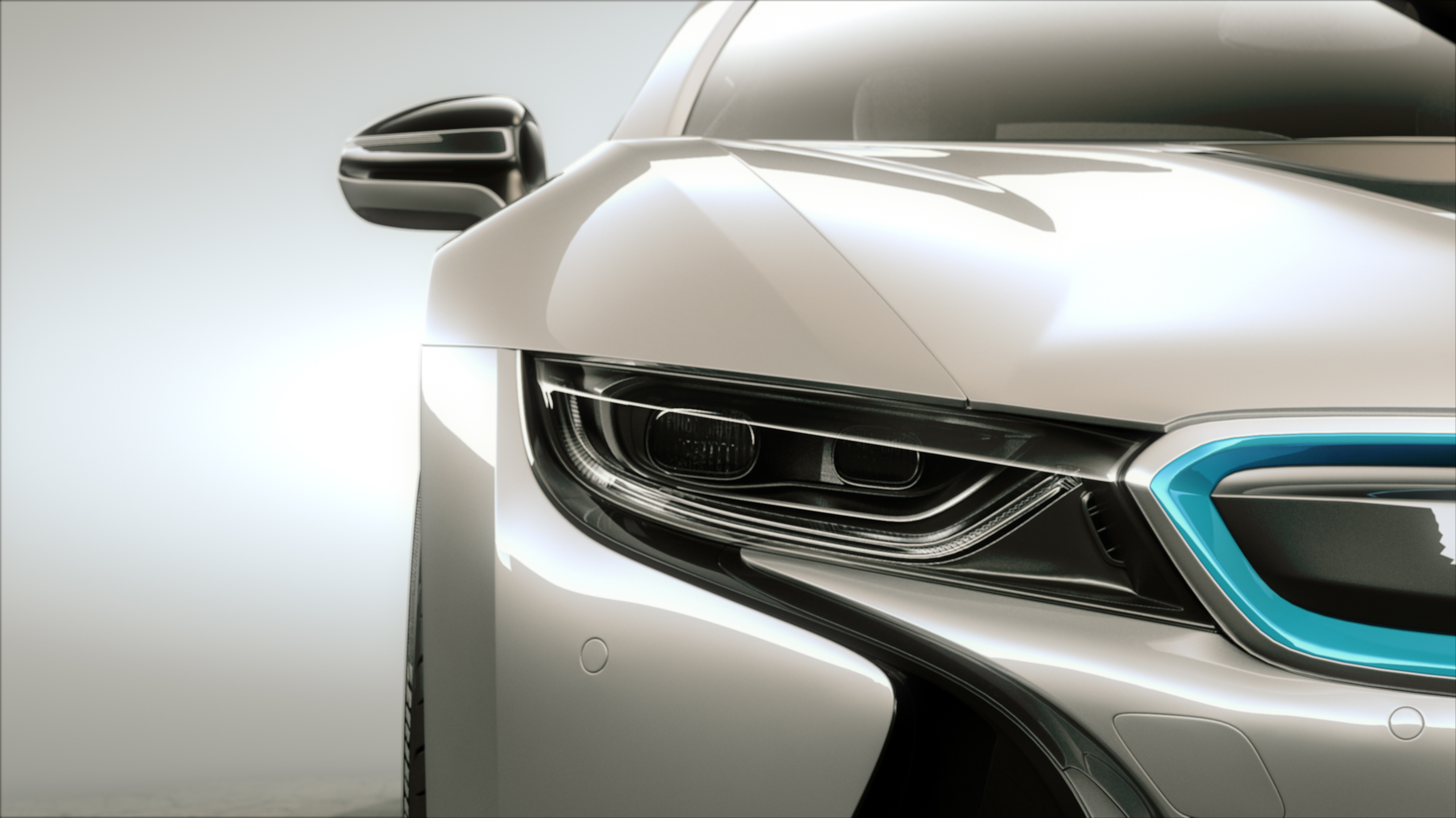
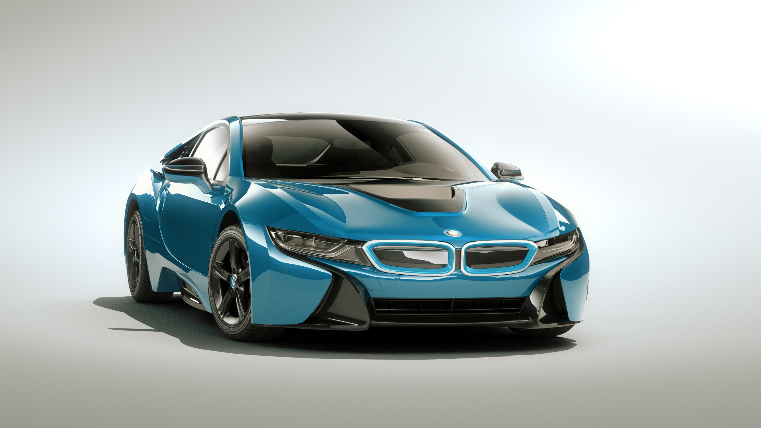
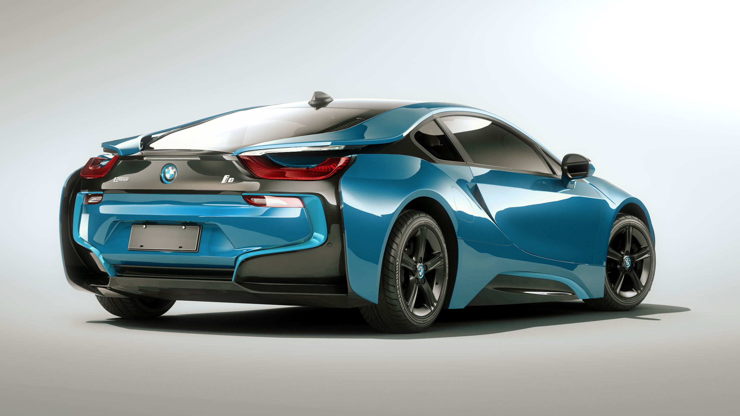

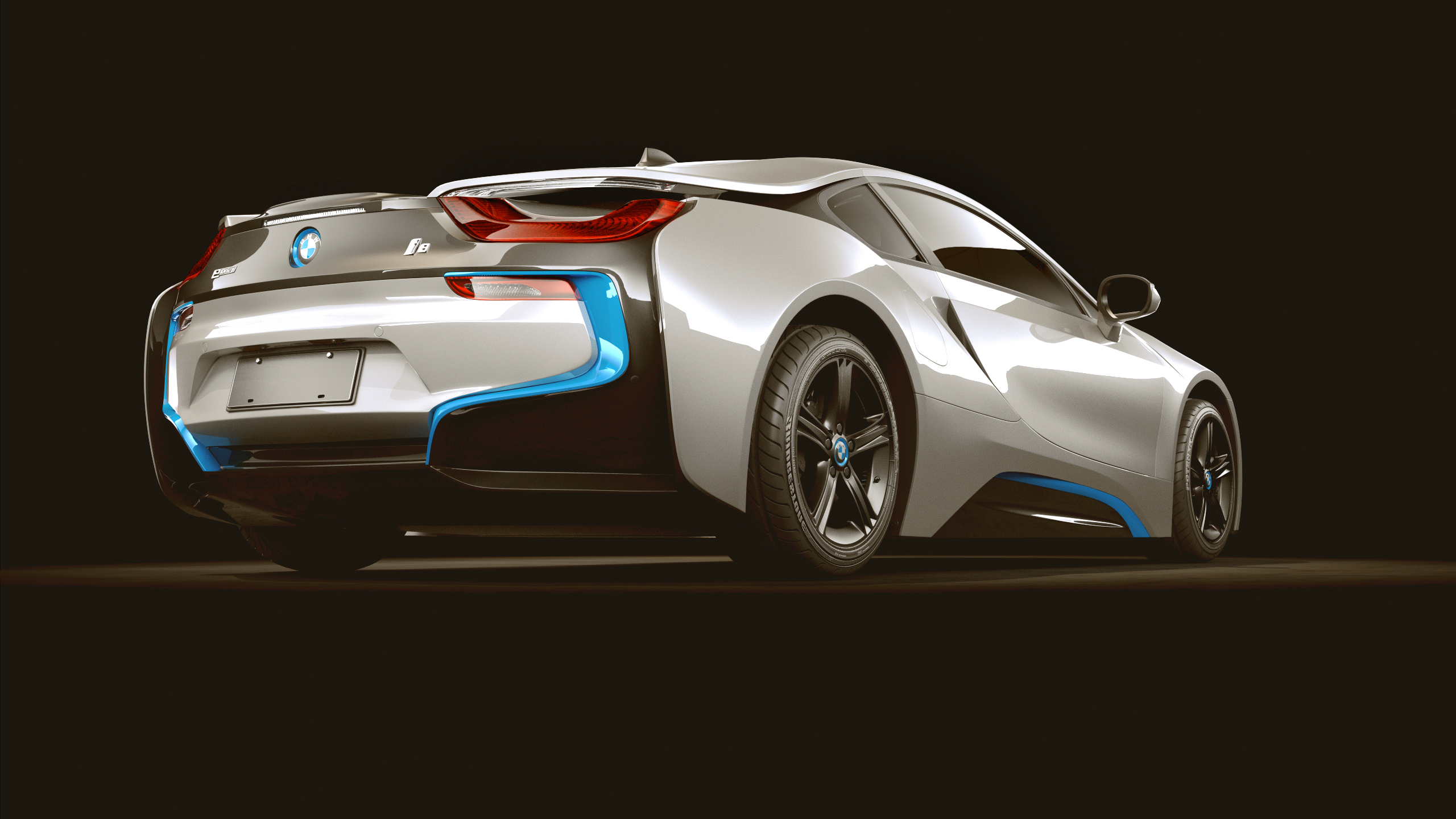

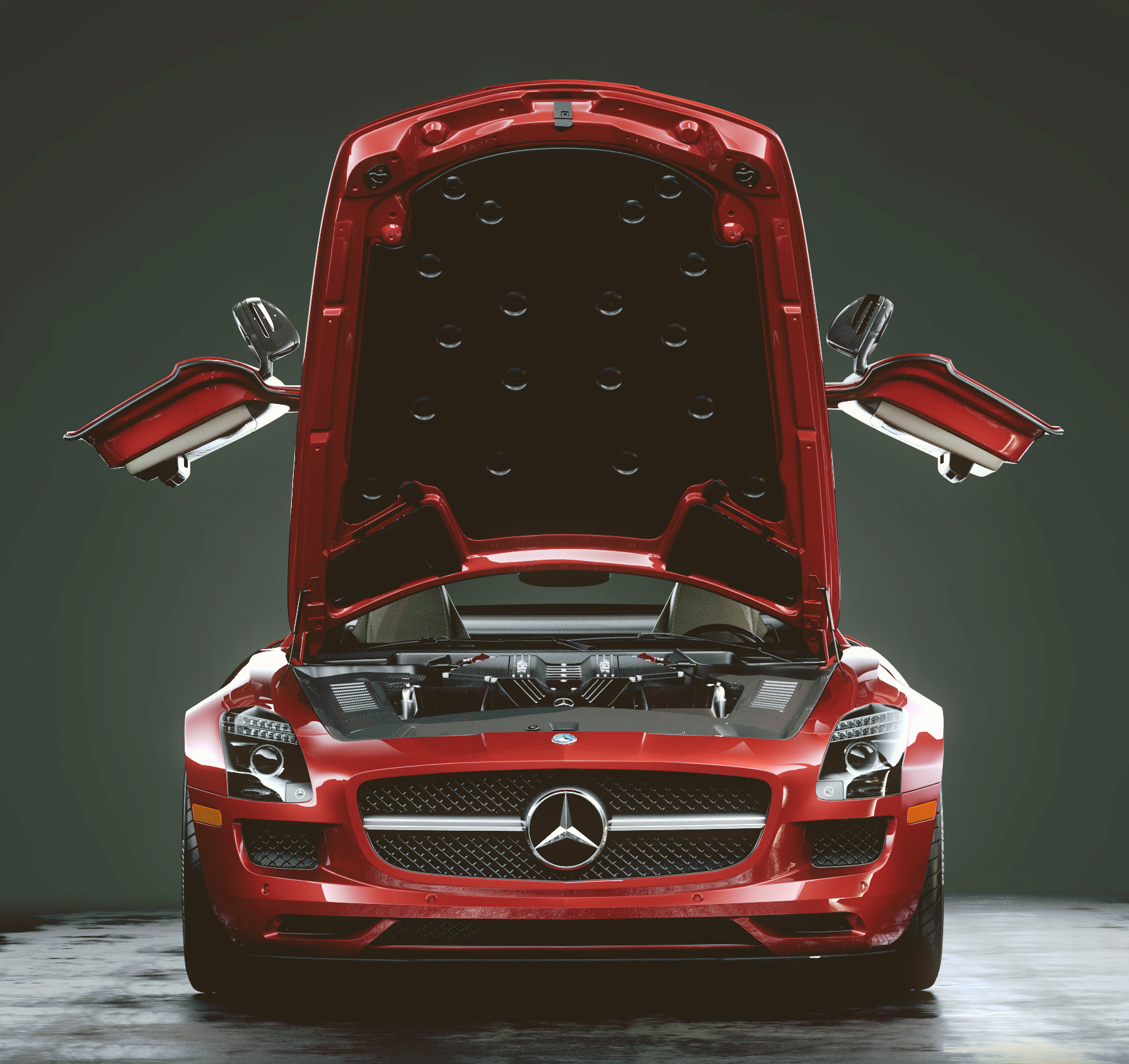
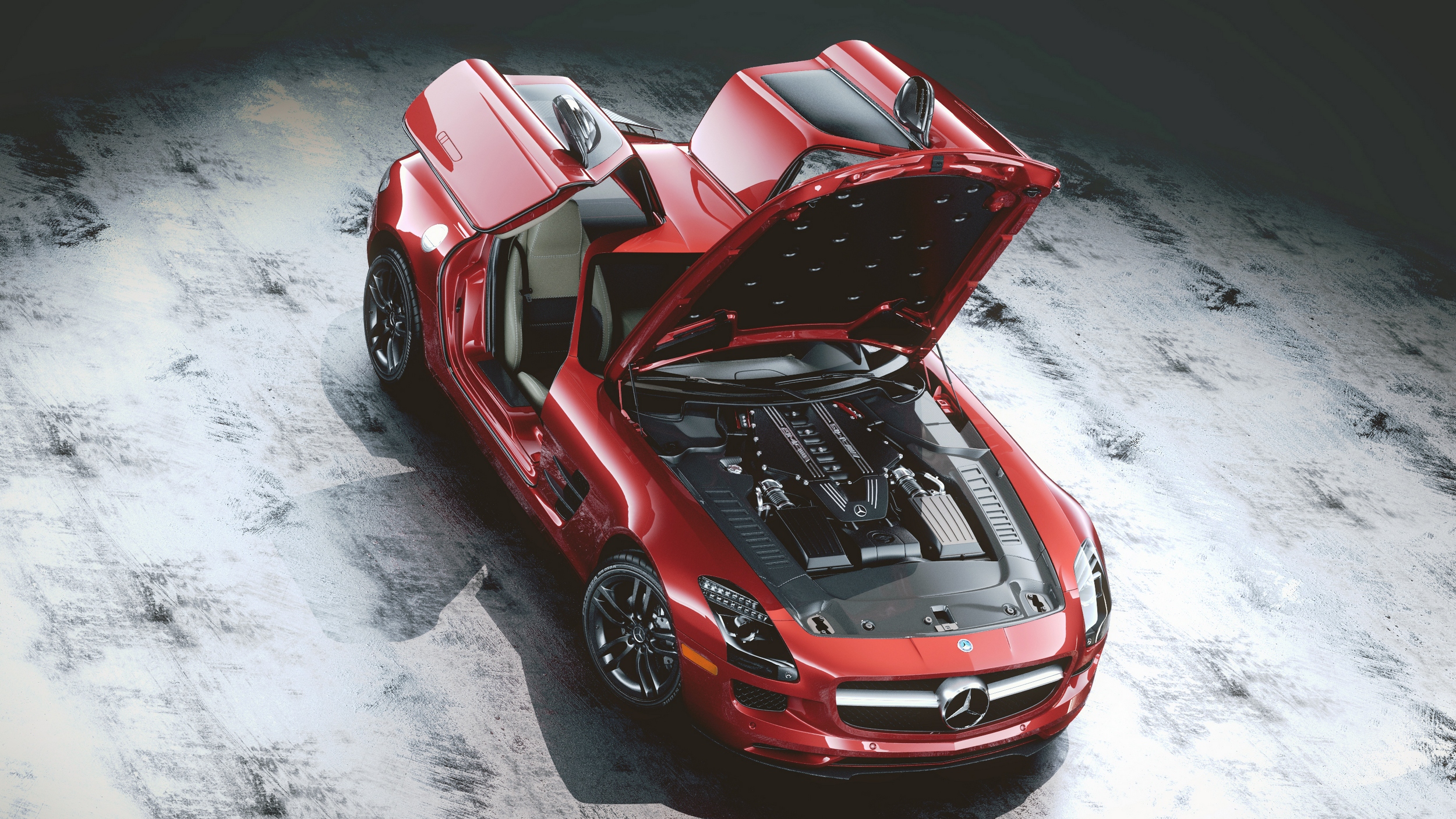
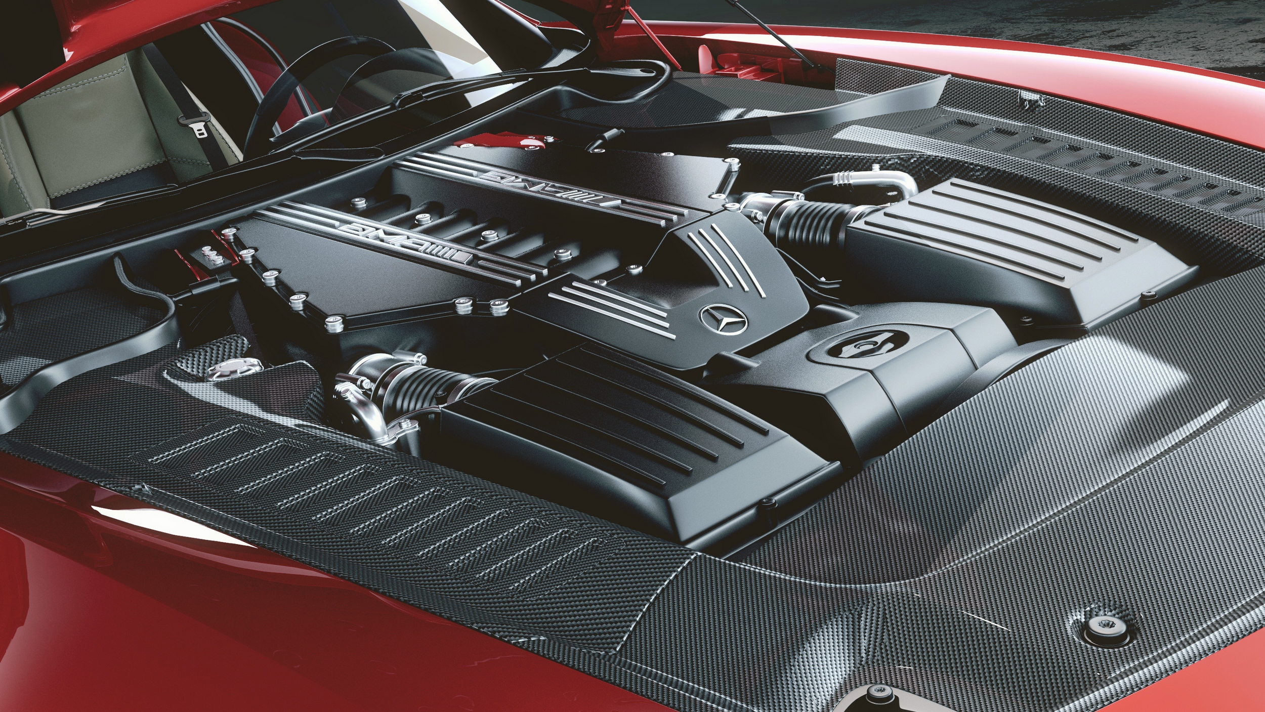
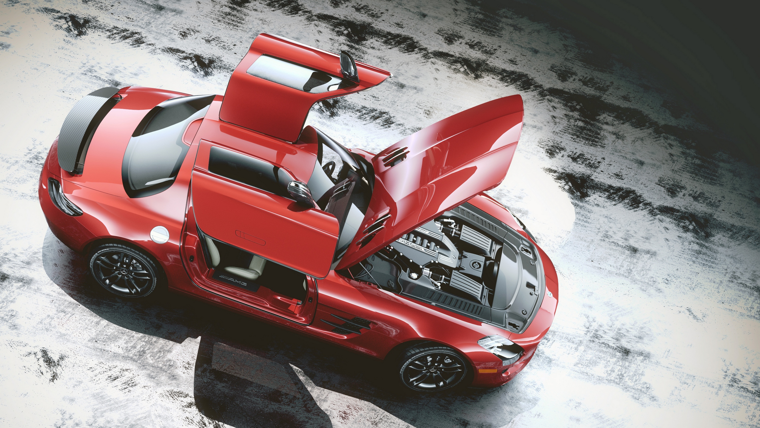
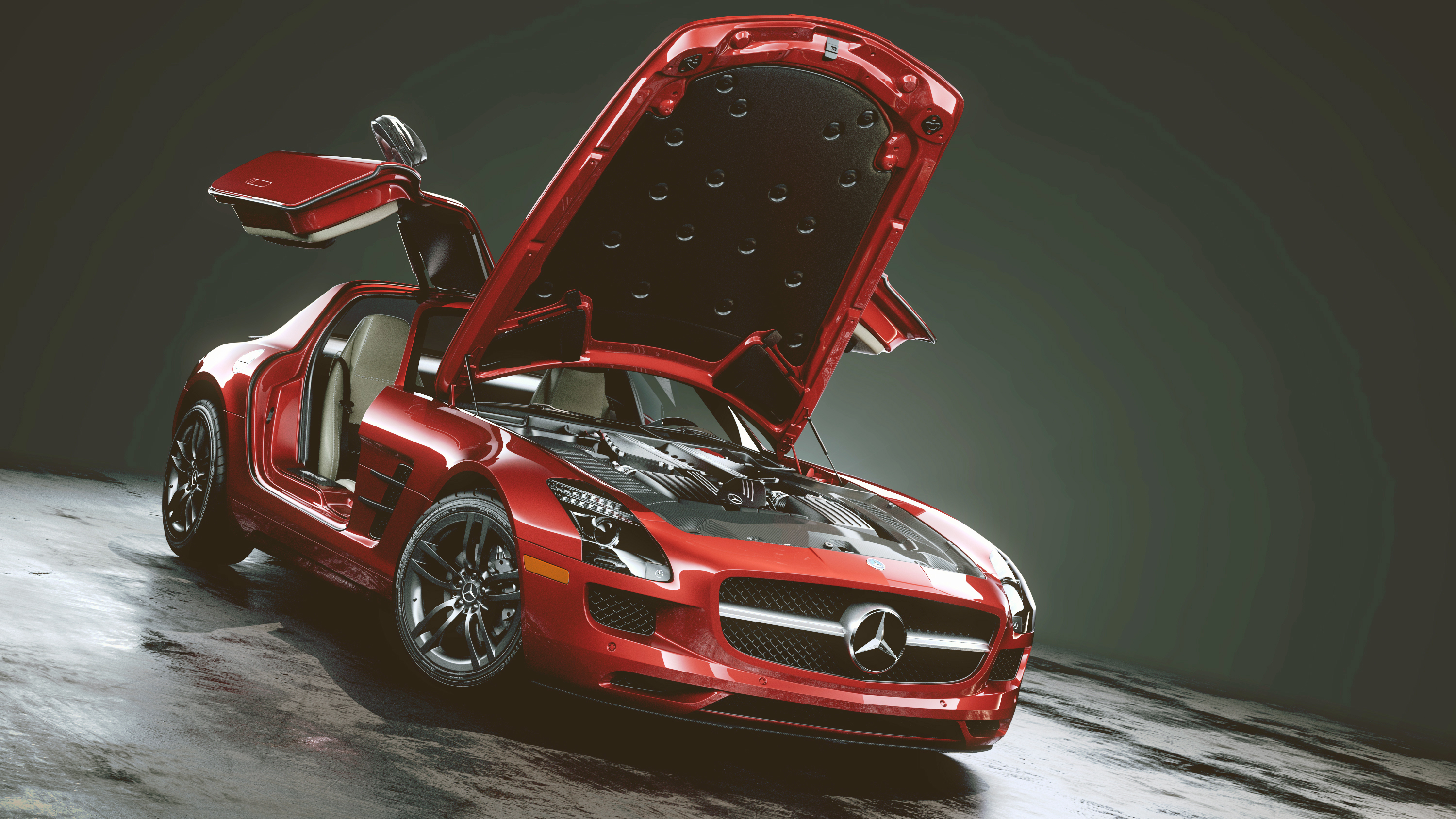
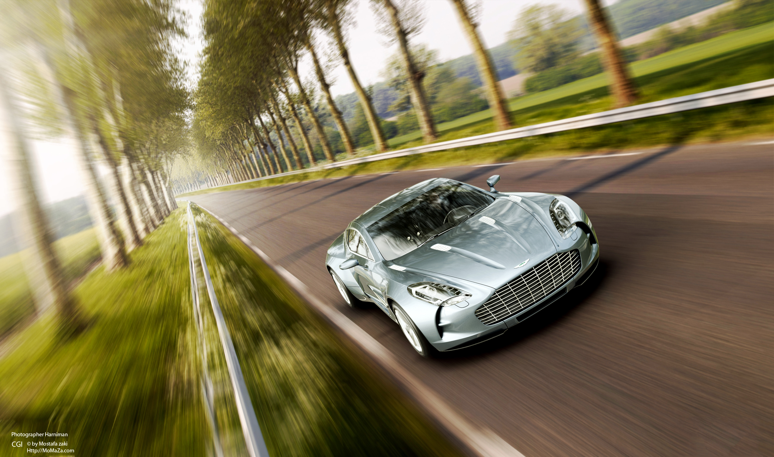
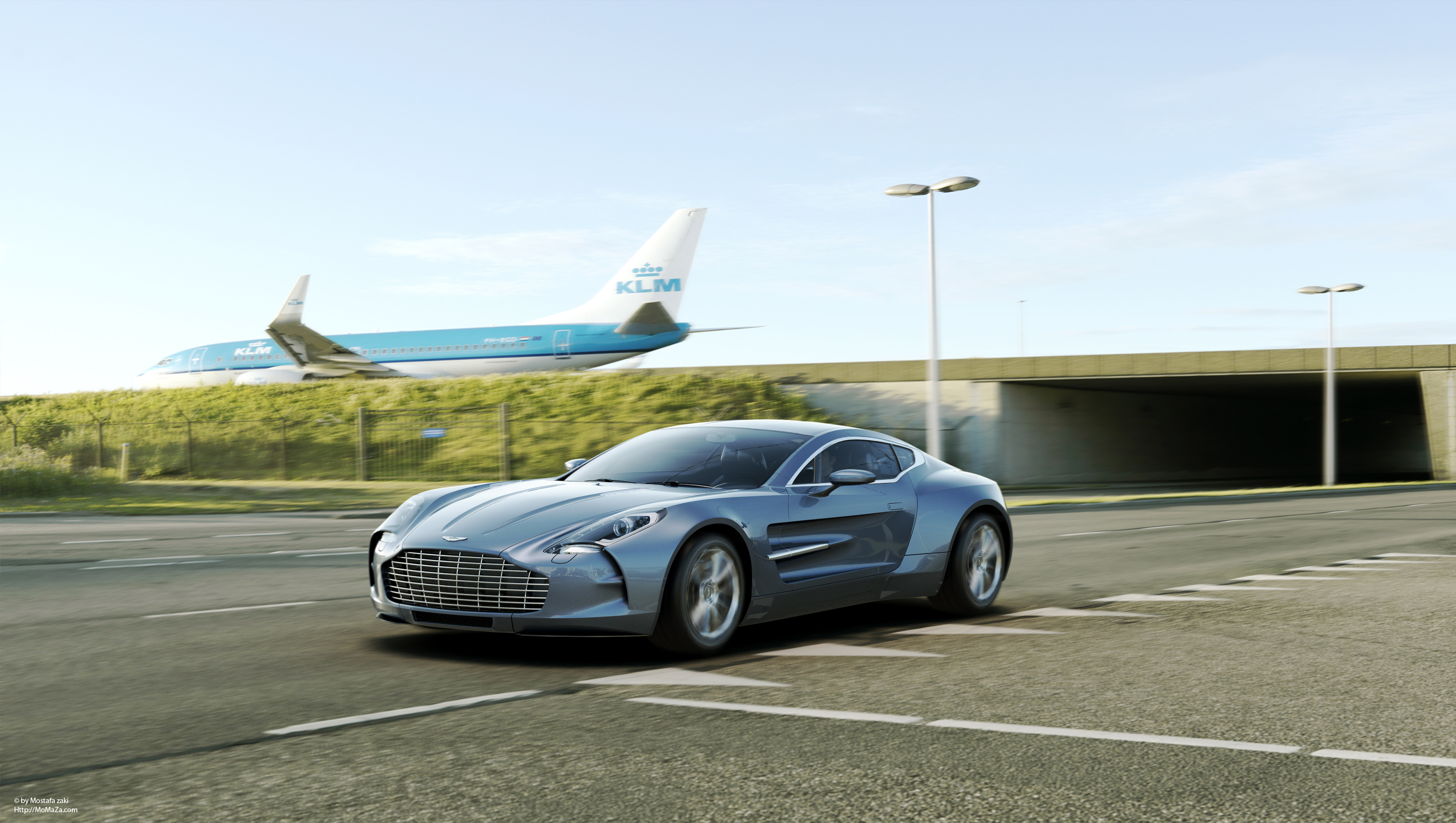
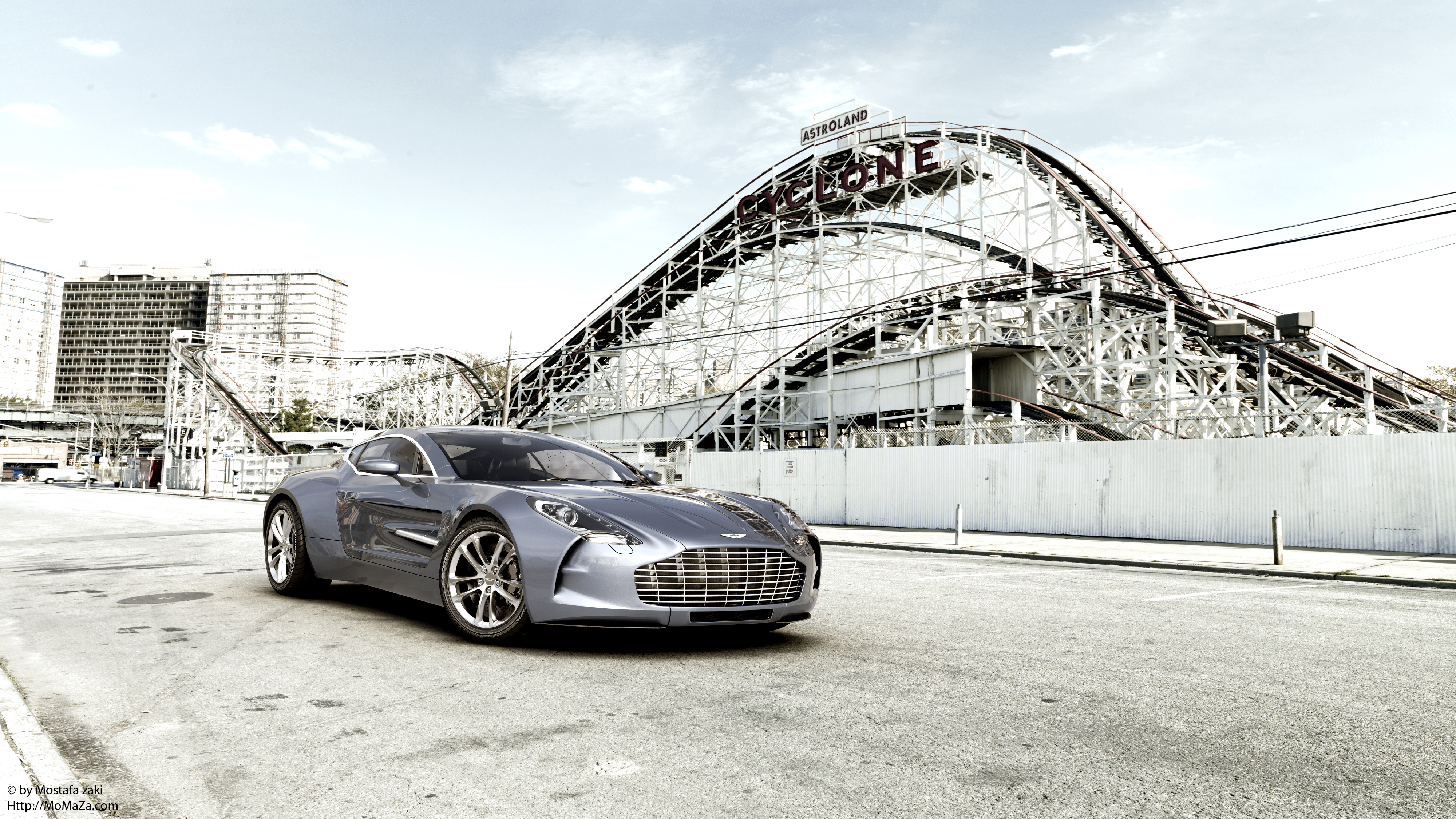
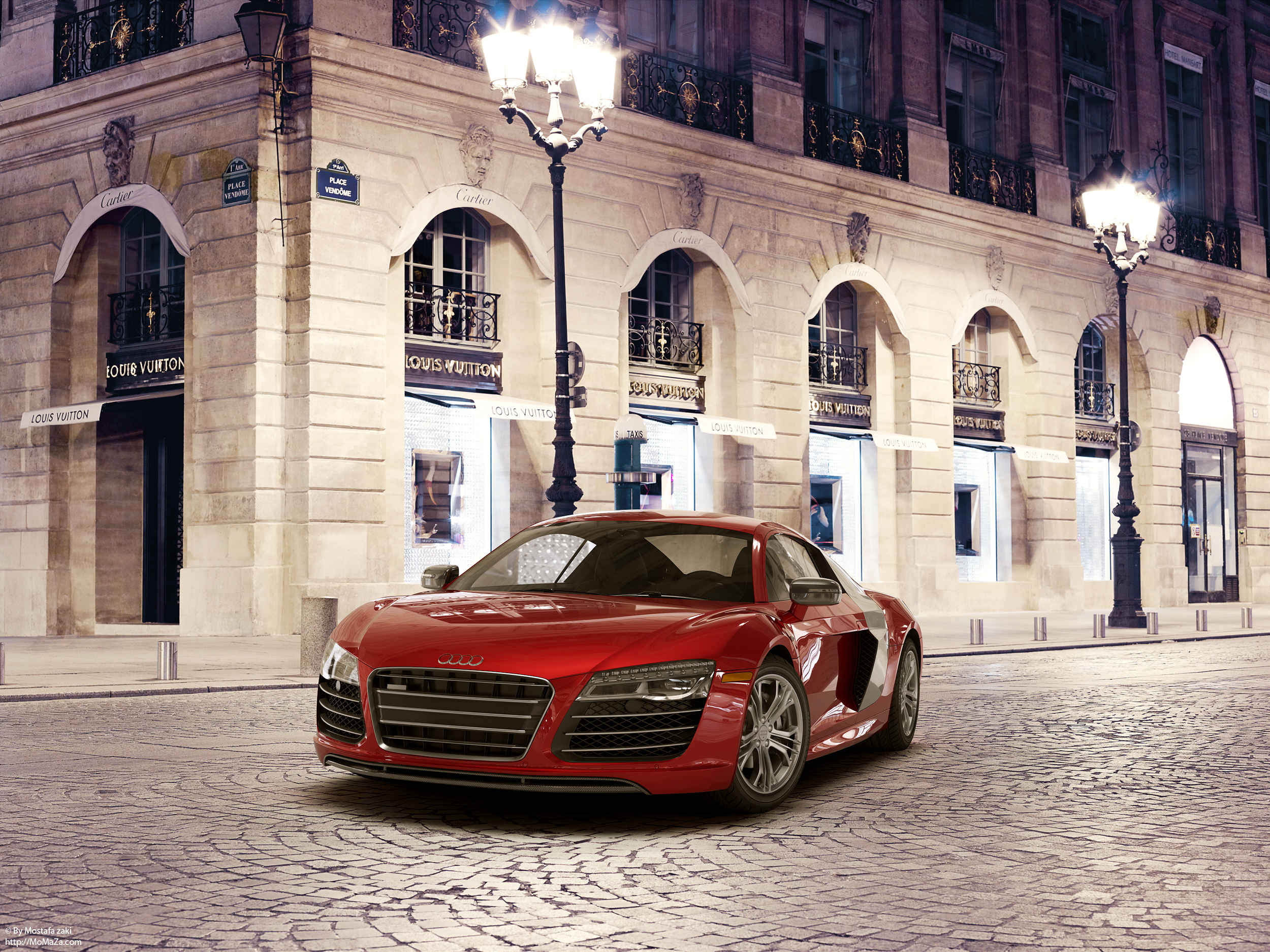
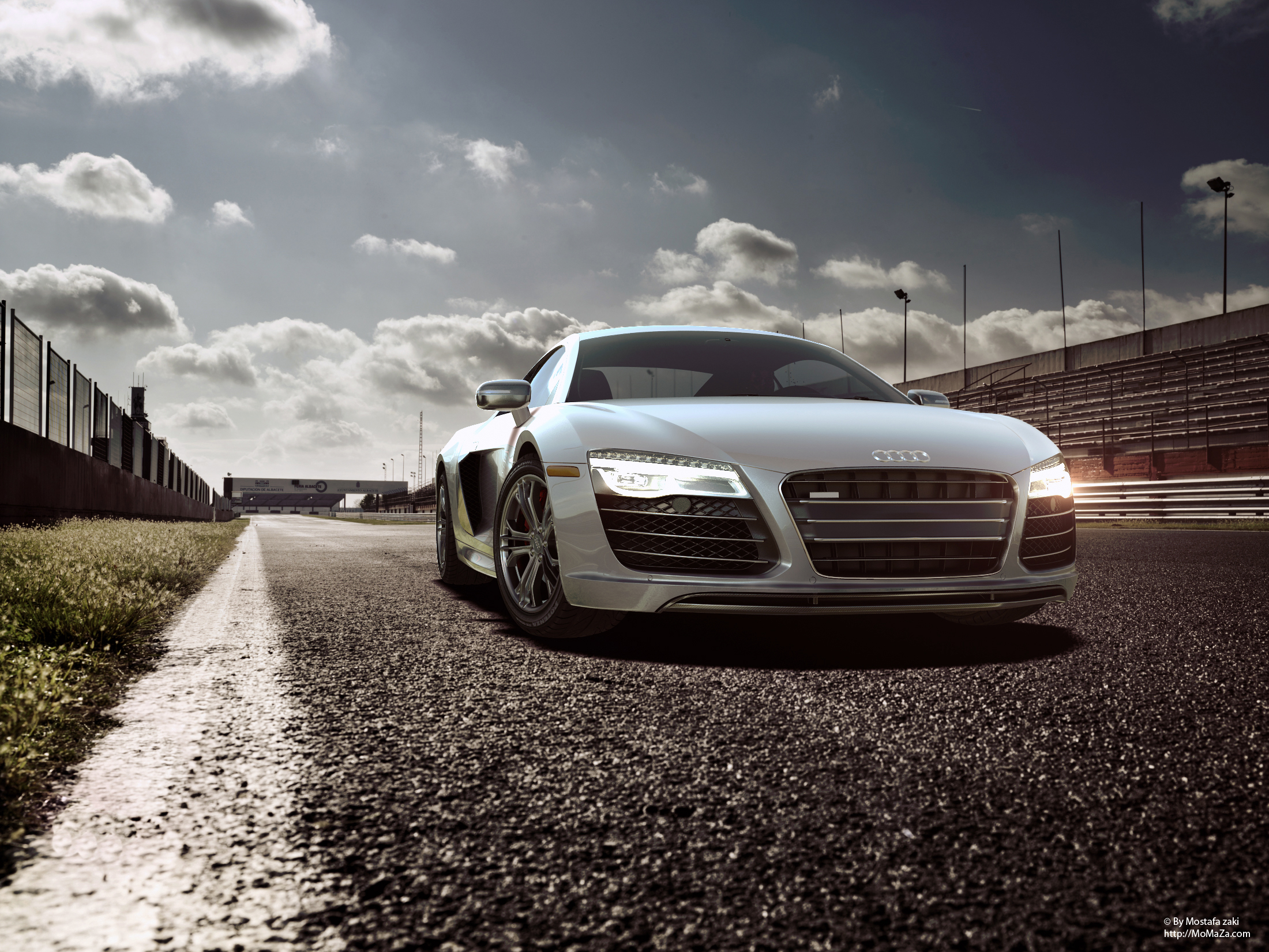
http://MoMaZa.com
here is some of what i was working on last year, it has been very long time since i posted something so i thought it's time to share with you some
hope you like them
Software used
3DS MAX,VRAY,After Effects
for more you can visit my website
http://MoMaZa.com


http://MoMaZa.com
Replies
Your work is very inspirational! WOW!
*bookmarked*
ok here is another one the new Cadillac CTS ,the model based on official cad drawings
also here is fly around for this one
1080P
https://www.youtube.com/embed/DdqD3siQUYA?&vq=hd1080
this is sexy
im not usually a fan of cars .. but damn it
Do you mind sharing some of your lighting / hdri workflows or just showing some HDRIs ?
Some small things, many of the backgrounds have very strong 8 bit compression gradients, and the CLK? ground has very obvious tiling
The only thing is that your website doesn't do it justice at all. The frontpage
has buggy alignment, the buttons look very dated, and none of the 2D elements are
consistent to each other. Then things like twitter icon with white JPG border etc.
Your video reels do not have sound and no intro and outro, and the play button looks like from 1995. If you spend some of that passion into your website, you could make a really professional appearance on the web.
either way good job momaza.:thumbup::poly141:
Thanks a lot guys i'm very glad you liked my works
Shrike thanks a lot man for taking time and giving me this feedback and you are 100% right i fixed this things on the website and replaced the players button , for the sound most of the videos reel are just 10 seconds so i was waiting to merge them together and add another show reel for this year , hope i can do this asap
sure man i will add today or tomorrow a couple of screenshots to show how my lights are placed ,i don't use HDR ,just normal vray lights with gradient maps
thanks guys:)
ok here is a screen shot show's how the vray Lights are placed + the settings for the lights and the maps i used as a Light Texture
Inside each gradient map another gradient map with the same settings just to give the light a little of contrast
Modeling & Lighting by Mostafa Zaki
http://MoMaZa.com
Seriously this thread makes me giddy inside! Amazing!! I was going to model the aston, haha. This does it enough justice.
As for the work, it is really well done, and really well executed. I would love to see some wire frame shots. One small nitpick, if I am being hyper critical, is that your iron man suit is not up to the level of quality as your other work.
Awesome job!
Also, the splash page is a bit of a downer, because your work is so amazing, yet the homepage doesn't capture that magic instantly.
Your logo and "Portfolio" button seem like they belong in a "Free template for download" kind of site. The colors don't help either, as its not carried in the rest of your portfolio's site.
Hopefully this makes some kind of sense (I don't mean to be rude with the critique). Anyways, again, your work is inspirational! Can't wait to see more.
many thanks guys for your feedback
BARDLER,Joshflighter
thanks again guys for your advice and you are right about that things in the website
the speed is not fast as it should be i think that's because of the bandwidth so i will have to upgrade it this should improve the browsing , the flash are really very simple it shoudn't be that heavy
for saving the images ,this is one thing i totally forgot
trademark, colors and logo i'm currently working on this things , i just came from my vacation so i'm ready to play with them hope i can finish them this weekend
thanks again guys
Modelling and lighting BY Me
3Dsmax , Vray
Enjoy
regards
Mostafa Zaki
http://MoMaZa.com
These all are looking fantastic!
Would like to see some inGame Shots in Cry or Unreal 4
Are you planing to make them Game Ready?
i'm thinking to test the bmw i8 inside the unreal4 but i just need some time to modify some parts of the model so it can fit there
i add some new shots for the i8 hope you like it guys
Thanks for the additional angles.
enjoy
Haha. Just kidding. Magnificent work. I've got a lot of respect for vehicle modelers. It's an intimidating undertaking and you are obviously a master.
i have added another new thing i have been working on it
hope you like it guys