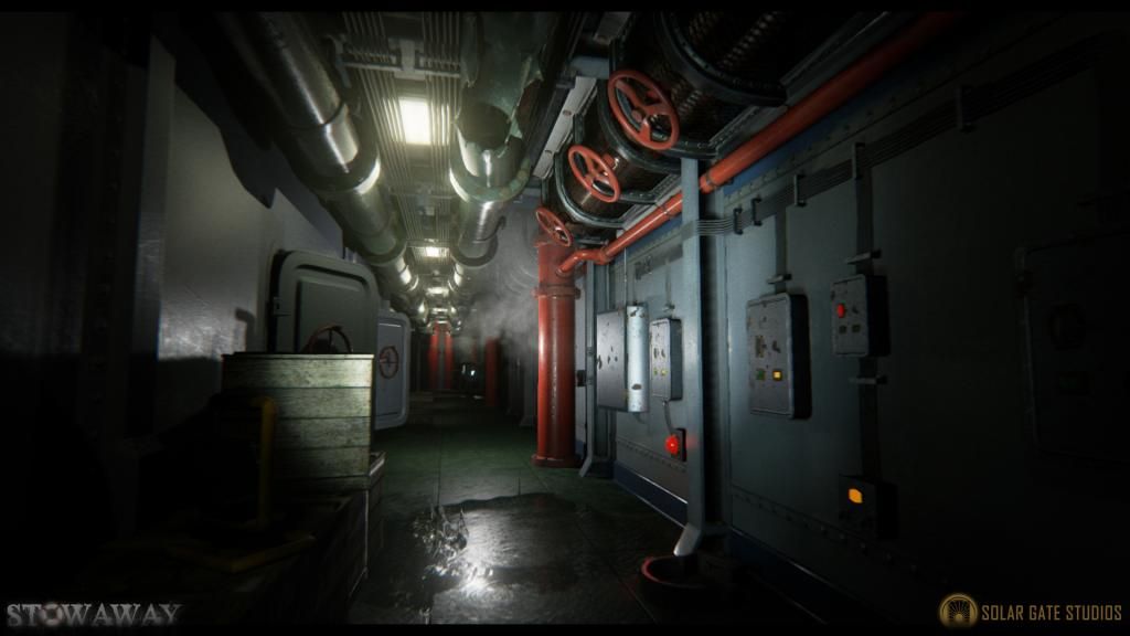
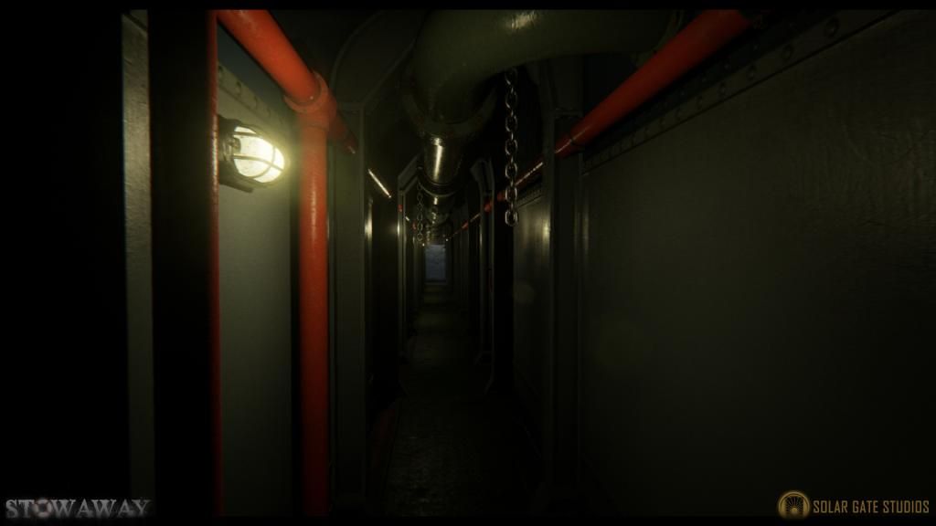
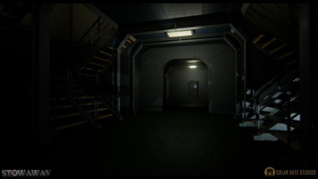
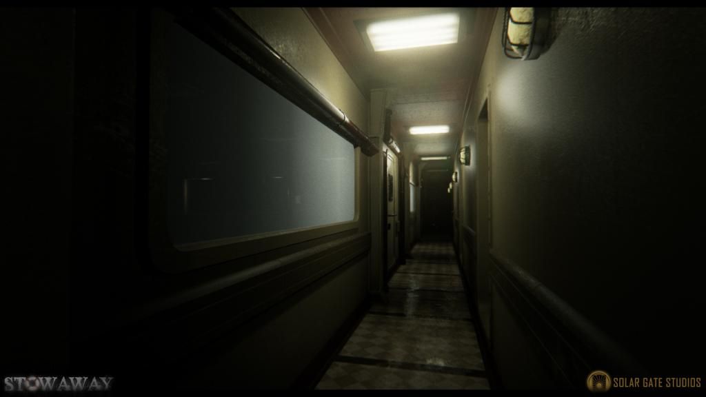
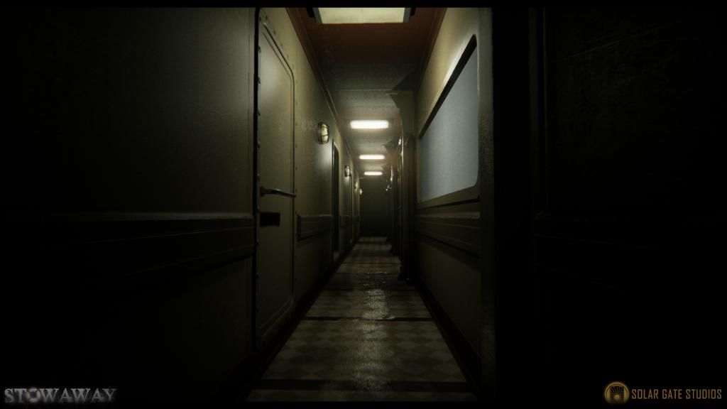
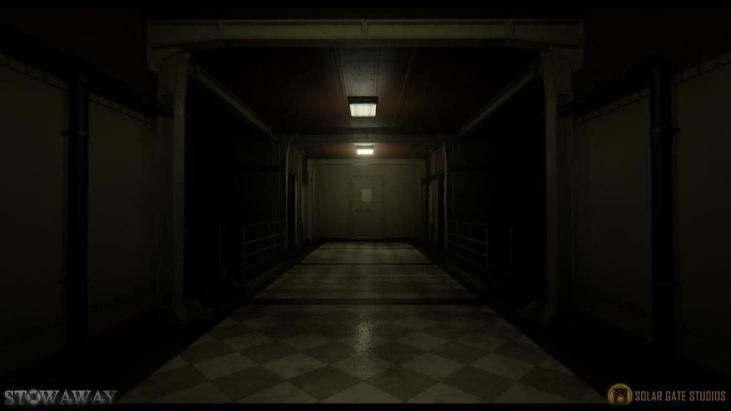
It's a mix of both, mostly dynamic at the moment, as it's a work in progress so it just makes life easier to have dynamic lights while building the environment. It means I don't have to constantly build the lights every time I place or move a mesh
Man one warning I can give you, never have anything fully shadowed. I played the most recent Killzone and hated the level where the player was on the abandoned ship. I had the game's brightness maxed and my tv was set to a high brightness setting and I was STILL disoriented in the dark. I get that they were going for a spooky mood, but if you do that, at least give the player some way of casting light. Like a flashlight with limited line of light
Thanks for the feedback BringMeASunkist, I know exactly what you mean, I had the same issue when I played Halo ODST, nothing irritates me more than when you can't see anything.
Obviously we need the darkness to increase the horror aspect of the game and they player immersion. However we are giving the player multiple objects that they can use to light up the areas. They can swap and choose their light source to suit the area of the ship they are in. So where some areas will be very dark, they will never not be able to see where they're going
It's very clean at the moment, due to using modular assets I wanted to avoid having obvious dirt in the texture so that it didn't repeat all over the ship. I'm going to use decals to add more dirt and grime to the walls at a later date.
Looks great, I'm glad to see the horror genre has been getting more popular in the last few years. It's about time we see some well made modern horror games!
You might want to switch from normal, white lighting to red emergency lights to give it more of an abandoned feel.
Small details - scattered papers, overturned mugs & chairs - can also add to the creepy vibe.
Even smaller details - a still steaming cup of coffee or smouldering cigarette - can also enhance the mystery. Slowly dripping water - 2 or 3 drops a minute, for example - with an appropriate sound effect is also effective.
The survival/horror media I've found effective - whether in movies or games - have been in the less-is-more school. Gradually build up, and let the player's imagination do most of the work for you; by the time you actually show anything the player should already be hiding under the desk holding his blanky...
We have some red emergency lights scattered around, got to be careful with them, sometimes they can be a bit too intense and a bit garish, were using them, but not massively. All the extra props and deco objects are currently being modeled as we speak. But I agree with you, less is definitely more, were aiming for subtleties rather than over the top, in your face scares. Suspense and creating the impression that something is there can often be much scarier than a big monster just shouting in your face!
Ahh man I would love to see a tutorial or even just a recording of you mapping in UE4. I am creating a horror game with my own team of developers in UE4 we are currently modelling props and our mapper/level designer is working on getting our first scene done. This is some nice inspiration though, really high quality stuff dude!
Sorry ScrotieFlapWack I don't have any recordings! I'm not doing much of the environment at the moment, I'm working on props, I'll get back to it when I have more meshes to place! Thanks again for the comments!
Just posting some progress on the props, only done the one so far, hopefully get a lot more done in the coming week.
Dayum man! I'm following this thread, very excited. Really love the work dude keep it going your making a masterpiece here! XD
The models and textures are incredible man. How are you doing your textures dude?
Another quick question too lol. How did you do your walls and ceilings etc? Are they just planes with normal map and stuff or is this some NDO wizardry?
Thanks for the comments man! Once again, really appreciate it! I'm mainly doing the texture with dDo with a bit of my own customisation in there. The walls were a fairly basic flat mesh and the rivets were baked from a high poly version into the normals. Then we used nDo to create some nice warping and painted metal effects in the normals. Then it was just a quick pass through dDo and done.
Were using a master material shader in UE4 to control the diffuse colour, roughness and metallic amount through instances. We then have a global rougnhess and normal map which we can control to add extra detail to certain meshes in the world.
Ive read that you use material instances. So how do you create the specularity? With material id masks? Just interested to know. Keep up the good stuff.
If you want to change the specularity of a material with an instance you just make sure the specular value is converted into a parameter so it can be adjusted in real time. Material IDs and Masks are 2 separate things, so I'm not sure what your referring to?
Ahh man incredible. Keep it going guys, I've liked you on Facebook and rated and faved on Steam
In regards to the materials, for my project I have been using substances with the plugin for UE4. I had some initial problems with UV's when modelling my parts, for some reason UE4 was telling me I had overlapping UV's so I have had to go super modular on my environment and build walls, floors, arches etc all on their own. Really love the models and textures here though guys very AAA.
Why are masks and material IDs two seperate things? Isnt it the same?
Well my questions seemed very odd let my try to rephrase:
i dont know how to go about when a prop needs different specularity values. So a wooden box held togheter by some metal would obviously need different values.
So in this case one would use material ID maps, right?
I havent heard about "masks" in unreal, could you explain that i a little furhter?
oh and yes, keep posting images
Hey dude I think I can help with this one. The way I would do this is put each prop in different UV sets. So in UV set 1 you have your UV's for your wooden box, then in UV set 2 you have your UV's for your metal strips on the box.
I think Odd3sy is using dDo (might be the new Quixel Suite) this would be the best workflow to texture one asset but with two UV sets. Hope that helps
Hi guys I wouldn't do it the way you suggested ScrotieFlapWack, that would be quite inefficient to use multiple UVs. By Material ID's I mean splitting the model in Max up into material elements, like you would if you were to use a multi sub object material in Max. Doing it that was means that when you bring the mesh into Unreal you can then apply multiple materials to a single mesh.
I tend to use this method for anything with glass or translucency because it seems to bug out otherwise when trying to use opacity maps.
The other way is to use maps to determine levels of roughness and specularlity. Darker areas on a roughness map appear very smooth, where as light areas appear very rough. You can then amplify this with the specular map (white areas shiny and dark areas dull) to increase/decrease the specularity of a mesh
When I refer to material masks I mean coloured RGB masks that you can add into a material shader to then control diffuse, colour, roughness, etc of different parts of the mesh using material instances.
Here's part of one of my shaders where I've used an RGB mask made in Photoshop to control different areas of a tiled floor piece.
I hope this was useful for you! Give me a shout if you have any more questions
Very clever stuff man! I am using Substances for my project (when I get more of it done I'll put up some screenshots). My problem is I don't use Max or Maya to model, I use Zbrush for sculpting, Silo 2 for box modelling and 3D - Coat for UV'ing and Topogun for topology on sculpts.
I have no clue how to split a model into separate material groups inside Silo 2 (I don't think it is even possible) thats why I've been doing my UV's this way so I can apply different substances to one mesh but anything thats more efficient I will gladly try XD
I guess I'll have to look into and see if it's possible to do this with Silo 2 otherwise I might be looking at getting Maya LT or something :P
That seems like a lot of programs to use, especially if your doing that per mesh! There's a lot of advantages of using Max as you can put ZBrush sculpts straight in, retop and unwrap all in one program. Seems like a very long winded pipeline to follow!
I forgot to mention earlier, those overlapping UV errors you are getting are more than likely overlapping lightmaps, I'm not sure if you have the ability to create multiple unwrap channels on a mesh to allow unreal to detect an unwrap for textures and another for the light map.
That seems like a lot of programs to use, especially if your doing that per mesh! There's a lot of advantages of using Max as you can put ZBrush sculpts straight in, retop and unwrap all in one program. Seems like a very long winded pipeline to follow!
Yeah I'm trying to figure out the best workflow to be honest haha. I've been experimenting with the handful of programs I have an I feel pretty comfortable doing it this way but I am starting to see the problems its causing.
I think I may get Maya LT (seen it on Steam pretty cheap per month). If I can get better results in a quicker time and better my workflow then that would be awesome
Max works best for me, high poly, low poly, unwrap, bake maps, texture, into engine. unless I'm sculpting in ZBrush then I tend to make a quick base mesh in Max to ensure I get the proportions and dimensions correct. I then take it to ZBrush, do my sculpt then export to XNormal and bake the normals, as super high poly meshes tend to lag Max out massivley.
Looking nice man! I'm still figuring out the best way to do lightmaps lol. I've stopped UV'ing in 3D - Coat and I'm now doing my UV sets in Silo 2 along with material ID's.
Great models though man and amazing textures keep going man!
I've been working this week on a vertex painting shader to create some variation on the modular assets in the environment. For more detail on the shader check out the website www.stowawaygame.co.uk
amazing work. wished the picture were of higher quality.
jpg should be an inexcusable offense when trying to display graphical fidelity.
regardless what an amazing game this is shaping up to be.
hopefully the gameplay follows this top notch trend and has innovative features to it.
rather than your typical run on the mill horror game of flashlights, dark room and reading a piece of paper.
Thanks for the comments Bladers, I'm not sure what happened to the image quality, that was a high res BMP taken straight from the engine, I'll look into that. Cheers for pointing that out.
Thank you again for the positive feedback, we appreciate all the support we get. We are happy with how the gameplay is shaping up so far. We're trying hard to make it as immersive as we possibly can, throwing in some good mechanics and a few features that stem back to the good old days of gaming.
If you want to find out more, or follow along with development you can sign up to our website www.stowawaygame.co.uk
Hey guys, thought I'd share with you some more gameplay orientated screenshots now that the experience is a lot smoother and more playable.
Hopefully this will give you a better sense of how the game will play and the sort of quality to expect.
Please understand this is PRE-ALPHA footage so its not representative of the final product. This is just a small slice of some of the techniques we are capable of implementing under the limited time frame we had, balancing them all to create a visually diverse vessel to explore; while keeping the gameplay elements smooth and controllable.
Replies
Is it 'baked light' or full dynamic lighting?
It's a mix of both, mostly dynamic at the moment, as it's a work in progress so it just makes life easier to have dynamic lights while building the environment. It means I don't have to constantly build the lights every time I place or move a mesh
Obviously we need the darkness to increase the horror aspect of the game and they player immersion. However we are giving the player multiple objects that they can use to light up the areas. They can swap and choose their light source to suit the area of the ship they are in. So where some areas will be very dark, they will never not be able to see where they're going
I like the hall way.
It's very clean at the moment, due to using modular assets I wanted to avoid having obvious dirt in the texture so that it didn't repeat all over the ship. I'm going to use decals to add more dirt and grime to the walls at a later date.
Facebook https://www.facebook.com/StowawayGame
Steam Greenlight http://steamcommunity.com/sharedfiles/filedetails/?id=279016282
Indie DB http://www.indiedb.com/games/stowaway
Good luck. And I hope it goes smoothly.
Small details - scattered papers, overturned mugs & chairs - can also add to the creepy vibe.
Even smaller details - a still steaming cup of coffee or smouldering cigarette - can also enhance the mystery. Slowly dripping water - 2 or 3 drops a minute, for example - with an appropriate sound effect is also effective.
The survival/horror media I've found effective - whether in movies or games - have been in the less-is-more school. Gradually build up, and let the player's imagination do most of the work for you; by the time you actually show anything the player should already be hiding under the desk holding his blanky...
We have some red emergency lights scattered around, got to be careful with them, sometimes they can be a bit too intense and a bit garish, were using them, but not massively. All the extra props and deco objects are currently being modeled as we speak. But I agree with you, less is definitely more, were aiming for subtleties rather than over the top, in your face scares. Suspense and creating the impression that something is there can often be much scarier than a big monster just shouting in your face!
Just posting some progress on the props, only done the one so far, hopefully get a lot more done in the coming week.
The models and textures are incredible man. How are you doing your textures dude?
Another quick question too lol. How did you do your walls and ceilings etc? Are they just planes with normal map and stuff or is this some NDO wizardry?
Were using a master material shader in UE4 to control the diffuse colour, roughness and metallic amount through instances. We then have a global rougnhess and normal map which we can control to add extra detail to certain meshes in the world.
Hope that helps! Thanks again
Ive read that you use material instances. So how do you create the specularity? With material id masks? Just interested to know. Keep up the good stuff.
If you want to change the specularity of a material with an instance you just make sure the specular value is converted into a parameter so it can be adjusted in real time. Material IDs and Masks are 2 separate things, so I'm not sure what your referring to?
In regards to the materials, for my project I have been using substances with the plugin for UE4. I had some initial problems with UV's when modelling my parts, for some reason UE4 was telling me I had overlapping UV's so I have had to go super modular on my environment and build walls, floors, arches etc all on their own. Really love the models and textures here though guys very AAA.
Why are masks and material IDs two seperate things? Isnt it the same?
Well my questions seemed very odd let my try to rephrase:
i dont know how to go about when a prop needs different specularity values. So a wooden box held togheter by some metal would obviously need different values.
So in this case one would use material ID maps, right?
I havent heard about "masks" in unreal, could you explain that i a little furhter?
oh and yes, keep posting images
Hey dude I think I can help with this one. The way I would do this is put each prop in different UV sets. So in UV set 1 you have your UV's for your wooden box, then in UV set 2 you have your UV's for your metal strips on the box.
I think Odd3sy is using dDo (might be the new Quixel Suite) this would be the best workflow to texture one asset but with two UV sets. Hope that helps
I tend to use this method for anything with glass or translucency because it seems to bug out otherwise when trying to use opacity maps.
The other way is to use maps to determine levels of roughness and specularlity. Darker areas on a roughness map appear very smooth, where as light areas appear very rough. You can then amplify this with the specular map (white areas shiny and dark areas dull) to increase/decrease the specularity of a mesh
When I refer to material masks I mean coloured RGB masks that you can add into a material shader to then control diffuse, colour, roughness, etc of different parts of the mesh using material instances.
Here's part of one of my shaders where I've used an RGB mask made in Photoshop to control different areas of a tiled floor piece.
I hope this was useful for you! Give me a shout if you have any more questions
I have no clue how to split a model into separate material groups inside Silo 2 (I don't think it is even possible) thats why I've been doing my UV's this way so I can apply different substances to one mesh but anything thats more efficient I will gladly try XD
I guess I'll have to look into and see if it's possible to do this with Silo 2 otherwise I might be looking at getting Maya LT or something :P
I forgot to mention earlier, those overlapping UV errors you are getting are more than likely overlapping lightmaps, I'm not sure if you have the ability to create multiple unwrap channels on a mesh to allow unreal to detect an unwrap for textures and another for the light map.
Yeah I'm trying to figure out the best workflow to be honest haha. I've been experimenting with the handful of programs I have an I feel pretty comfortable doing it this way but I am starting to see the problems its causing.
I think I may get Maya LT (seen it on Steam pretty cheap per month). If I can get better results in a quicker time and better my workflow then that would be awesome
Great models though man and amazing textures keep going man!
jpg should be an inexcusable offense when trying to display graphical fidelity.
regardless what an amazing game this is shaping up to be.
hopefully the gameplay follows this top notch trend and has innovative features to it.
rather than your typical run on the mill horror game of flashlights, dark room and reading a piece of paper.
Thank you again for the positive feedback, we appreciate all the support we get. We are happy with how the gameplay is shaping up so far. We're trying hard to make it as immersive as we possibly can, throwing in some good mechanics and a few features that stem back to the good old days of gaming.
If you want to find out more, or follow along with development you can sign up to our website www.stowawaygame.co.uk
Thanks again!!
Hopefully this will give you a better sense of how the game will play and the sort of quality to expect.
Please understand this is PRE-ALPHA footage so its not representative of the final product. This is just a small slice of some of the techniques we are capable of implementing under the limited time frame we had, balancing them all to create a visually diverse vessel to explore; while keeping the gameplay elements smooth and controllable.