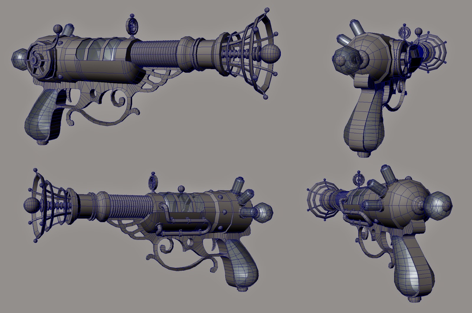
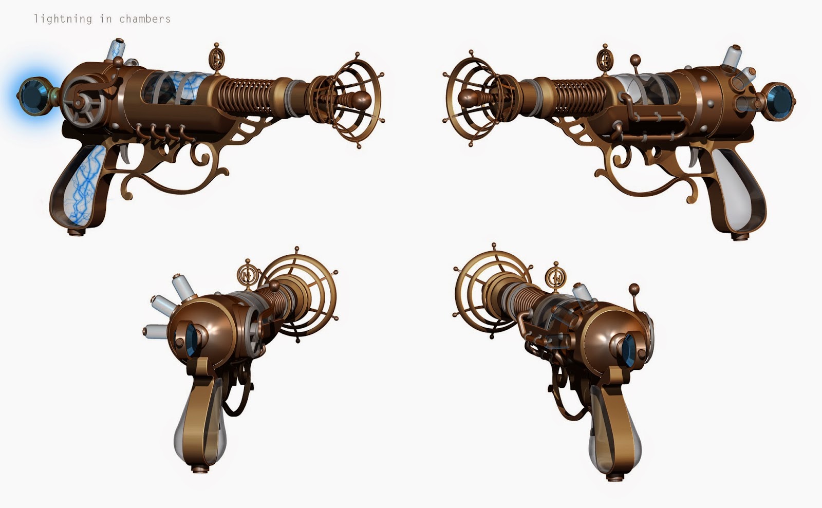
Just wanted to get some feedback on this gun I've started working on before I really did into the texturing. Inside of the glass areas will be little bolts of lightning with a separate particle made in UE4. Any feedback would be much appreciated

!

UPDATED:

Replies
I'm also a little confused about the back part. Is the design actually faceted like that or is it supposed to be perfectly round and you're just trying to stay within a polygon budget?
The front has a much smoother silhouette than the backside and it just seems inconsistent if that's not supposed to be the case.
Tobbo: I was trying to stick within a limit of 5k-10k tris and right now it's sitting at 9k so there is some room for smoothing. I'm toying with the idea of making that back sphere a glowing crystal instead of another glass piece maybe as like a sort of power source for all the electricity?
Dragonxxxv: Not sure what wires you're talking about? is under 10k tris for a FPS weapon too much? Going from low to high poly this time around and thankfully everything is already unwrapped atm so any changes will be unwrapped as I go but the bulk of it is done thankfully!
All of your spheres, for example, seem to have the same number of triangles; those tiny ones at the end of the muzzle should be reduced, while the one at the very back should be smoother.
The same is also true for your cylinders. The thin cylinders forming the lightning rod and the muzzle cage have too many sides, especially considering their distance from the player, while the glass area should be smoother.
You can probably also change the 'corrugated' cylinder in front of the glass portion to a solid cylinder, allowing the normal map to indicate the ridges.
With proper optimization, you're probably looking at a 5-6k model that looks better in-game.
Changed the back to a gemstone to give is a cool little glowing power source for all the lightning inside. Though I could keep working the model even more I need to start on a large scale environment so I am getting ready to texture this guy and move on by the end of the week.
DWalker: I did optimize it some more and did pretty much exactly what you said and lowered the cylinders in the front and upped the larger pieces in the back as well as some other parts, the base mesh is sitting at 6.4k now.
If you're like me, school taught you that quads are essential. Half true.
Quads are essential for a large number of reasons. But low poly games models are the exclusion to the rule; most game engines use triangulated models anyway so imported quads is a moot point. In red, I've highlighted some edges that I feel could be optimized down to tris and in green I've added some places I think you could add some edges to improve the silhouette.
A critique I often received at job fairs was the inconsistent poly density on my models. It's super important to allocate the right amount of tris throughout. Obviously spheres need more tris than cylinders, which need more tiss than cubes, but try to keep the density somewhat thought out. Is this model going to be a first person weapon? Put more tris in the rear. Is this model going to be a glamor shot of a cool looking gun, try to make the wireframe look consistent.
Right now I am about to do a little paintover to figure out what colors and materials I want all the pieces to be but here is a quick shot from Zbrush with just some quick mat caps thrown on.
For the future, I wouldn't even worry about the low poly until you're finished with the high poly. Sure keep the low poly in mind as you're making the high, but you shouldn't make the low poly before you make the high. If you try and let the low poly dictate everything you're just limiting yourself. Make the low poly based off of the high, not the other way around.
What you had before I would consider it to be a block out mesh. I was confused because you called it your low poly, which typically means your end result mesh.
Rather than almost all brass, consider using the steampunk triumvirate of brass, wood, and steel.