Akira´s Project
Hello there,
almost done my last personal project. A lowpoly model based on Akira´s anime, kaneda. My first time with Marmoset, a lot things to study, but definitely it´s awesome to make real time renders.
...any critics or tips are welcome...thanks
HASTA
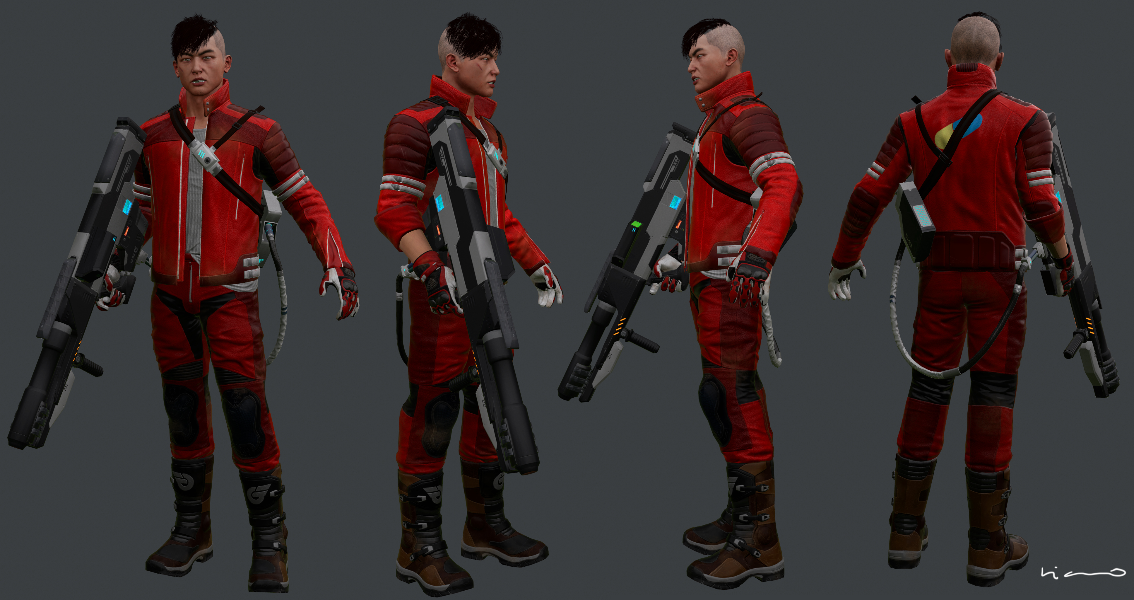
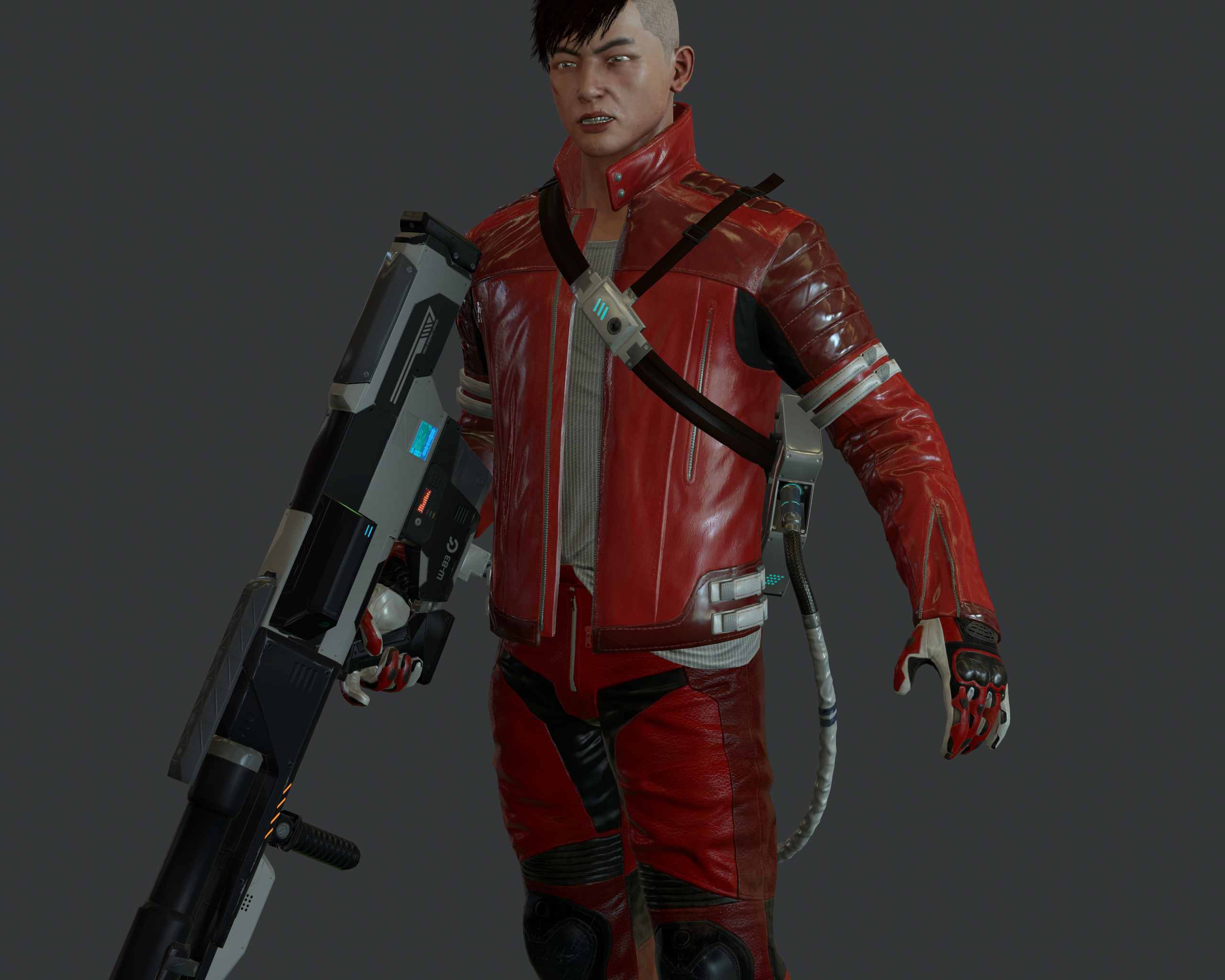
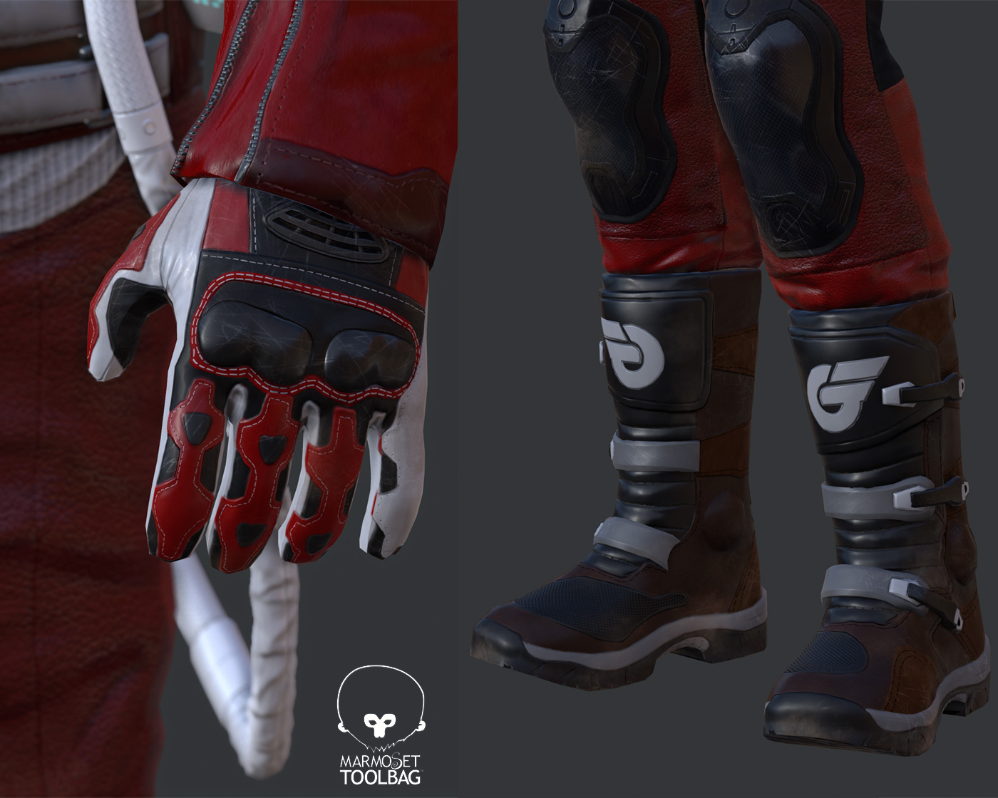
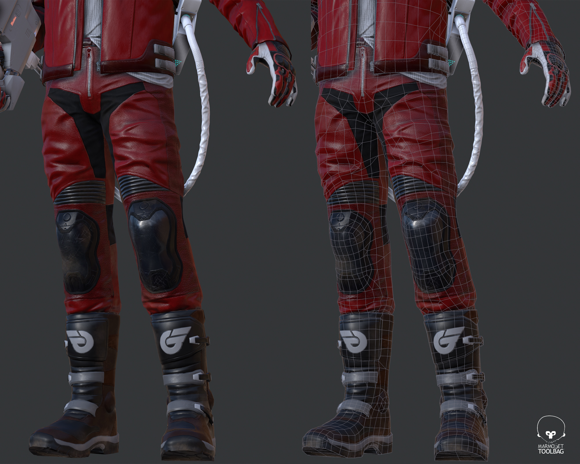
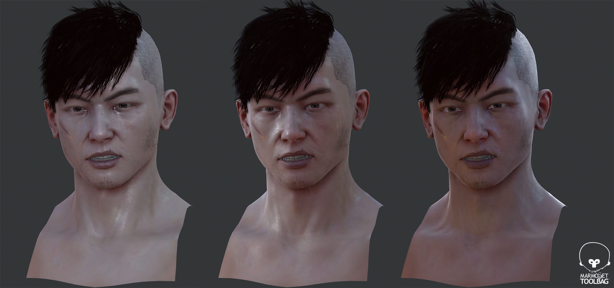
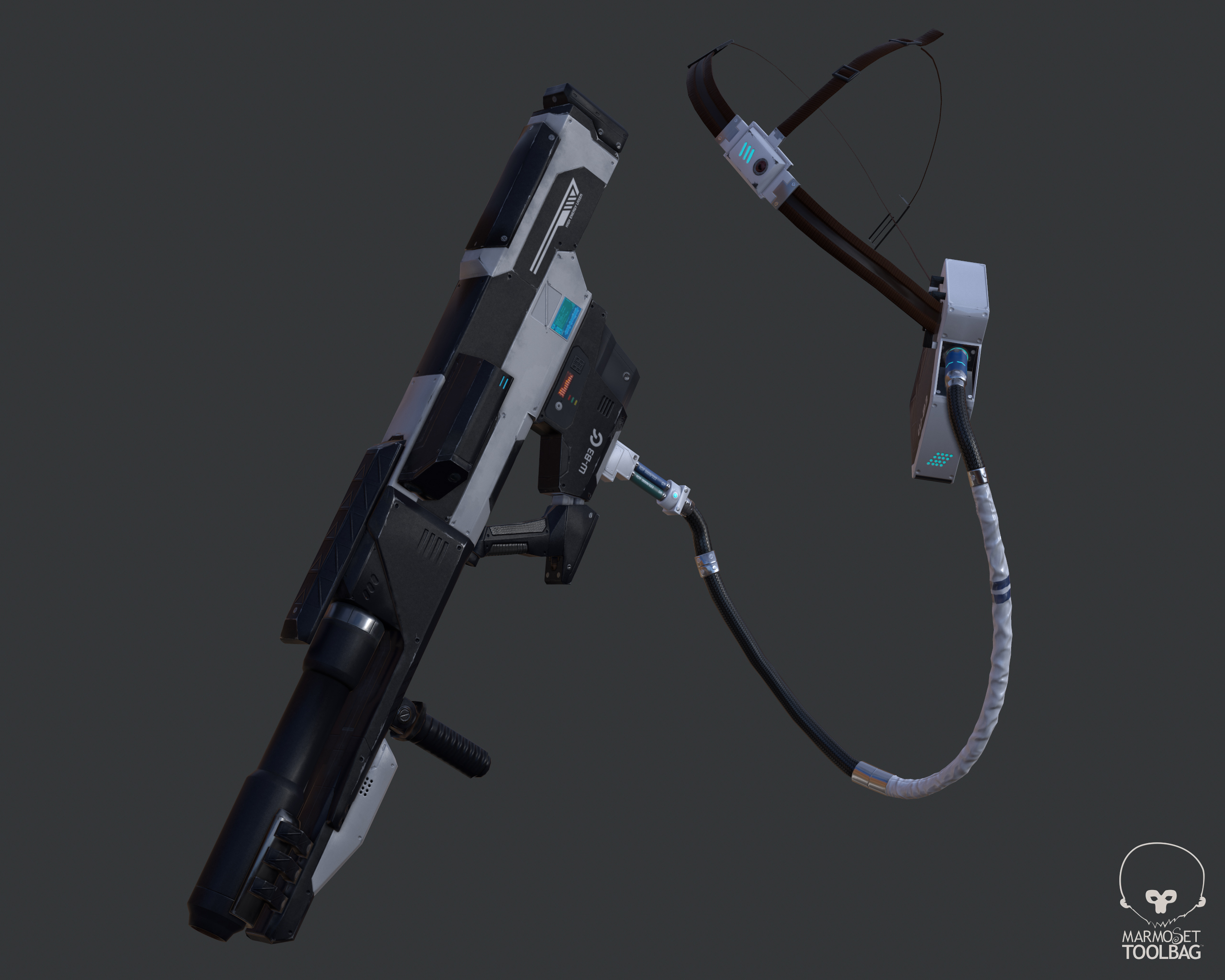
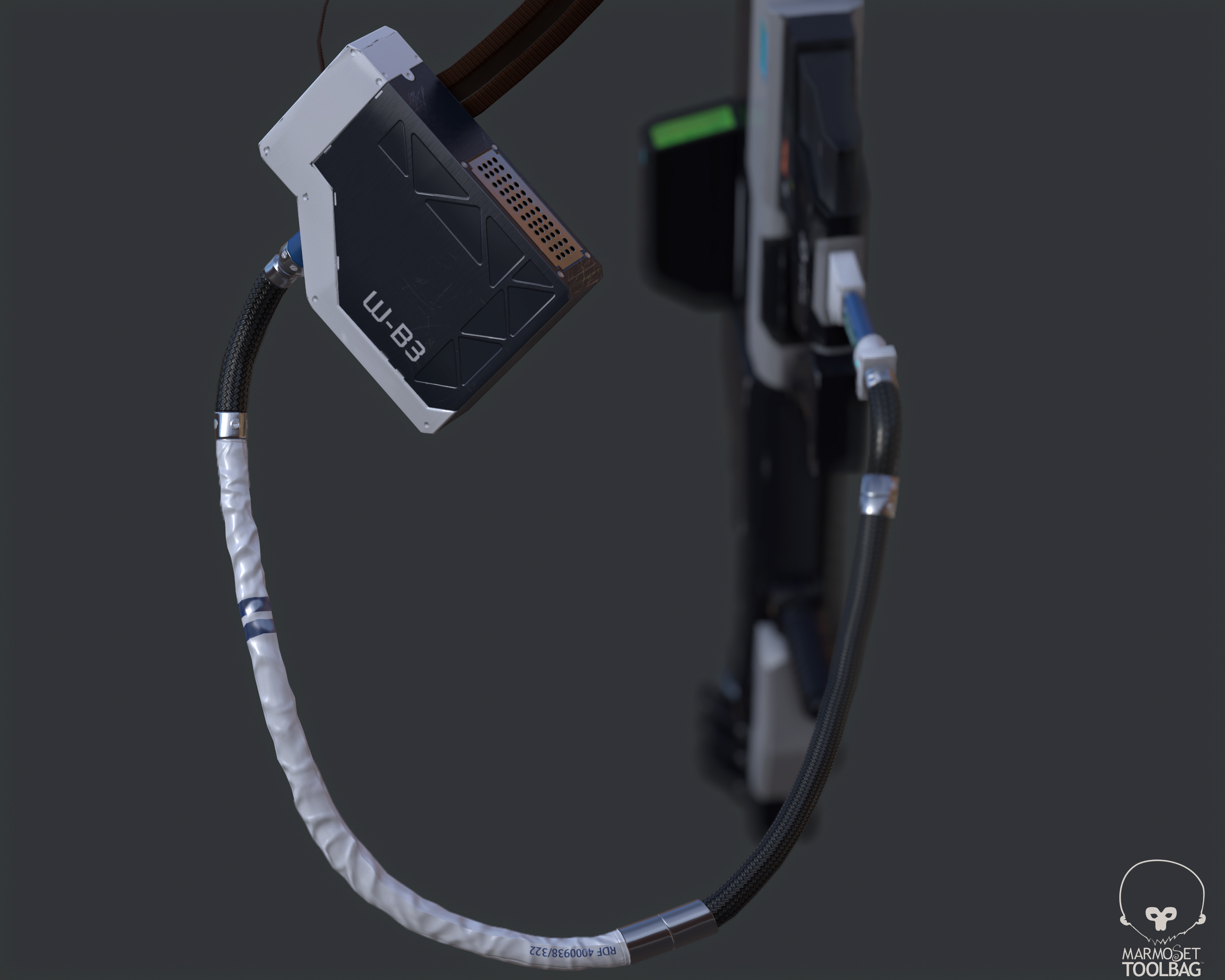
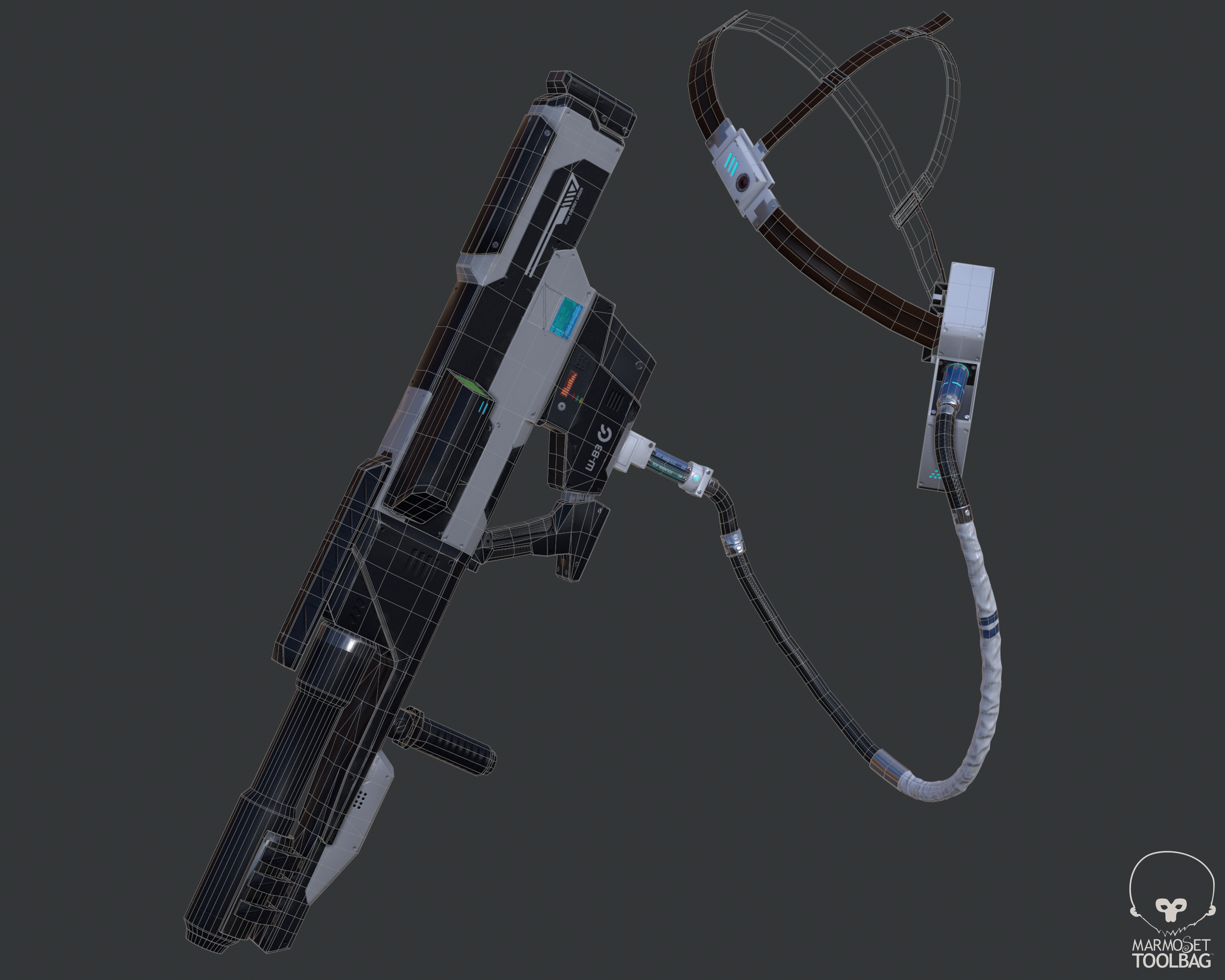
almost done my last personal project. A lowpoly model based on Akira´s anime, kaneda. My first time with Marmoset, a lot things to study, but definitely it´s awesome to make real time renders.
...any critics or tips are welcome...thanks
HASTA


Replies
The materials are reading a little flat, I think it lacks a dirt/grime pass and some general gradients.
Also, your lighting is hurting this a lot. Need to work on the lighting quite a bit more.
Pretty cool looking hair. I would be interested to see a breakdown on that!
Especially the white plastic, covering otherwise the black boring tube/cable. Don't know why, but it really caught my eye.
But as Stirls mentioned - it looks like you don't have AO currently, or if you do, crank it up.
i´m working in the project breakdown , hasta
I do feel like the color in his face is too even. Maybe you could add some more red in there, considering he is exhausted.
1) The pose feels a bit stiff and so does his facial expression. I'd push both.
2) If I remember correctly that gun is used towards the end and sh*t has gone down so he shouldn't be that clean. I'd add some dips, dents and whatnot to show he's been through some hell. That shirt is waaaaaaay too white and that jacket is begging for some dirt.
3) I agree with the comment above about the diffuse needing a bit more color variation on the face.
That aside, it's looking pretty good.