Complicated humanoid monster..
It's early days for this sculpt, I've just "finished" the block out in zbrush but I'd appreciate people's opinions on form and silhouette and any pointers before I take it any further. I'm making this mesh to be game ready.
I've made his torso more human/muscular than shown in the concept as that area of the concept is quite vague and I'm not really sure what to do with it yet.
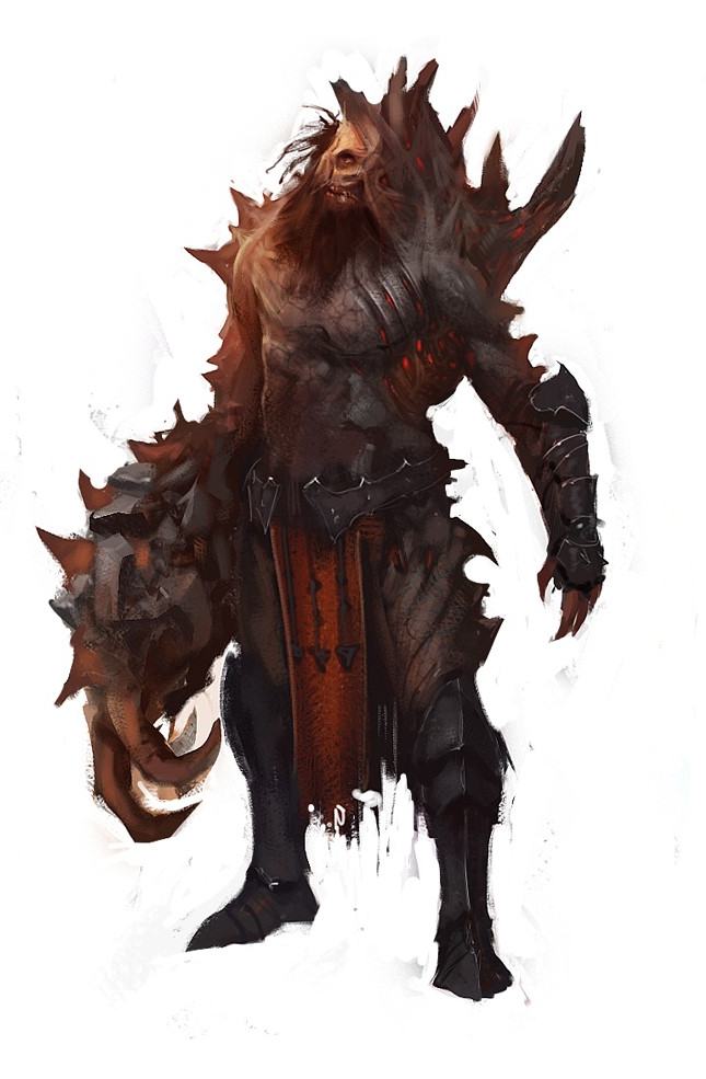
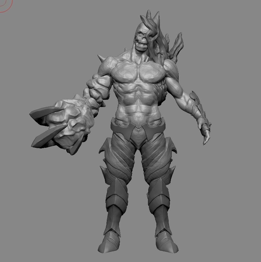
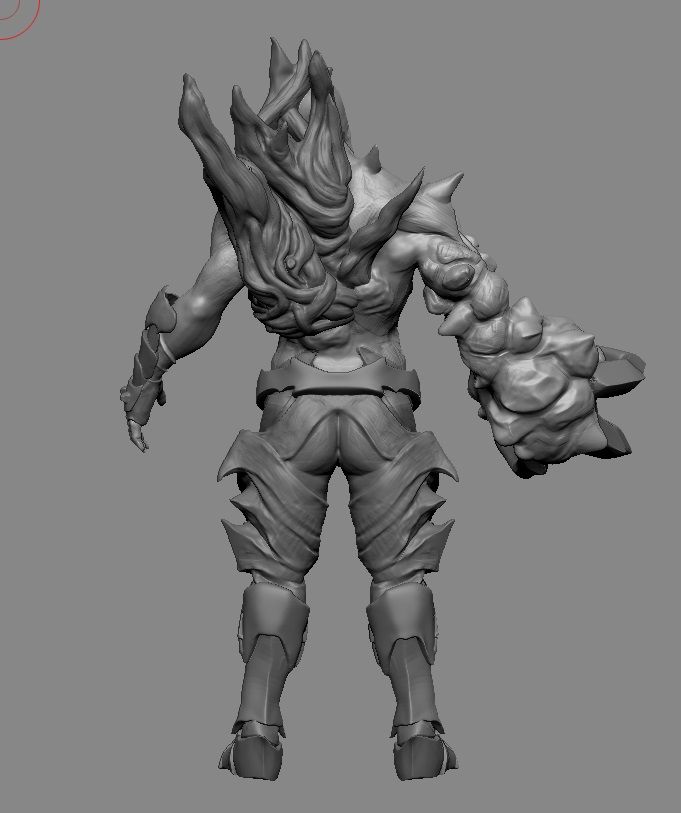
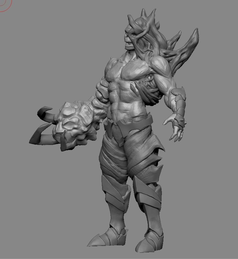
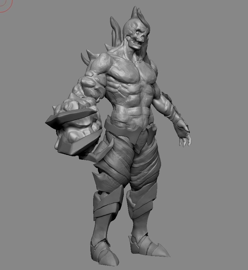
I've made his torso more human/muscular than shown in the concept as that area of the concept is quite vague and I'm not really sure what to do with it yet.


Replies
I think it looks like a sick start!. I gotta say, I wish you tried to make the torsos less human, more like it is in the concept. In the concept he looks like he takes up more space and he's bulkier. both ways would look fine though.
@Itholon
I agree with the head thing. It looks less skull like in the concept.
I agree the face looks too skull-like, I might try a placeholder beard as it's quite hard to see what difference that will make to the silhouette and definition of the jaw.
I think the torso will definitely become less human and more bulky, it might just need some iterations before it looks right.
So far I think it's been about 6 hours. To completion.. 40 hours?
In general I think you are defining forms too much. One of the cool things about the concept is he sorta has this melted skin look to him. Try to simulate that as much as you can and this will really stand out.j
[edit] just to explain more. try to push yourself to make it look like the concept, not what you think human anatomy looks like. One thing I notice is you are moving around and hitting all the general muscle groups and stuff, which is fine, but sorta a waste of time, and is distracting with the forms in general. In the concept he has like no abs showing, so in yours there shouldn't be any. Anyway, keep up the good work here!
Buffed him up a bit and lengthened the left arm.
Blocking in a few more shapes
Thanks KazeoHin, nearly there. :poly121: