Home 2D Art Showcase & Critiques

More Hand Painted Textures

DeathMethod
polycounter lvl 3
Offline / Send Message
DeathMethod polycounter lvl 3
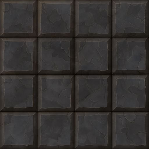
Hey all, its been a while since I've posted anything but i have still been plugging away trying to get the hang of hand painted textures. I just want to know what people think of these.

Id like some feedback on these to see what else i can do as I feel ive been staring at them too long.
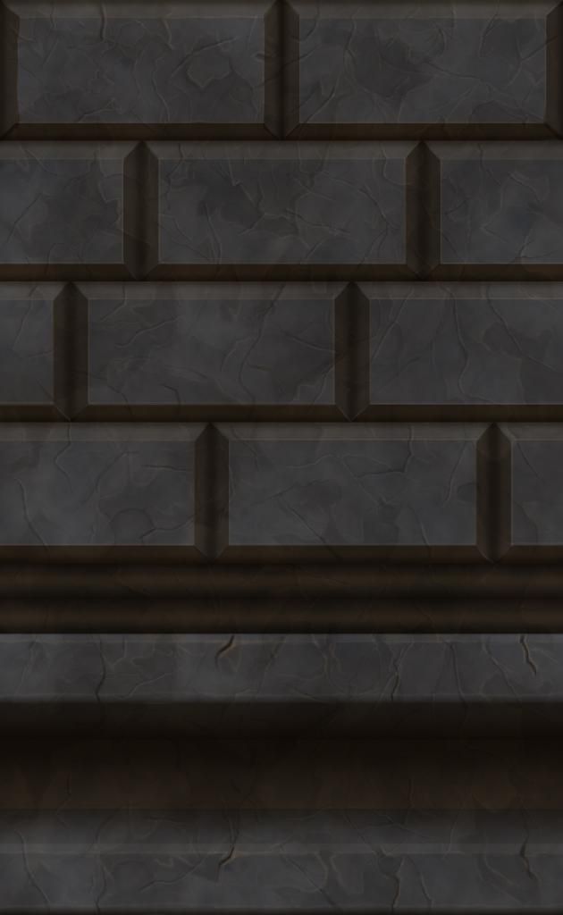
wall1-1.jpg


floor1-1.jpg%7Eoriginal
Cheers.

Replies

  • DeathMethod
    Offline / Send Message
    DeathMethod polycounter lvl 3
    blueroof.jpg%7Eoriginal

    A blue roof I did today.
  • artquest
    Offline / Send Message
    artquest polycounter lvl 14
    These look pretty good so far man, But your bricks are so perfectly edged, It'll give them more character if they looked a little more "hand made" imo. Maybe even add some surface imperfections like chips and such.
  • Fenyce
    Offline / Send Message
    Fenyce polycounter lvl 11
    I really like the roofing.
  • pmiller001
    Offline / Send Message
    pmiller001 greentooth
    Nice Brick man. I'm not expert, but they (the brick) look a little too perfect. Otherwise, I really do enjoy it. That roofing looks like a dragon sacle thing, whatever it is, I enjoy it.
  • DeathMethod
    Offline / Send Message
    DeathMethod polycounter lvl 3
    Hey all!
    Thanks for the feedback. I decided to start the bricks again and came out with the following. I will visit the roof texture and try to improve on it.

    Think I will start on a wood texture now.

    22-julbrick1.jpg
  • ArtViktor
    First thing I thought of when I saw the roof was "Oh, pretty dragon scales!". If you want to to something like that, the blue roof could easily be converted to scales of some sort. I make the hightlilghts a bit brighter for more 3D effect. Great job!
  • Khaja
    have you checked out these textures when there tiled? your latest one looks as though that one brick would pop out to the eye too much when tiled. Other than that your textures are fantastic man. looking forward to seeing more
  • DeathMethod
    Offline / Send Message
    DeathMethod polycounter lvl 3
    Thanks all for the feedback. I may do another roof with flat slates and use the other texture as dragon scales as that seems to be the general opinion, I kinda think that myself now. Will do a bit more work on it and see what i can do.

    On the brick texture. I have tiled it and 3 of them pop out a bit more than the rest. If anyone has a tutorial to pop a brick into the wall it would be appreciated.

    Cheers.

    More to come soon!!
  • Owlie
    Something that really helps right when starting out hand painted textures is making a few of the bricks different colors to break up the composition of the wall. So maybe giving a few a more red hue, maybe a stray one should be slightly more green than the others. Hope this helps!
  • DeathMethod
    Offline / Send Message
    DeathMethod polycounter lvl 3
    Thanks Owlie. I but a few colour overlays on the bricks and I think it makes them pop even more. Thanks for that great advice. Also tiled the texture so people can see it repeated.

    brick3.jpg
  • DeathMethod
    Offline / Send Message
    DeathMethod polycounter lvl 3
    Had another go at a roof texture.

    roof31-7.jpg
  • IndieGear
    Offline / Send Message
    IndieGear polycounter lvl 8
    Well done! I like the variety in the tiles here! I'd probably move that on dark tile to a lower row, just so it wouldn't look too repetitive.
    Keep going!
  • skylebones
    Offline / Send Message
    skylebones polycounter lvl 10
    Hey DeathMethod, I hope you don't mind but I did a quick and dirty 5min paintover that I hope will give you some valuable feedback.

    Roof_Tile_Paintover.jpg

    Really push the gradient from the place where the tiles meet to the tip of the tile. You already have a gradient, but push it further. You don't want things to be stagnant, always changing in value. Also, typically things get more saturated in the darker areas and less saturated as it lightens up. So change the saturation of your colors as you move along the gradient, and even change the colors a bit. I like to go more purple/blue in the shadows and a lighter almost cyan color in the light. You don't want to use the same hue of blue everywhere.

    you have some damage marks, but they are random in their direction, almost like leather. Wood tiles are traditionally cut along the grain, and as wood ages it splits and cracks along the grain. So add some grain to your wood and make the damage and splitting follow it's form. Also it can help to show parts where the paint has torn away, that really re-enforces the idea that this is old wood painted blue.

    I hope this has helped! Your making wonderful progress, keep it up!
  • DeathMethod
    Offline / Send Message
    DeathMethod polycounter lvl 3
    wood1.jpg

    Having trouble making the roof look good to a degree im happy with. Did a wood texture in the meantime.
    Let me know what you think.

    Cheers
Sign In or Register to comment.