The BRAWL² Tournament Challenge has been announced!
It starts May 12, and ends Oct 17. Let's see what you got!
https://polycount.com/discussion/237047/the-brawl²-tournament
It starts May 12, and ends Oct 17. Let's see what you got!
https://polycount.com/discussion/237047/the-brawl²-tournament
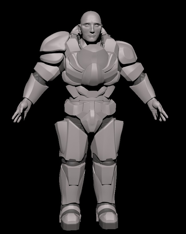
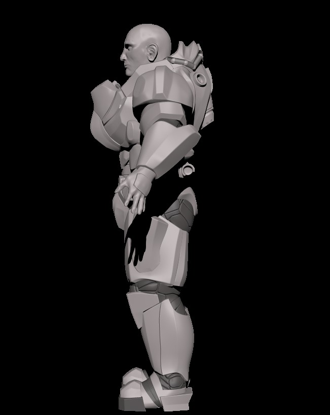
SciFi Soldier
Ok so I've been working on this for a while, and it is currently the most complex thing I have ever done. Still in the High Poly phase. I have never done hair planes before and was wondering if anyone could point me in the right direction.
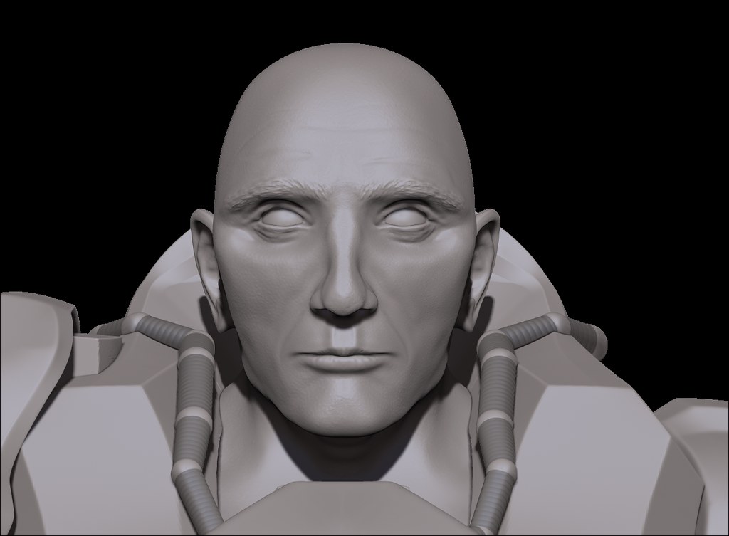
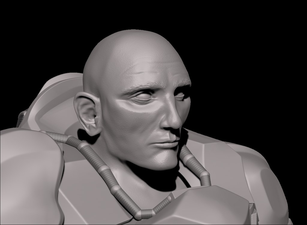
Also....eyeballs. I have never been able to make believable eyes. I think that it needs to be sculpted in high poly, I have just never done eyes that don't look like horrible paintings.
Any critiques are welcomed. The zspheres around the neck is going to get turned into a hose of some kind. I plan on detailing the armor a bit more since it is kind of boring at the moment (at least I think It is).


Replies
OK So I think I have fixed it. If it is still off please let me know.
front, side and 3 quarters of the same male person (if you haven't) and start working on the face some more.
There's quite a lot of stuff still off, don't add pores and details until you are a 100% sure the shapes work ^^
Also..if you have a basic body underneath it would be easier to judge anatomy problems on the body itself(but if you don't, because you were lazy and wanted to do armor without any anatomy.. well.. :P)
Reference is key.. and even not so experienced people can create quite a lot while using good reference(me being one of them, just sharing my experience so far).
I think something that is causing me problems is the person whose face I am modeling is not the same person as the body. The body I used a lot of references from roman sculptures along with some from renaissance sculptors. The face references I've been using is Daniel Craig, I watched skyfall the night before I started the face and said why not.
But here is what I have without the armor on it (well the outer armor).
For comparison: (grid lines have the same spacing).. his ears are rather large and the nasolabial fold isn't there yet.
hopefully this is helpful for you
Something on mine still looks really off. I think its the part where his cheeks meets his jaw but every time i try to fix them it seems to no really change that much.
also, I have not tried to fix the ears yet
It's hard to see in the side view, but I think you could define the jaw line a bit more. The eyes seem a bit twisted too.
cheers
So this is where I am at now with the head.
I plan on adding a helmet now, but I would also like to add a buzz cut and stubble to the character instead of clean shaved head and face. What would be the best way to pull that off?
I will defiantly start doing that. Thanks
I need to texture and make a game res mesh still.
Please point out anything that is off or needs a bit more work. thanks
first of great effort you`re putting into learning zbrush and character art.
But i think you`re taking on a bit more than you can chew atm.
theres two problems
1. Anatomy:
You seem to be afraid to dig into your shapes, i suggest sculpting a naked body first before adding the armor ontop. Atm everything is very straight and rectangular as if you`re adding detail ontop of a basemesh.
2. Design:
This is the most tricky one since it relies a lot on your own visual library and experience. Some shapes clash with eachother while others work perfectly. When your eye isnt trained you might feel something is off but cant point out what it is.
The only way to fix these problems is to do a lot of studies from reference, I`d say first leave the design part out. Try to create something from someone elses concept. Learn to see why things work and why not and move on from there.
For anatomy do a lot of smaller studies, like sculpt a chest from reference out of a sphere. and do it a lot.
i`m sorry if this sounds harsh but i hope you get the message, if you do this you`ll become better at a much faster pace with a bit less of a headache from wondering why stuff isnt looking the way you want it to
good luck and keep on going!
But keep them relatively quick and to the point.
I feel like his knees are a little low.