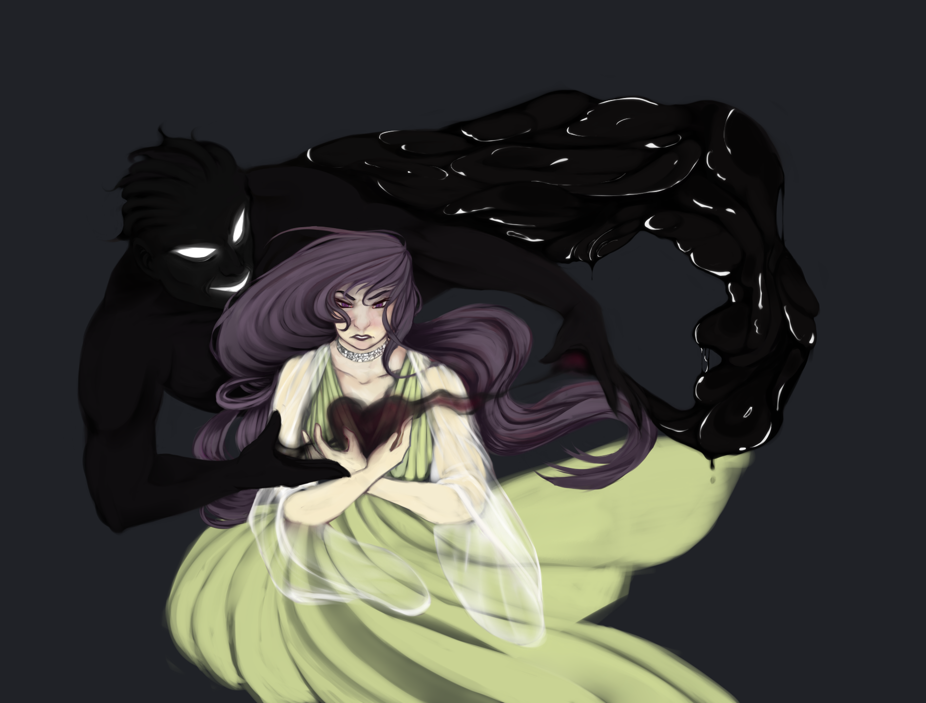
Hearty Roundabout - WIP
[UPDATED- Go to bottom of post to see update]
Hello, this is my first time making a thread or posting anything on Polycount at all, please forgive any incorrection in the posting method
This is a WIP of a portfolio piece, I've been working on it for about 3 evenings on and off, I'd really like some feedback on this piece

I haven't yet decided on what colour the background is going to be, nor the colour of her dress. I'm planning on working the sludge texture into the shadow's torso, and partially into his arms, but not his face (in that case by the hair)
Any feedback would be very appreciated!
(also if you could give me any advice on how/where to better post stuff like this, I'd also appreciate it a lot. I've been a member on Polycount since late 2013, but I only started using it today)
Hello, this is my first time making a thread or posting anything on Polycount at all, please forgive any incorrection in the posting method
This is a WIP of a portfolio piece, I've been working on it for about 3 evenings on and off, I'd really like some feedback on this piece

I haven't yet decided on what colour the background is going to be, nor the colour of her dress. I'm planning on working the sludge texture into the shadow's torso, and partially into his arms, but not his face (in that case by the hair)
Any feedback would be very appreciated!
(also if you could give me any advice on how/where to better post stuff like this, I'd also appreciate it a lot. I've been a member on Polycount since late 2013, but I only started using it today)
Replies
I'm not certain how finished the girl is, but her pose at the moment is difficult to see from her arms down. I'm not sure if she's kneeling or sitting, sitting on her legs or standing. The lower part of her dress is very wooshy, appears to be very short on the left side.
The directions her hair, dress, and sleeve things are blowing seem to be contradictory. Most of her hair appears to be blowing to the left, while the longer portion in the back is going right, matching her sleeves/dress.
Composition seems like it could use some consideration. She's over there in what might be an appropriate focus area for the rule of thirds thing, but the straight-on way you've painted her makes me think she'd be much better off in the dead center of the painting (maybe doing some cool half-circle, encompassing arch thing with the black sludge fella going over/behind her). If you plan to keep her where she is compositionally, you may consider experimenting with a 3/4ths view. I think centering her in the painting may help the wind-blown aspects being all over the place not such a bad thing, as well.
You mention being unsure of the background's color, though I feel this painting is an an odd place from a rendering style standpoint to have that fit. It feels fairly flat at the moment, but has enough done to it to not make it seem really intentionally flat. I think a solid color background may not be the best thing. At the same time, planning and rendering backgrounds if they weren't planned to begin with can be a pain in the ass, so I'm not certain what the answer is other than to recommend some experimentation so far as your background goes.
Not sure how far you intended to go with it, but the painting as a whole could really benefit from a discernible lightsource & corresponding shadows.
Beyond those crits, I'll say that I think it's a pretty cool idea, I like the expression on her face and what you've done with the hair so far.
The idea of sludgedude surrounding her in a half-circle sounds extremely tempting, and I think that would help with the contradicting dynamics in the wind (they were intentional, but it's a risky move, I know)
also luckily I wasn't planning on leaving the background flat, but I'll have to try out different things there
Overall thank you so much for this critique- it's an amazing help!
A continuation to the previous WIP, based on the feedback I got. I also horisontally reversed the position of the slimedude since I thought it gave the overall mass a better ballance.
There's still some tweaking to be done like the position of the heart and I'm also still trying to figure out a good background. Any tips and further crits?
Thanks a lot in advance
There might be a bit too much space beneath his chest right now, should I add something more there?
Also is it just me, or does his left arm appear as too short?