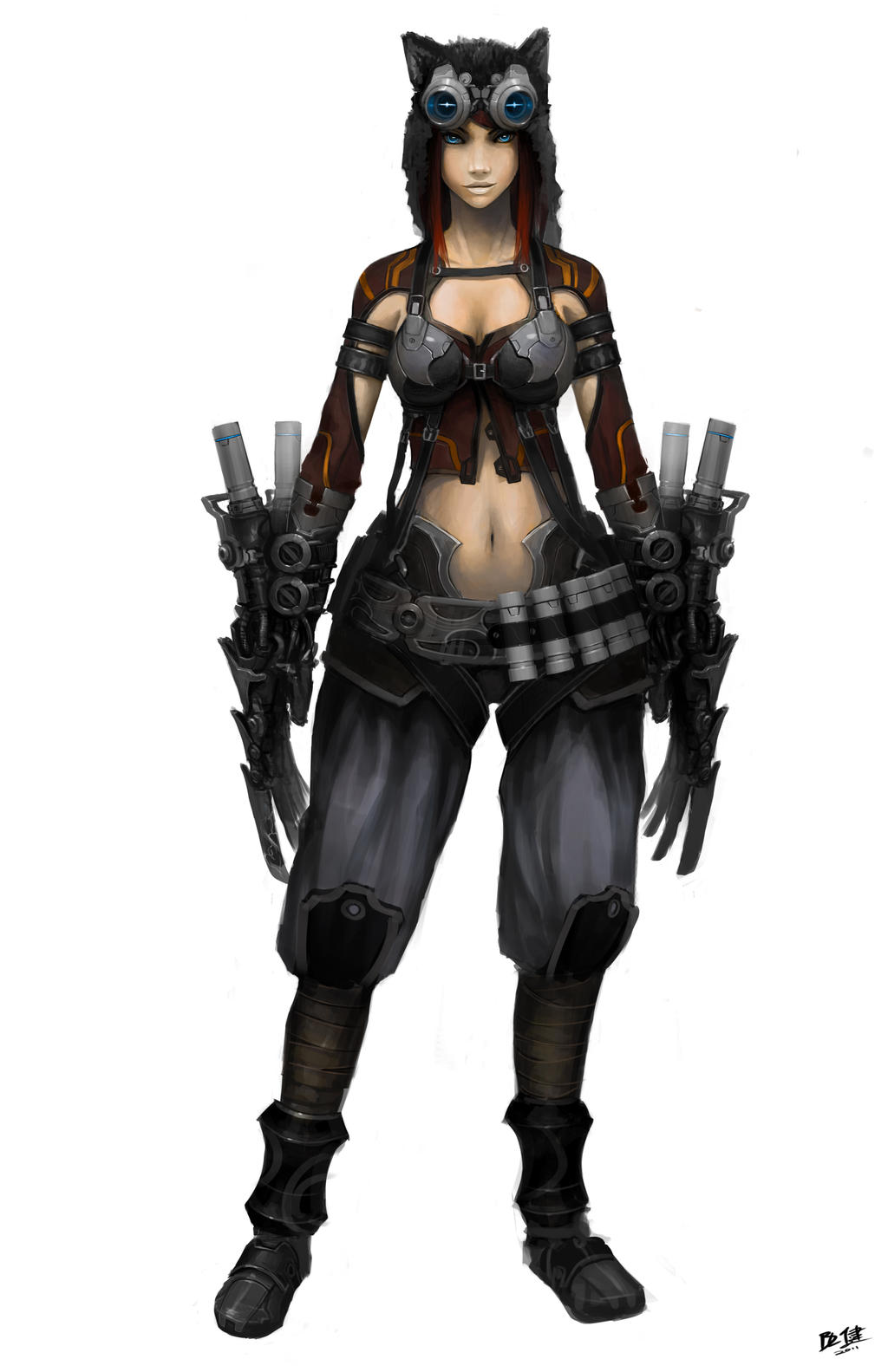
She Wolf
Hey all
I found this artwork some time ago. It have made a WOW effect on me. The artwork was made by Brandon Liao.
He allowed me to use it for making 3d model.
So lets begin) All critique is welcome:)

I found this artwork some time ago. It have made a WOW effect on me. The artwork was made by Brandon Liao.
He allowed me to use it for making 3d model.
So lets begin) All critique is welcome:)

Replies
Here is blocking of the model. Some of the elements will not be identical to concept art, but maximum close to it.
Here is the screenshot:
Next my goal is creating glove.
Also, her breasts look more like balloons with air instead of drooping sand filled breasts. Give weight to them.
Btw, what are you rendering the High poly models in? Looks wonderful!
http://breadwinningmama.com/wp-content/uploads/2012/10/hello_kitty001.png
About render, thanks) I rendered in KeyShot. All render settings were default, only 128 samples instead 16)
@Legion_studios Haha, I was thinking about this character too) but this Kitty is a little bit more aggressive
I have fixed the body and made geometry of a the glove
But i gotta agree with JadeEyePanda though, the boob area still looks kindda off, the natural weight of the breast plus the metal plating on the armor should have weighted it down more.
can't wait to see it finished
Need this girl more muscular arms or not? And also what is your opinion about whole character?
for the pants folds id recommend not looking at the concept for reference
pants tend to have horizontal folds instead of vertical specially here the pants are baggy with boots holding them up
check the folds here for example . notice how there are lots of horizontal folds right above the shoes :
not the best ref . just an example
oxygencube, got it, yes, you are right. I will revise her stomach area and neck area.
Catzcratch , thanks for the screenshot. Really, her pants should be more looks like your reference. I will try two variants: Marvelous Design and hand-made folds.
I think he meant to model.
"are complex stuff like the claws supposed to take forever to model?"
I have spent not so much time to model this claws and other stuff. I had so little free time last months, that is why this project has long terms:)
Now is high-poly modelling
looking forward to this
Guys, I have a question:
I baked normal map in ZBrush. But it has weird result
How to bake Normal Map without splitted smooth groups?
Thank you, pal, I will bake it in Xnormal)
EDIT : Seems like you already know that, sorry, didn't read properly, late in the night and all...
Thank you
Was baked skin, made eyes and eyelashes. Also was setted up a light in the scene. I mean this direction of light.
Guys, need your advice. Do you know some good tutorials about making hair for the realtime tharacters? For hair with planes and alphas.
click me
Haha, thank you, pal!
You have better folds than before but you don't seem to have fully get how cloth works yet. This page might be useful http://www.mightyartdemos.com/mightyartdemos-bradley.html
It's important to mix the references with a certain understanding of cloth, especially when references are hard to find.
I also made a very crappy paintover to indicate what I think would be the main directions of the folds.
Because they are baggy pants in boots, you want to have some large, deep folds on some places (mainly the long diagonal folds in the front view)
Hard to find a ref that perfectly matches her trousers but this one might help:
Old pants with new folds
Those skin textures really brought her to life near the end.
I see what you were trying to do......and I'll say what works for the concept does sometimes not work when translated to 3-D, it's where you as a 3-D artist have to make a call and find real world reference, apply, or stylize and apply. Our brains know that cloth material doesn't behave that way, and it's causing us to pause and dissect it.
You were planning on informing the viewer they were pants by texture weren't you? Go back, model that shit, and those folds.....reset, again.
Again!
I am working in the Marvelous Designer. Here is the variant I actually like. What is yours opinion?