Orellia - Need character feedback
Hey Folks! I need some feedback on a character (design, colours, technicalities or anything that seems odd about it- do point it out) I've been slugging on it lately- It started out as a steam punk/pirate character I had wanted to work on, but after awhile I realized, I needed something of my own design, I thought maybe I'd just go with whatever I could come up along the way since I'd already started it- which I realized was a REALLY bad idea after halfway through the project and now I'm a little stuck and wasted so much time(yes :poly127: terrible, not making that mistake again)-
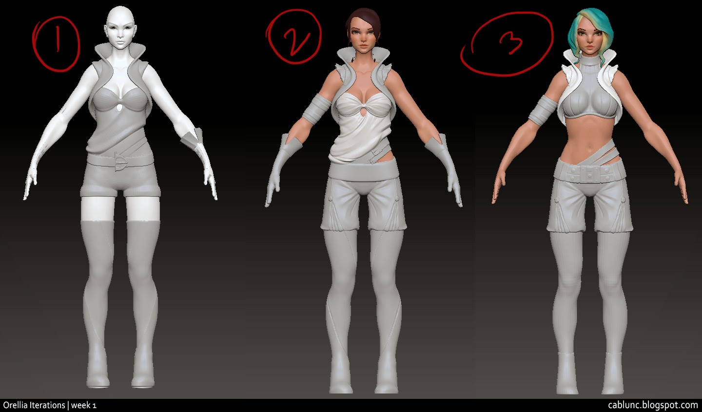
So here's some of the earlier progress I worked on,
This was meshing out some ideas-
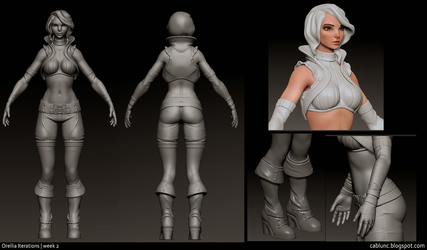
This was an assumption I was sticking to the design and sculpted it-
Used Topogun at this stage and chucked it into marmoset for a test run-
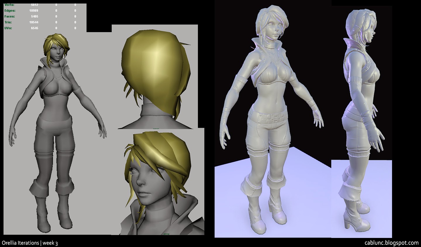
Some horrible paintover colours added at this stage (realized it was a terrible idea not to have done this earlier)

Got some feedback and painted over the character-
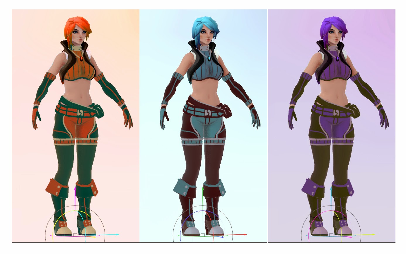
After tweaking, got more feedback and more paint overs,
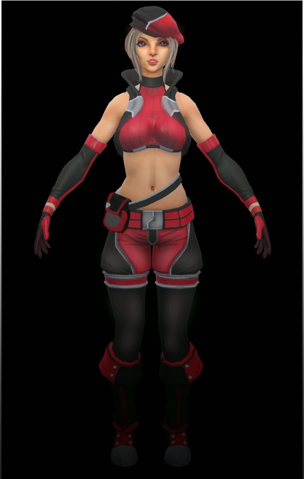
Current Progress, I decided to go for a more modern look and although it's strayed far from what I had in mind, I think it works alot better- But It's looking a little too barbie like right now- (the hair texture is a placeholder)
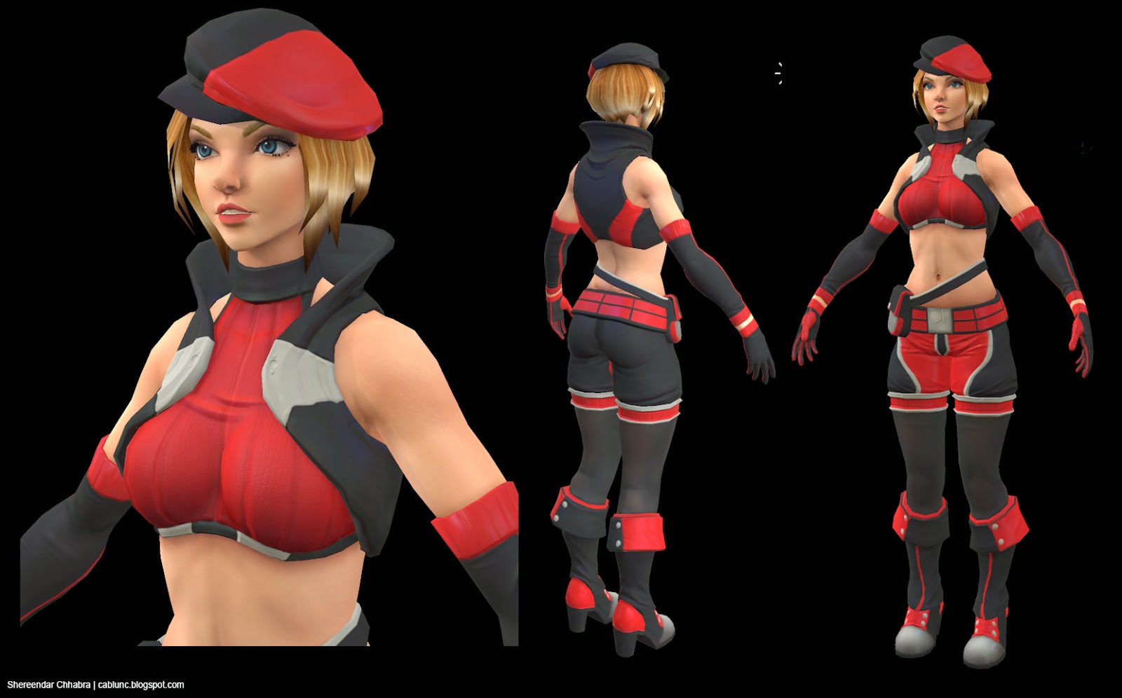
So here's where I'm stuck- I can't help but feel that there is something missing- any feedback you guys could spare before I move on?
So here's some of the earlier progress I worked on,
This was meshing out some ideas-

This was an assumption I was sticking to the design and sculpted it-

Used Topogun at this stage and chucked it into marmoset for a test run-

Some horrible paintover colours added at this stage (realized it was a terrible idea not to have done this earlier)

Got some feedback and painted over the character-

After tweaking, got more feedback and more paint overs,

Current Progress, I decided to go for a more modern look and although it's strayed far from what I had in mind, I think it works alot better- But It's looking a little too barbie like right now- (the hair texture is a placeholder)

So here's where I'm stuck- I can't help but feel that there is something missing- any feedback you guys could spare before I move on?
Replies
After lots of experimenting and some feedback from a few friends-
I got to this stage-
Added loads of freckles/ pores to the other parts of the skin. I used a scatter brush around the tummy area and the arms with opacity at 40% mostly eye dropping from real life photo references. The face was quite challenging, the lips took me an hour before I got the specular to look like how it does- many times she looked haggard because I had put too much detail at the bottom of her eyelids by adding a grey/ purple tint to it- Added leather and cloth specular to the clothes, mostly using textures online and de-saturating them- So far I'm okay with the results, and currently working on texturing the hair-
Here's a full profile of the character. Also feedback would be of great help, Thanks guys
Cheers!
It looks alot better I didn't realize that it could make a big difference haha- I'm not too sure if I got the armpits right yet though- I reckon I'd need to work on the texture to make it look more obvious- whatchu think?
Some hair paint over I did, I scrapped the tail and worked on trying to get the overall bob look for her hair- The hair colour I changed it to a darker brown to make her face pop out more- The blond made her face drown- I also made little changes to the skin and lips-
A little close up on the hair model with some wireframe, I realize it still needs work especially on the texture/alpha- It's not looking too good on that part-
A little more close up
And a full body of the model-
Halfway through rigging and will be adding a few blendshapes for an expression ;3
I'm planning to add a vehicle and make it a whole set-!
I did this with my SO and this is the progress so far
He did most of the modular pieces and I made more detailed pieces and made it a little more organic- I'm currently Uv-ing and will continue to textures
Feedbacks would be great btw! help this poor artist improve! tq-!
In regards to the barbie statement, maybe you can play around with adding some killer body tattoos on the side of the torso and/or arms. Who knows maybe it'll be fun to try out even if you don't stick with it. She does seem to have some ample skin showing afterall!
http://drawcrowd.com/ushiki
Just a thought, she's already nice.
And maybe the chin is a bit too lowpoly, could add some def here. Maybe it's just me but I think people should start doing smoother meshes ( the shoulders for example, we can easily see the polys ), the new generation of consoles can handle it, and PC's can handle it for a long time now ( just look some body mods for Skyrim, they are really smooth ).
The hoverbike is nice too ^^.
Last thing : I feel like more and more people are trying to copy Hazardous' style. Well I love his characters and I'm a big fan of his works too, but it's really obvious, like people trying to copy Orb's style some time ago. I really see Haz' style in this face, did you do that on purpose ?
@Texelion Hey man thanks! The references are really good, I especially like the fox girl- I'll try adding more tones to it! This model is more of a testing ground so I'll definitely try the colour schemes out- Yea it is a little low poly, I was trying to see how far low it could go before it started getting blocky- I'll definitely add it if its too obvious- and thanks
Aahh- It's mostly coz I was following this thread by funkybunnies and I did use most of haz's tutorials :-
http://www.polycount.com/forum/showthread.php?t=98186
It wasn't really on purpose
Just came by to say I really like where this is going, she looks very good
Once again not helfull at all but still nice to hear sometimes, cheers!
My point: try to differentiate your art by playing around with her height. Even if you don't stick with it, try to see what she might look like at say, 5'5"...
Regardless: awesome work. Solid skills showing here.
Nah, I actually don't know a lot of people that like tall girls. But I do know that most people like long legs, doesn't mean the girl has to be tall though, it's all about proportions.
@KazeoHin - Hmm I'm not too sure about height but I did notice she looked a little too long at one point and added some body mass instead XD I can't really change the height at this point coz I've already rigged it
Somehow I like how her face looked in the early stage more. Now she somehow looks like a young gender-bent Mario or Luigi O o'
I'd recommend going over your textures again, though, to really give her some material definition. At the moment, she really looks like everything on her is made out of the same stuff. Give some different spec and gloss definition, and try to push the diffuse a little further.
At absolute minimum, get those metals looking more like metals. Right now they look exactly the same as the fabric, when they should look drastically different, surely.
@BagelHero Got it! I'll be adjusting abit more of the outfit and get the spec right- I'm testing out on how much detail I should put in the diffuse @_@ I've usually worked with painted texturing for my characters- so it's kinda hard to tell how much detail should I put in the diffuse or the spec/detail map or even normals- I'll continue to work on it
@SuperDuty455 I changed the outfit a little in a paintover I did- I do think it looks alot better and it doesn't look as bubbly or kiddy at least XD
@Popol Thank you
@slosh Yea I thought something was wrong there, It looked like the belly button was too big at first but now that you said it - I added more shadow to the under belly area to give it a rounder look- It's still toned but I think it's much softer now- I also tried pulling out the vertices a little- I don't know if that helped much though but I do think its better-
I'm trying my very best to get some changes in, So far I did some paint overs and some shader testing- I reckon It'll look better with more colour and instead of sticking to brown for her hair I'll change it to a more green-turquoise tone- I also Posed her for fun- to get a little more motivation-
I kinda like her bald right now-