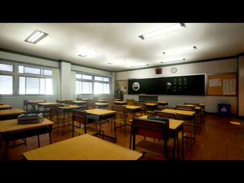
[UE4] Modern Japanese School
COMPLETE:
[ame] https://www.youtube.com/watch?v=rXcwh6DqXsQ[/ame]

===============================================================================================================
Decided to do an anime/Japanese inspired school building with some exterior and interior. I have a mix of mostly anime references but I've also Googled and watch videos of real schools in Japan as well. I'm kind of just mashing references plus my own ideas to make the scene.
Some of my References:
http://imgur.com/a/n003D
What I have so far:


C&C is always welcome! Thank you!
[ame]
 https://www.youtube.com/watch?v=rXcwh6DqXsQ[/ame]
===============================================================================================================
Decided to do an anime/Japanese inspired school building with some exterior and interior. I have a mix of mostly anime references but I've also Googled and watch videos of real schools in Japan as well. I'm kind of just mashing references plus my own ideas to make the scene.
Some of my References:
http://imgur.com/a/n003D
What I have so far:


C&C is always welcome!
Replies
anyway a few suggestion on your current state are:
1 - Don't go overboard with the shinies. Study and narrow down the look of the materials you want to go for from real life reference. Also be careful of baking AO in your diffuse with UE4 materials, rather just use the AO slot in the material editor.
2 - (this should be n1 actually but...) References... don't take too many from anime since, as detailed they might get they're still exagerating some aspects and neglecting others. THIS and other articles related to it might help.
3 - Check your proportions carefully. Those beams on the window frames are HUGE.
Also, most "modern" japanese building are really keen to modular designs as they're actually build modularly (is it even a word?) in real life. They still need supporting structure tho... you got a 40meters building with not a single pillar or wall that's not "paper thin".
This and all points above actually come down to "gather proper refs and plan ahead"... It's quite easy to start doing something big like this from a window and then banging your head trying to figure out what's wrong in the end.
Anyway keep it up, I'll be watching this with intrest
A couple of real life movies that feature a lot of scenes (or are solely playing in highs chools):
- Confessions
- Swing Girls
- Go!
- Linda Linda Linda
- All about Lilly Chou Chou
- Love Exposure
but iam pretty sure there are also a lot of picture around if you search for
高校教室 (koukoukyoushitsu High school classroom)
but remember, this:
is a rather lush private school.
this:
http://2.bp.blogspot.com/-P6XS1iYbKHo/Uk0uP3s7A-I/AAAAAAAAALQ/F9fEqb09ECg/s1600/%E5%8B%89%E5%BC%B7%E4%BC%9A10%E6%9C%883%E6%97%A5.jpg
is more what they look like.
@Jonas Ronnegard I was debating what type of floor to use for the classrooms. Originally was going to do this kind
but after seeing the image that Anchang provided (http://2.bp.blogspot.com/-P6XS1iYbKHo/Uk0uP3s7A-I/AAAAAAAAALQ/F9fEqb09ECg/s1600/%E5%8B%89%E5%BC%B7%E4%BC%9A10%E6%9C%883%E6%97%A5.jpg) I'm going to try it out for sure, we'll see how it goes.
@Fnitrox 1 - I'll definitely tone down the roughness on the frames. After looking at some more reference, it shouldn't be that shiny. Also, the only material I have the AO multiplied in the diffuse/albedo is the floor tiles. I learned that technique from Unreal's realistic rendering showcase with how they did the wooden planks on the floor. Everything else that has an AO map is using the AO slot in the material.
2 - Basically what I said in the beginning of this post. Although that blog you gave me helped a lot! I'm going to keep referring to it for sure.
3 - They look real big now yeah. That's not how they are going to be in the end though. I think I'll have to remodel some assets with better proportions but, what I was going for was this.
The red is what I have, the blue is what I still need to add. I decided to do the individual windows separate so I can slide them open or closed at any time. I haven't started adding pillars and such but I know that's something that needs to be done. I was just trying to get a feel as far as scale before I added that stuff.
@Anchang-Style Thanks for the reference material! And yea, I'm gonna tone down the steel frames a bit haha.
I think either my door height, or ceiling height is off because in most of the references, the top window is a lot more rectangular than the bottom, yet the windows reach the ceiling. I'll probably have to make the bottom windows more rectangular vertically.
Alright, first, I resized the windows because I felt that the bigger window on the bottm, and the more narrow, rectangular window on the top looked better, changed the roughness values of the steel frames, and changes the floor of teh classroom to wood instead of tile. I couldnt really find a proper parquet style wood flooring, the one I got from CGTextures was kind of small as far as the tiles go, so by making them bigger obviously the resolution goes down.
Made the windows that look outside their own object so i can move them and open them freely. Going to add the pillars/supports, and classroom doors next. Thanks for the C&C it helps a lot!
How did you make the blurry glass?
Did you use a bump map and link its node to the opacity? Does it also have any reflective/refractive properties?
I just made a few parameters for the normal map intensity, scale, and other basic parameters to control in an instanced version. The problem I ran into was, the farther away from 1 my refraction was, you would see weird mirror like bending, so my refraction is like .9 something that way you don't get the bending, yet the normal map still gets shown, because the normal is what is making the blur, and if your refraction is 1, you don't get any normal map information shown on the material. I then just messed around with the normal intensity and scale until I got something that worked right.
Added some sliding doors, some supports, etc. I also started the outdoor courtyard area, tomorrow I'm going to dive into modeling my own foliage for the first time. : D
So far it's satisfying, but its not looking how I first envisioned it. I think part of that is due to the lack of props I have yet to add in. Once I start filling up the scene, it should start feeling more alive I guess. Crits always welcome!
I'm really anxious to go back inside and work on the classrooms so I'm going to start that next!
Working with the Quixel Suite is so much fun, especially with cross-app mode. Starting to add some props now. It's coming along!
Slowly adding more props to the interior. Going to add some more lockers out in the hallway before I start digging into micro props and decals like writing on the chalkboard, paper, etc.
Added a few small props and fully dynamic flowing curtain. First time I messed PhsyX stuff.
I'd recommend either bumping up the AO a bit or messing around with the lights so you can get more of a shadow underneath the desks, as of right now they're looking a bit "floaty."
Perhaps some differently positioned chairs and desks.
Posters, books, globe, origami cranes, bento, mecha outside, etc
Decorations for the ever present cultural festivals in every high school anime?
Could even add some items that nod to popular high school anime.
Started adding..stuff.
Random Props:
I've been streaming me working on this sometimes. Usually really late at night if you want to check it out. Still gotta add more stuff and make the place a tad more dirty. A lot of people say its too clean, but the idea is that, it's after school hours, the janitors have swept through, and this room is a room where kids meet up before they go about their after school activities. C&C always welcome!
WIP Japanese Vending Machine.
Keep at it! I like the posters/flyers in the hall.
Keep it up!